Selection controls allow the user to select options.
Three types of selection controls are covered in this guidance:
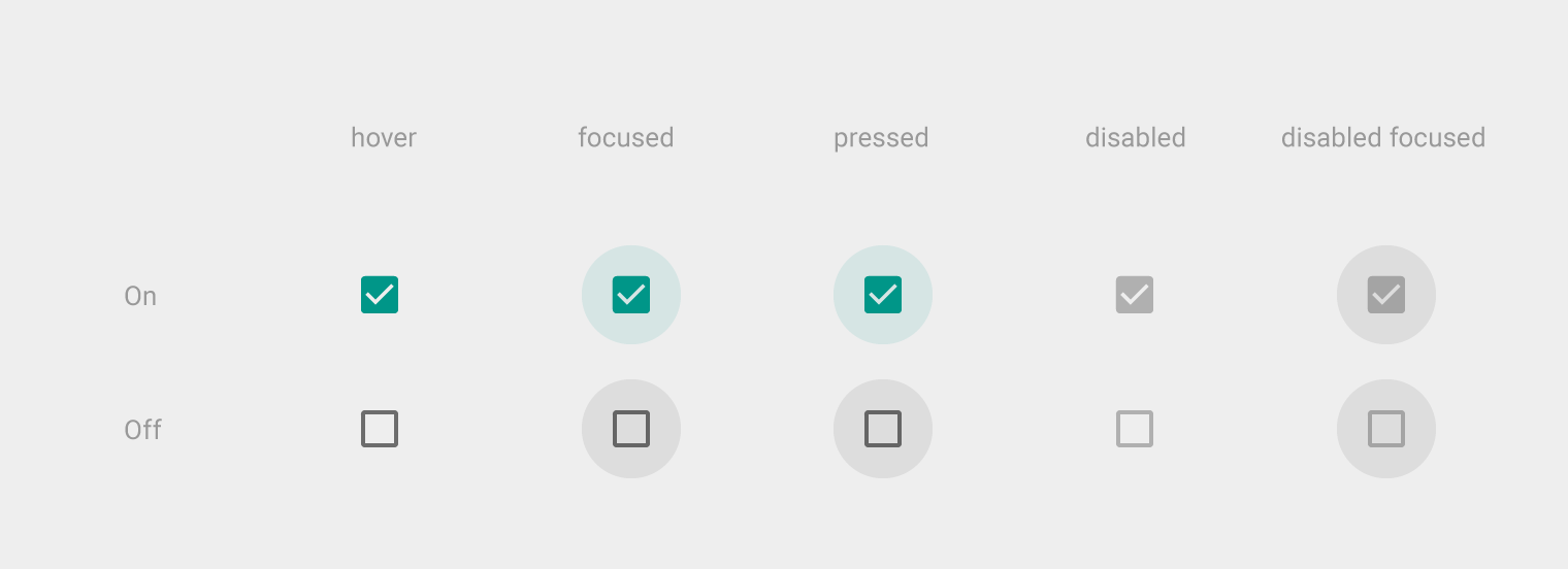
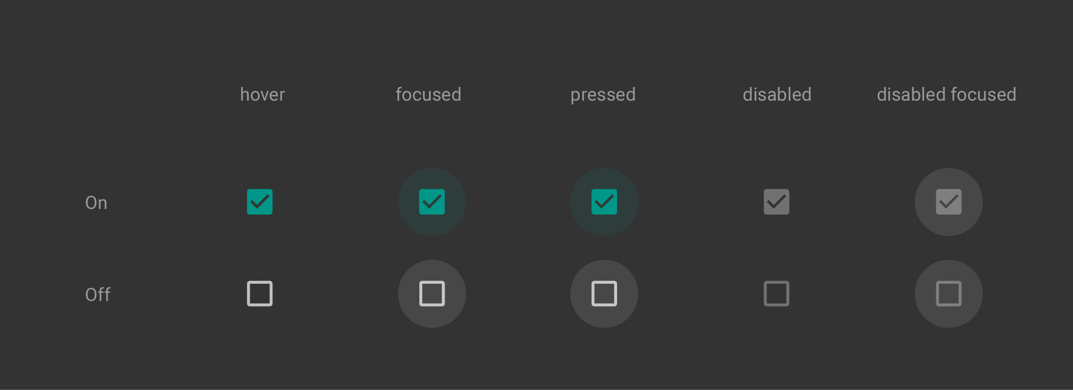
- Checkboxes allow the selection of multiple options from a set.
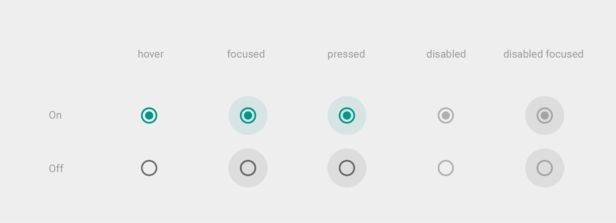
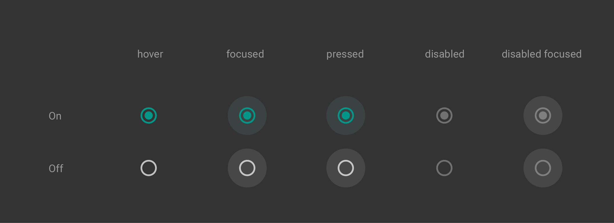
- Radio buttons allow the selection of a single option from a set.
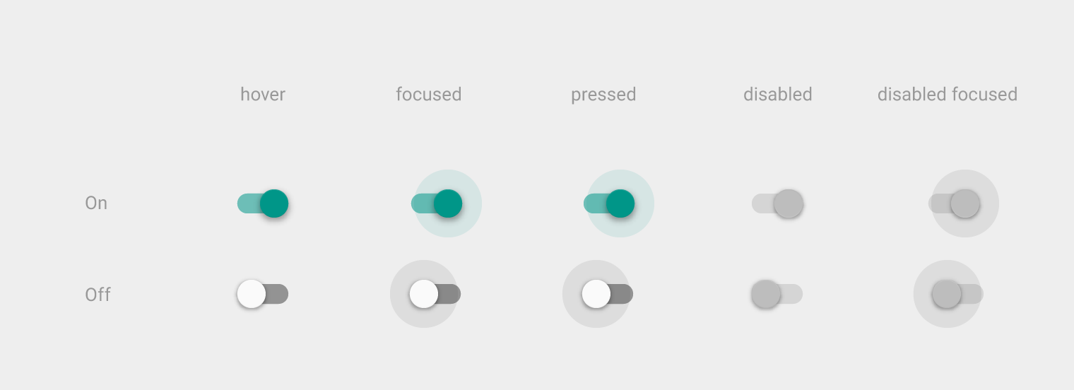
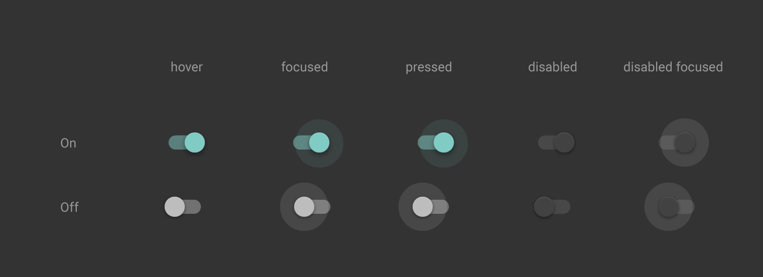
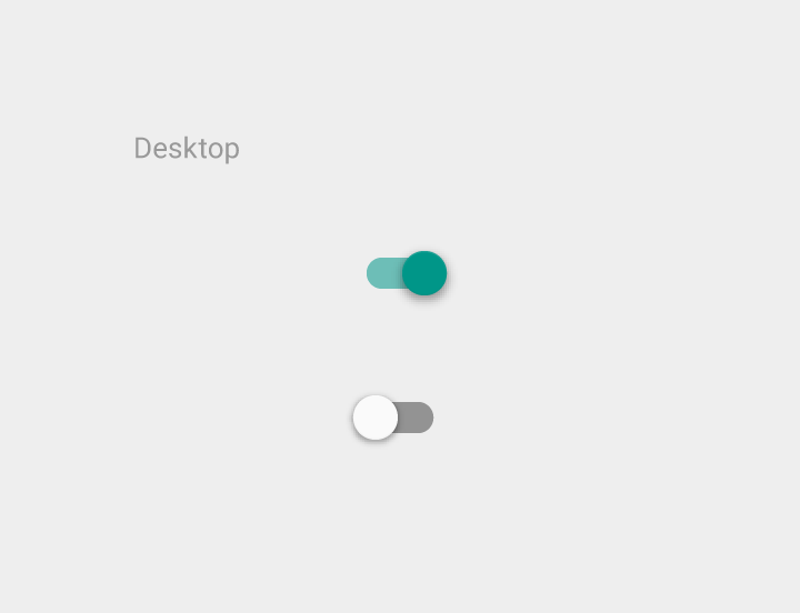
- Switches allow a selection to be turned on or off.
Color
Selection controls use an app’s accent color.
Themes
Selection controls are available in both dark and light themes.