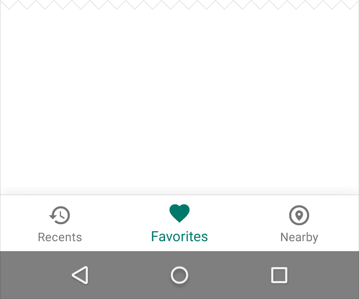
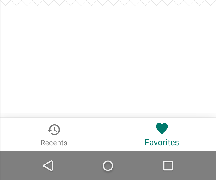
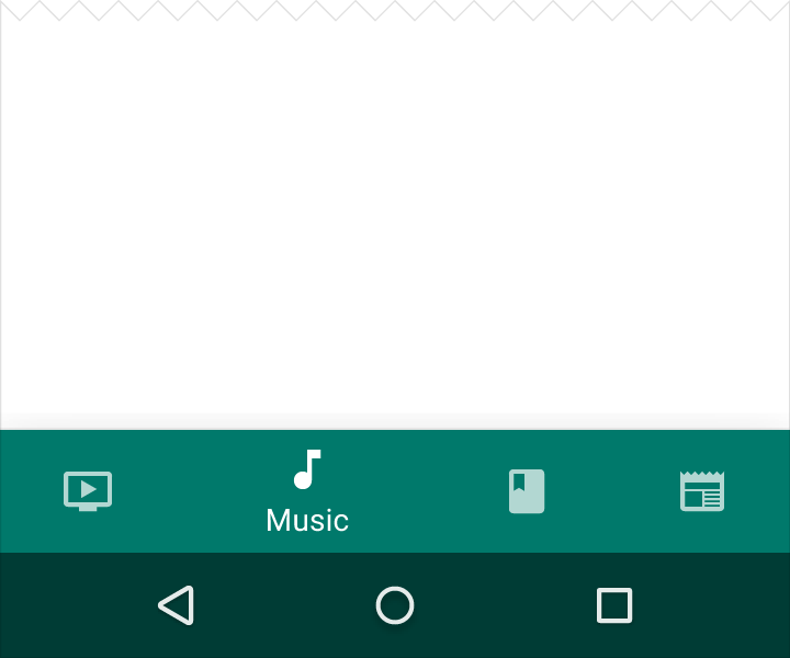
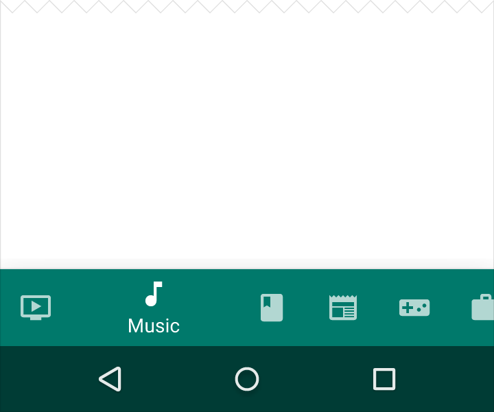
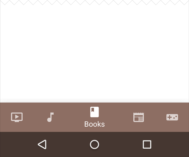
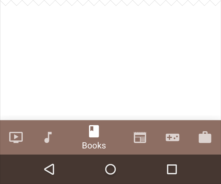
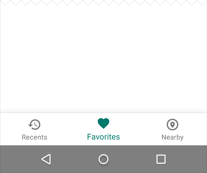
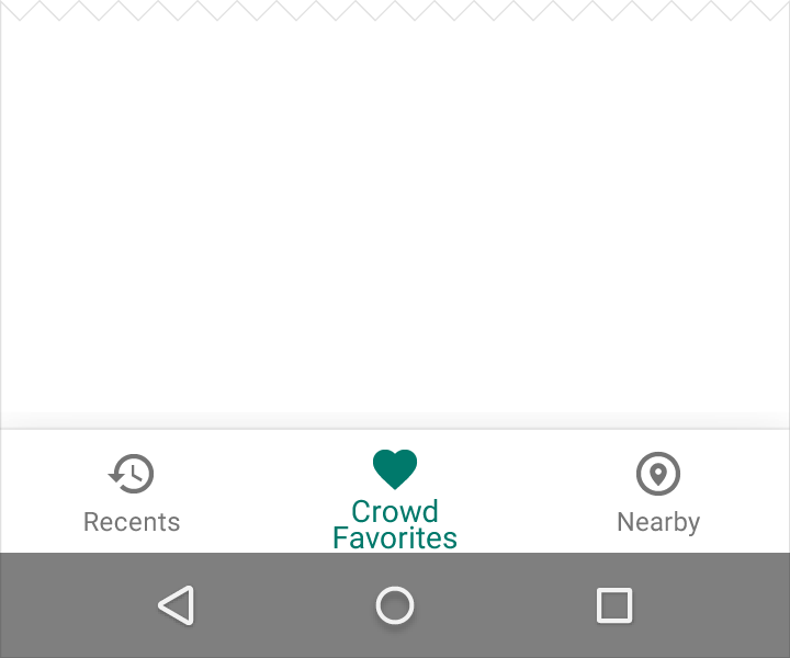
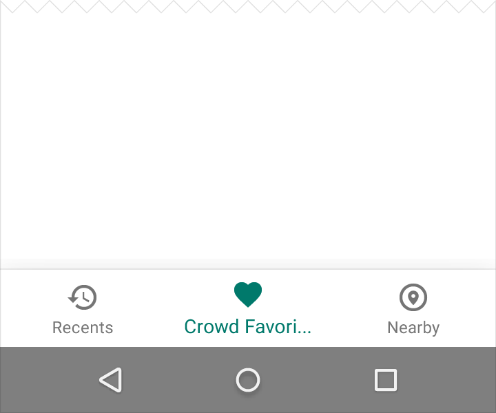
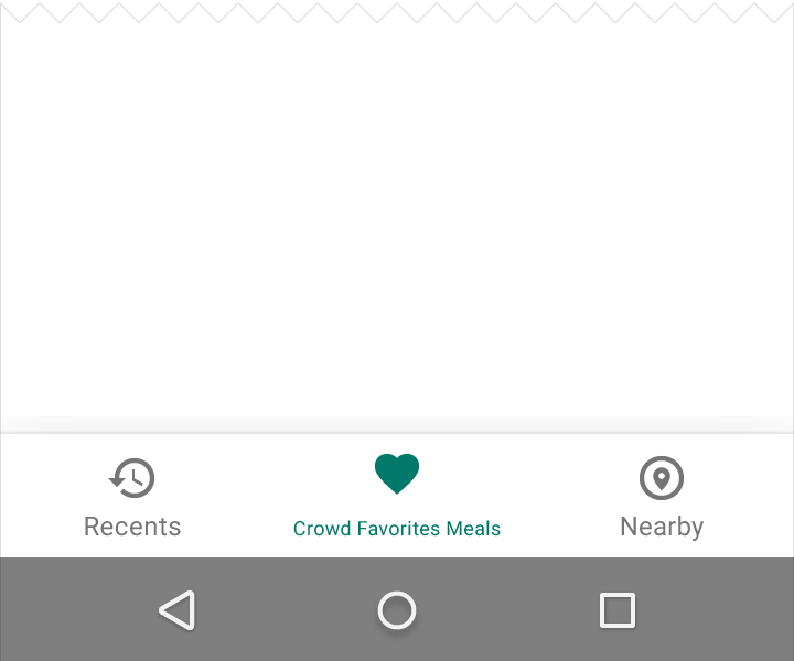
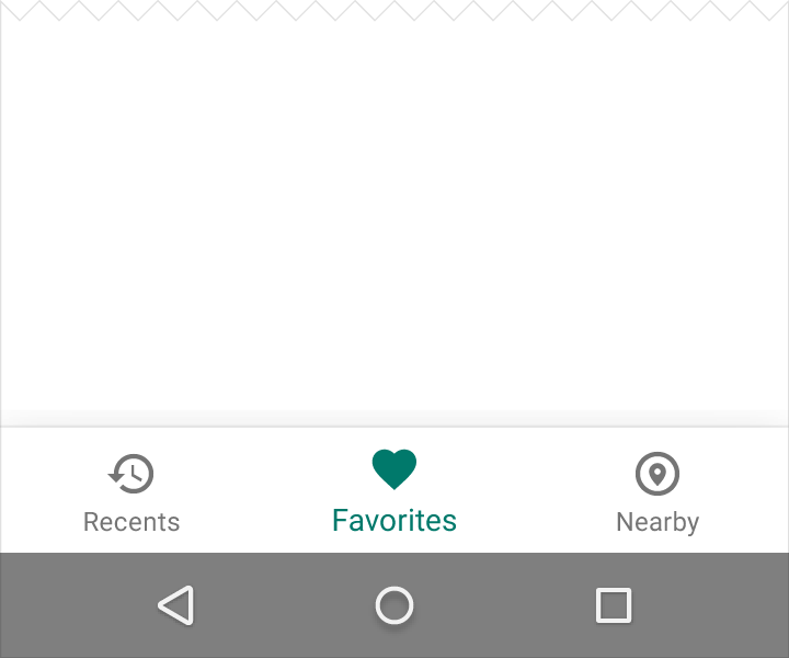
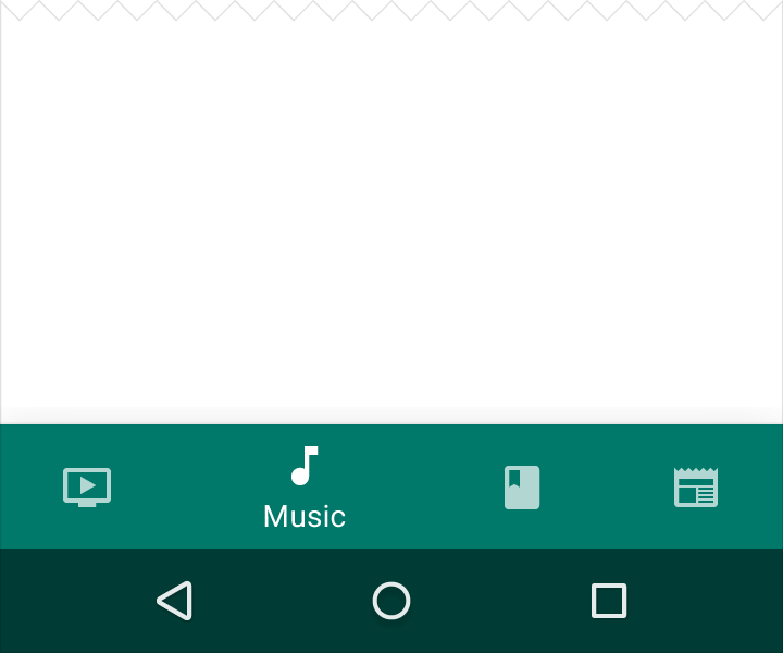
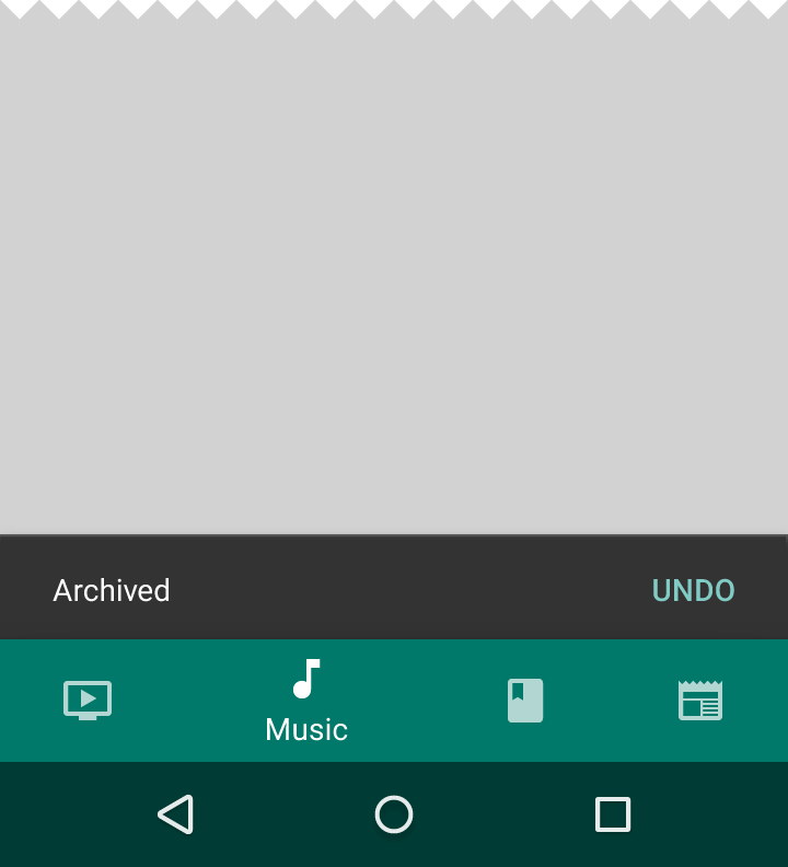
Bottom navigation bars make it easy to explore and switch between top-level views in a single tap.
Tapping on a bottom navigation icon takes you directly to the associated view or refreshes the currently active view.
Bottom navigation is primarily for use on mobile. To achieve a similar effect for desktop, use side navigation.
Usage
- Three to five top-level destinations
- Destinations requiring direct access
Color
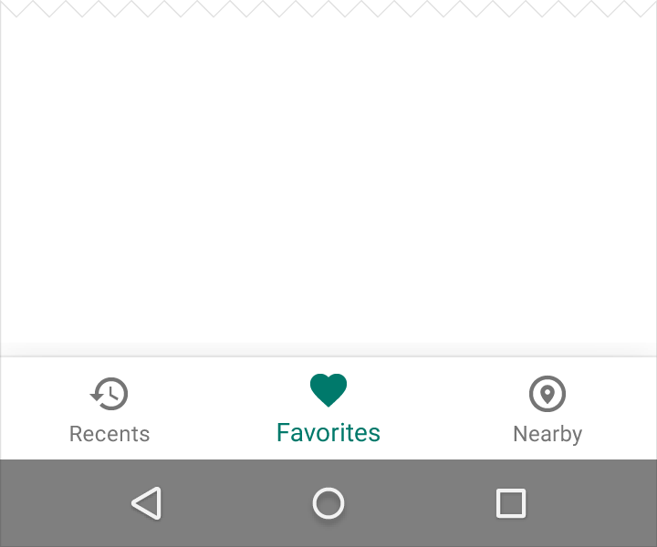
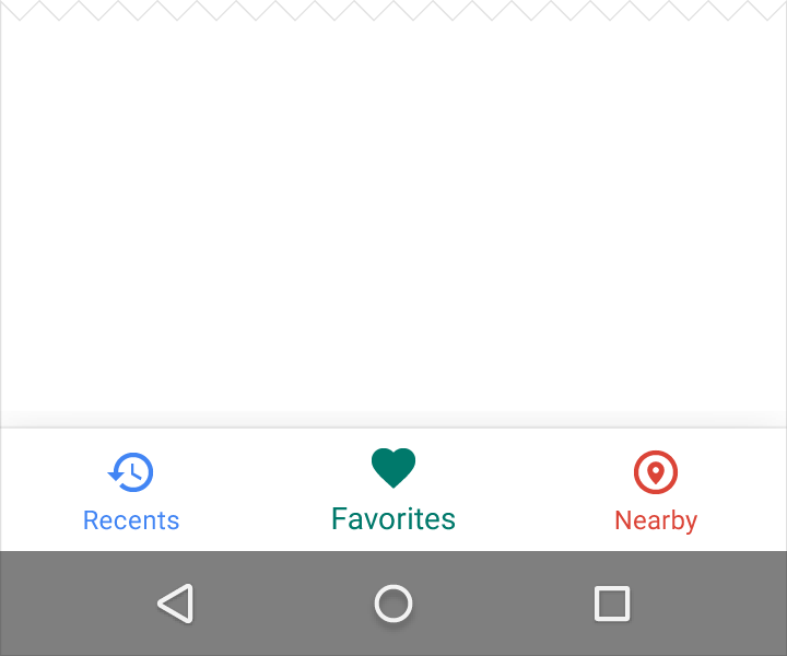
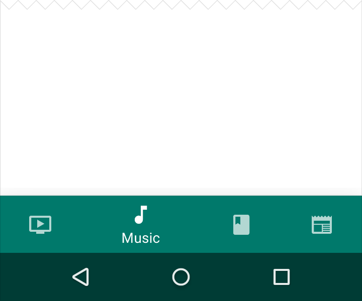
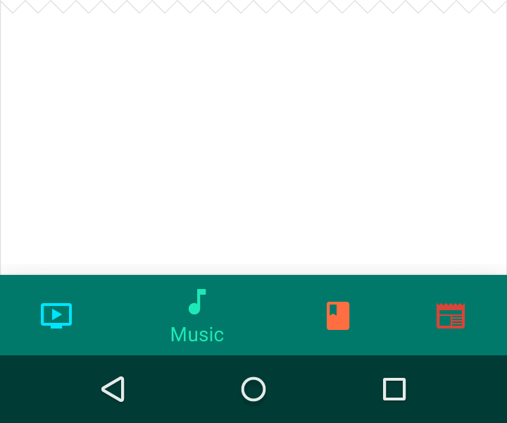
Tint the active icon with the app’s primary color. Use black or white if the bottom navigation bar is already colored.
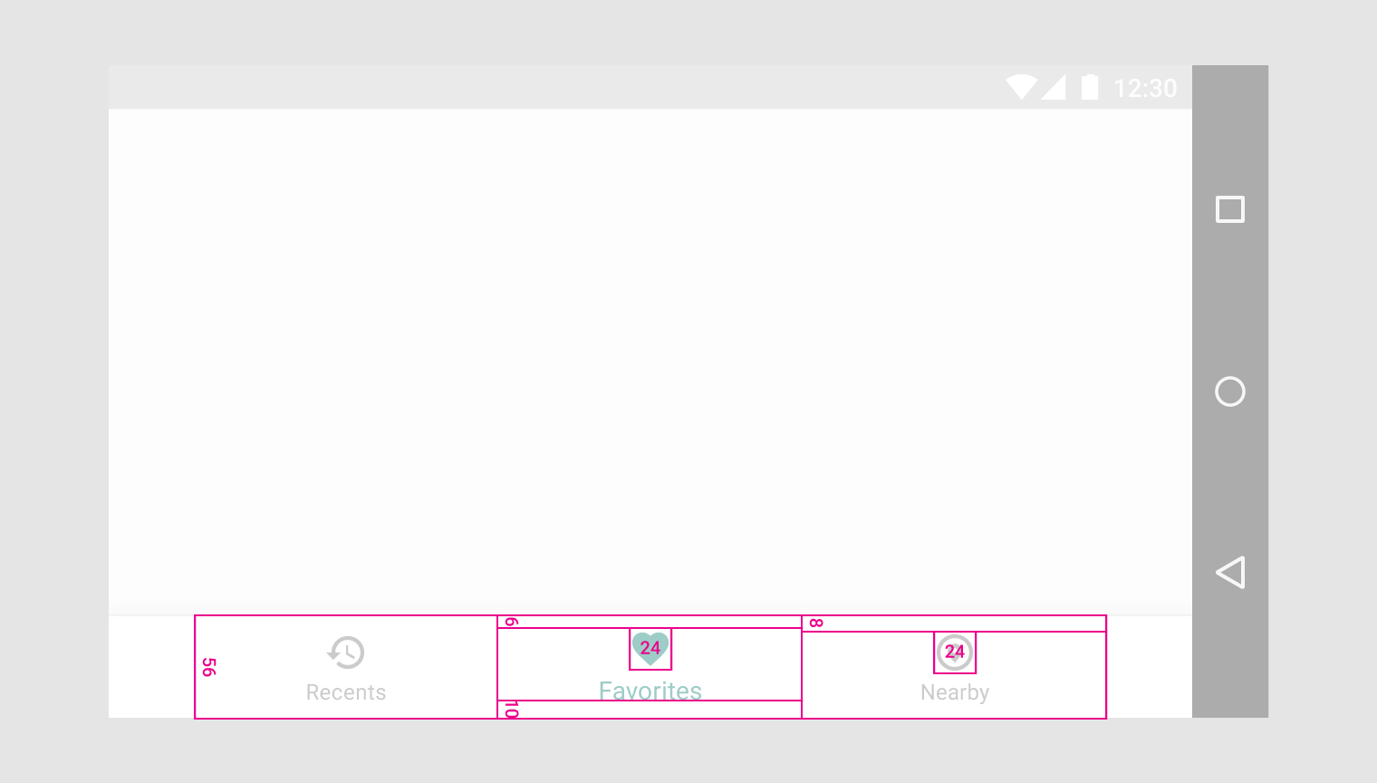
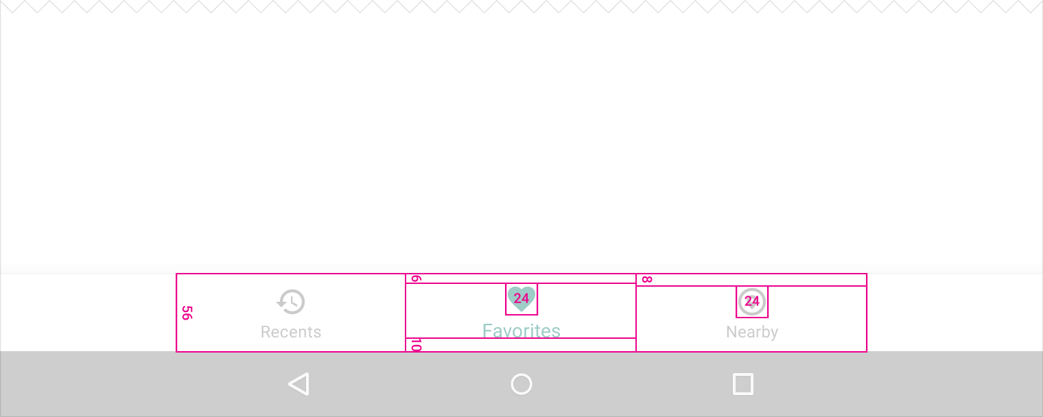
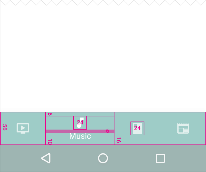
Specs
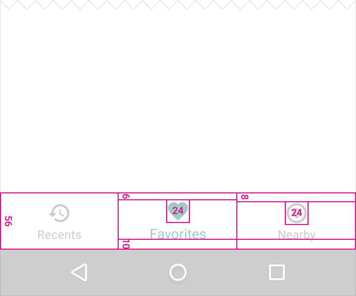
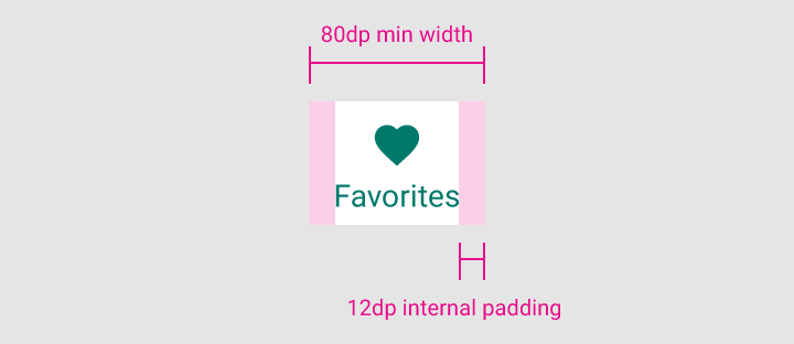
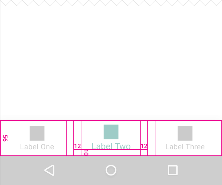
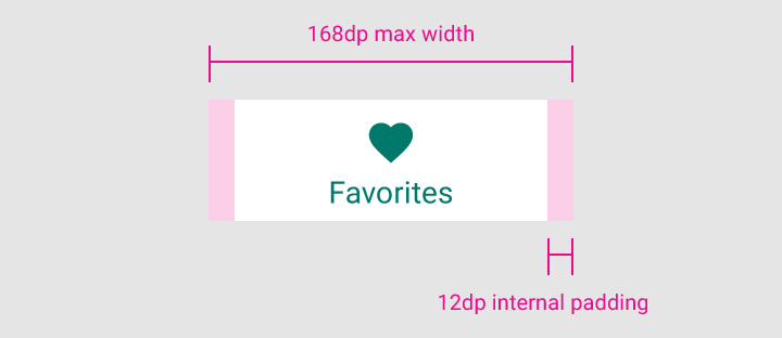
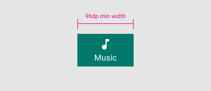
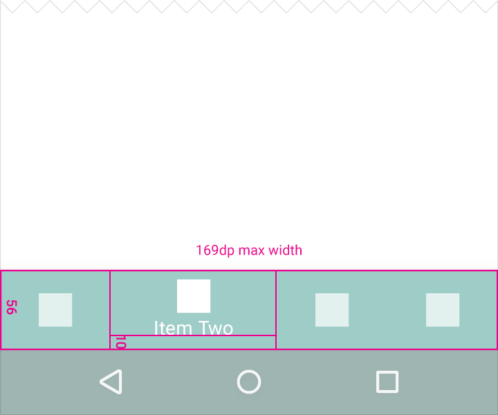
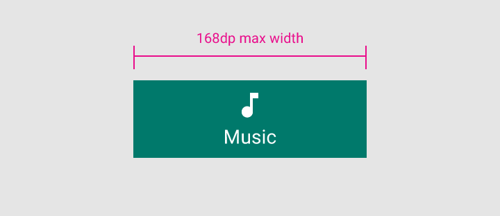
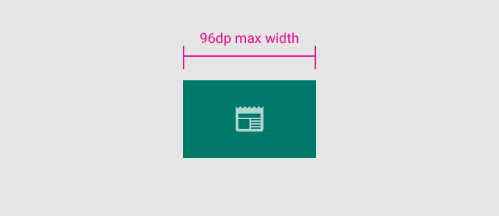
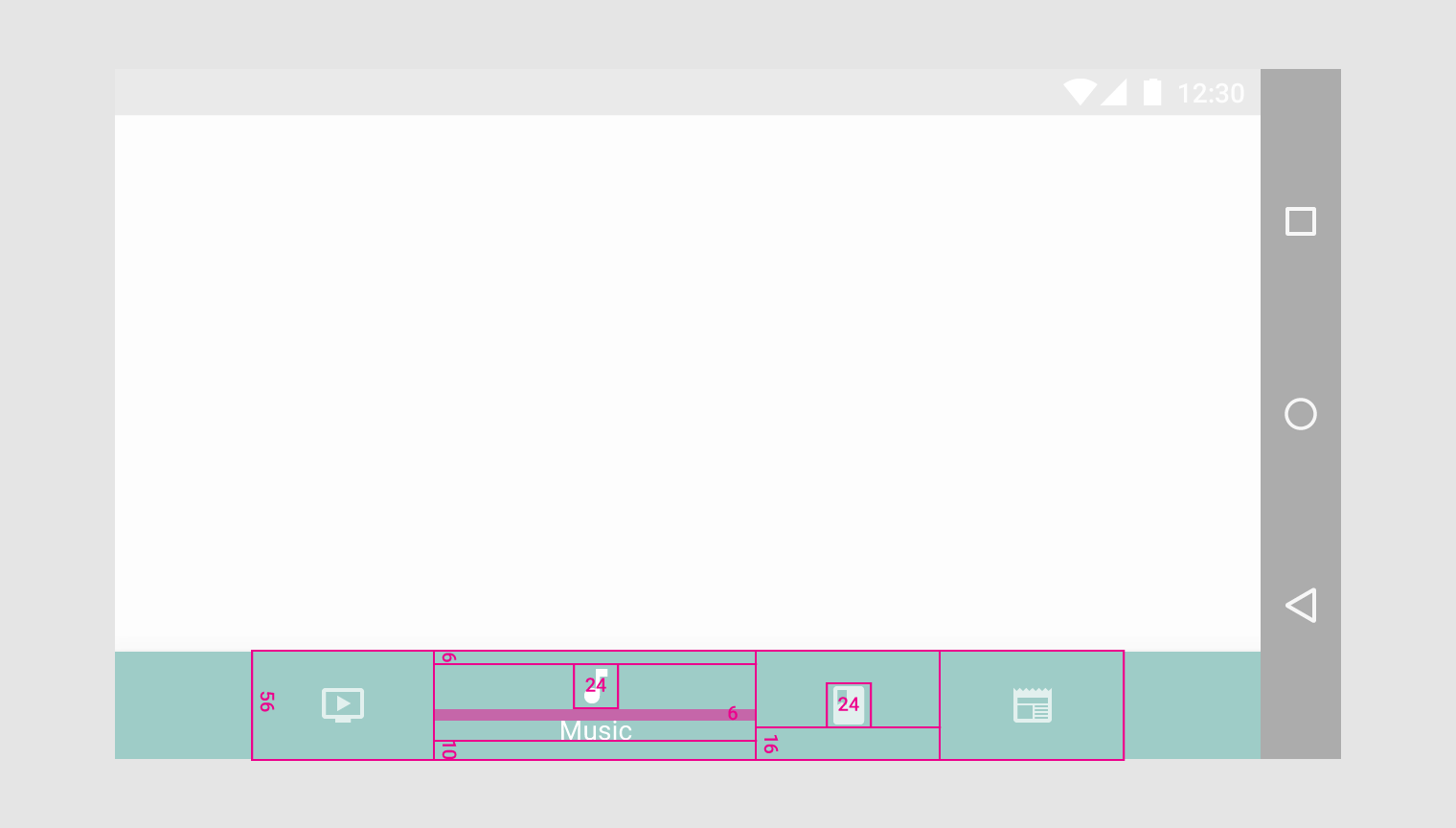
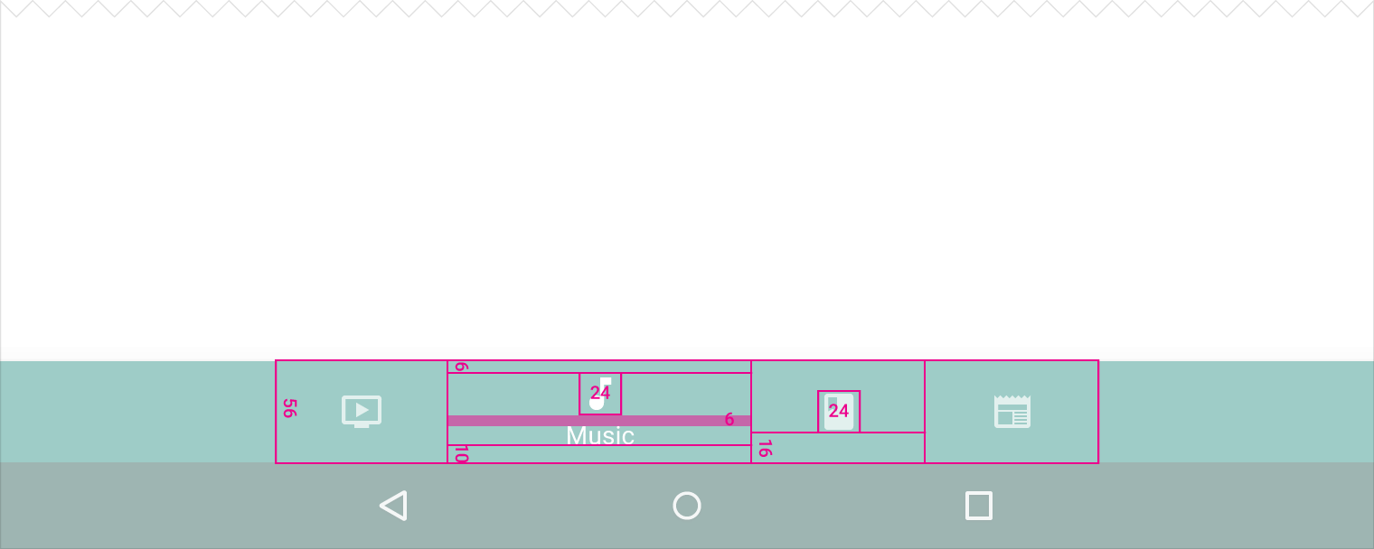
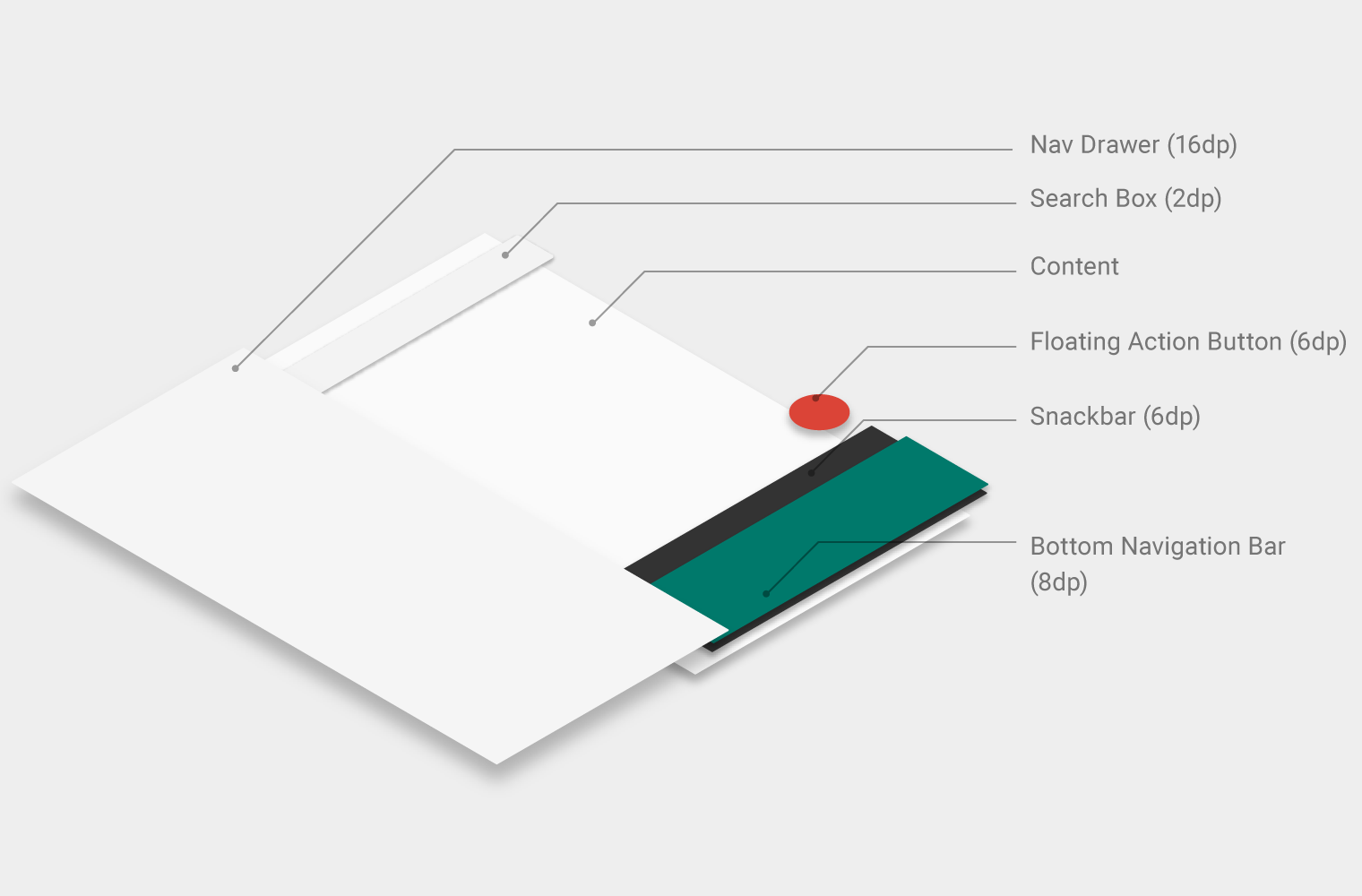
- Width of each action: The width of the view divided by the number of actions (with a max of 168dp and a minimum of 80dp)
- Height: 56dp
- Icon: 24 x 24dp