Components Tooltips

Tooltips

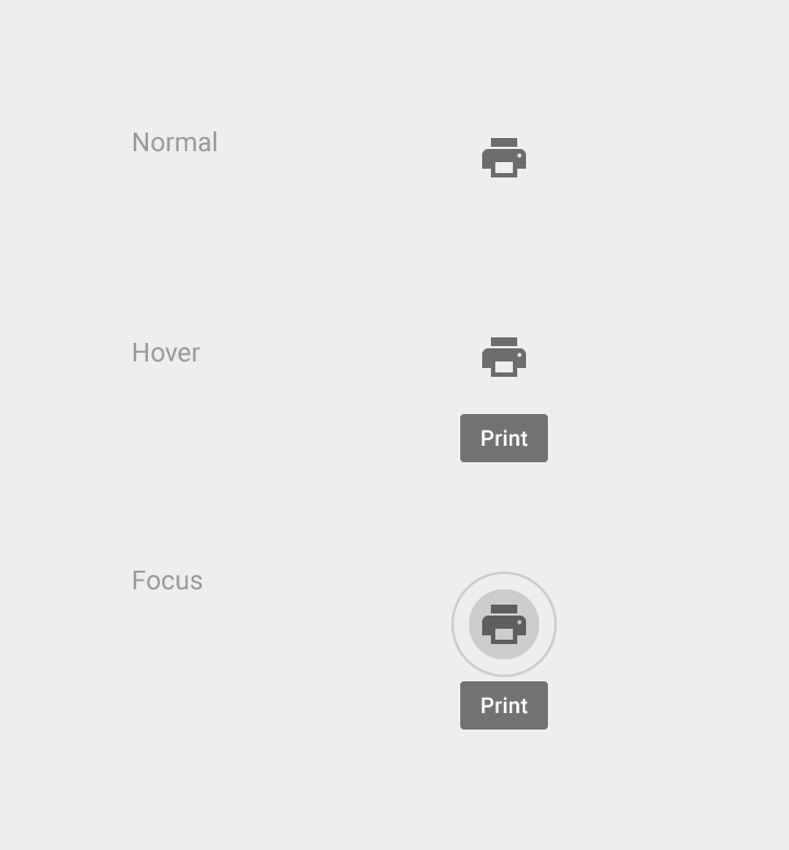
Tooltips are text labels that appear when the user hovers over, focuses on, or touches an element.

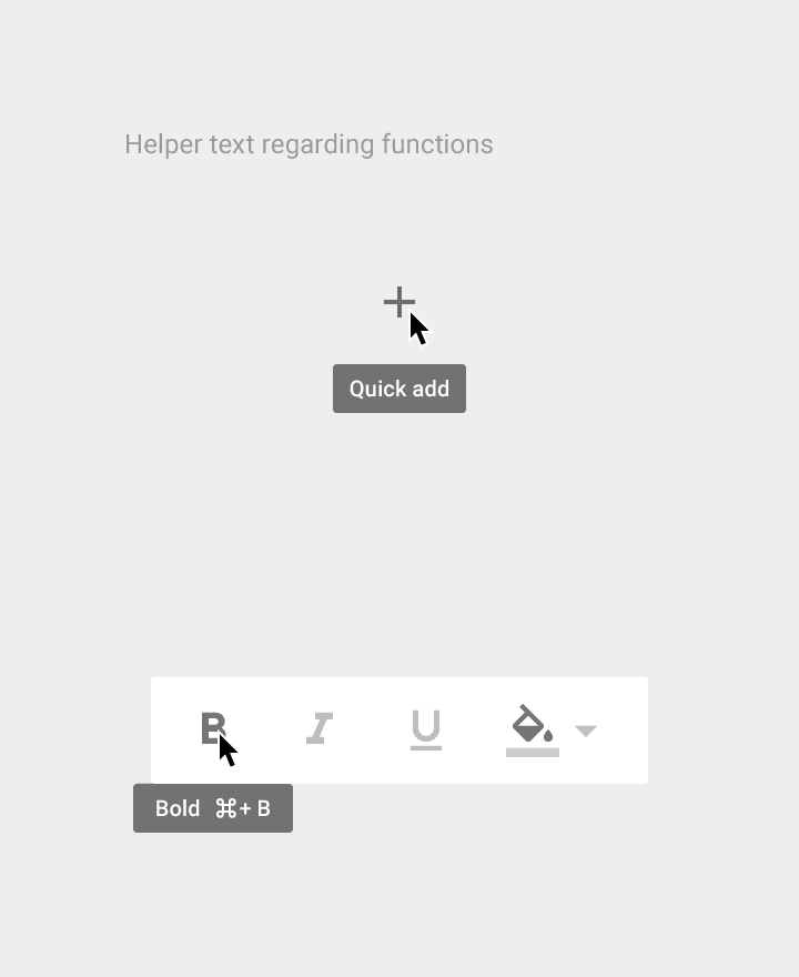
Tooltips identify an element when they are activated. They may contain brief helper text about its function. For example, they may contain text information about actionable icons.

Tooltip labels do not receive input focus.

Summoned by:
  • Hovering over an element with a cursor
  • Focusing on an element with a keyboard (usually the tab key)
  • Upon touch
Material Design tooltips appear on hover or touch

Usage Expand and collapse content An arrow that points down when collapsed and points up when expanded.

Use tooltips for interactive imagery.

Current example of a tooltip in Material Design

Do.

Error example of a tooltip in Material Design

Don’t.

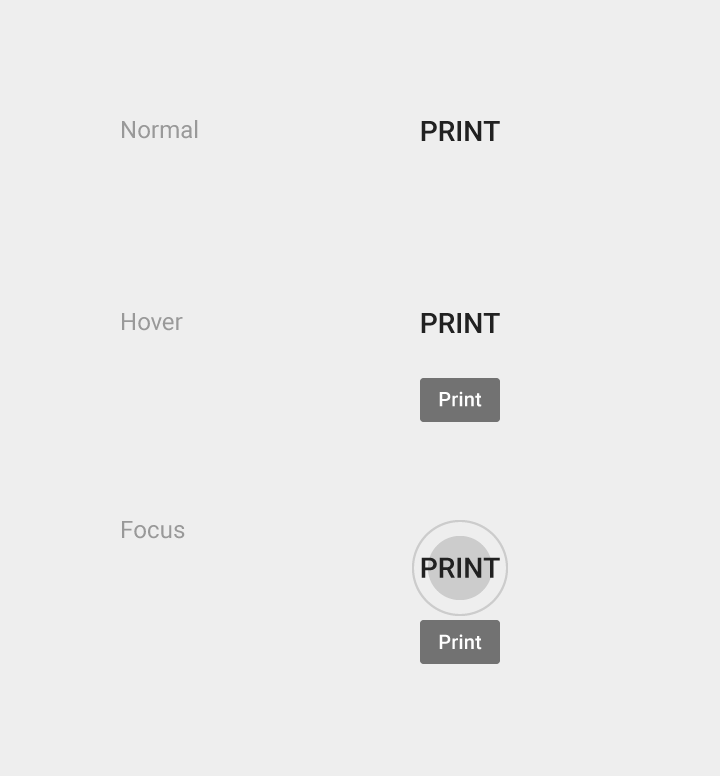
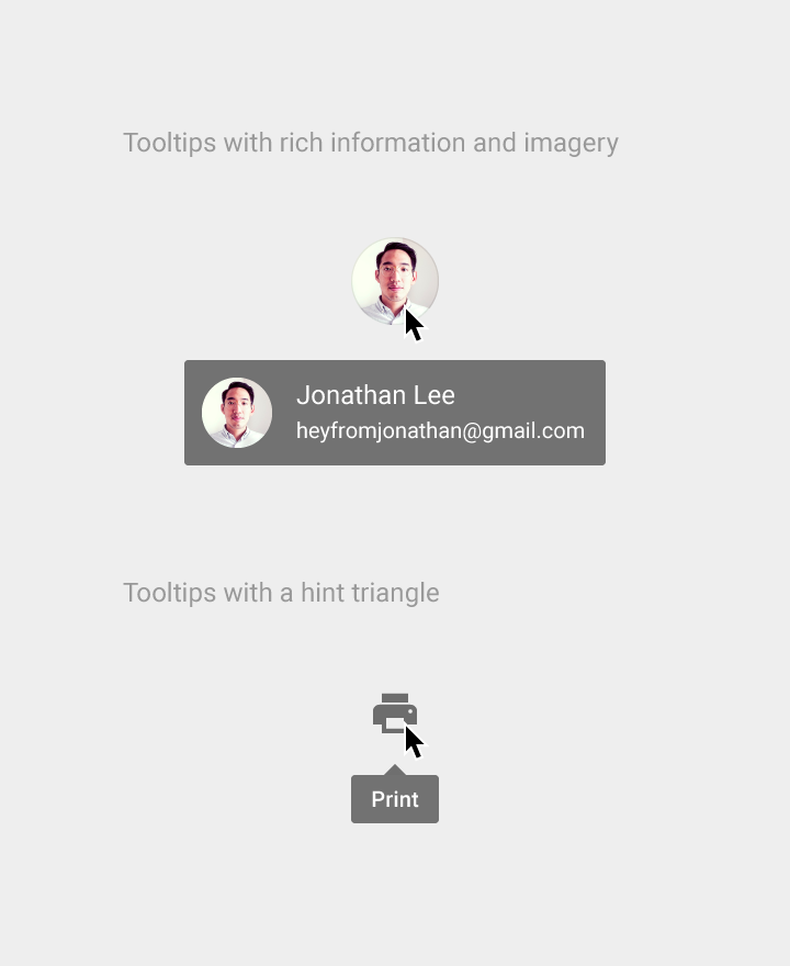
Tooltips don’t display rich information including images and formatted text.

Tooltips are different than ALT-attributes, which are intended primarily for static images.

Tooltips don’t have directional arrows; instead, they rely on motion emanating from the source to convey direction.

Current example of a tooltip in Material Design

Do.

Error example of a tooltip in Material Design

Don’t.

Interaction Expand and collapse content An arrow that points down when collapsed and points up when expanded.

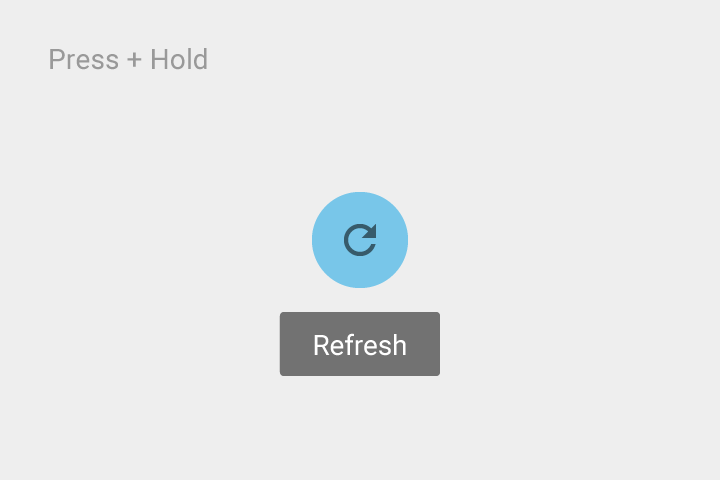
A tooltip is triggered by tapping and holding an item. Keep the tooltip displayed as long as the user continues to hold the element.

Timing

On lift, display the tooltip for 1.5 seconds.

If the user takes another action before that time ends, the tooltip will disappear.

Motion details

The tooltip entrance occurs over 150ms, using the Deceleration Curve. It also exits over 150ms, using the Acceleration Curve.

Tooltips (desktop) Expand and collapse content An arrow that points down when collapsed and points up when expanded.

Text: Roboto Medium 10sp

Color: Grey 700

Opacity: 90%

Material Design cursor and keyboard tooltips

Cursor/keyboard tooltips

Tile height: 22dp
Left and right text padding: 8dp
Top margin: 14dp

Material Design tooltip example for cursor/keyboard

Example of cursor/keyboard tooltip

Tooltips (mobile) Expand and collapse content An arrow that points down when collapsed and points up when expanded.

Text: Roboto Medium 14sp

Color: Grey 700

Opacity: 90%

Material Design touch UI tooltips

Touch UI tooltips

Tile height: 32dp
Left and right text padding: 16dp
Top margin: 24dp

Material Design Touch UI tooltips example

Example of Touch UI tooltips

Material Design 中的触控 UI 提示示例

Example of Touch UI tooltips

Touch UI tooltips example in Material Design

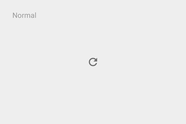
Example of Touch UI tooltips in a normal state

Touch UI tooltips example in Material Design

Example of Touch UI tooltips in a press and hold state