Layout Responsive UI

Responsive UI

Responsive layouts in material design adapt to any possible screen size. This UI guidance includes a flexible grid that ensures consistency across layouts, breakpoint details about how content reflows on different screens, and a description of how an app can scale from small to extra-large screens.

Breakpoints Expand and collapse content An arrow that points down when collapsed and points up when expanded.

For optimal user experience, material design user interfaces should adapt layouts for the following breakpoint widths: 480, 600, 840, 960, 1280, 1440, and 1600dp.

Preview Material Design breakpoints with this interactive viewer across desktop, mobile, and tablet
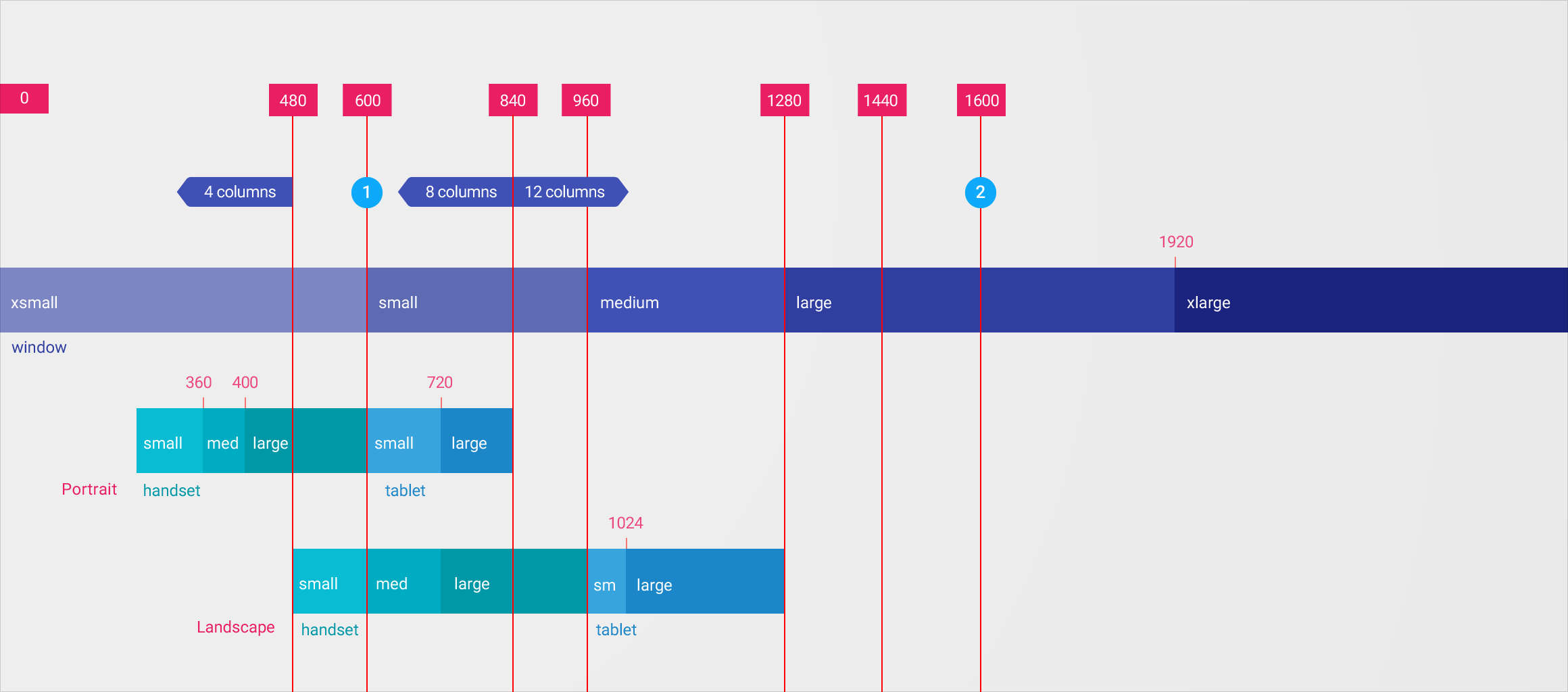
Material Design Breakpoint system

1. Summary and detail view content in layouts

  • Layouts under 600dp wide may fill the screen with a single level of content hierarchy (either summary or detail content, but not both)
  • Layouts over 600dp wide may place two levels of content hierarchy on the screen (both summary and detail content)

2. Max screen widths

Layouts over 1600dp wide may let the layout grow until it hits a max width. At this point, the grid may do one of the following:

  • Become center aligned with increased margins
  • Remain left aligned while the right margin grows
  • Continue to grow while revealing additional content

Breakpoint system

These breakpoints describe column and width specifications for different screens, devices, and orientations.

For some measurements, the values remain the same even if a device is rotated. For that reason the smallest width in either orientation is the defining value.

* 16dp when the smallest width of the device is <600

** Desktop breakpoints are 16dp below the listed values to accommodate variations in browser chrome.

Breakpoint (dp)

Handset / Tablet Portrait

Handset / Tablet Landscape

Window

Columns

Gutter

0

small handset

xsmall

4

16

360

medium handset

xsmall

4

16

400

large handset

xsmall

4

16

480

large handset

small handset

xsmall

4

16

600

small tablet

medium handset

small

8

16/24*

720

large tablet

large handset

small

8

16/24*

840

large tablet

large handset

small

12

16/24*

960

small tablet

small

12

24

1024**

large tablet

medium

12

24

1280**

large tablet

medium

12

24

1440**

large

12

24

1600**

large

12

24

1920**

xlarge

12

24

Grid Expand and collapse content An arrow that points down when collapsed and points up when expanded.

Material design’s responsive UI is based on a 12-column grid layout. This grid creates visual consistency between layouts, while allowing flexibility across a wide variety of designs. The number of grid columns varies based on the breakpoint system.

This animation shows how surfaces and panels can align to influence the 12-column grid.

Margins and Gutters

The responsive grid focuses on consistent margin and gutter widths, rather than column width. Material design margins and columns follow an 8dp square baseline grid. Margins and gutters can be 8, 16, 24, or 40dp wide.

Margins and gutters don’t need to be equal. For example, it’s acceptable to use 40dp margins and 24dp gutters in the same layout.

This animation shows interactions of the following margin and gutter width variations:

  1. 8dp margins and gutters
  2. 16dp margins and gutters
  3. 24dp margins and gutters
  4. 40dp margins and gutters
  5. 40dp margins and 24dp gutters

Full-width vs Centered

Full-width grids use fluid columns and breakpoints to determine when a layout needs to change.

Centered grids use fixed columns and reflow the layout when all columns (plus a defined margin) no longer fit on screen.

  1. Full-width grids
  2. Centered grids

Panel Influence on the Grid

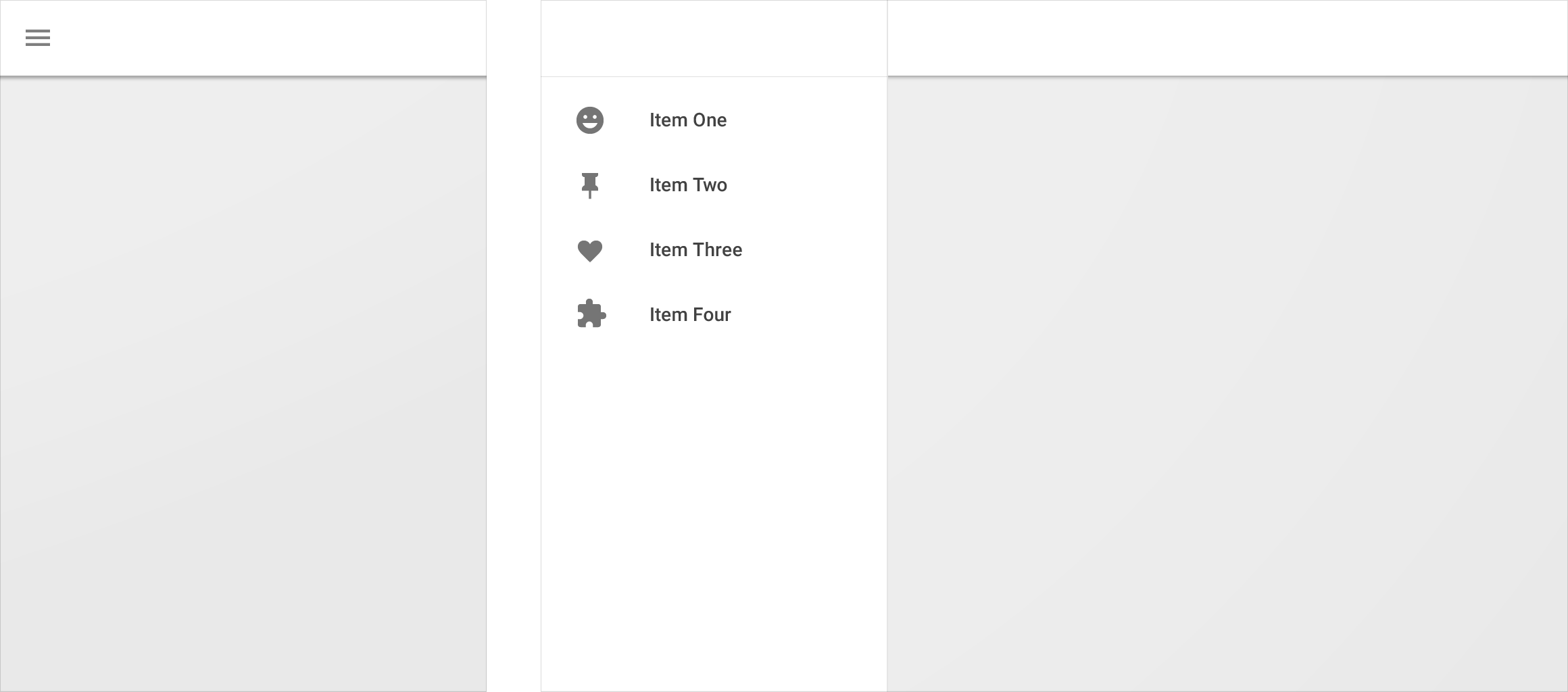
As defined in Navigation patterns, the side nav may be permanent, persistent, or temporary. These behaviors apply to any panel, not just a side nav.

Permanent

A permanent panel exists outside of the responsive grid. The panel appears at a defined breakpoint (when the screen can accommodate the panel) and squeezes content. There are no controls to show/hide the panel.

The effects of a permanent panel on the responsive grid

Side panel effects on the grid

This animation happens in two phases:

  1. A persistent side panel appears, squeezing both content and the grid. Content is accessible while the panel remains visible. The panel hides upon toggling.
  2. A temporary side panel appears, pushing grid content off-screen. Touching either outside the panel, or an item inside the panel, hides the panel.

The effects of a persistent panel on the responsive grid

Temporary overlay

A temporary panel does not affect the grid or content when off-screen. When toggled to be visible, it can be hidden again by touching anywhere outside the panel or an item inside the panel.

The effects of a temporary panel on the responsive grid

Surface behaviors Expand and collapse content An arrow that points down when collapsed and points up when expanded.

When a screen size changes, the UI adapts using the following surface-specific behaviors.

Visibility

Behavior

Definition

Permanent

When screen space is available, a surface is always visible.

Persistent

Surface visibility can be toggled between visible and hidden. When visible, interacting with other elements on the screen does not change visibility.

Temporary

Surface visibility can be toggled between visible and hidden. When visible, interacting with other elements on the screen toggles the surface to become hidden or minimized.

Width

Behavior

Definition

Fixed

Element width stays the same when screen size changes.

Fluid

Element width grows as screen size changes.

Sticky

Element width is fixed until influenced by another element or breakpoint.

Squeeze

Element width contracts as a panel is revealed

Push

Element width stays the same, its position changes horizontally as a panel appears, and it may be partially occluded by a screen’s edge.

Overlay

Element width and position stays the same as a panel appears over content.

Descriptors

Behavior

Definition

Above, Below

The y position of an element.

Over, Under

The z position of an element in motion.

In Front, Behind

The static z position of an element.

Left, Right, Centered

The x position of an element

Top, Bottom

The y position of an element and its position relative to a screen edge.

Flat, Raised

The z position, and shadow of an element. A flat element will have no shadow.

Inset, Full Bleed

The padding of an image or element

Summary, Detail

A content summary, and the full expansion of the summary

Patterns Expand and collapse content An arrow that points down when collapsed and points up when expanded.

As screen space increases, the following responsive patterns may be applied:

  • Reveal
  • Transform
  • Divide
  • Reflow
  • Expand
  • Position

Reveal

UI hidden by smaller screens may be revealed with increased available space.

Material Design side nav may become visible

Elements, such as a side nav, may become visible.

Material Design: Simple UI reveals complex options

A simple UI may reveal more powerful or complex options.

Material Design: Tap to reveal content on small screens

Content on a small screen that only appears after tapping an element may be revealed by default when more space is available.

Transform

A UI element may transform from one format to another.

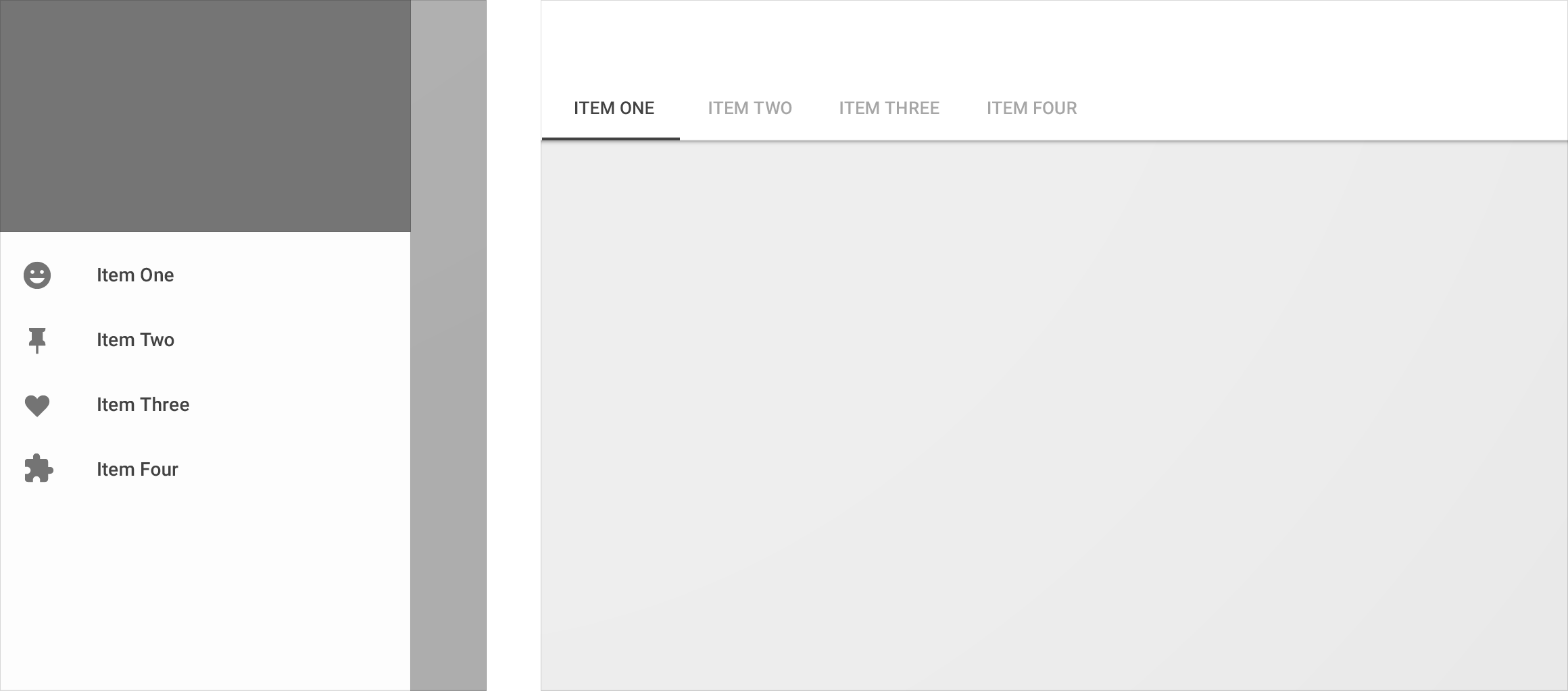
Side navigation may convert to tabs in Material Design

Side navigation may transform into tabs.

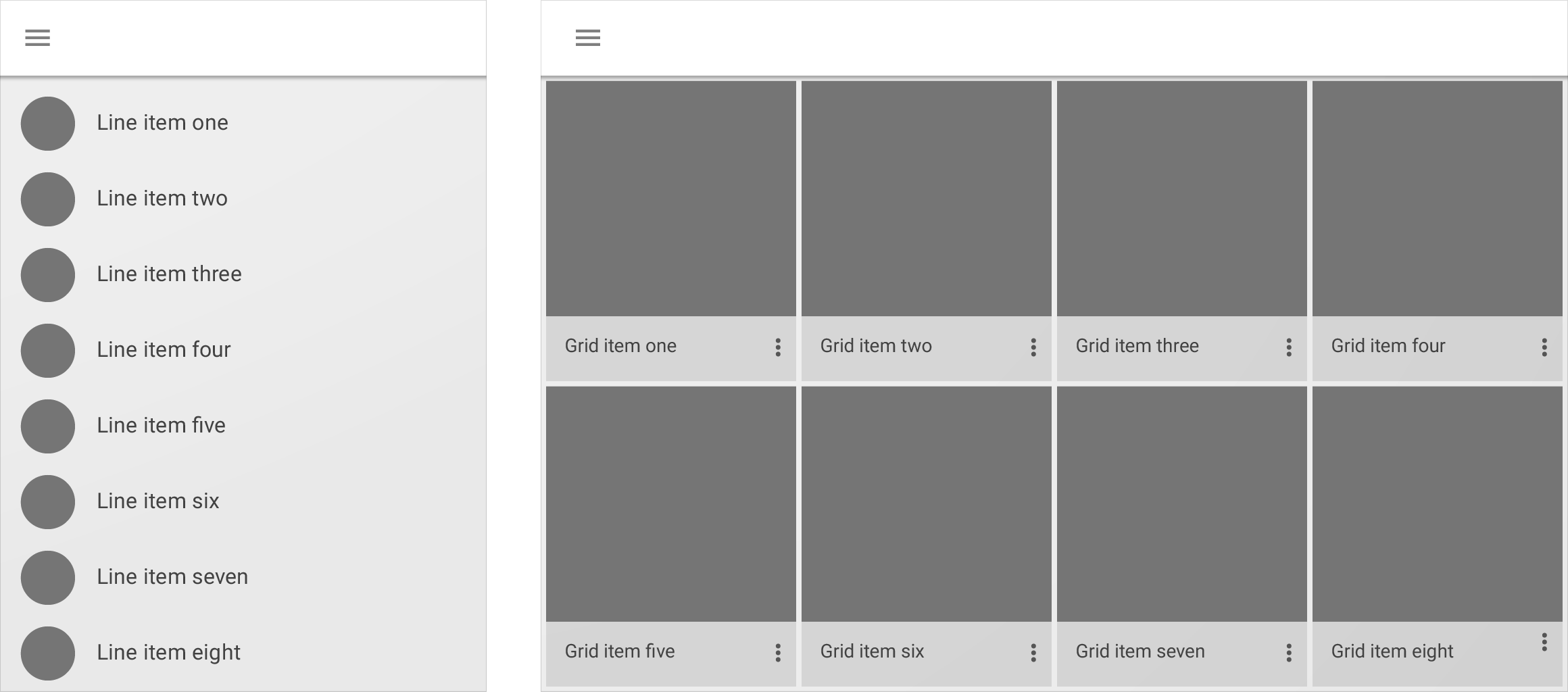
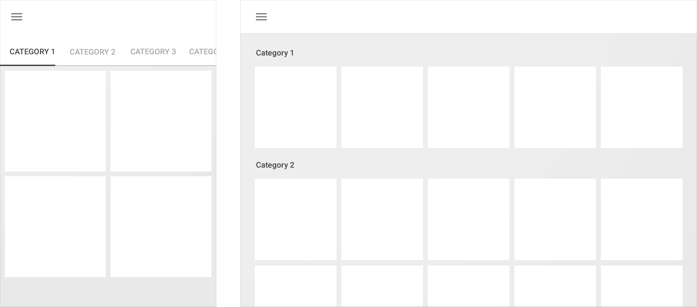
List transforms into a grid with Material Design

A list may transform into a grid list.

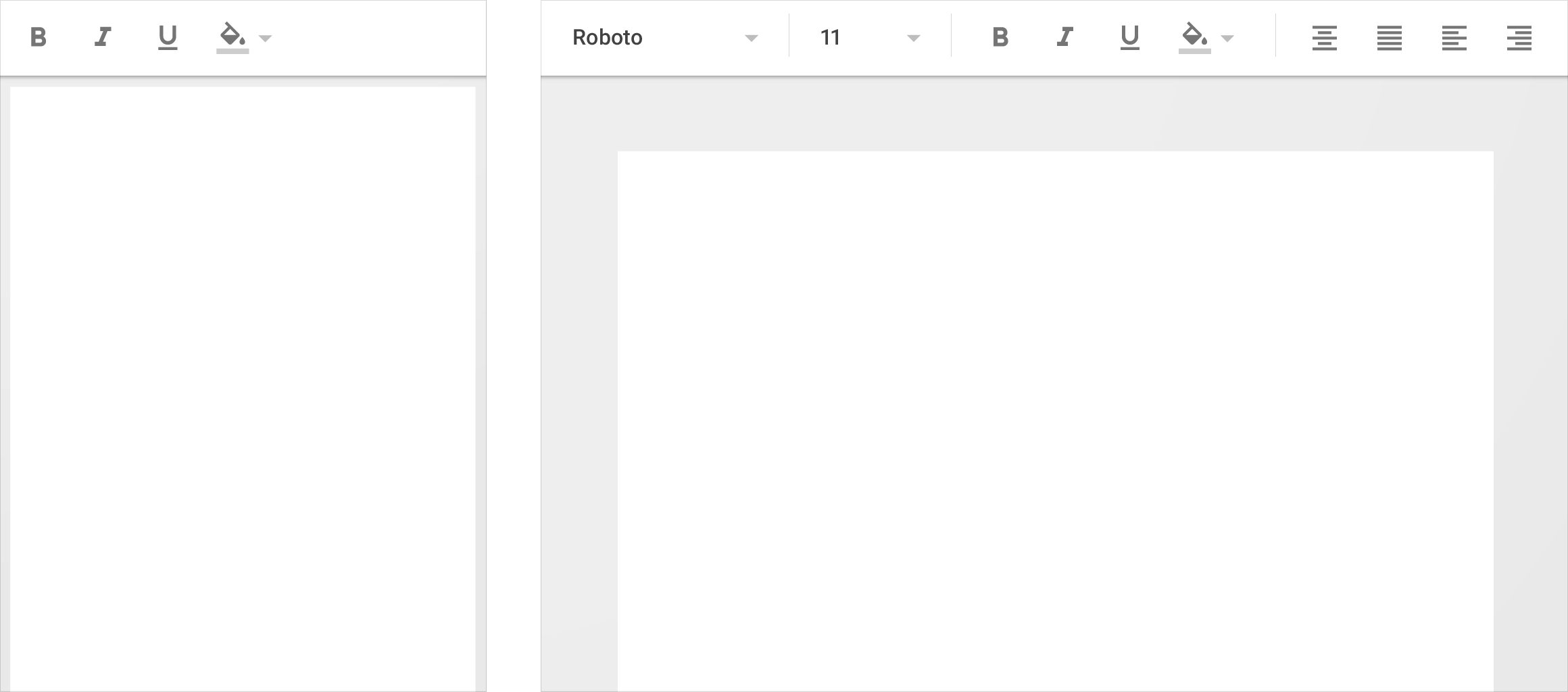
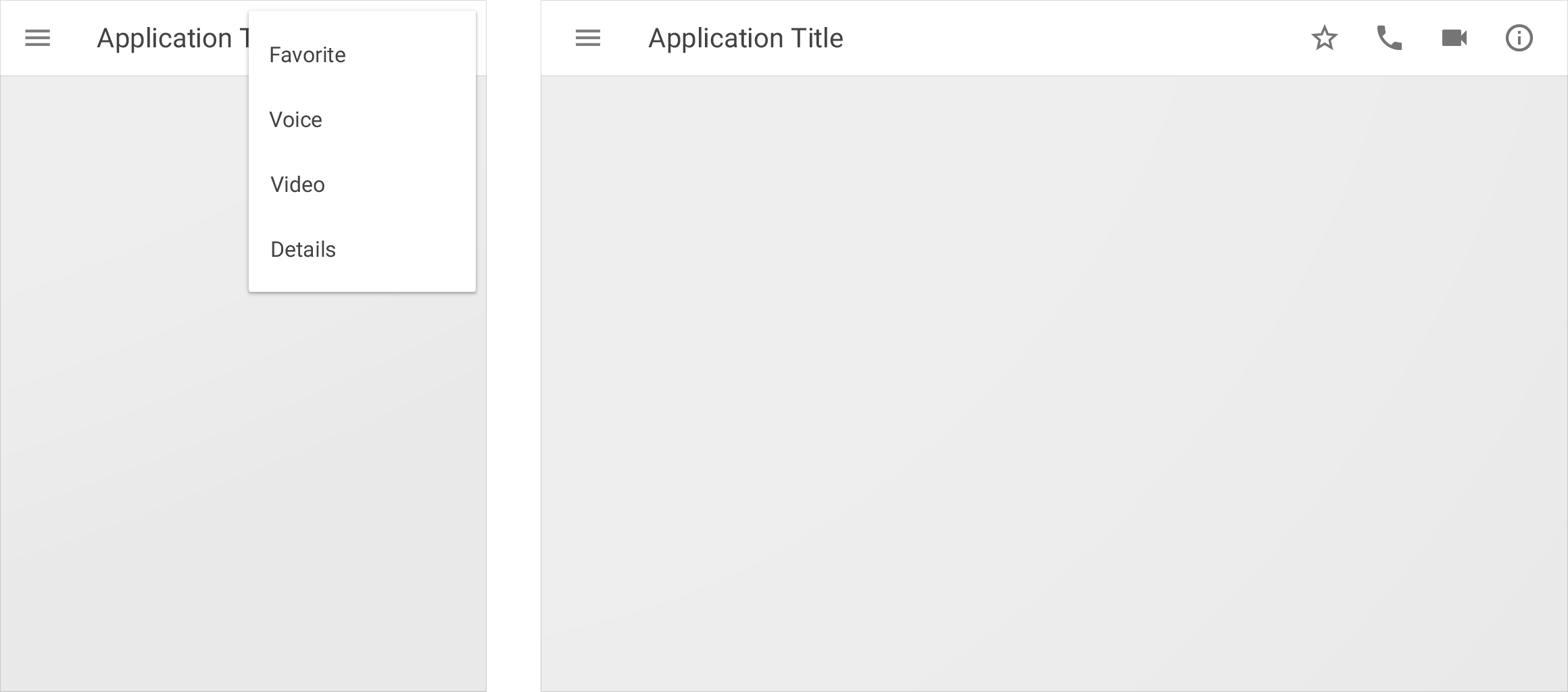
Menu items transform into icons in Material Design toolbar

Menu items may transform into icons in a toolbar.

Divide

A layered UI may be divided into newly available space.

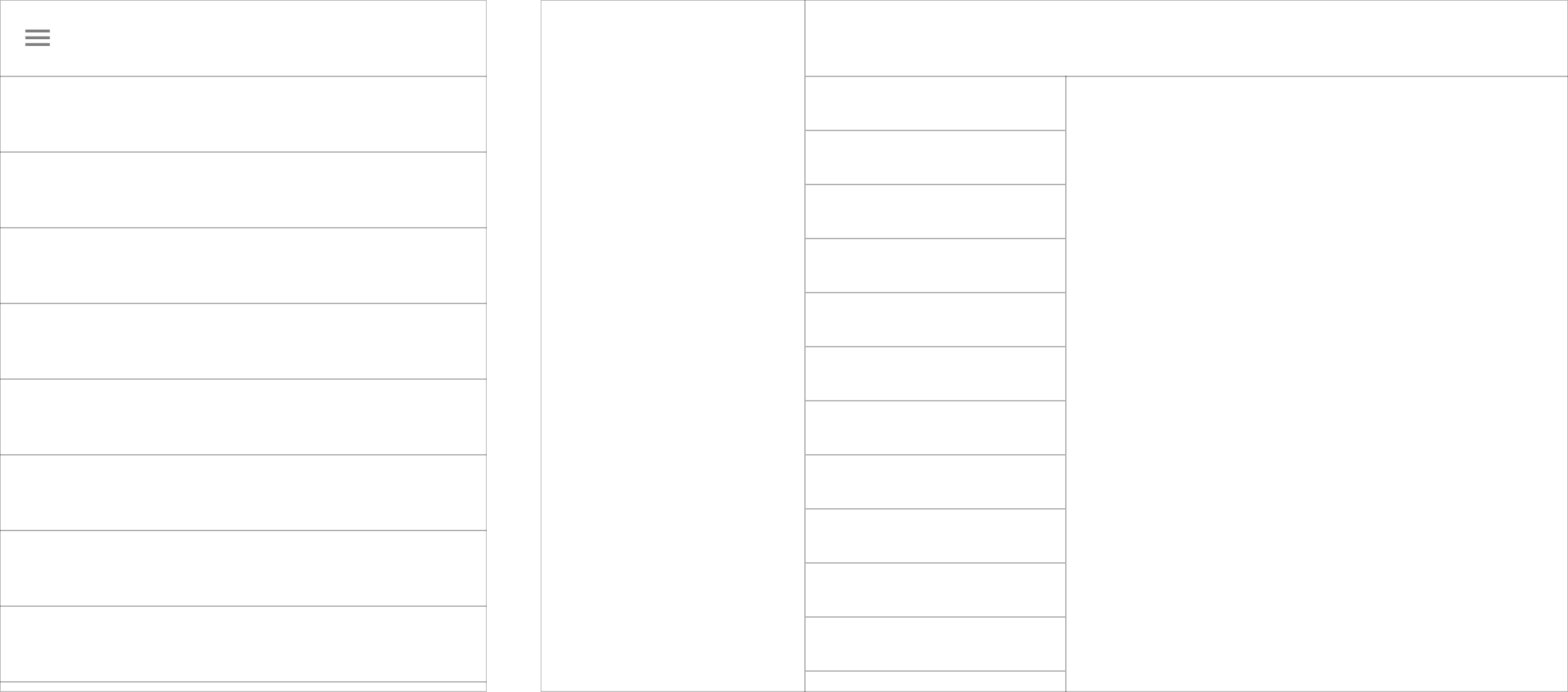
Material Design: Side navigation and content layout

Side navigation, list content, and detailed content divide to fill a single view.

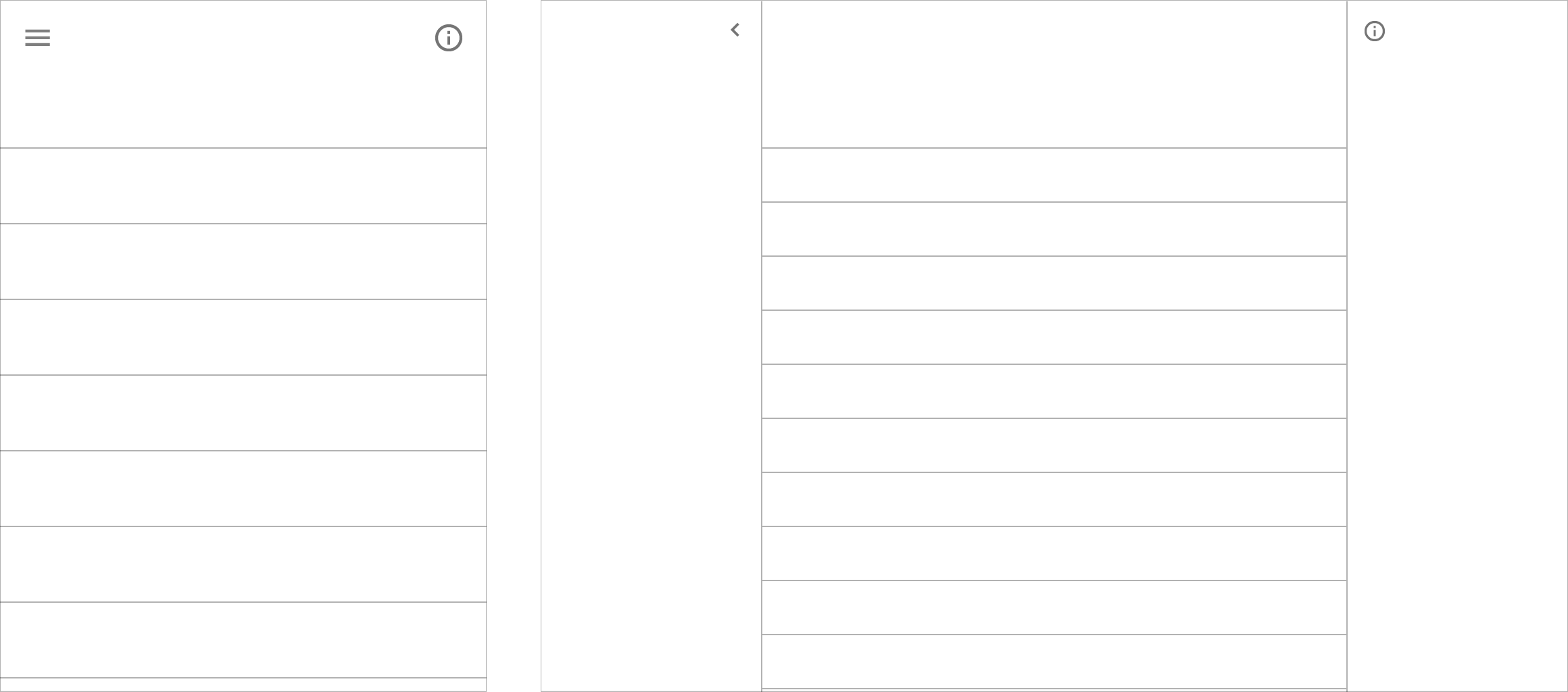
Material Design layout with left and right panels

A left panel, list content, and a right panel divide within a single view as space increases.

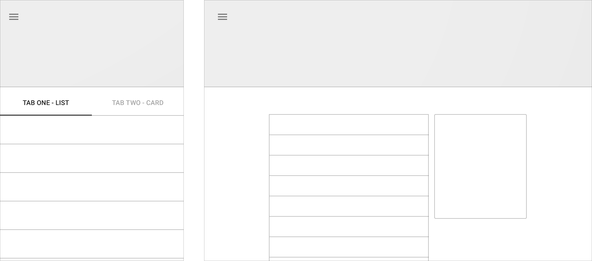
Tabbed sibling content in a single view with Material Design

Tabbed sibling content is divided within the same view.

Reflow

A UI may reflow into available space.

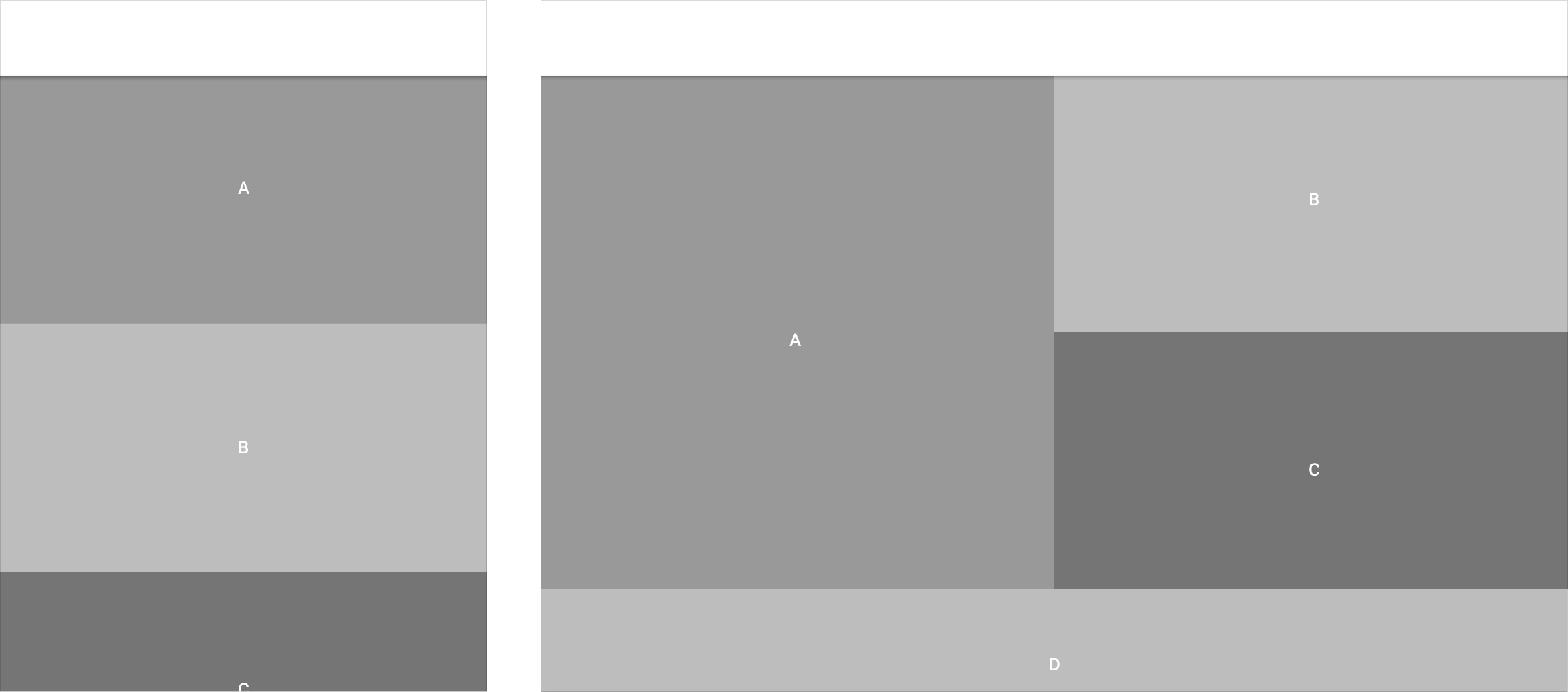
Material Design elements may reflow in a single column

Elements from a single-column format may reflow to fill the content area in various combinations.

Material Design: Horizontal tabs may become vertical

Horizontal tabs may reflow into a vertical list.

Material Design elements may reflow with screen changes

Elements may reflow within a component based on a new screen ratio or device orientation.

Expand

The UI may expand across more space.

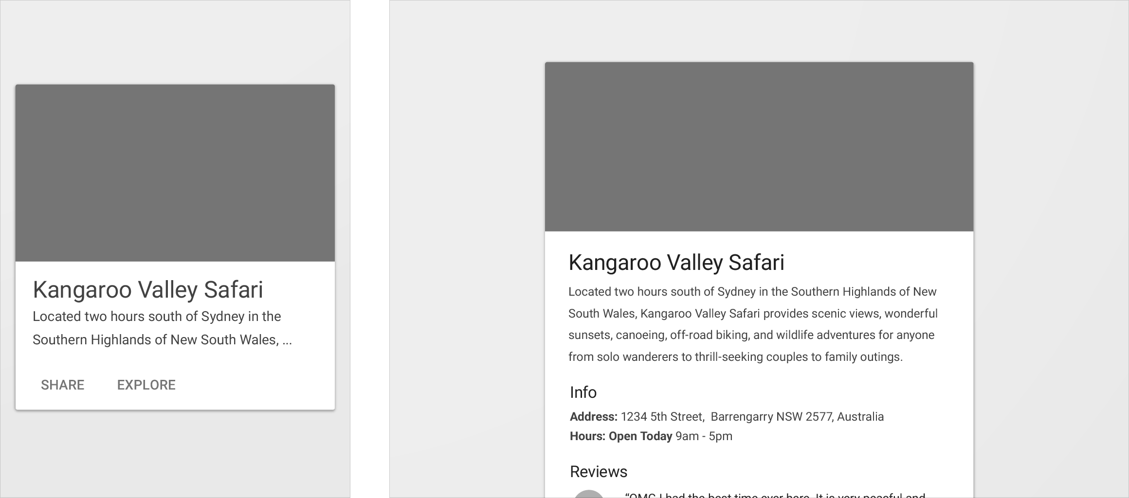
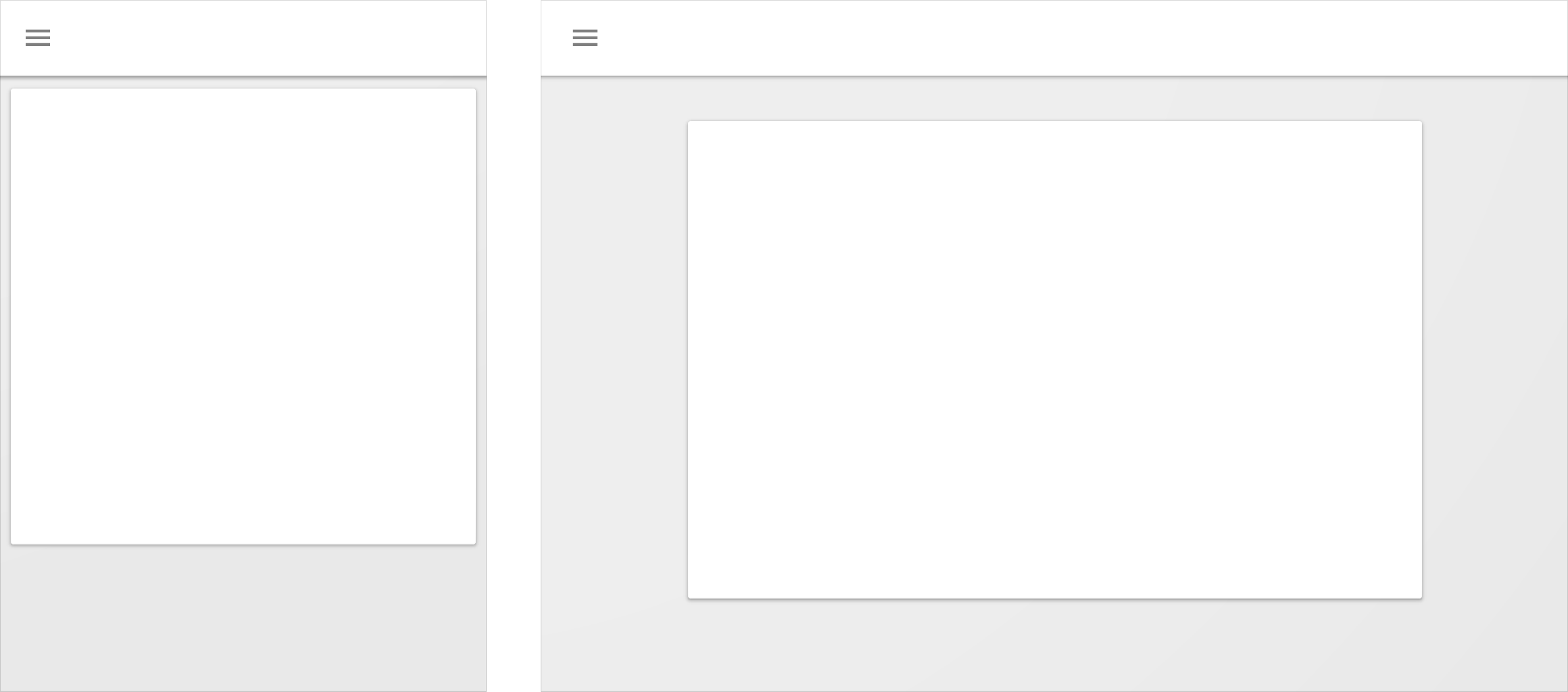
Content cards expand in Material Design layout

Content cards may expand to fill the new space.

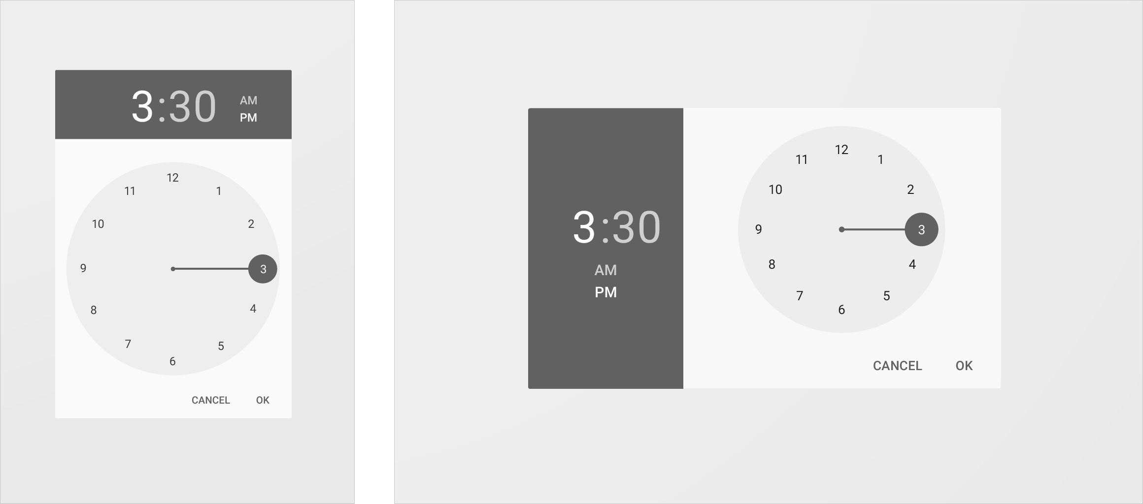
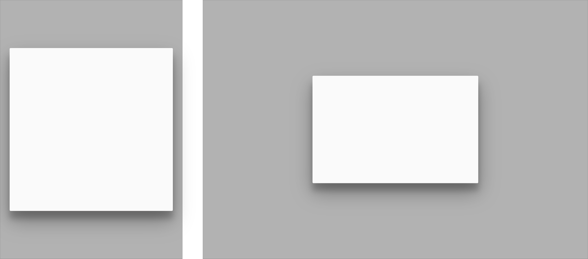
Material Design dialogs expand with content or increments

Dialogs may expand proportionally with content or in specific increments.

Position

The position of UI components may change to more appropriate locations.

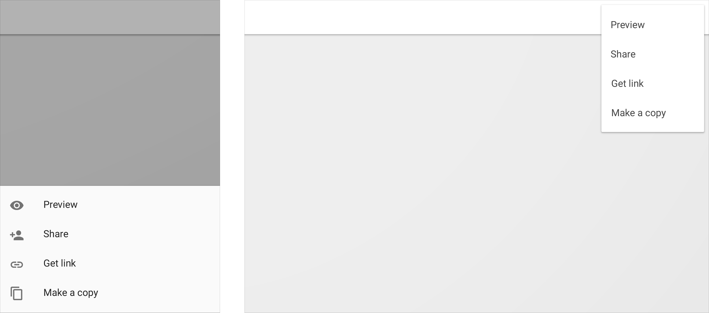
Material Design bottom sheet may act as a menu on small screens

A bottom sheet on a small screen may reposition itself as a menu.

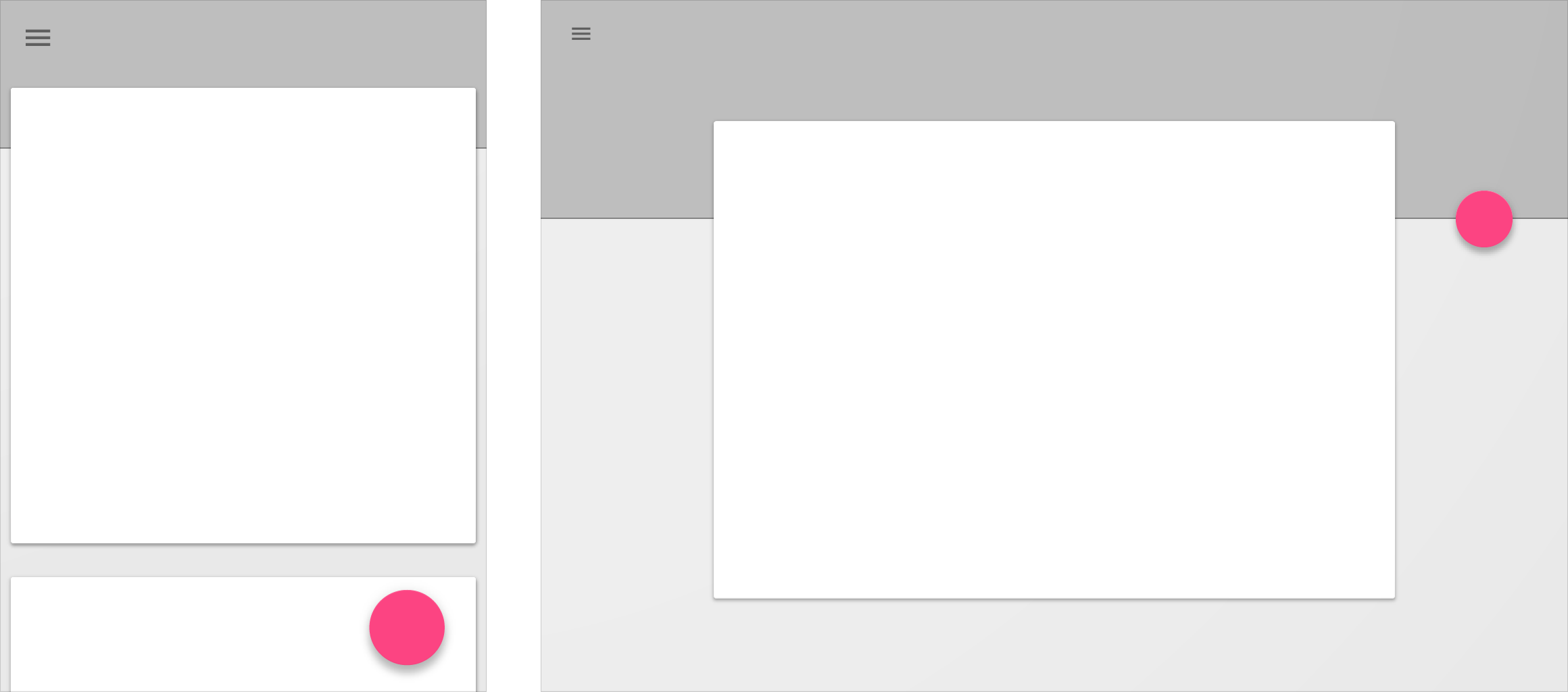
Material Design FAB can shift for better visibility

A floating action button (FAB) may move to a more visible location relative to other UI elements.