Patterns Settings

Settings

App settings let users indicate preferences for how an app should behave.

App settings are located under the “Settings” label in your app’s navigation.

Setting controls should capture user preferences. The settings shown should either affect most users or provide critical support to a minority of users.

Placement options

Side navigation
Toolbar menu

Settings components

Labels
Secondary text
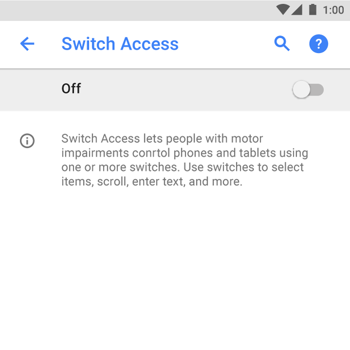
Switch or checkbox settings
Status
App settings for user preferences in Material Design

Placement Expand and collapse content An arrow that points down when collapsed and points up when expanded.

All of an app’s settings should be reached via the “Settings” label. Do not use synonyms such as “Options” or “Preferences.”

Side navigation

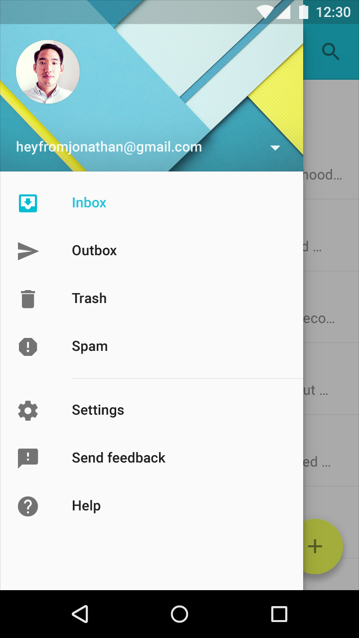
If side navigation such as a navigation drawer exists, include “Settings” below all other items (except Help & Feedback).

Apps without navigation

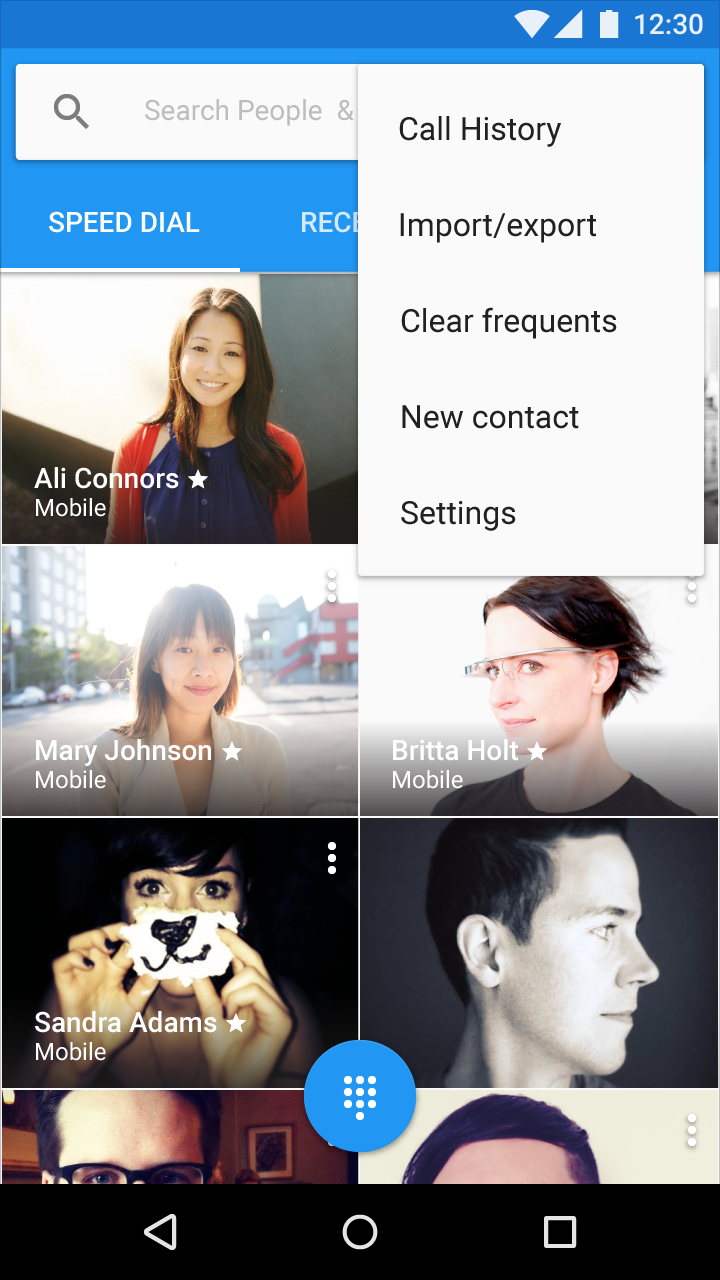
Place Settings in the toolbar menu below all other items (except Help & Feedback).

Material Design navigation drawer settings

Settings in the navigation drawer

Material Design toolbar menu settings

Settings in the toolbar menu

Usage Expand and collapse content An arrow that points down when collapsed and points up when expanded.

Settings should be well-organized, predictable, and contain a manageable number of options.

Provide an overview

A user should be able to quickly see the most important or frequently used settings and their values.

If there are many settings, prioritize the ones most likely to interest users. Less important settings can be grouped and moved to their own screen.

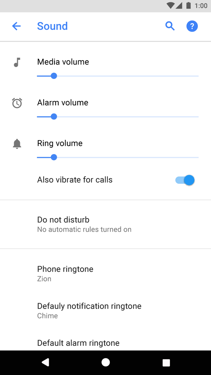
Important settings in Material Design at the top

Important settings appear at the top of the list

Select appropriate settings

Settings should:

  • Save user preferences
  • Get accessed infrequently
  • Be used by most users
  • Be used by a minority of users, but are essential to supporting their needs

Settings should not:

  • Be frequently accessed (Move these to a toolbar)
  • Contain information about the app, such as a version or licensing information (Move these to a Help screen)
  • Manage user accounts (Present these in the main flow of your app, such as a side nav)

Choose polite defaults

The default value for a setting should:

  • Represent the selection most users would choose
  • Be neutral and pose little risk
  • Use less battery or mobile data
  • Only interrupt when important

Grouping settings Expand and collapse content An arrow that points down when collapsed and points up when expanded.

Show the most important or frequently used settings upfront.

Divider lines

Use divider lines to group together several related settings. Avoid using dividers between each individual setting.

Section titles (optional)

Grouped settings can include a section title. Section titles should be specific, avoiding ambiguous names like “Other” or “Miscellaneous.”

15+ settings

Related settings are best grouped under a subscreen. Use consistent terms: the label of the setting that opens a group should match the subscreen title.

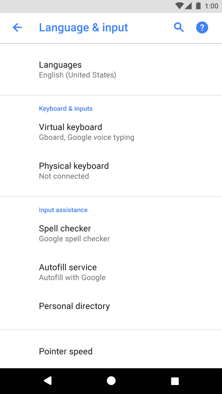
Material Design: Grouped settings for Languages and Input

Grouped settings for Languages and input

Labels and secondary text Expand and collapse content An arrow that points down when collapsed and points up when expanded.

Labels

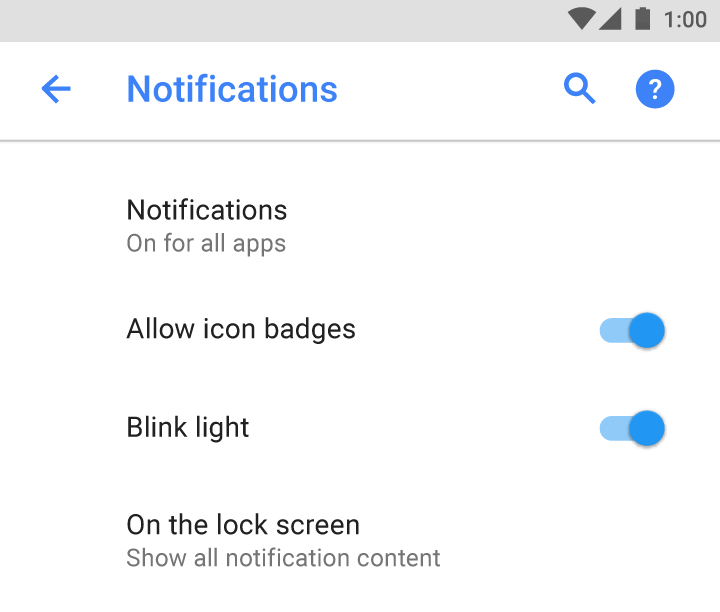
Make your labels brief and meaningful. Labels will wrap to multiple lines if necessary.

Labels should:

  • Capitalize only proper nouns and the first word of a label
  • Start with the most important text
  • Avoid negative terms like "Don't" or "Never" in favor of neutral terms like "Block"
  • Use impersonal labels like "Notifications" instead of "Notify me" (Exception: If referring to the user is necessary for understanding the setting, use the second person ("you") rather than the first person ("I"))

Labels should avoid:

  • Generic terms, such as: Set, Change, Edit, Modify, Manage, Use, Select, or Choose
  • Repeating words from the section title
  • Technical jargon, unless it's widely understood by your target audience

Alignment

All labels should align with the left edge of the screen title. This provides a simpler, unified appearance.

Labels align with the screen title in Material Design

Labels align with the screen title

Secondary text (optional)

Secondary text helps the user better understand the current state of a setting. If the label is sufficient on its own, don't add secondary text.

Material Design guidelines for effective text usage

Don’t.

Avoid repeating words from the label in the secondary text.

Switch or checkbox settings

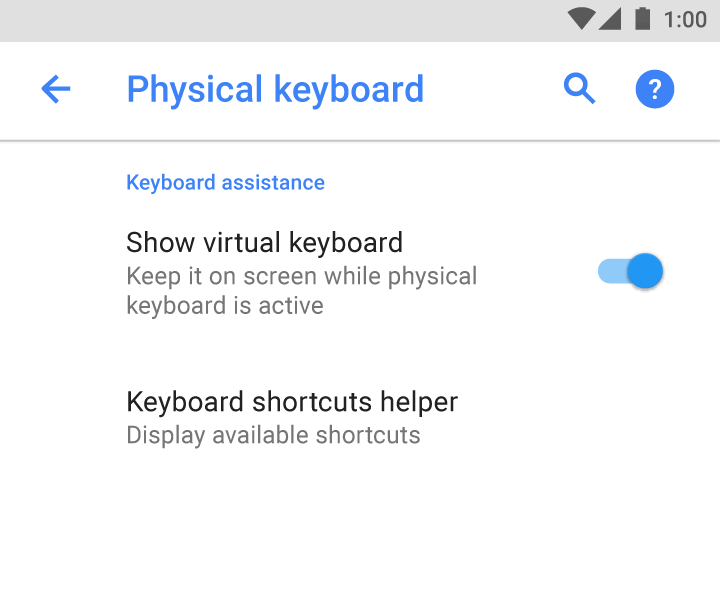
Switch and checkbox settings that require precise descriptions may add a single-line description under the label.

Descriptions should:

  • Convey information about a setting’s state or status
  • Indicate what happens when a setting is enabled
Material Design switch and checkbox settings description

Do.

Start the description with a verb.

Current setting status in Material Design

Do.

Explain the current status of the setting.

Settings that require longer explanations may add a description on a second screen.

Material Design switch status: 'On' or 'Off'

Underneath the label, show the status text of the switch as "On" or "Off.”

Material Design: Add switch and description to second screen

Add the switch and a longer description to a second screen.

All other settings

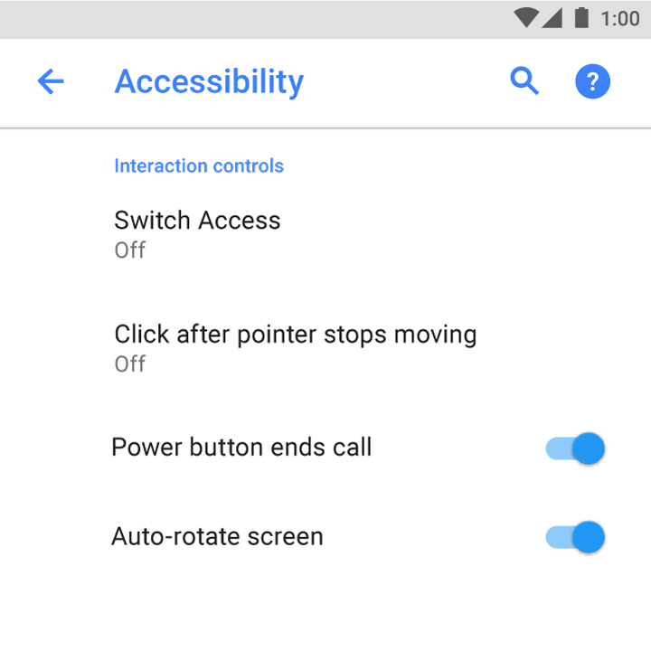
For non-switch settings, secondary text should only show the current status of a setting.

Sleep
After 10 minutes of inactivity

Do.

The secondary text conveys the current state of the setting.

Screen timeout
Adjust the delay before the screen automatically turns off

Don’t.

Avoid describing the setting. Show the setting’s status instead.

Writing guidelines Expand and collapse content An arrow that points down when collapsed and points up when expanded.

Be direct and understandable.

Vibrate on tap

Do.

Use tactile feedback

Don’t.

Indicate status with specific details placed within the appropriate context.

Hotspot & tethering
Hotspot on

Do.

Hotspot & tethering
Provide internet to other devices through your mobile data connection

Don’t.

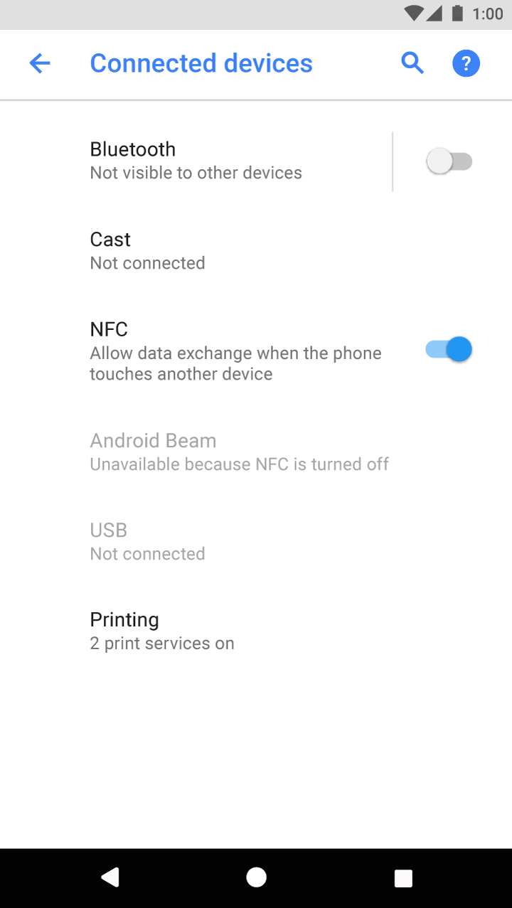
Use familiar acronyms when there aren’t better alternatives. Convey how and why an unfamiliar setting exists.

NFC
Allow data exchange when the phone touches another device

Do.

NFC
Use Near Field Communication to read and exchange tags

Don’t.