Layout Split screen

Split screen

Android only

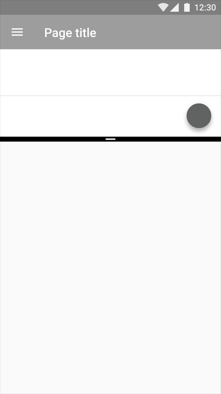
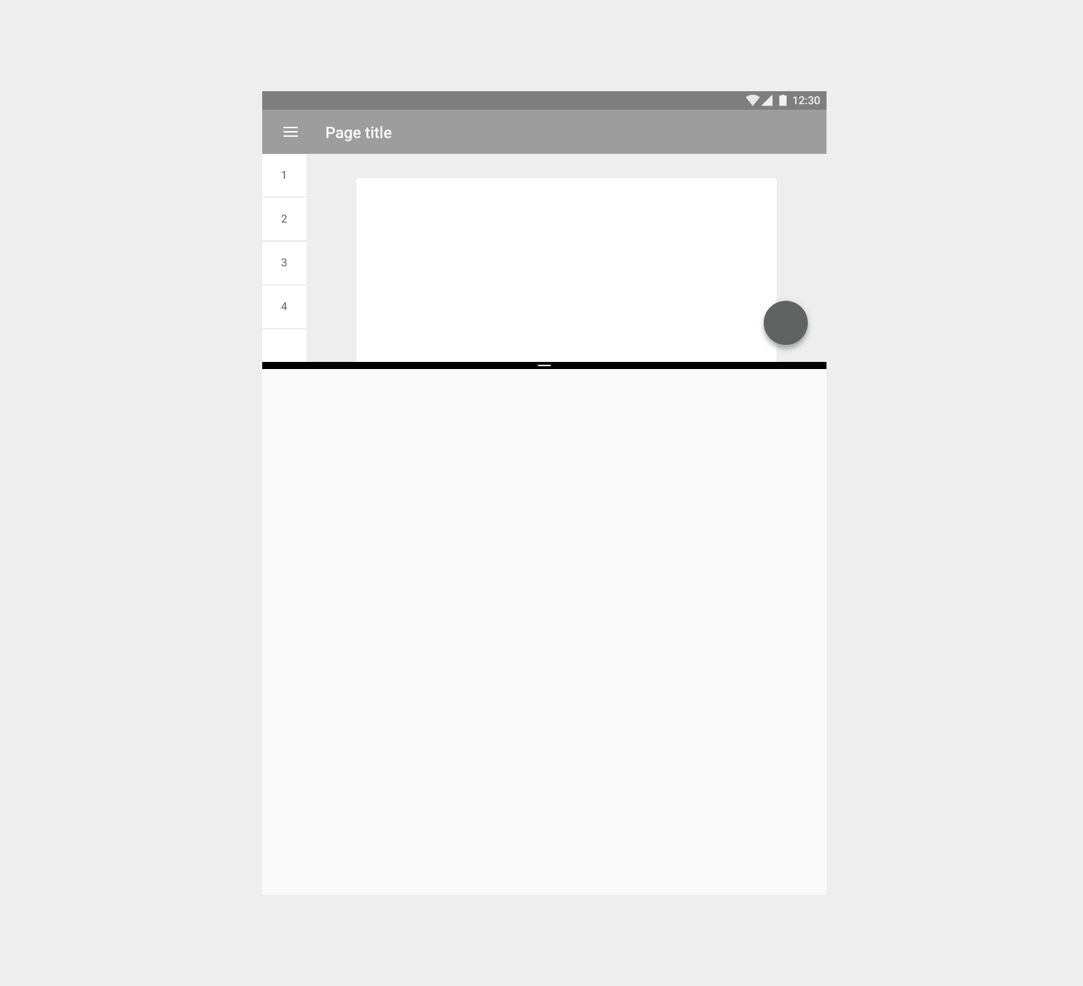
Split-screen mode allows two activities to be visible on screen at the same time.

Usage Expand and collapse content An arrow that points down when collapsed and points up when expanded.

User interaction required

Apps are not allowed to invoke split-screen mode by themselves; the user must activate it.

Launching new activities

When an app launches a new activity, it will launch within the same portion of the screen by default. Apps will be resized to fit the split-screen view as necessary (unless your app isn’t compatible with the split-screen format).

When split-screen mode is active, apps may launch new activities in the opposite portion of the screen if the following criteria are met:

  • The original and new activities are related to each other and usable while in split-screen mode
  • The task the app helps accomplish warrants displaying two activities at once, and hiding the other app that was open
  • It is clear that the app will enter split-screen mode, such as with a button stating “Open in new window”
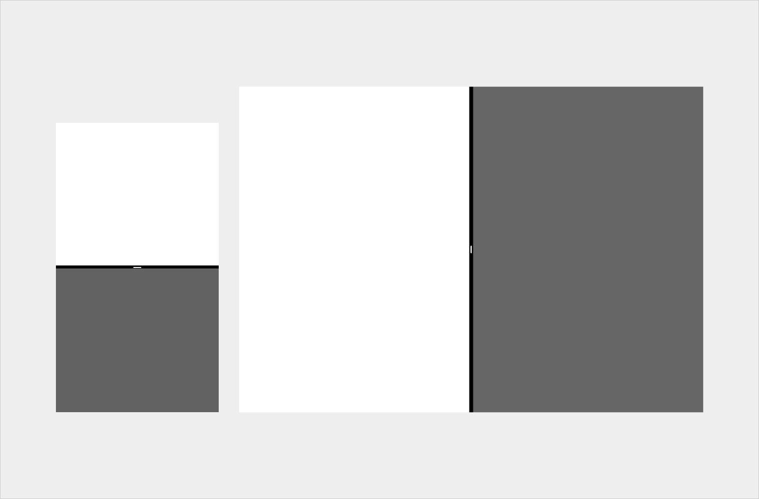
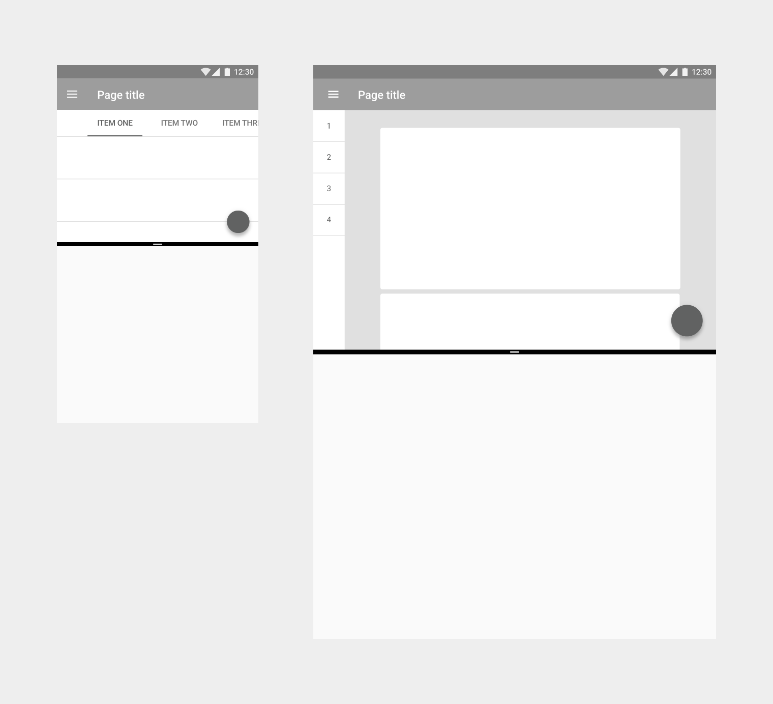
Material Design split screen on mobile and tablet

Split screen shown in portrait mode on mobile (on the left) and landscape mode on tablet (on the right)
Behavior Expand and collapse content An arrow that points down when collapsed and points up when expanded.

Split-screen mode remains active until the user cancels it or switches to an incompatible app.

Resizing split screen

Users may move and resize each screen in split-screen mode by dragging the divider between the two split screens.

Edge swipe gestures

When split-screen mode is active, the edge swipe gesture will likely not work as intended. Because split-screen mode relies on swiping to resize each split screen, if your app also relies on edge swipes to perform actions, then it’s possible that the swipe will either trigger screen resizing or an action in your app.

To avoid this, edge swipes should not be the only way to perform actions in your app. There should be an alternative method to perform each action.

For example, the navigation drawer enables an edge swipe to open the drawer, but it is also accessible by pressing the menu icon.

Layout Expand and collapse content An arrow that points down when collapsed and points up when expanded.

To support split-screen usage, viewable content should be scaled to an appropriate size and density.

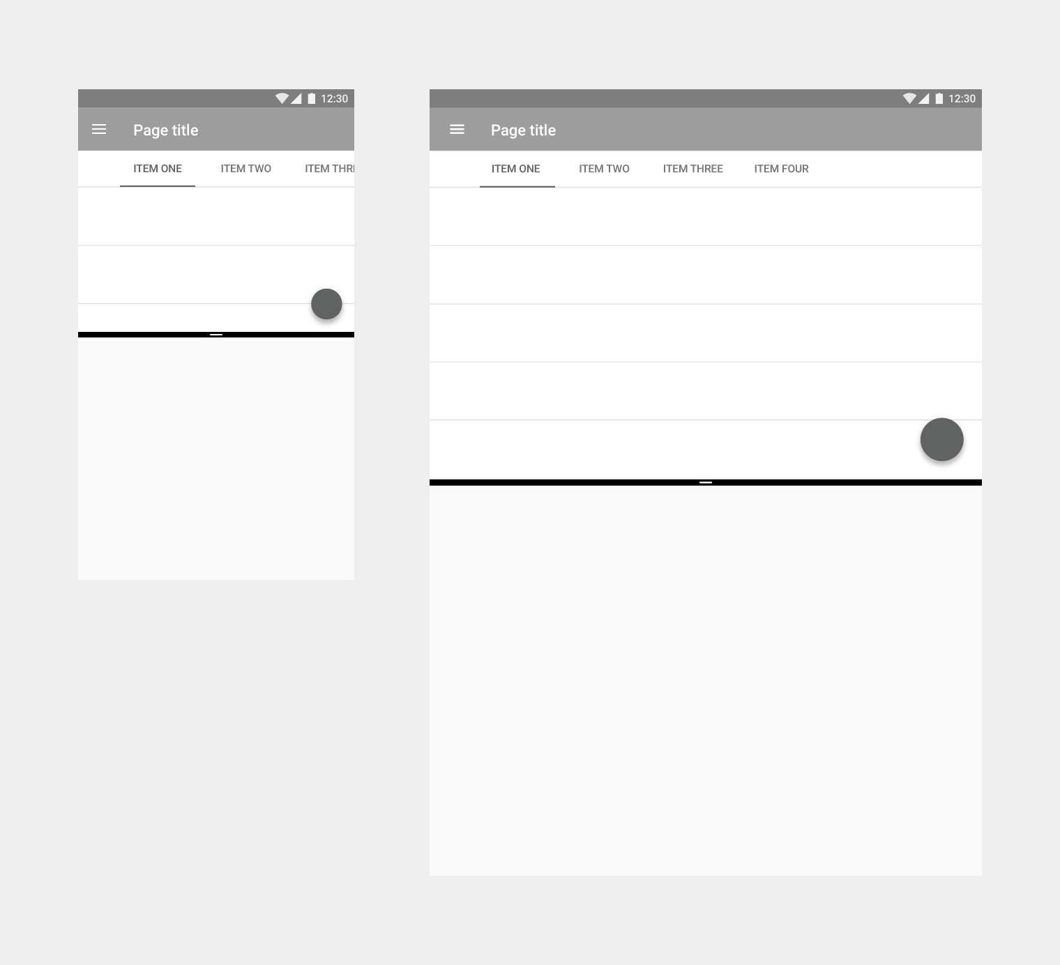
Primary controls should be adapted for split-screen mode. For example, navigation tabs may be collapsed into a menu.

Responsive UI

Apps in split-screen mode should elegantly adjust across device sizes and orientations.

Changing a device’s orientation should not cause the UI to change unexpectedly. For example, an app displaying a video in one of the split screens (in portrait mode) should not begin playback in full-screen mode if the device rotates to landscape mode.

Apps may use the same or different layouts for mobile and tablet:

  • Apps with similar layouts for mobile and tablet may switch between the tablet and mobile UIs when the app is resized, as the transition will not be jarring
  • Apps with completely different layouts for mobile and tablet should avoid using the mobile UI on tablet in split-screen mode. Instead, the existing tablet UI should be adapted to fit the smaller size to ensure that users have a consistent experience on both devices.
Material Design: Consistent layout for mobile and tablet

An app may use the same layout across mobile (left) and tablet (right).

Material Design layouts for mobile and tablet devices

An app may use different layouts across mobile (left) and tablet (right).

Design for condensed sizes

To simplify adapting your app for the various sizes of split-screen mode, it is recommended to design for the smallest size first.

Create a layout that works at 220dp wide or tall by condensing elements or removing non-essential ones. The layout may be scaled upward from there.

Material Design split screen: 16:9 portrait aspect ratio

When the split screen is active, the aspect ratio of an app in portrait orientation is 16:9 on mobile.

Material Design app aspect ratio 34.15% in split screen

When the split screen is active, the aspect ratio of an app in portrait orientation is 34.15% on tablet.