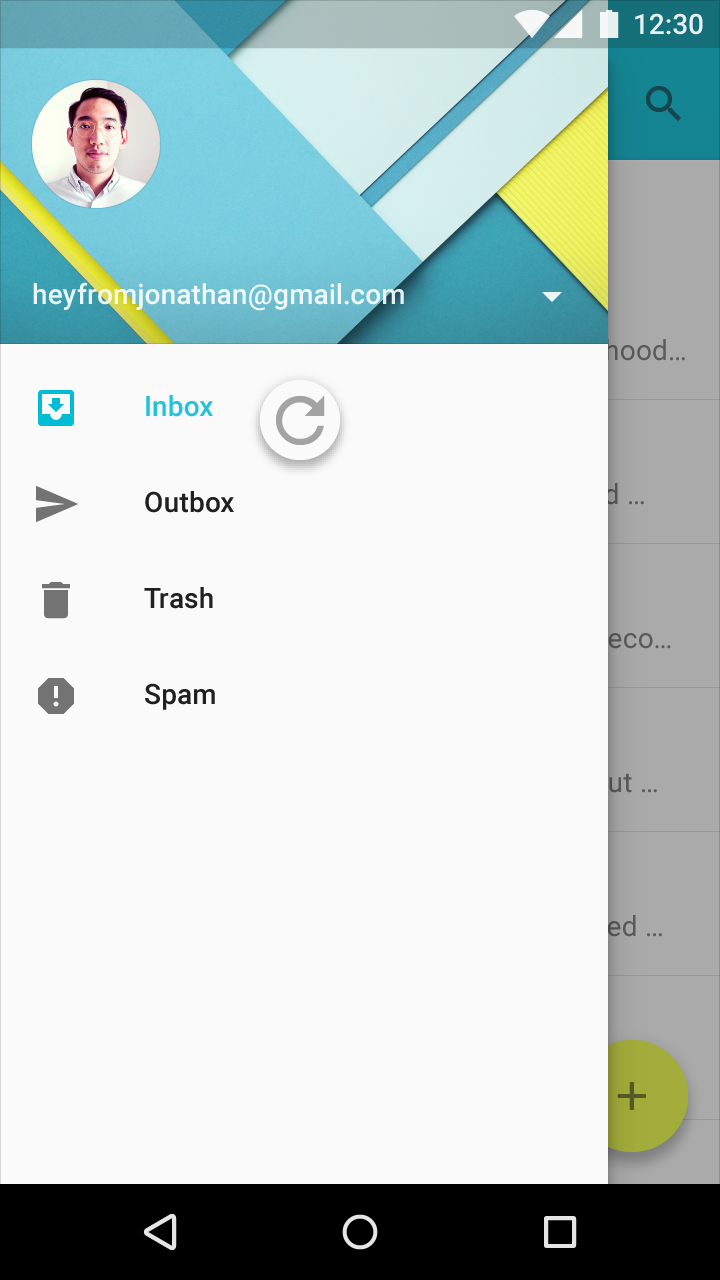
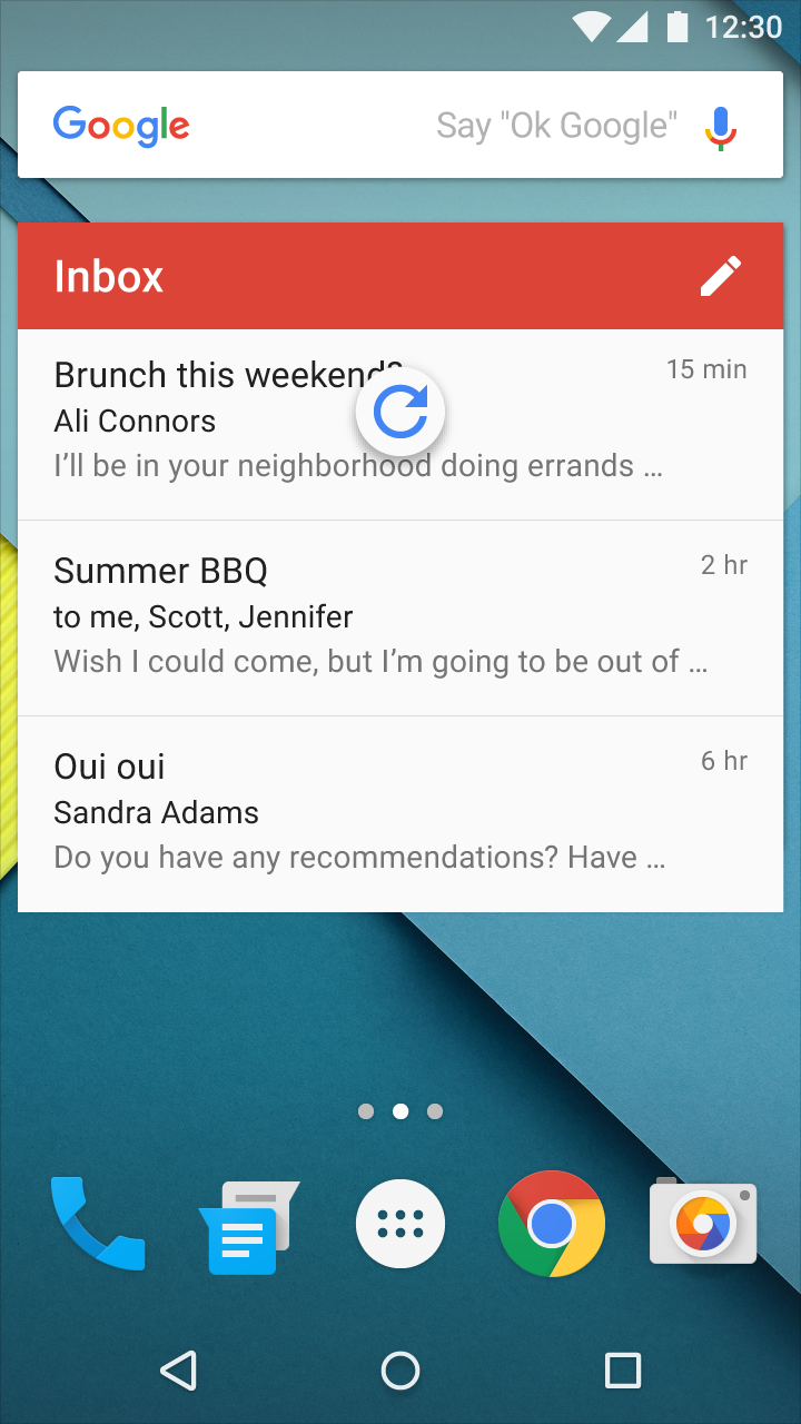
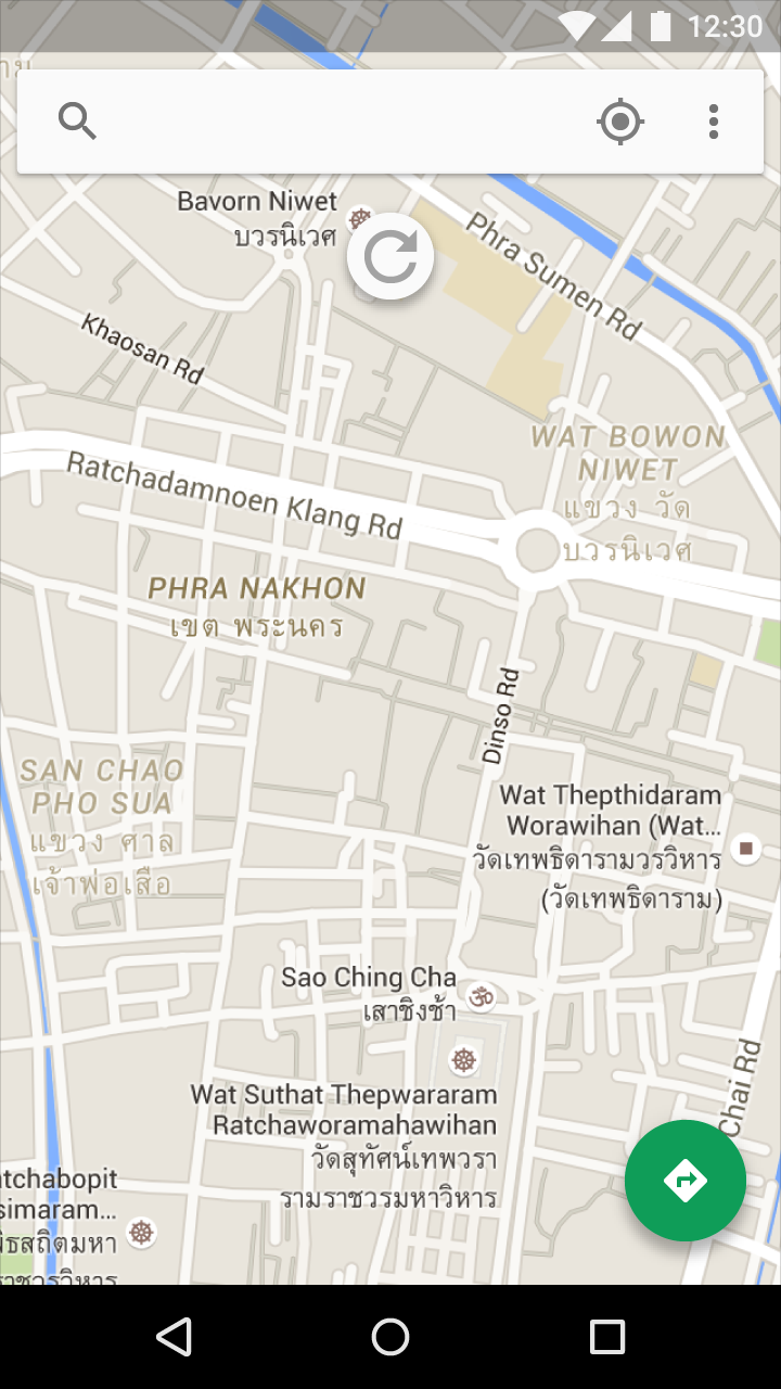
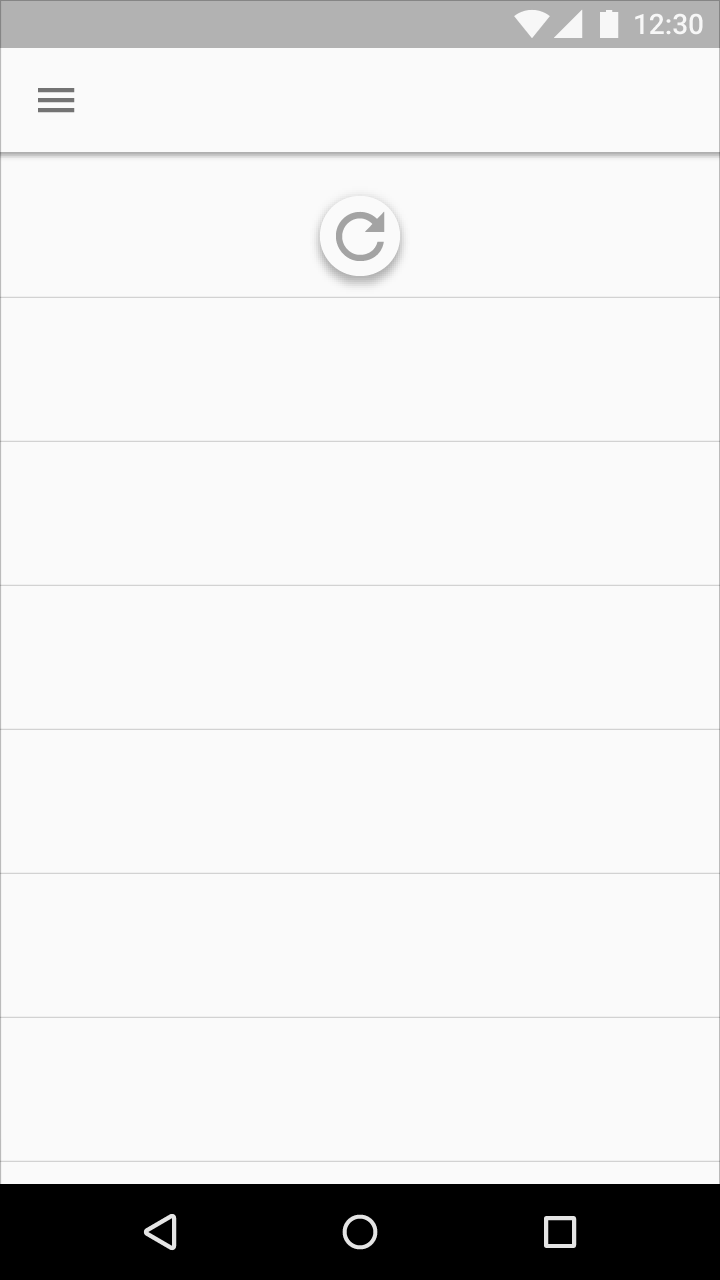
Swipe to refresh manually refreshes screen content with a user action or gesture.
There are two methods for updating content in an app:
- The preferred method is to automatically update content using sync, which keeps app content automatically updated
- Swipe to refresh is a swipe gesture available at the beginning of lists, grid lists, and card collections that are sorted by recent content
Manual refreshing can supplement syncing. It maintains the current scroll position, as when checking for new mail in Gmail.
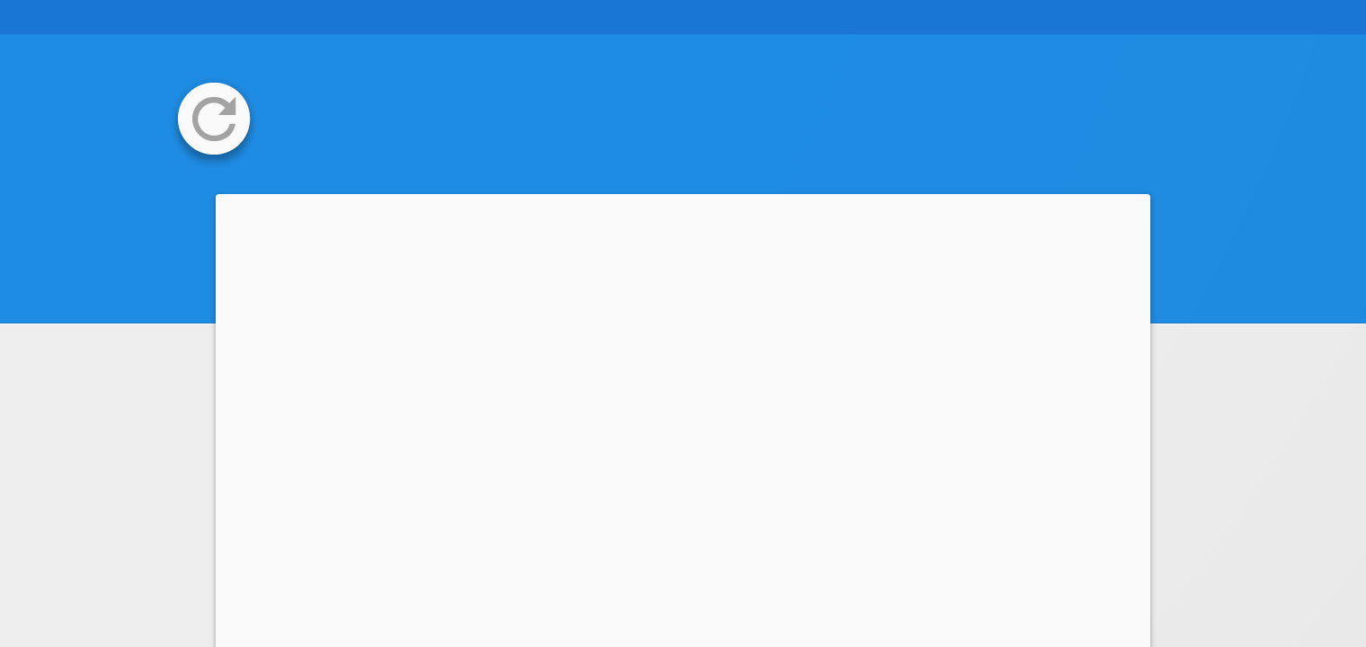
Icon
The refresh indicator is represented by a circular spinner, an icon with a curved arrow that spins in a circular motion.
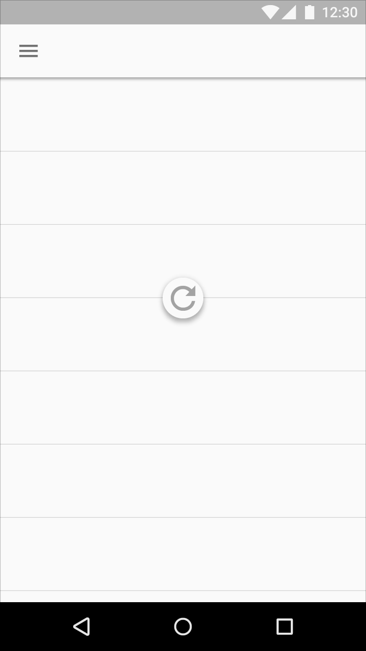
Position
- The swipe to refresh gesture is available at the top or bottom of content collections
- The refresh indicator’s resting position is centered horizontally relative to refreshing content
Threshold
The refresh indicator must pass a threshold before an app refreshes, as indicated by the circular spinner’s opacity, speed, and translation changes.