Platforms Platform adaptation

Platform adaptation

Material Design supports design and usability best practices across platforms to help create beautiful user experiences.

When to adapt Expand and collapse content An arrow that points down when collapsed and points up when expanded.

Material Design was built on a foundation of best practices in both traditional and web design, informed by user experience research and cognitive science. The design guidelines that developed from these findings are intended to be universally applied across all platforms and devices.

Design conventions can differ from platform to platform. These differences in convention can affect the user's ability to understand the UI or complete certain tasks. In these cases, it is recommended to adapt to platform-specific conventions. In areas where design differences are minimally disruptive, adapting to the platform is optional.

The following guidelines indicate when you should adapt to native platform conventions, and when you have the option to adapt. Platform conventions are constantly evolving, and Material Design is evolving with them to increase the quality of our design patterns.
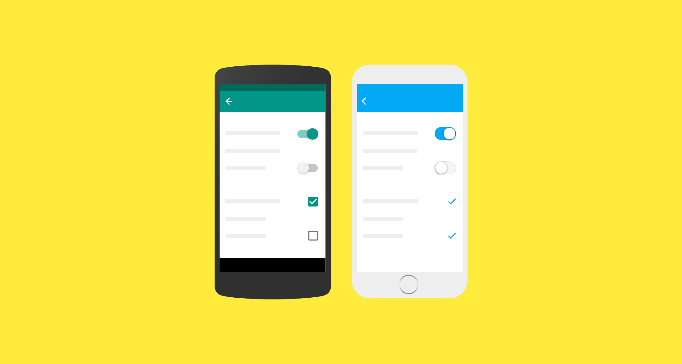
When to adapt Material Design for platform conventions

Platform recommendations Expand and collapse content An arrow that points down when collapsed and points up when expanded.

Toolbars

Toolbars are commonly used to frame the context of a screen.

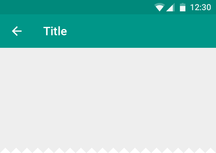
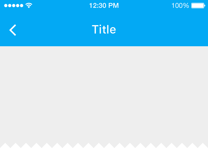
It is recommended to use a platform’s default text alignment for toolbar titles, unless multiple action buttons are present.

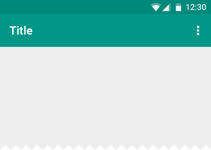
Left-aligned titles in Material Design for Android/Web

Android/Web

Titles are always left-aligned.

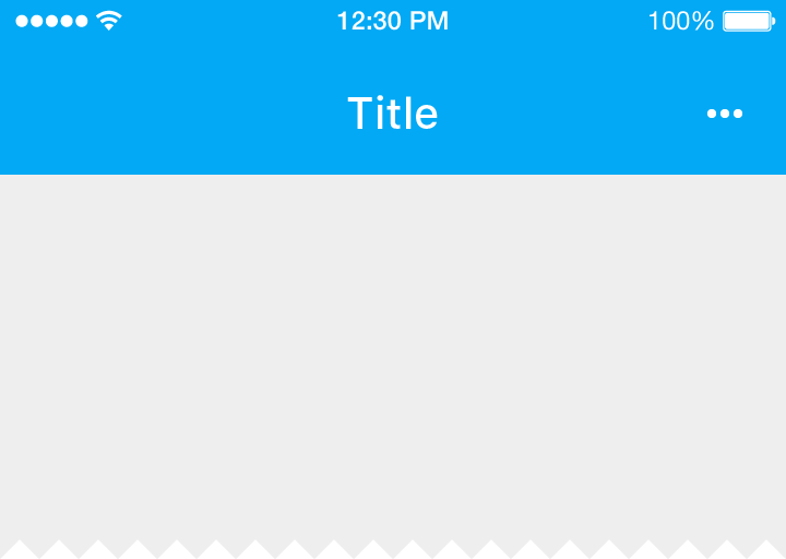
iOS center-aligned titles in Material Design

iOS

Titles are center-aligned by default.

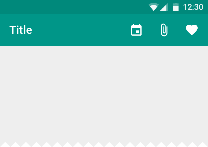
Left-aligned toolbar titles in Material Design on Android

Android

When multiple actions, or even no actions, appear on the right side, toolbar titles are always left-aligned.

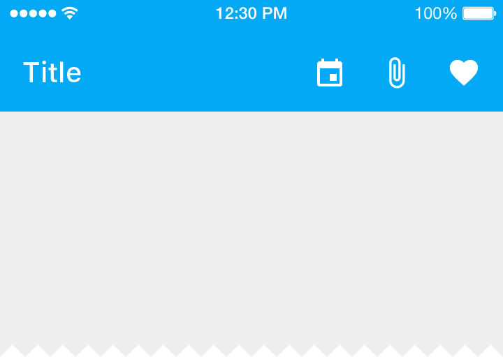
iOS: Left-aligned titles in Material Design action buttons

iOS

When multiple action buttons are on the right side, or at the home screen of an application, titles may be left-aligned.

Iconography

System icons are used to represent the most universally available actions for the platform.

Material Design up button with thin arrow and stem for Android/Web

Android/Web

The up button contains a thin arrow with a stem.

Material Design thicker back arrow on iOS, no stem

iOS

On iOS, the back arrow is thicker, and without a stem.

Material Design action overflow menu with three dots for Android/Web

Android/Web

The action overflow menu icon (indicated by the “More…” symbol) contains three vertical dots.

Material Design action overflow menu with three dots on iOS

iOS

The action overflow menu icon (indicated by the “More…” symbol) contains three horizontal dots.

Controls

Controls should clearly indicate how users should interact with them.

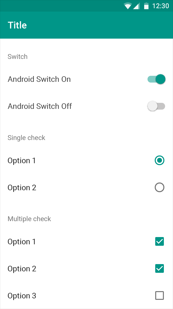
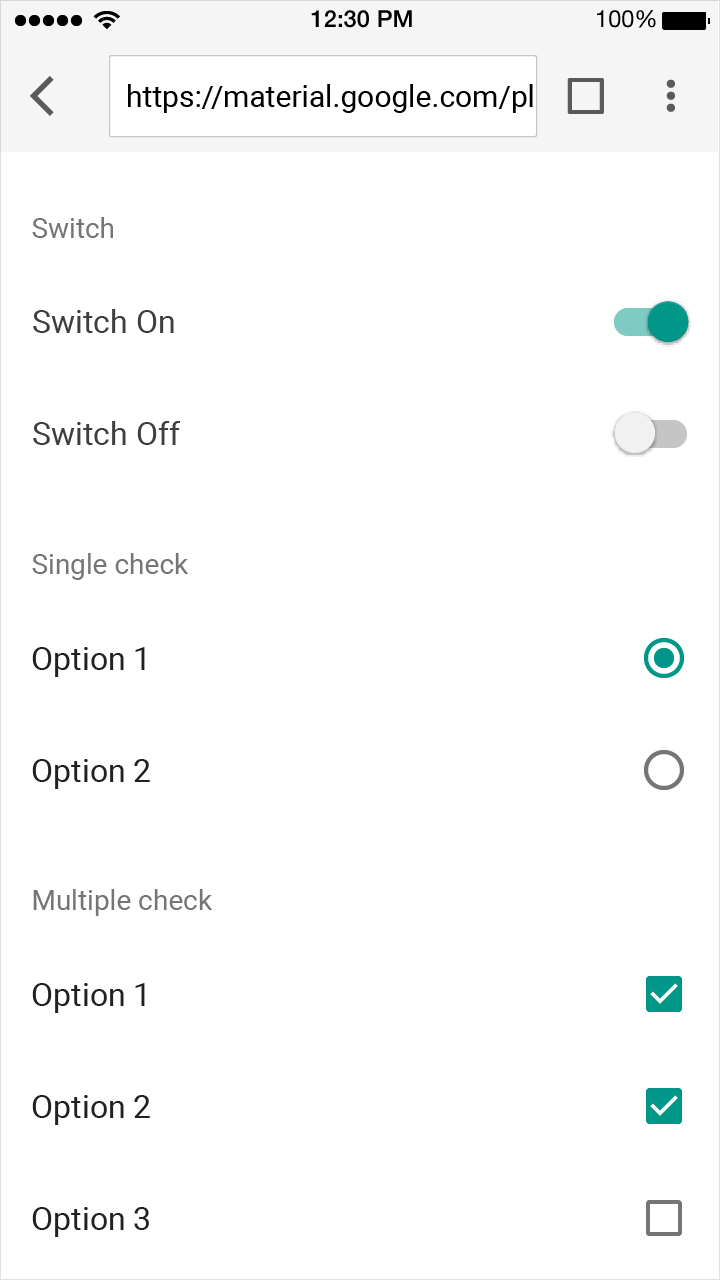
Material Design switches, checkboxes, and radio buttons for Android

Android

Use Material switches, checkboxes, and radio buttons.

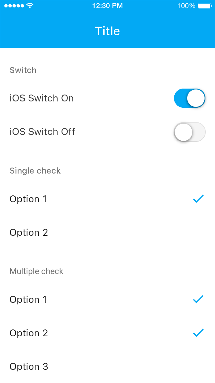
iOS native switches match Material Design functionality

iOS

Native platform switches may be used as they have matching functionality and appearance as Material switches.

Use switches instead of check boxes and check mark lists instead of radio buttons, as these are the graphics expected on iOS.

Material Design switches, checkboxes, and radio buttons for Web

Web

You may use Material switches, checkboxes, and radio buttons.

Gestures

Edge swipe

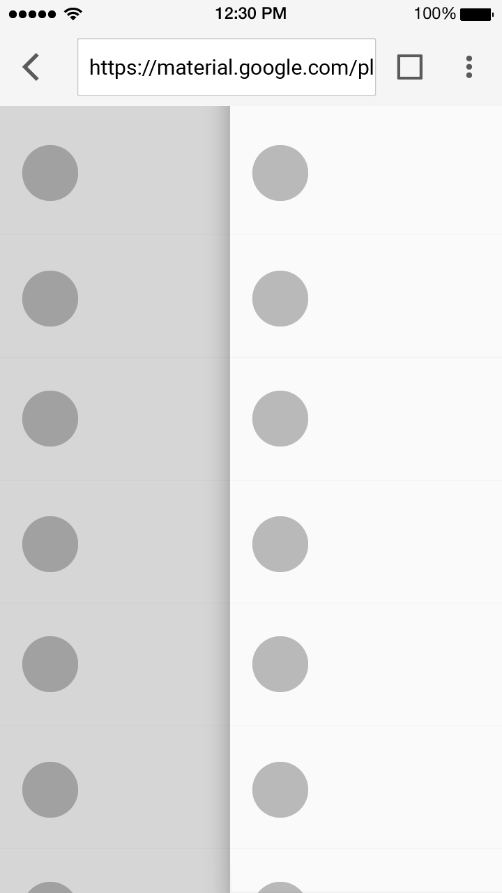
An edge swipe starts from outside of the screen to reveal off-screen content.

Edge swipes can conflict with other swipe gestures, such as horizontal swipes through pages or table rows. To avoid these kinds of conflicts, an edge swipe should perform the same behavior as any other swipe that exists over a content area.

Android

When conflicting gestures are not present, performing an edge swipe from the left reveals off-screen content, such as a navigation drawer.

iOS

When conflicting gestures are not present, performing an edge swipe from the left navigates you back through an app’s hierarchy.

Material Design: Avoid edge swipes in web browsers

Do.

Web

Browsers often use edge gestures for their feature set. Edge swipes should not be used on the web.

Material Design: Edge swipes not consistent across browsers

Don’t.

Web

Edge swipes can not be relied on across browsers.

Typography

Typography communicates both text content and branding. In both cases, text must be accessible and resizable.

If your app already uses typography for branding, it is recommended to do so in moderation.

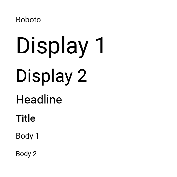
Android default typeface Roboto, supports Material Design

Android

The default typeface on Android is Roboto. On Android, text size should be specified in scaleable pixels to allow type to be resized using accessibility features.

iOS uses San Francisco font for Material Design accessibility

iOS

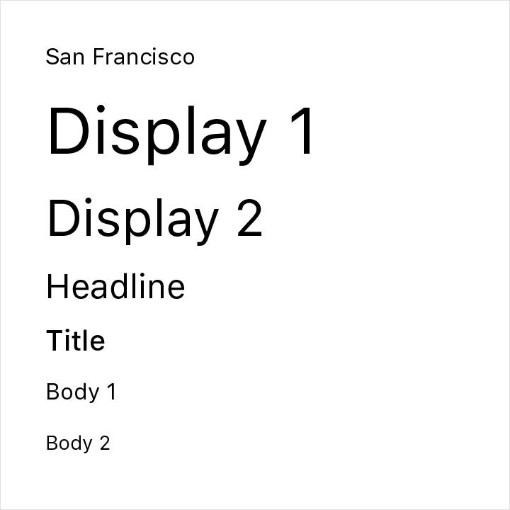
The default typeface on iOS is San Francisco. Using this typeface is the easiest way to implement accessibility features like Dynamic Type. Using other typefaces may require making adjustments to get the same accessibility features.

Material Design font guidelines for web: use Roboto

Web

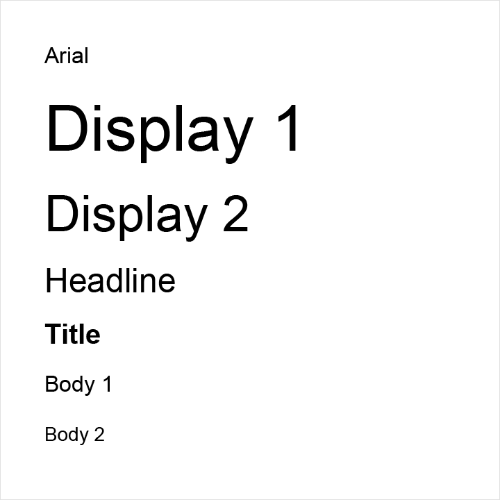
While Arial is the most broadly available font on the web, modern browsers provide accessibility and scaling support for web fonts.

Material Design’s standard typographic guidelines for Roboto on the web can help simplify your font usage. Alternatively, use custom fonts and establish your own type hierarchy that ensures legibility.