Usage
Help content provides answers to common user questions about your app. Users can send comments, report bugs, and ask questions that are not already answered by the help content.
Help content provides answers to common user questions about your app. Users can send comments, report bugs, and ask questions that are not already answered by the help content.
Make it easy for users to find help content in your app.
Help content can be made accessible from various points in your app’s navigation, with options listed below. It is usually placed in the navigation drawer (or overflow menu) under the label “Help” or “Send feedback.”
If your app is complex, place “Help” both in the navigation drawer and the app bar.
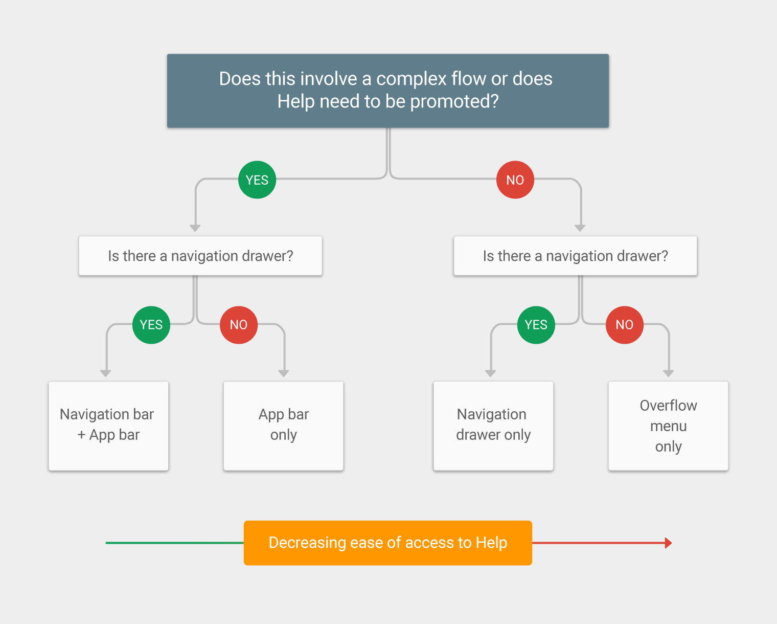
To make it easy for users to get help, particularly if your app is complex, place “Help” in both the navigation drawer and app bar. Otherwise, place “Help” in the navigation drawer only, or the overflow menu.
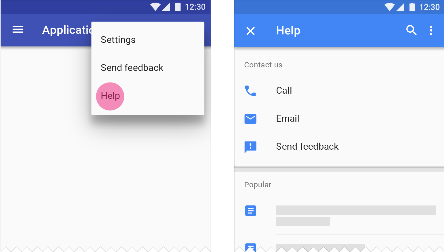
Place “Help” as the last item in the navigation drawer, with “Send feedback” directly above it.
If “Sign out” appears in the navigation drawer, it should be the last item in the list.
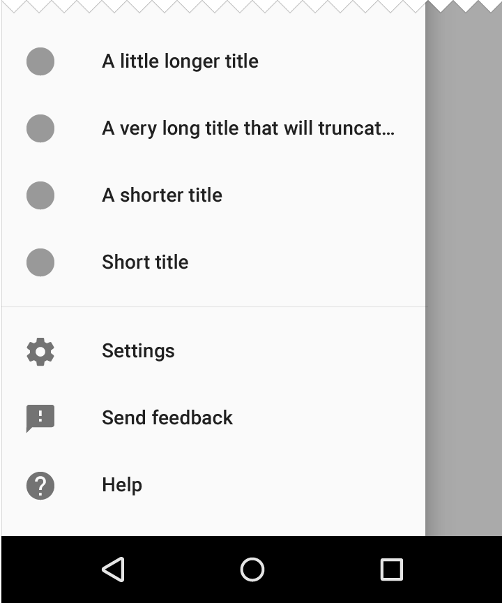
The navigation drawer showing “Help” and “Send feedback”
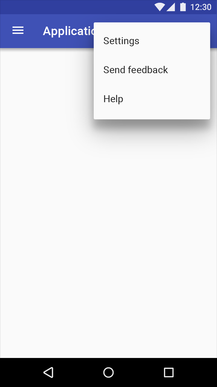
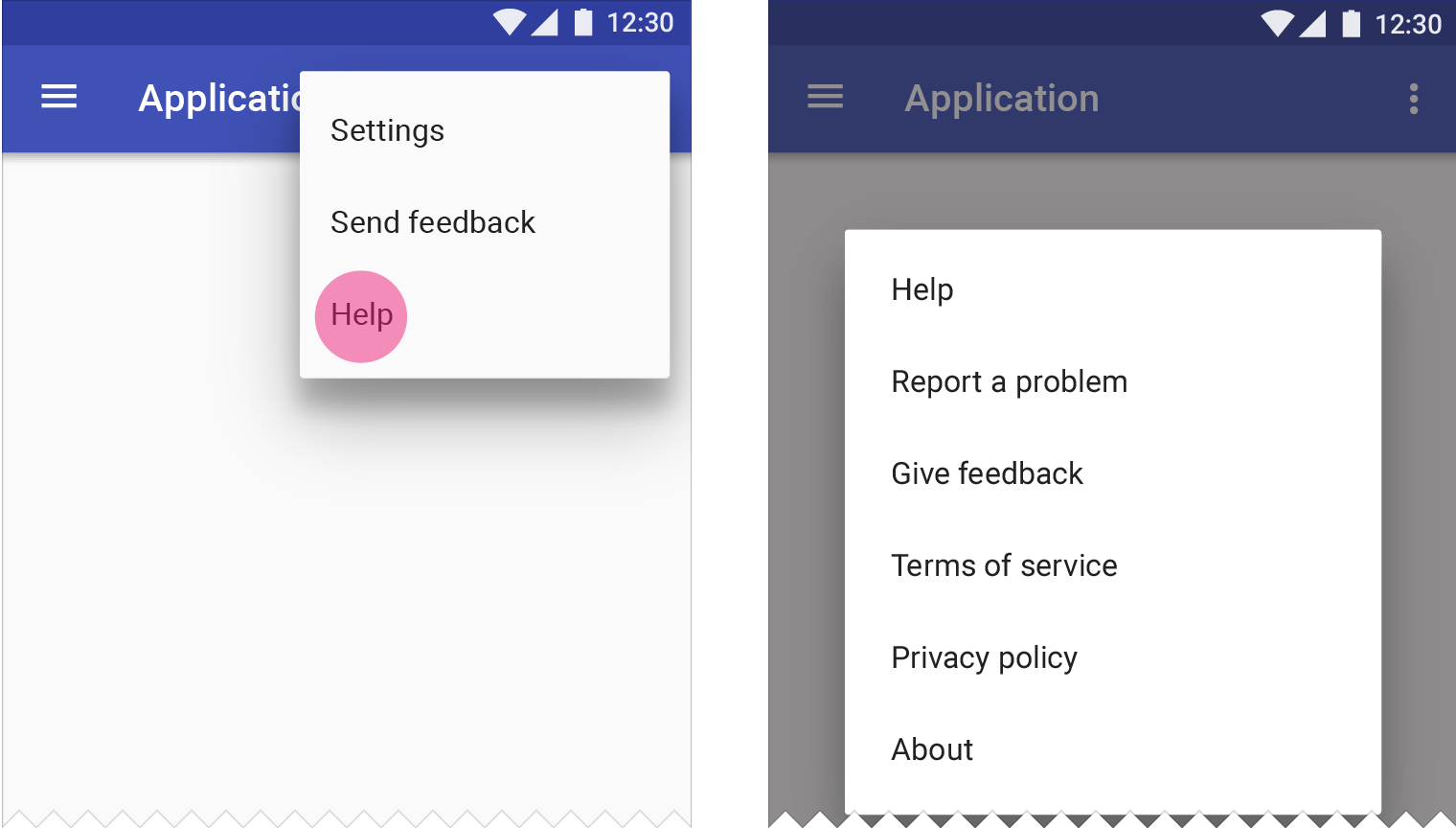
Place “Help” and “Feedback” (or “Send feedback”) in the overflow menu when there is no navigation drawer.
If “Sign out” appears in the overflow menu, it should be the last item in the list.
Do.
Overflow menu showing “Help” and “Send feedback”
To make it easier for users to find help for urgent issues, such as payments and refunds, place a Help icon in the app bar.
Desktop applications may also place a Help icon in the app bar, as there is more space in the desktop UI.
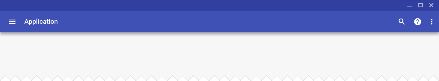
Help icon promoted in the app bar
A “Send feedback” button may be included in the help screen.
Content viewed less often (such as “About,” “Privacy,” and “Terms of service”) may be placed in an action overflow menu.
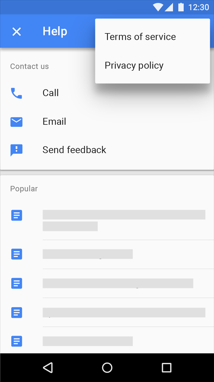
A help screen with frequently asked questions and answers and an action button to send feedback.
Help content should be relevant to the user’s current location in an app. For example, if a user is viewing their account information, the help content displayed should include information about accounts.
Take the user directly to help content upon selecting “Help” in your app.
Do.
Once a user selects “Help,” they should be taken directly to the “Help” menu.
Don’t.
After a user has selected “Help,” do not present a screen asking the user to choose between “Help” and other options.
Occasionally, help content appears when users interact with an app for the first time, even though the user has not requested help. By offering unsolicited help, users don’t have to search the “Help” menu for answers on how to use new features. This kind of help often appears:
This type of help should be limited to new features and gesture education, as it could be interruptive and distracting.
Help and Feedback icons are displayed at 24dp.
Tooltip icons are 18dp.
On light backgrounds, icons have an opacity of 54%. On dark backgrounds they have an opacity of 100%.
Light theme | Opacity |
Active icon | 54% |
Inactive icon | 38% |
Dark theme | Opacity |
Active icon | 100% |
Inactive icon | 50% |
Do.
Use the standard Material Design icon for Help.
Don’t.
Don’t use icon variations, such as those with speech bubbles or circle outlines.
Do.
Use the standard Material Design icon for Send feedback.
Don’t.
Don’t use icon variations, such as chat or bug icons.
Do.
Use the standard Material Design icon for Help Tooltips.
Don’t.
Don’t use icon variations, including the Help icon, or icons with speech bubbles or outlines.
Help content lets users find answers to questions or problems that are unique to your app.
Consider these guidelines when writing help content:
Keep explanations as short as possible. Avoid giving details that aren’t relevant to typical usage. Answer one question or concern at a time.
Make help content easy to read by formatting text with bold headings, lists, tables, and space between paragraphs as needed.
In particular, when referring to elements that users need to select, such as buttons or links, bold the label names when referring to them in help content.
Headings clearly outline an article’s content. They help readers scan the page to quickly find the information they need.
Avoid using technical terms in help content where possible.
When providing step-by-step instructions, show relevant images or icons to explain what the user needs to do.