For guidance on arranging elements in z-space to achieve the correct behavior and shadows, see the Environment and Elevations and shadows sections.
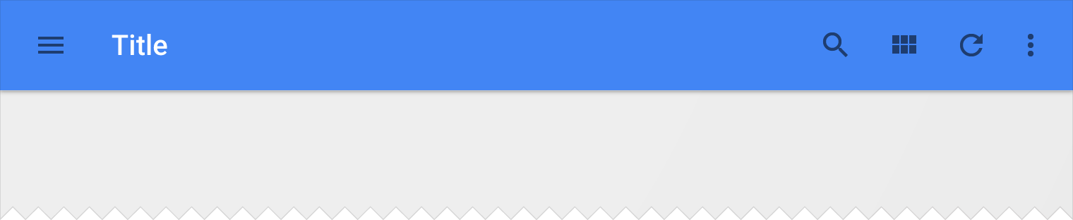
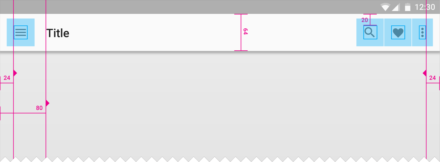
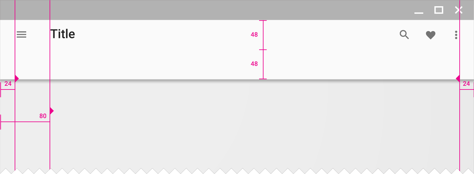
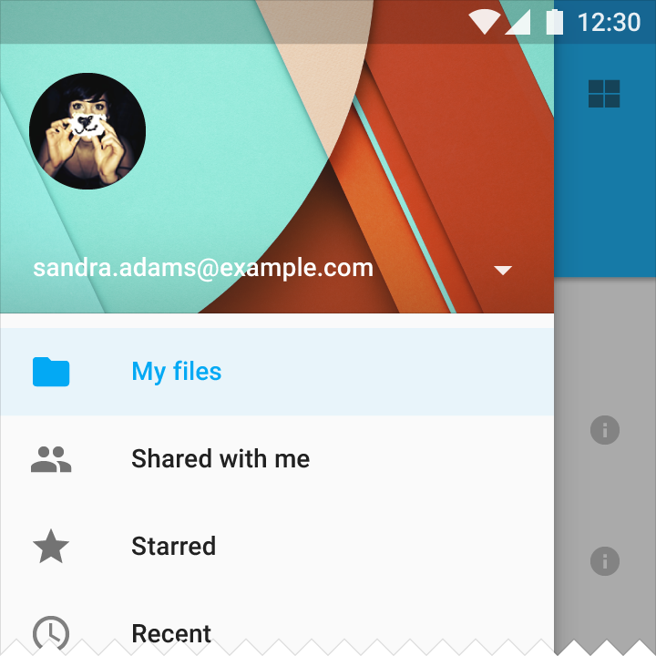
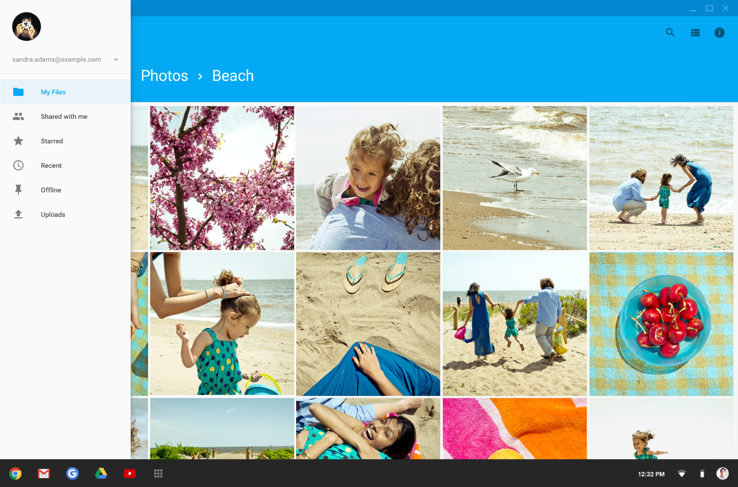
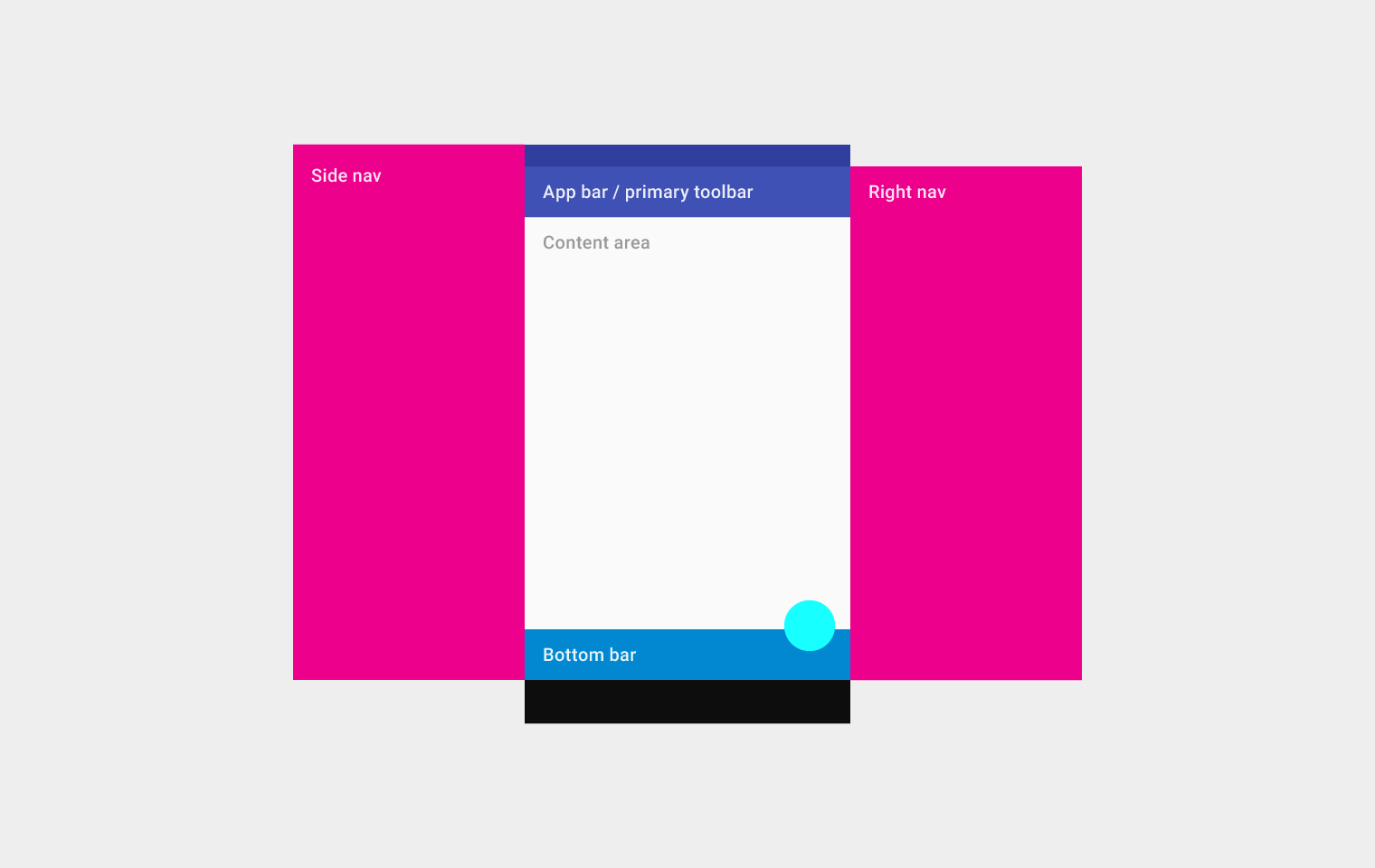
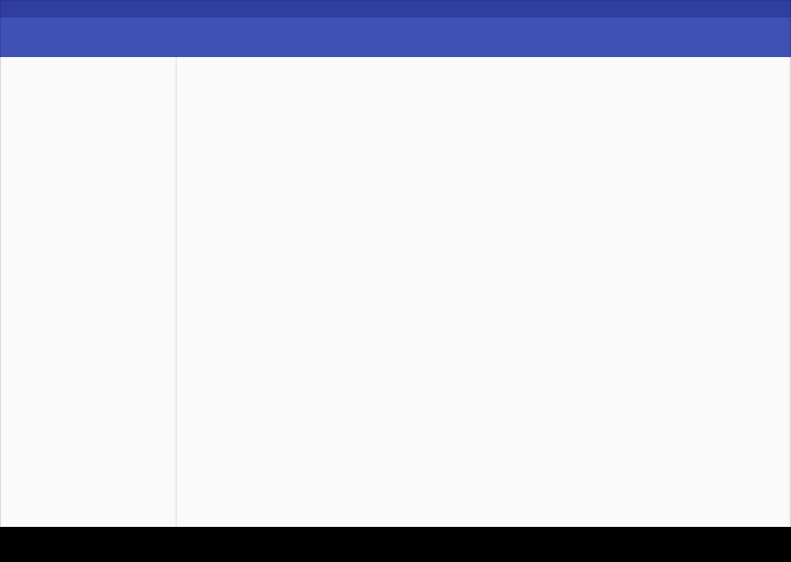
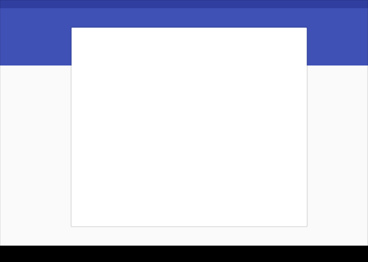
Mobile structure
This structure includes a permanent app bar and floating action button. An optional bottom bar can be added for additional functionality or action overflow. Side nav menus overlay all other structural elements.
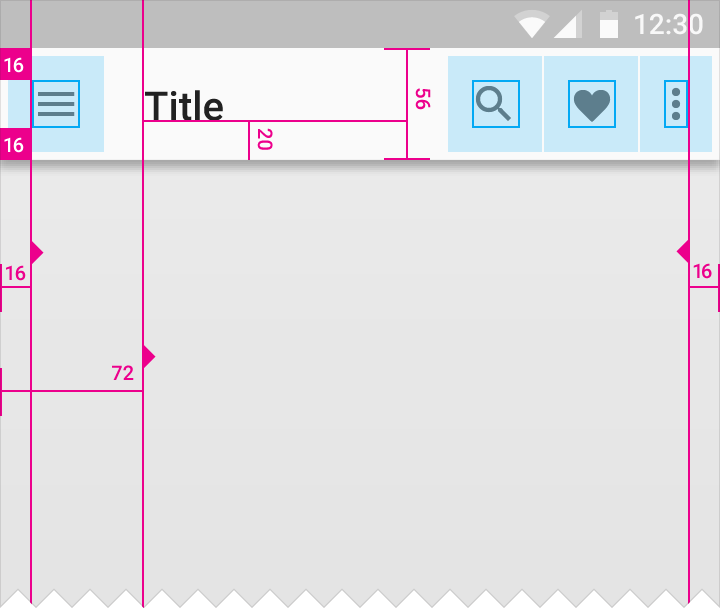
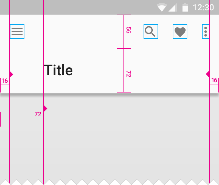
Mobile structure
Top left to right: Side nav, app bar/primary toolbar, content area (below the app bar/primary toolbar), and right nav
On the bottom: bottom bar
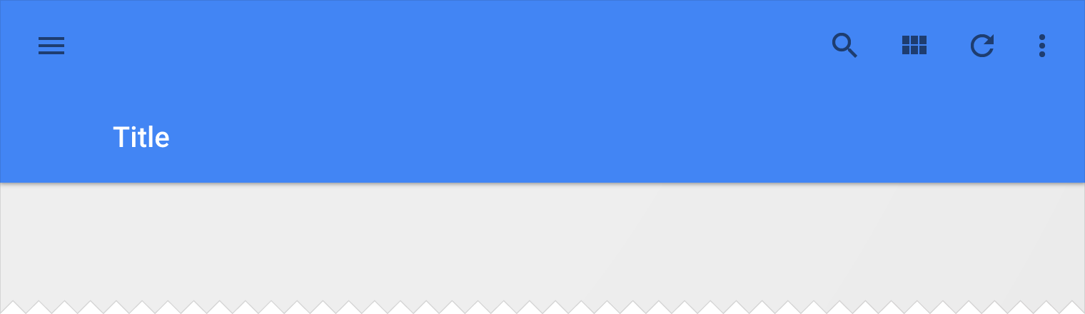
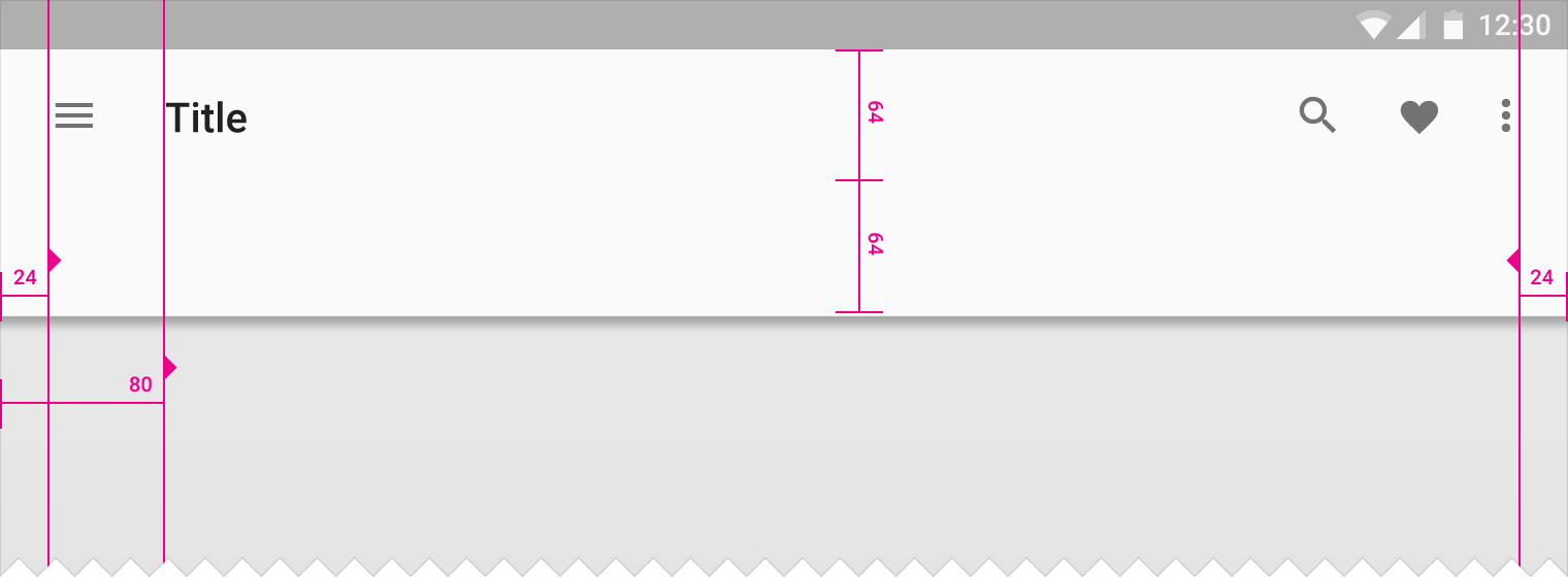
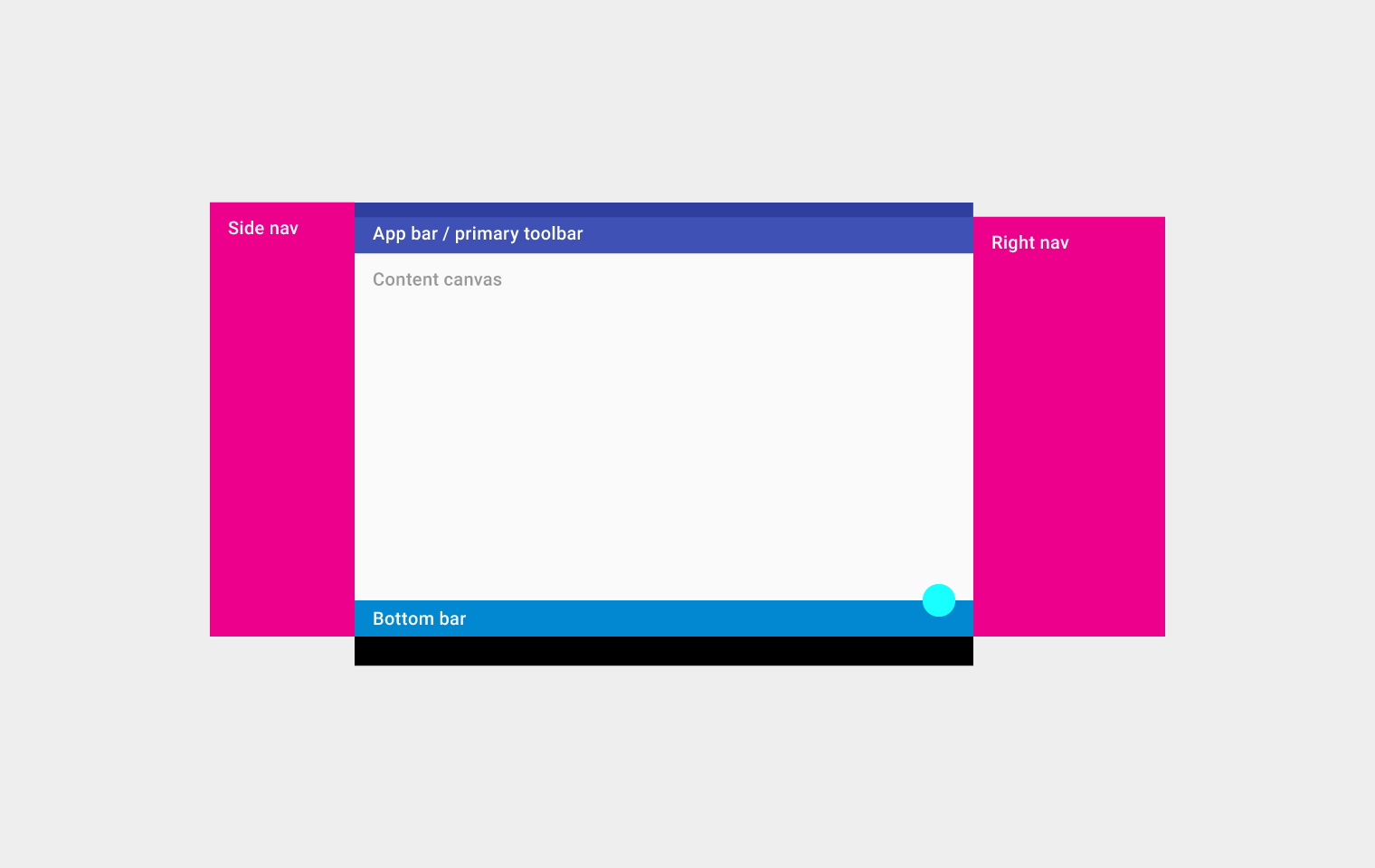
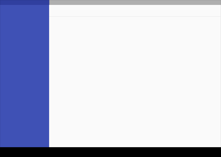
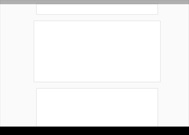
Tablet structure
This structure shows a permanent app bar with a floating action button. The app bar absorbs elements from the tablet and mobile bottom bars. An optional bottom bar can be added for additional functionality or action overflow. A side nav overlays all other structural elements. A right nav menu can be accessed temporarily or pinned for permanent display.
Tablet structure
Top left to right: Side nav, app bar/primary toolbar, content canvas (below the app bar/primary toolbar), and right nav
On the bottom: bottom bar
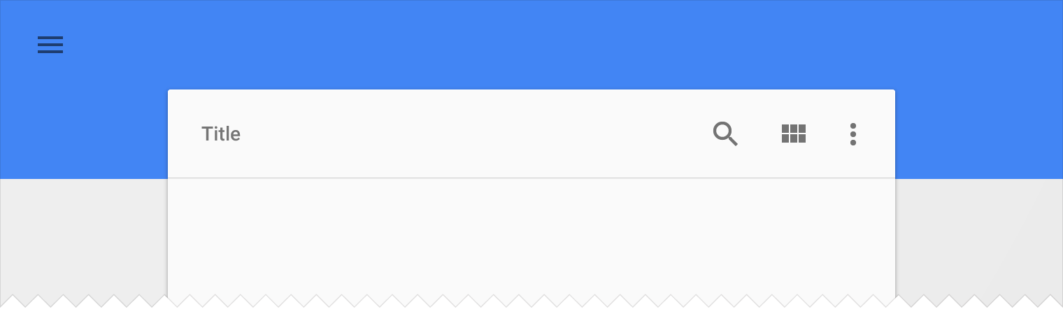
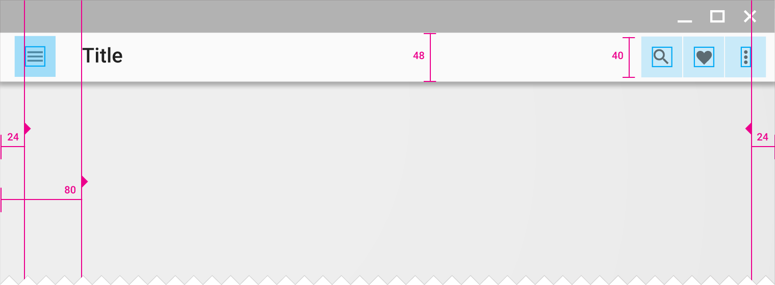
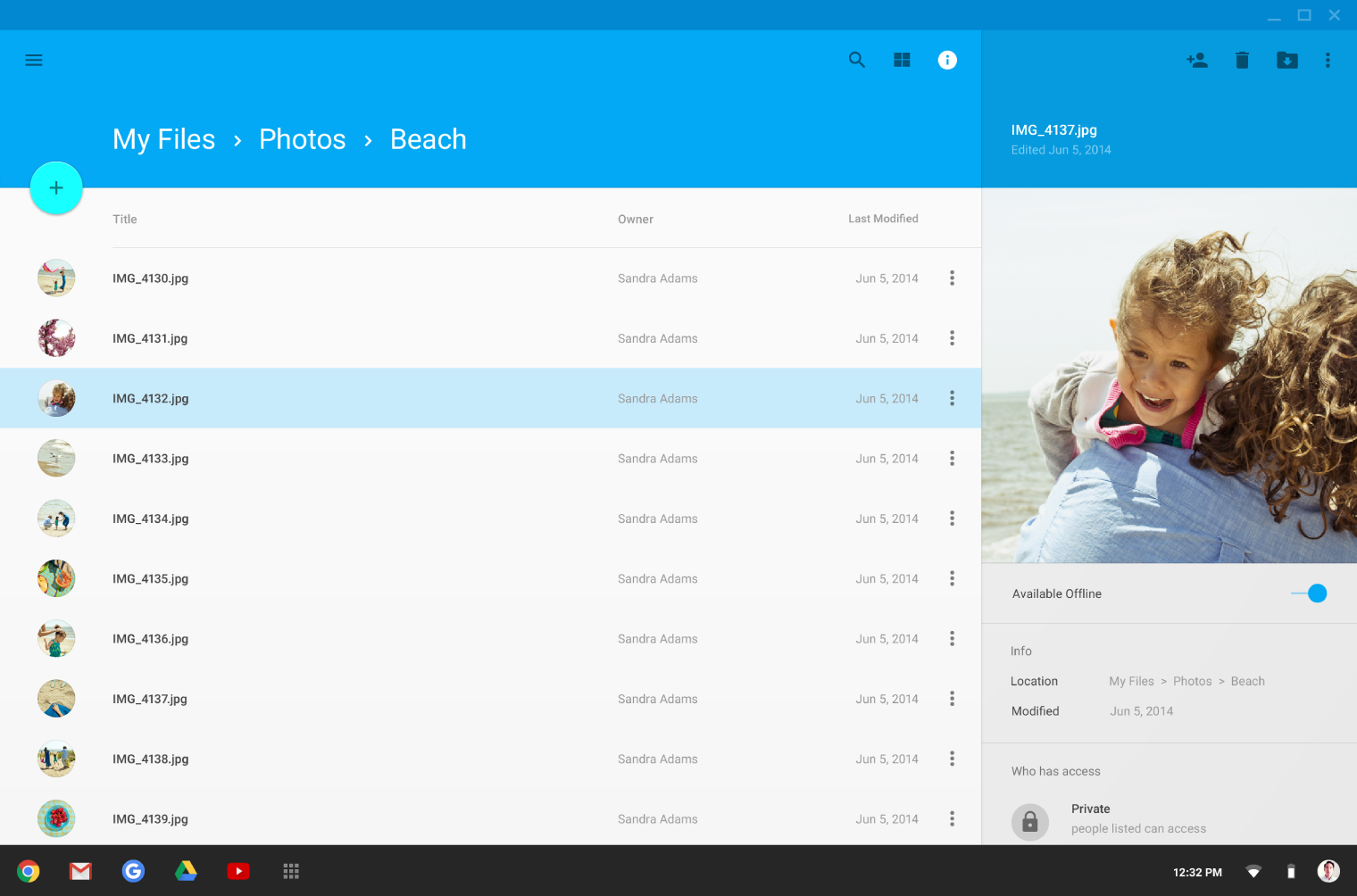
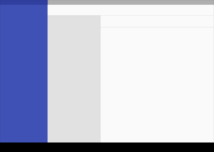
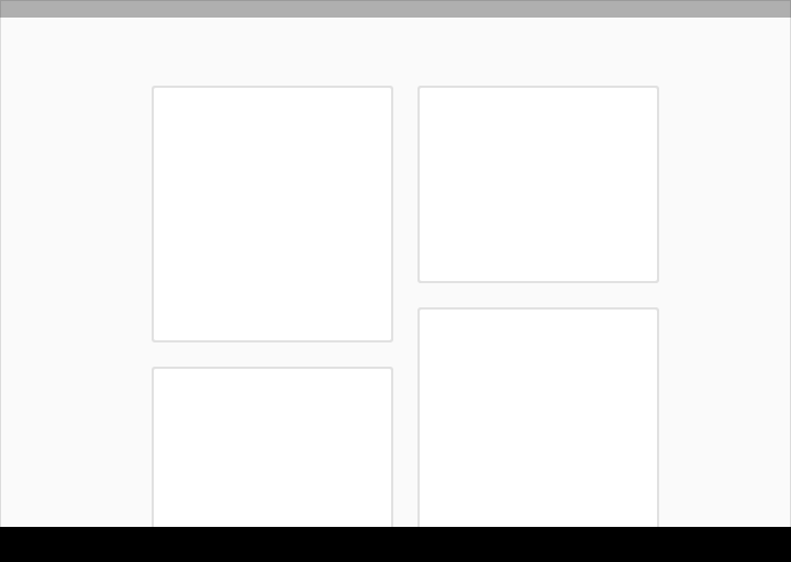
Desktop structure
The desktop structure contains a permanent app bar with a floating action button. The app bar absorbs elements from the tablet and mobile bottom bars. Where possible, the window controls are absorbed into the app bar.
Side navigation menus can take up the full height of the screen size (including under the app bar) and be accessed temporarily or pinned for permanent display. Side nav menus, as well as the content canvas, can have their own secondary toolbars for tabs, palettes, or secondary actions.
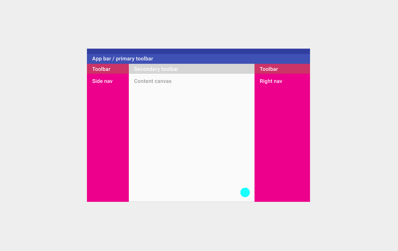
Desktop structure
Top left to right: App bar/primary toolbar
Second row from left to right: Toolbar, secondary toolbar, and toolbar
Third row from left to right: side nav, content canvas, and right nav
On the bottom: floating action button
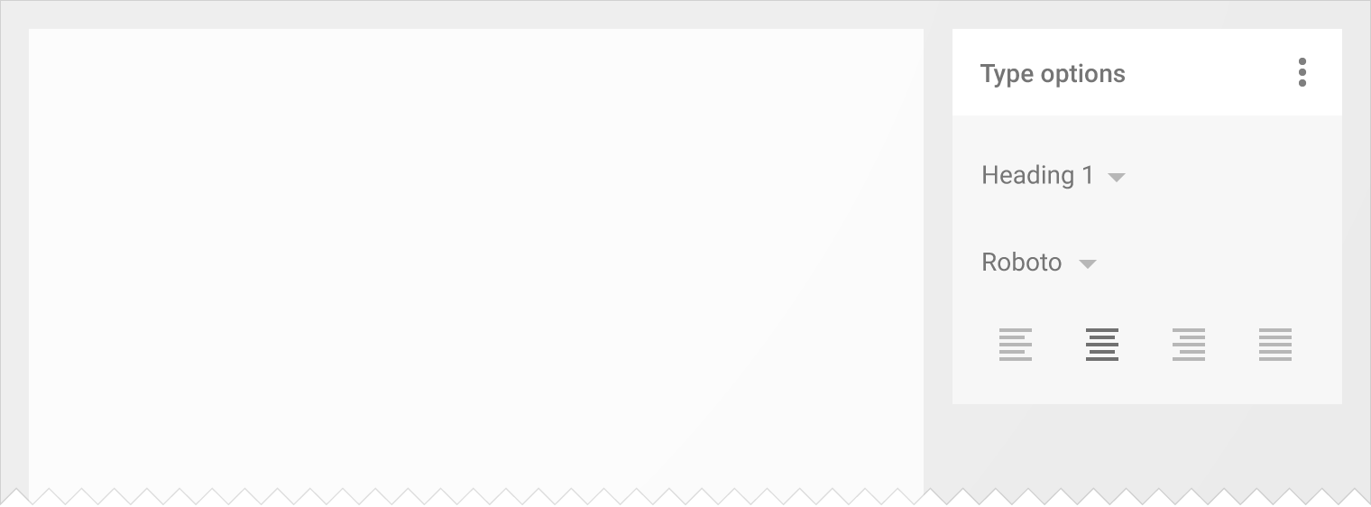
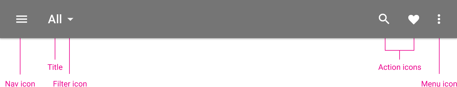
UI regions
Define a primary horizontal or vertical divider.
Vertical divider
Horizontal divider
Avoid slicing up the interface into too many regions which can cause L shapes. Instead, use whitespace to delineate secondary areas.

Do.
Use whitespace.
Don’t.
Avoid creating too many regions.
Break edges with cards and floating action buttons.
Card breaking an edge
Floating action button breaking an edge
Use cards to organize content when specific behaviors are needed or if groupings of information need more separation than what whitespace or dividers can provide.
Cards
Cards