Material Design Elevation & shadows

Elevation & shadows

Objects in material design possess similar qualities to objects in the physical world.

In the physical world, objects can be stacked or affixed to one another, but cannot pass through each other. Objects also cast shadows and reflect light.

Material Design reflects these qualities to form a spatial model that is familiar to users and can be applied consistently across apps.

Elevation

Measured from the front of one surface to the front of another, an element’s elevation indicates the distance between surfaces and the depth of its shadow.

Resting elevation

All material elements have resting elevations. While components have consistent resting elevations across apps, they may have different resting elevations across platforms and devices.

Dynamic elevation offsets

Dynamic elevation offsets are the goal elevation that a component moves towards, relative to its resting state.

Material Design uses elevation and shadows for spatial awareness

Elevation (Android) Expand and collapse content An arrow that points down when collapsed and points up when expanded.

Elevation is the relative depth, or distance, between two surfaces along the z-axis.

Specifications:

  • Elevation is measured in the same units as the x and y axes, typically in density-independent pixels (dp). Because material elements have depth (all material is 1dp thick), elevation is measured in distance from the top of one surface to the top of another.
  • A child object's elevation is relative to the parent object's elevation.

The images and values shown are for Android apps.

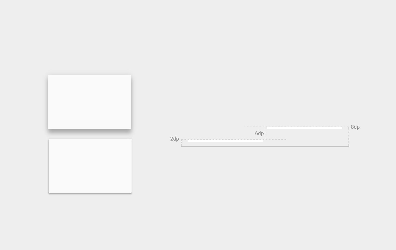
Material Design elevation depth in Android measured in dp

Multiple elevation measurements for two objects

Resting elevation

All material objects, regardless of size, have a resting elevation, or default elevation that does not change. If an object changes elevation, it should return to its resting elevation as soon as possible.

Desktop resting elevation is 2dp below the listed values to accommodate mouse and non-touch environments.

Component elevations:

  • Components maintain consistent resting elevations across apps. For example, the floating action button’s elevation does not vary from one app to another.
  • Components may have different resting elevations across platforms and devices, depending on the depth of the environment. For instance, TV has a greater depth than desktop as it has a larger screen and is viewed from further away. Similarly, both TV and desktop have a greater depth than mobile.

Responsive elevation and dynamic elevation offsets

Some component types have responsive elevation, meaning they change elevation in response to user input (e.g., normal, focused, and pressed) or system events. These elevation changes are consistently implemented using dynamic elevation offsets.

Dynamic elevation offsets are the goal elevation that a component moves towards, relative to the component’s resting state. They ensure that elevation changes are consistent across actions and component types. For example, all components that lift on press have the same elevation change relative to their resting elevation.

Once the input event is completed or cancelled, the component will return to its resting elevation.

Avoiding elevation interference

Components with responsive elevations may encounter other components as they move between their resting elevations and dynamic elevation offsets. Because material cannot pass through other material, components avoid interfering with one another any number of ways, whether on a per-component basis or using the entire app layout.

On a component level, components can move or be removed before they cause interference. For example, a floating action button (FAB) can disappear or move off-screen before a user picks up a card, or it can move if a snackbar appears.

On the layout level, design your app layout to minimize opportunities for interference. For example, position the FAB to one side of a stream of cards so the FAB won’t interfere when a user tries to pick up one of cards.
Elevation (dp)

Component

24

Dialog

Picker

16

Nav drawer

Right drawer

Modal bottom Sheet

12

Floating action button (FAB - pressed)

9

Sub menu (+1dp for each sub menu)

8

Bottom navigation bar

Menu

Card (when picked up)

Raised button (pressed state)

6

Floating action button (FAB - resting elevation)

Snackbar

4

App Bar

3

Refresh indicator

Quick entry / Search bar (scrolled state)

2

Card (resting elevation) *

Raised button (resting elevation)*

Quick entry / Search bar (resting elevation)

1

Switch

Component elevation comparisons

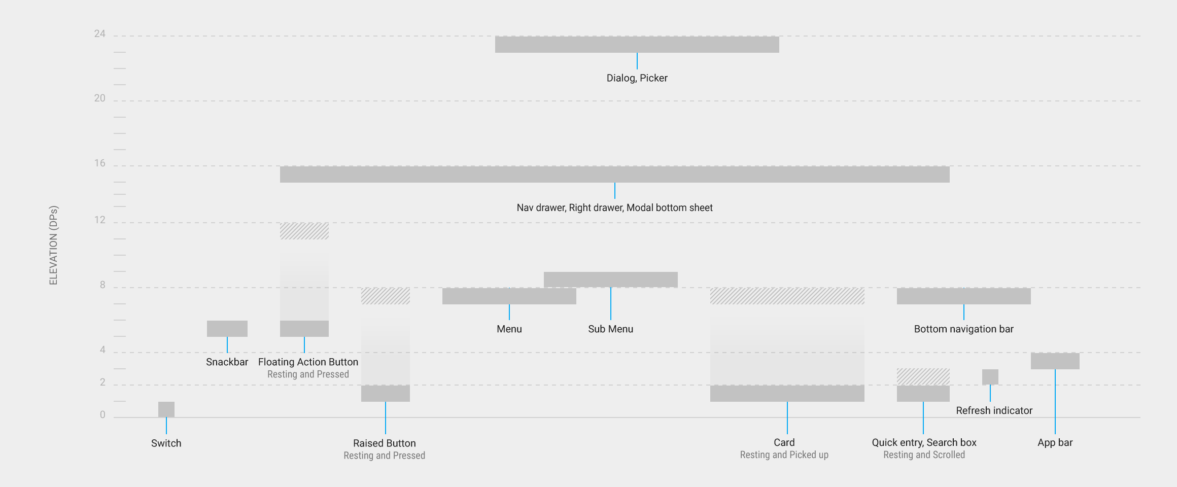
The following diagram compares component resting elevations and dynamic elevation offsets.

Component elevation comparisons in Material Design

In this diagram, only the elevation dimensions and layout for components are accurate. Other dimensions and overall layout of components are for illustration only.

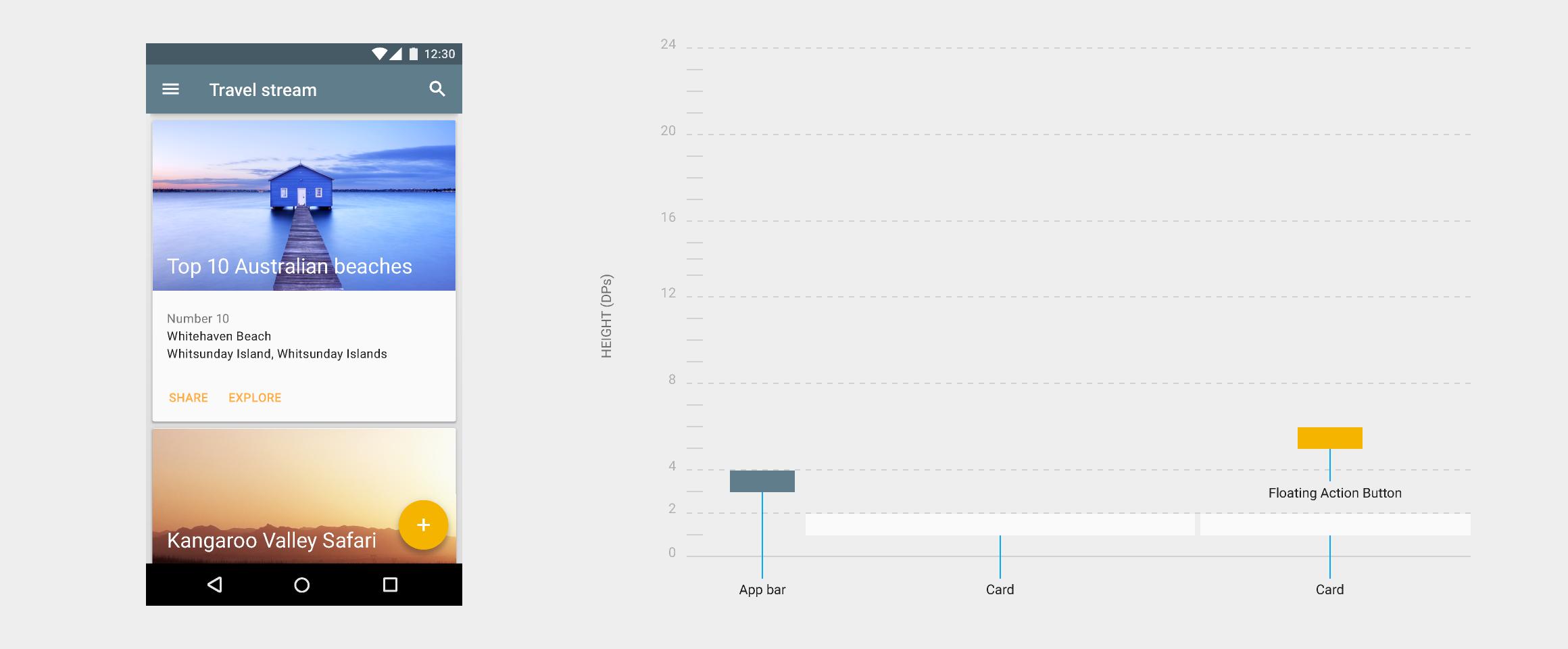
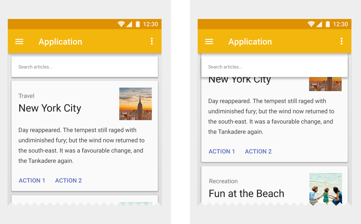
Material Design app layout with cards and a floating button

An example app layout with cards and a floating action button, along with a cross-section diagram of its component elevations along its z-axis

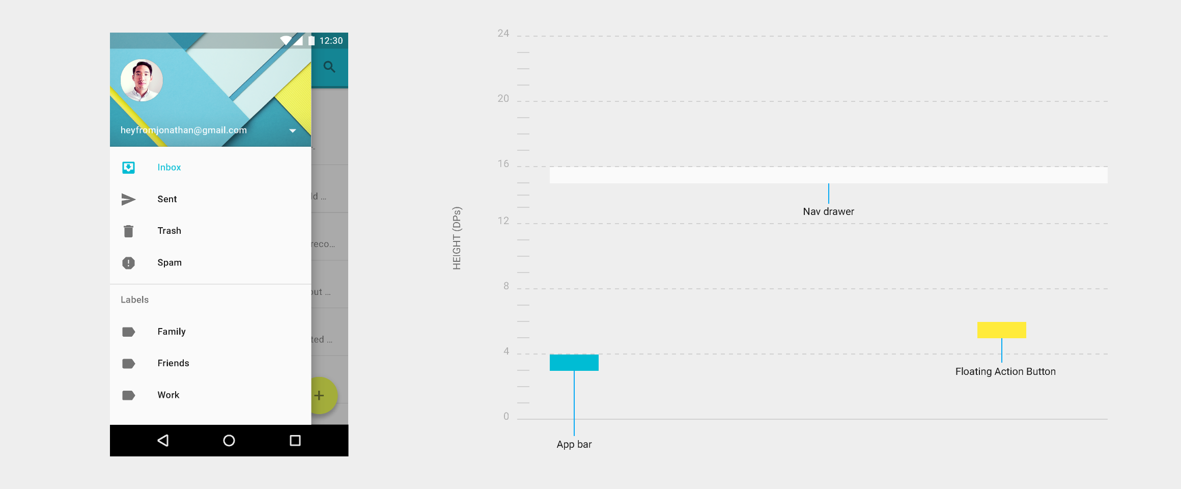
Material Design app layout with open navigation drawer"

An example app layout with an open navigation drawer, along with a cross-section diagram of its component elevations along its z-axis.

Shadows Expand and collapse content An arrow that points down when collapsed and points up when expanded.

Shadows provide important visual cues about objects’ depth and directional movement. They are the only visual cue indicating the amount of separation between surfaces. An object’s elevation determines the appearance of its shadow.

Material Design: Floating action button lacks shadow

Don’t.

Without a shadow, nothing indicates that the floating action button is separate from the background surfaces.

Material Design: Shadows show elevation of elements

Don’t.

Crisp shadows indicate the floating action button and the blue sheet are separate elements. However, their shadows are so similar that they imply they are both at the same elevation.

Material Design: Floating action button with soft shadows

Do.

Softer, larger shadows indicate the floating action button is at a higher elevation than the blue sheet, which has a crisper shadow.

In motion, shadows provide useful cues about an object’s direction of movement and whether the distance between surfaces is increasing or decreasing.

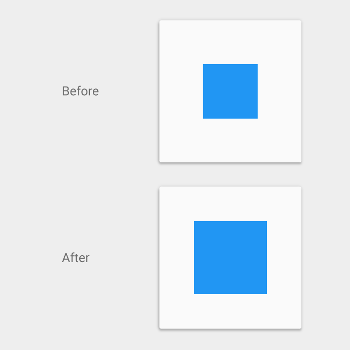
Square lacking shadow shows unclear elevation in Material Design

Don’t.

Without a shadow to indicate elevation, it’s unclear whether this square is increasing in size or increasing its elevation.

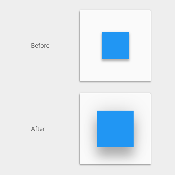
Material Design: Shadows change with elevation

Do.

The shadow grows softer and larger as the object’s elevation increases and grows crisper and smaller as the elevation decreases.

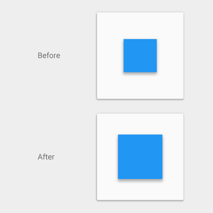
Material Design shadow indicates object shape change

Do.

In this case, the consistent shadow helps the user understand that the object is changing shape as opposed to changing elevation.

Component reference shadows

The following component shadows should be used as canonical references. If there are any differences between the following reference shadows and component shadows found elsewhere within this spec, defer to these reference shadows.

App bar

4dp

Material Design app bar shadow

Example of an app bar

Raised button
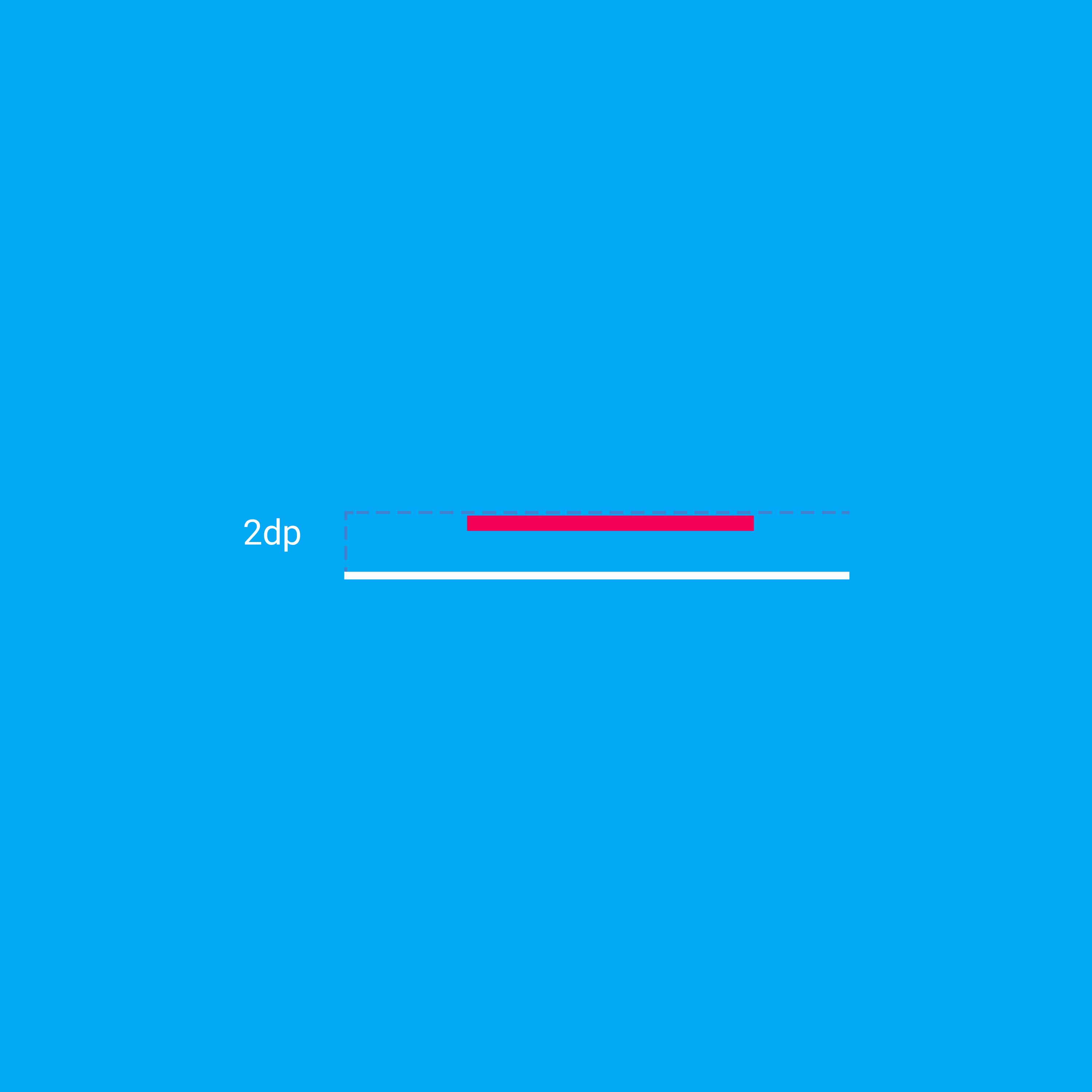
Resting state: 2dp
Pressed state: 8dp

For desktop only, raised buttons can have an elevation of:
Resting state: 0dp
Pressed state: 2dp

See raised buttons for more information

Material Design Raised button shadow

Floating action button (FAB)

Resting state: 6dp

Pressed state: 12dp

Material Design Floating action button (FAB) shadow

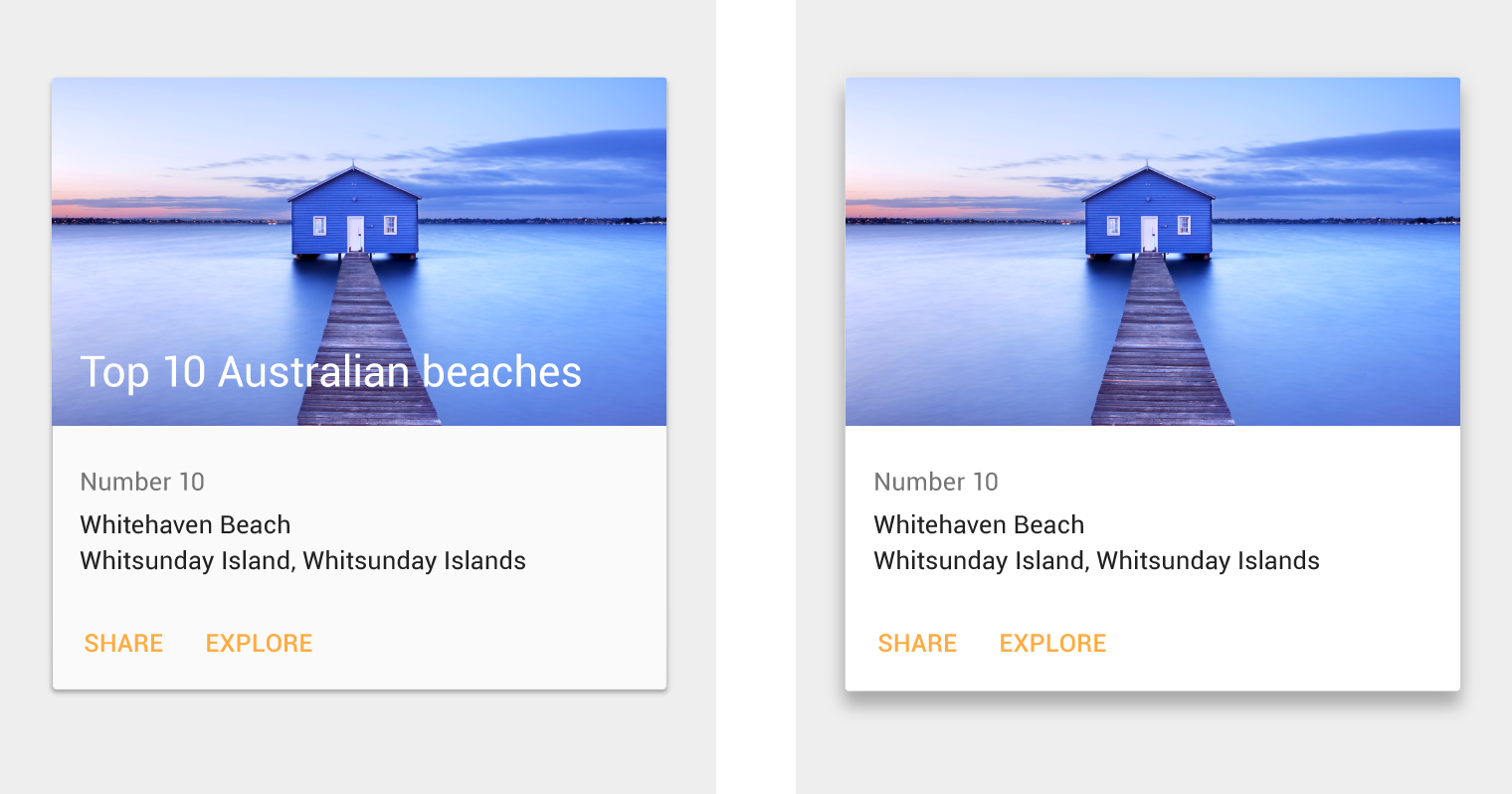
Card

Resting state: 2dp

Raised state: 8dp

For Desktop only, see Content blocks.

Material Design Card shadow

Menus and sub menus

Menus: 8dp

Sub menus: 9dp (+1 dp for each sub menu)

Material Design Menus and sub menus shadow

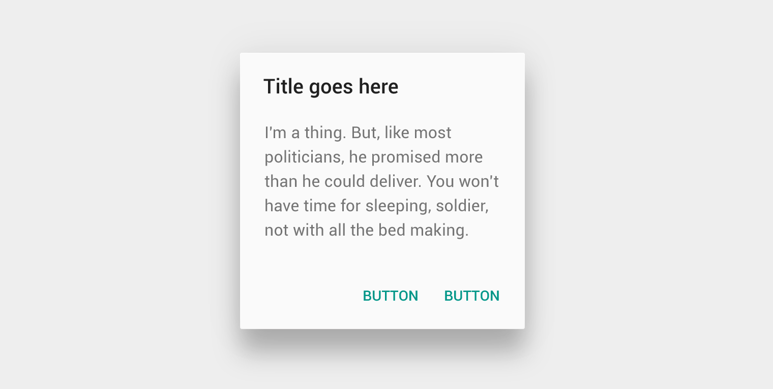
Dialogs

24dp

Material Design Dialogs shadow

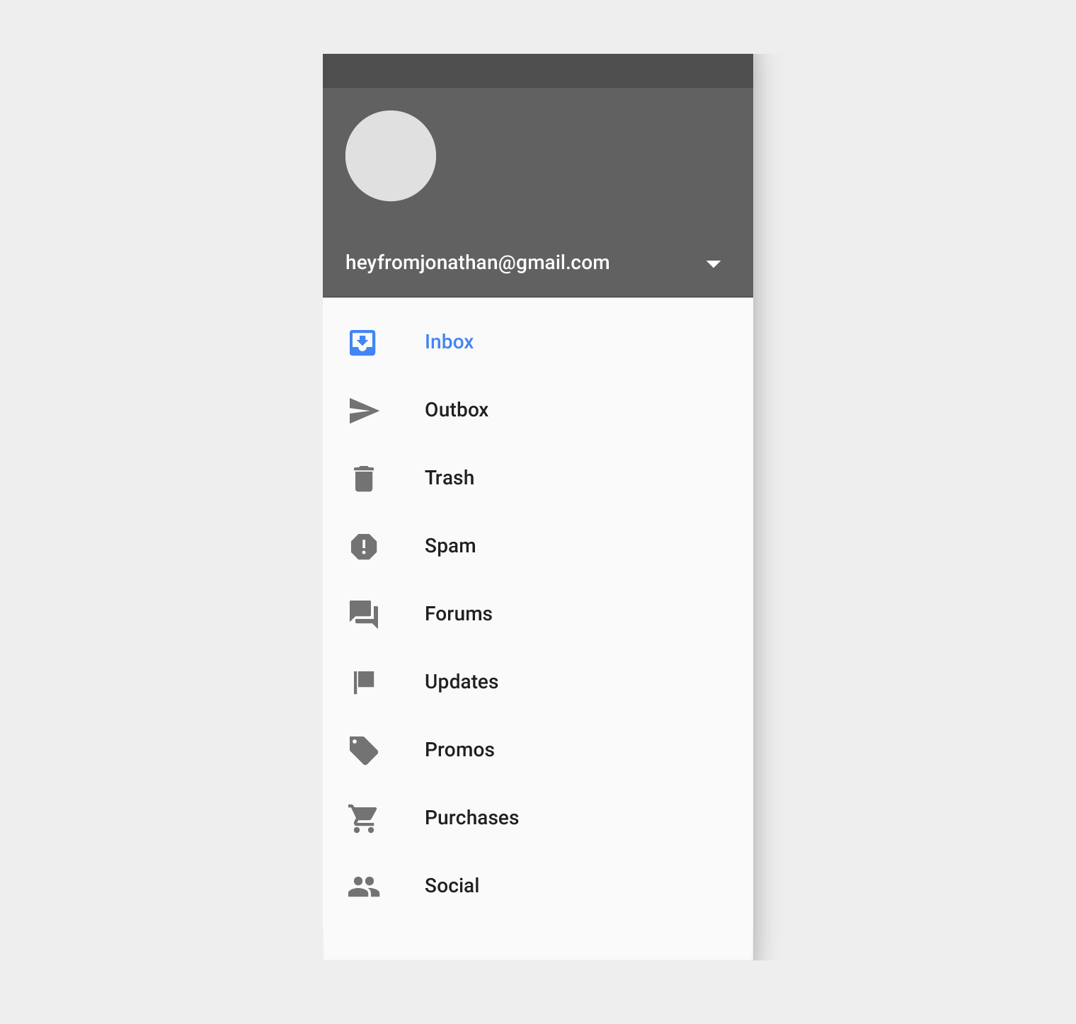
Nav Drawer & Right drawer

16dp

Material Design Nav Drawer & Right drawer shadow

Modal bottom sheet

16dp

Material Design Modal bottom sheet shadow

Refresh indicator

3dp

Material Design Refresh indicator shadow

Quick entry/Search bar

Resting state: 2dp

Scrolled state: 3dp

Material Design Quick entry/Search bar shadow

Snackbar

6dp

Material Design Snackbar shadow

Switch

1dp

Material Design Switch shadow

Object relationships Expand and collapse content An arrow that points down when collapsed and points up when expanded.

Object hierarchy

How you organize objects, or collections of objects, in an app determines how they move in relation to one another. Objects can move independently of each other or be constrained by objects higher in the hierarchy.

All objects are part of a hierarchy described in terms of a parent-child relationships. The “child” in each of these relationships refers to an element that is a subordinate to its “parent” element. Objects can be children of either the system or another object.

Parent-child specifics:

  • Each object has one parent
  • Each object may have any number of children
  • Children inherit transformative properties from their parent, such as position, rotation, scale, and elevation
  • Siblings are objects at the same level of hierarchy

Exceptions

Items parented to the root, such as primary UI elements, move independently of other objects. For example, the floating action button does not scroll with content. Other elements include:

  • An app’s side nav drawer
  • The action bar
  • Dialogs

Interaction

How objects interact with one another is determined by their place in the parent-child hierarchy.

For example:

  • Children have minimal z-axis separation from their parent; other objects do not get inserted between parents and children
  • In a scrolling card collection, the cards are siblings of each other, so they all move together in tandem. They are children of the card collection object that controls their movement.

Elevation

How you determine the elevation of objects – their position in z-space – depends on the content hierarchy you want to express and whether an object needs to move independently of other objects.

As the parent sheet scrolls, the raised button (its child) scrolls off screen with it.

As the card collection scrolls off-screen, its child cards scroll off-screen with it. The floating action button remains in place because its parent is not being scrolled.