Components Chips

Chips

Chips represent complex entities in small blocks, such as a contact.

A chip may contain entities such as a photo, text, rules, an icon, or a contact.

Contact chips may represent contact information in a compact way.

Behavior
  • Selecting a chip opens a full detail view.
  • Chips may be deleted if they display a delete icon.
Specs
  • Height: 32dp
  • Label: 13sp Roboto Regular, 87% black
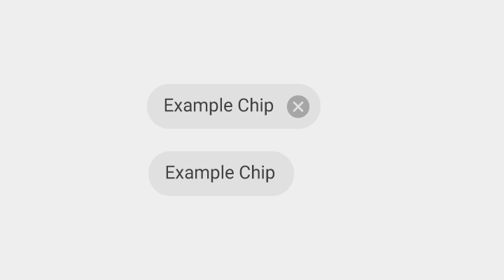
Material Design chips represent complex entities in small blocks

Usage Expand and collapse content An arrow that points down when collapsed and points up when expanded.

A chip may contain a photo, short title, and brief information.

Types of chips

Chips can be used for various types of entities, including free form text, predefined text, rules, or contacts. Chips may also contain icons.

Material Design chips with text

Chips with text

Chip label

  • 13sp Roboto Regular
  • 87% black
Material Design chips with text and icon

Chips with text and an icon

Behavior Expand and collapse content An arrow that points down when collapsed and points up when expanded.

Opening chips

Touching a chip opens a full detailed view (either in a card or full screen) or a menu of options related to that chip.

Deleting chips

Chips can be deletable or non-deletable. Display a delete icon if a chip is deletable.

Users may press the delete icon or use the keyboard “Delete” button to remove a chip.

Contact chips Expand and collapse content An arrow that points down when collapsed and points up when expanded.

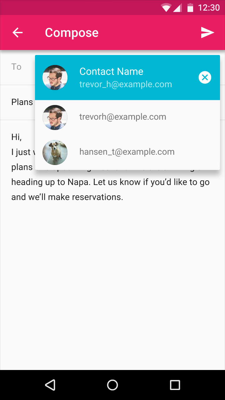
Contact information that users have for people may be represented in a compact way using contact chips. The chips are invoked and inserted into a text field (usually the “To” field) when the user starts typing a contact’s name, sees the contact’s addresses, and selects the correct one. Contact chips can be added directly to a text field from a menu of contacts.

Contact chips efficiently confirm that the user will be sending their message to the correct person.

User confirms email recipient names on contact chips

The user confirms the name(s) of the email recipient(s) on the contact chips.

User confirms email on Material Design contact chip

The user confirms which email address to select on the contact chip.

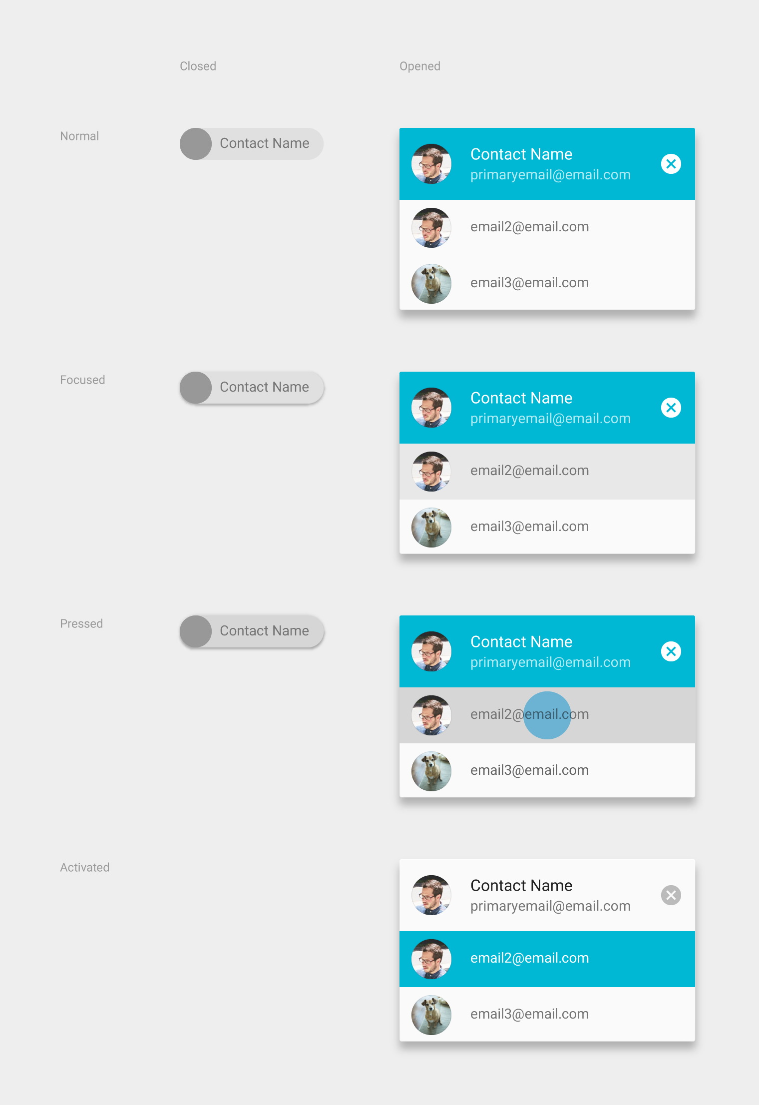
Material Design contact chip states: Normal, Focused, Pressed

The contact chip has different states: Normal, Focused, Pressed, and Activated.

Specs Expand and collapse content An arrow that points down when collapsed and points up when expanded.

Single-line chips

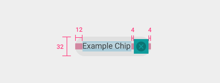
Material Design single-line chips specs

Deletable chip

Height: 32dp
Label left padding: 12dp

Remove icon

Size: 24dp x 24dp
Color & opacity: 54% black
Margin: 4dp

On desktop, the “Remove” icon is persistent.

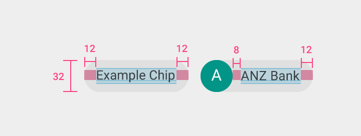
Material Design single-line chips specs

Non-deletable chip

Height: 32dp
Label left and right padding: 12dp

Contact chip

Height: 32dp
Label left padding: 8dp
Label right padding: 12dp

Contact chips

Closed contact chip

  • The contact name text is Roboto Regular 14sp
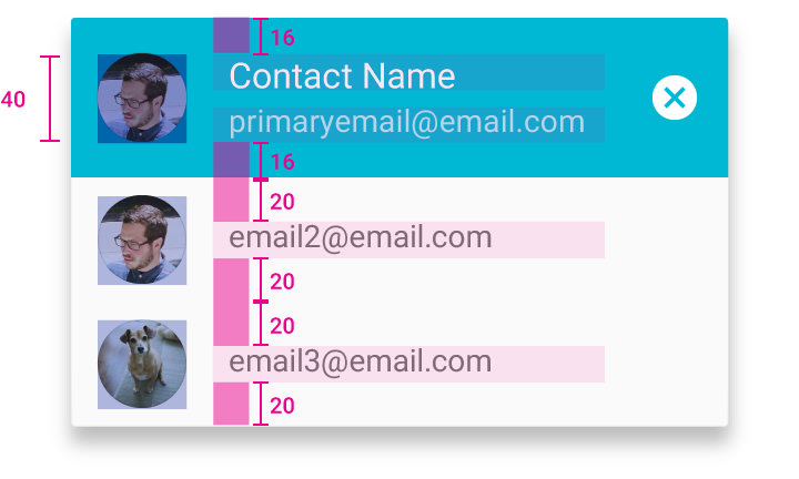
  • Upon focus, the chip rises to an elevation of 2dp. When pressed, it expands to show alternative addresses for the contact.

Open contact chip

  • Contact name text: Roboto Regular 16sp
  • Address text: Roboto Regular 14sp
  • Elevation of the open contact chip is 8dp
  • On press, the contact chip closes automatically
  • By default, the top field is activated and focused
Material Design contact chip element

Contact chip

Height: 32dp
Title top, bottom, and left padding: 8dp
Title right padding: 12dp

Material Design focused contact chip

Focused and activated contact chip

Height: 40dp
Top and bottom padding: 16dp

Unfocused contact chips

Top and bottom padding: 20dp