Patterns Selection

Selection

Selection enables user choices through gestures and visual cues.

Checkboxes indicate completion, such as checking items off a list.

Text selection is indicated by highlighting a segment of text.

Types of selection

Item selection
Text selection

Selection gestures
  • A long-press, touch, or mousedown that’s held in the same position for a moment
  • A two-finger touch (touch devices only)
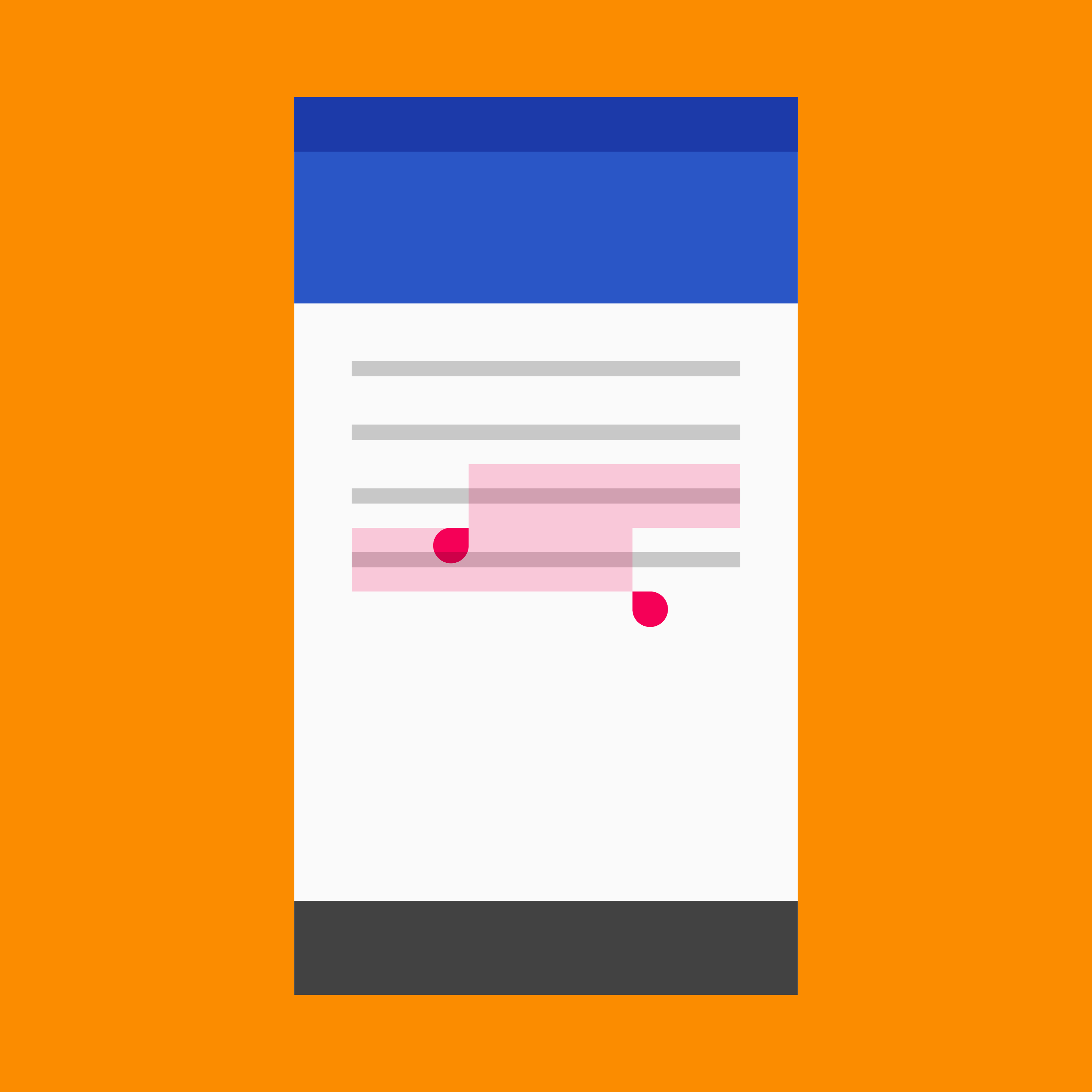
Material Design: Selection through gestures and cues

Usage Expand and collapse content An arrow that points down when collapsed and points up when expanded.

The selection gesture

The global gesture to select data is a long-press, touch, or mousedown that’s held in the same position for a moment. A two-finger touch may also trigger selection on touch devices.

Checkboxes (Recommended for desktop)

Checkboxes, or custom analogs, should only be used to indicate completion, such as checking items off lists.

Checkbox behaviors:

  • When hovering over an item, display a single checkbox for that item
  • After an item is selected, display checkboxes for all remaining items in that set

Avoid persistently displaying checkboxes as part of each item.

Item selection Expand and collapse content An arrow that points down when collapsed and points up when expanded.

Item selection allows users to apply actions to selected items.

Selecting items

On touch devices, select an item by pressing and holding it.

To exit selection mode, deselect all items or perform an action on selected items using the toolbar.

On touch devices, select an item by pressing and holding it.

Toggling selection on and off

To toggle an item between selected and unselected states, tap the item.

To select multiple items, long press and drag the cursor.

Once an item is selected, tap the item to toggle its selection.

Users may long press and drag to select items using the cursor.

Desktop

To toggle selection on desktop, hover over an item to reveal a check mark which can be clicked.

On desktop, users may click and drag across checkboxes to select multiple items.

Indicating selection

To indicate that an item is selected, display a check mark and scrim overlapping the item, or its associated avatar.

Checkmarks replace icons or avatars if there is space.

Use compact checkmarks to minimize the hiding the amount of content displayed.

.

Text selection Expand and collapse content An arrow that points down when collapsed and points up when expanded.

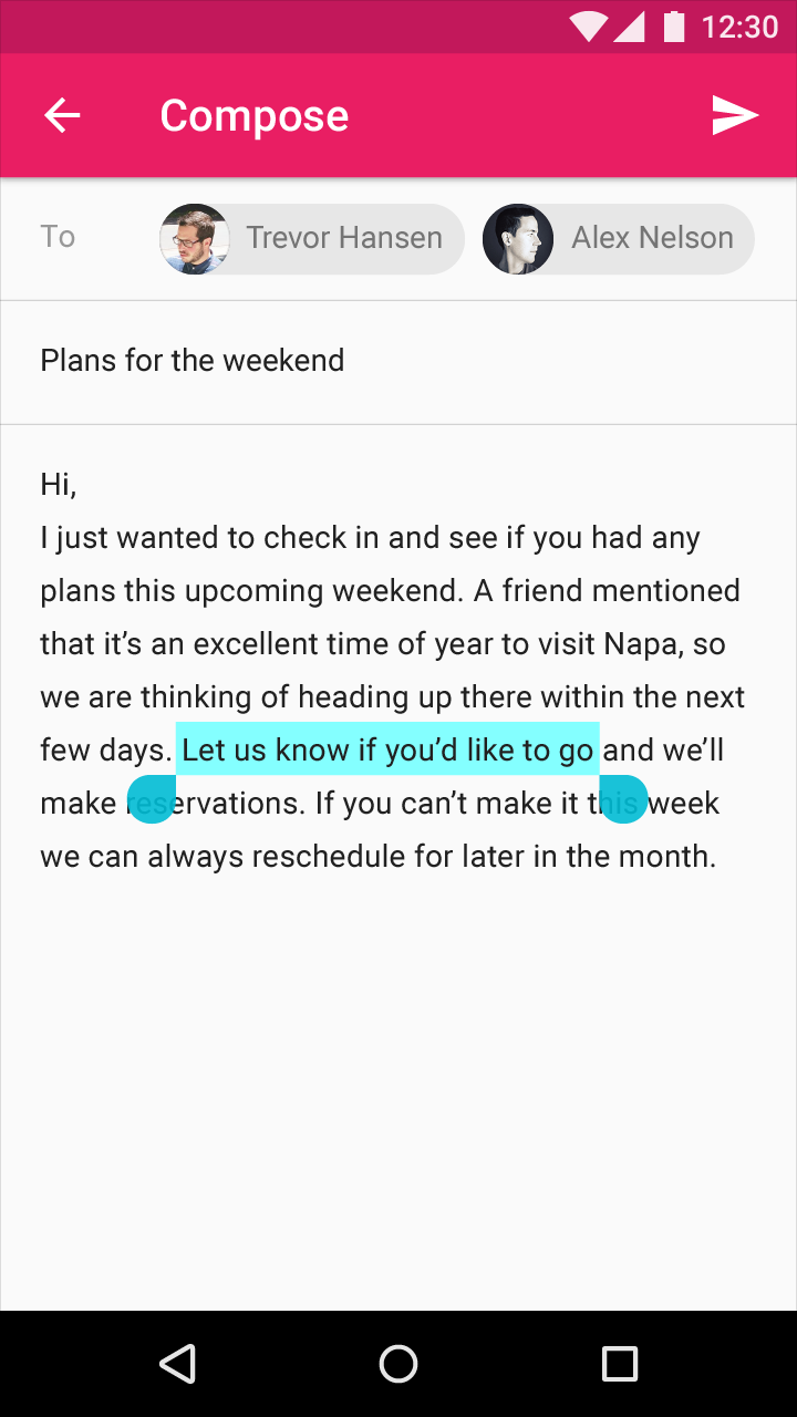
Text selection is indicated by highlighting a contiguous segment of text.

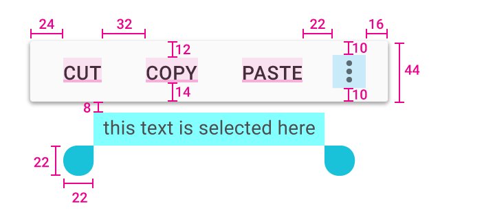
On mobile, a selection handle is added to both the beginning and end of a selection. Actions related to the text appear in a dropdown menu positioned immediately above, but not overlapping, the selection.

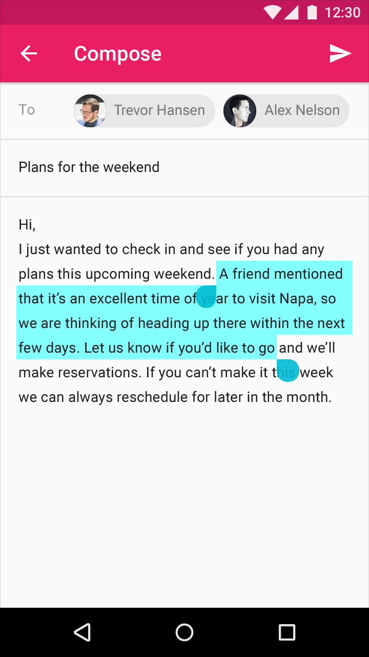
Adjusting selected text

The user may adjust which text is selected by:

  • Dragging the initial selection to expand it
  • Dragging either of the selection handles to expand or reduce the selection
  • Touching (or clicking) repeatedly within the selection to expand it (Selection will toggle between a single word, paragraph, or all text)
  • Keyboard shortcuts (see table)

Keyboard shortcut

Result

Shift+Left/Right Arrow

Character-by-character selection

Shift+Up/Down Arrow

Line-by-line selection

Ctrl/Command+A

Select all

Text selection keyboard shortcuts can be used to alter the selection bounds.

Text selection handles

Material Design text selection handles example

Example of text selection handles

Material Design text selection handles example

Example of text selection handles

Color and contrast

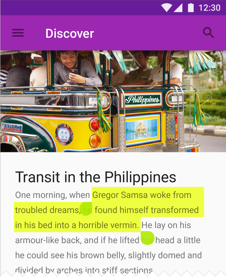
Text selection elements may reflect your color palette by using your accent color.

Selected text should be legible, with noticeable contrast against its background color. Alternatively, selected text may be indicated by displaying outlines, text treatments, motion, or checkmark icons.

Learn more about contrast (or try a color contrast analyzer) at webaim.org.

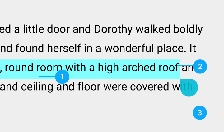
Material Design: Use accent color for text selection
  1. Text selection color
  2. Text
  3. Background
Customizable text selection with Material Design colors

Text selection can be customized using your palette accent color.

Text selection – Light theme

Light theme text selection in Material Design

Text selection – Light theme

Text selection – Dark theme

Text selection in Material Design dark theme

Text selection – Dark theme

Text selection toolbar

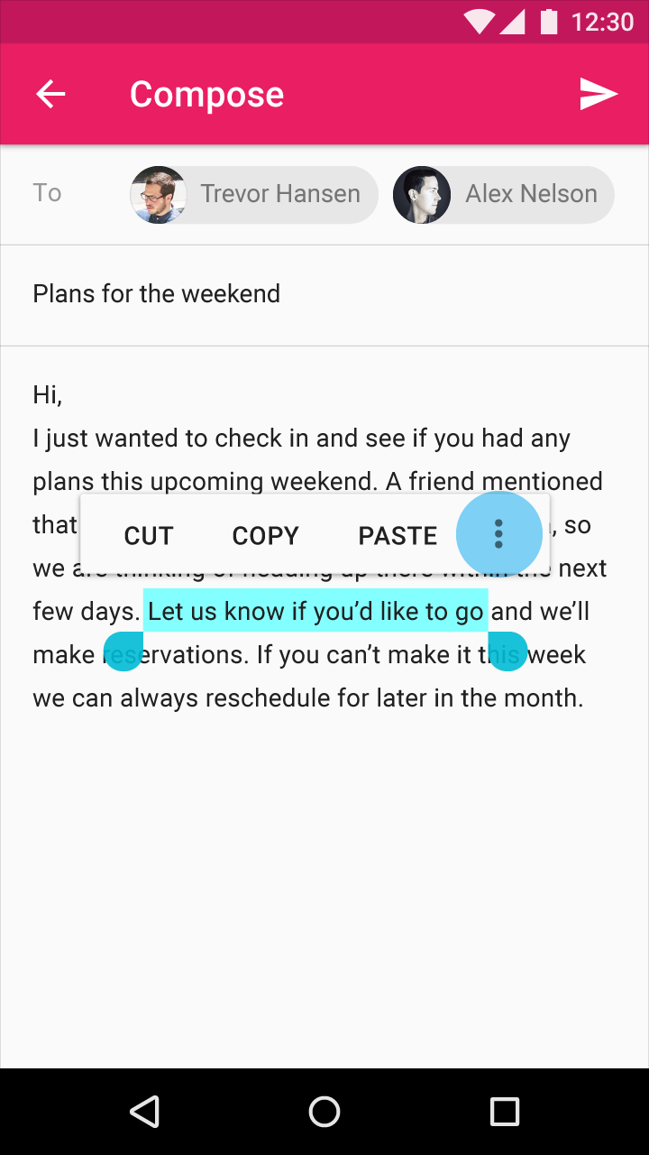
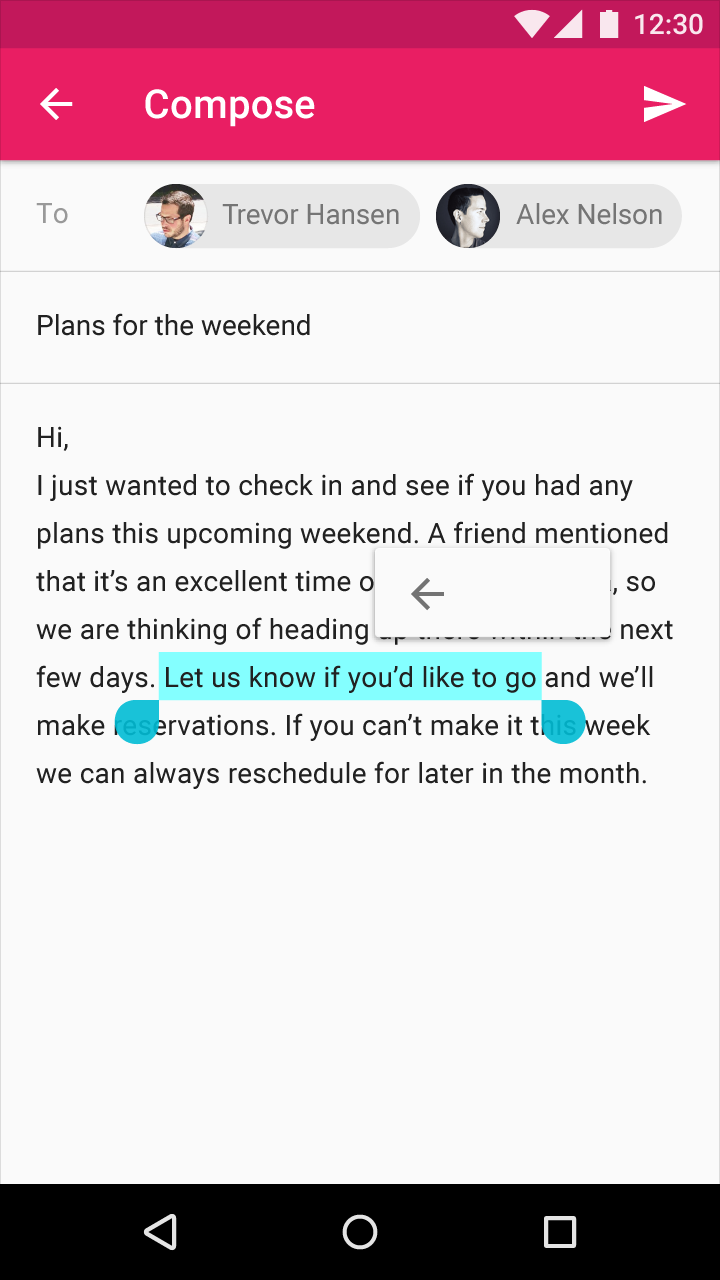
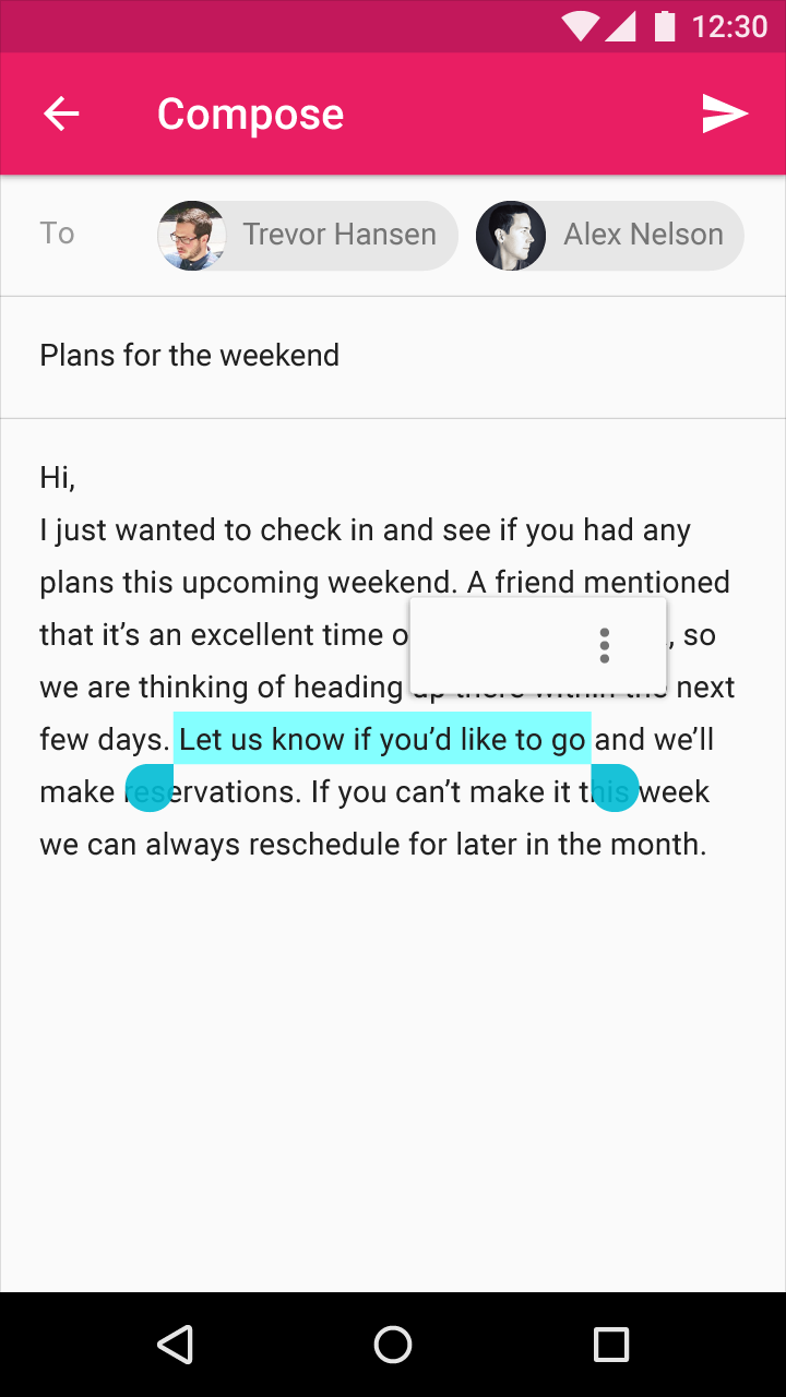
The floating toolbar appears above the selection area with primary actions of Cut, Copy, Paste, and More. When the user selects the More icon, the toolbar collapses and transforms into a secondary menu to reveal additional actions.

The font for the floating toolbar text is Roboto Medium 14sp, all caps.

Material Design dropdown menus for Cut, Copy, Paste options

Dropdown menus for Cut, Copy, Paste, and More appear above the selection area.

Material Design more menus

More

Material Design: Menu transitions to show overflow items

When the user selects More, the menu begins transitioning to show the overflow items.

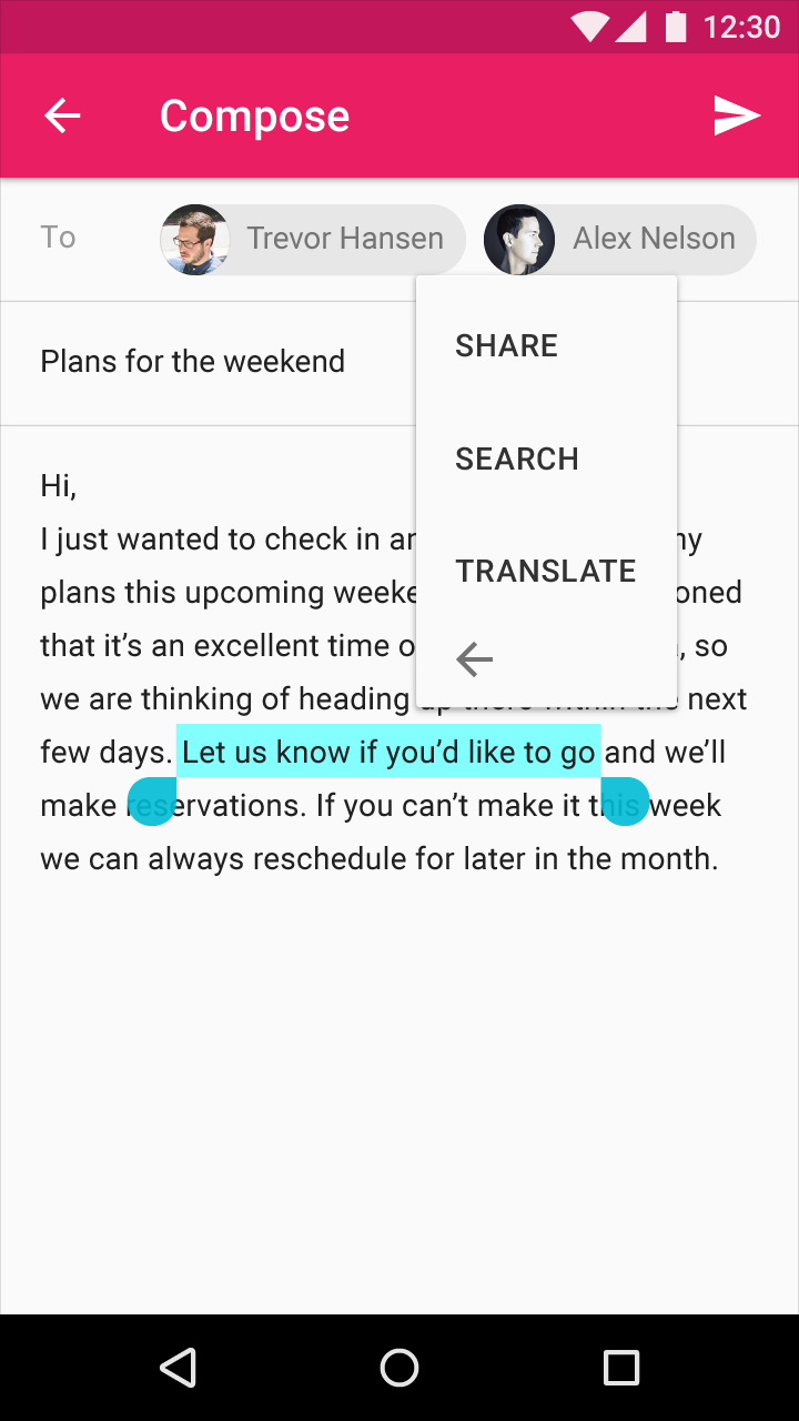
Material Design overflow menu: Share, Search, Translate

Overflow menu items: Share, Search, and Translate

Material Design text selection feature

Text selection

Dropdown menu height: 44dp
Dropdown menu text top padding: 12dp
Dropdown menu text top padding: 14dp
Dropdown menu text left padding: 24dp

Dropdown menu space between menu text items: 32dp
Selected text top padding: 8dp

Expansion icon right padding: 16dp

Expansion icon left padding: 22dp
Expansion icon top and bottom padding: 10dp
Text selection handles: 22 x 22 dp