Action | Description | Touch mechanics |
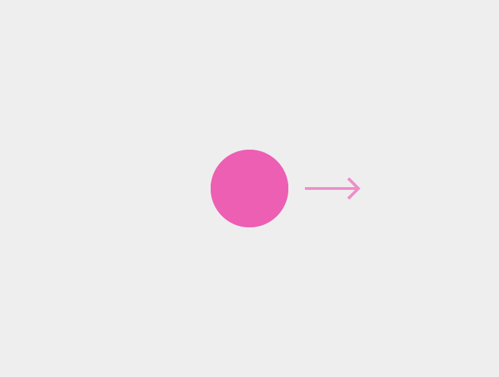
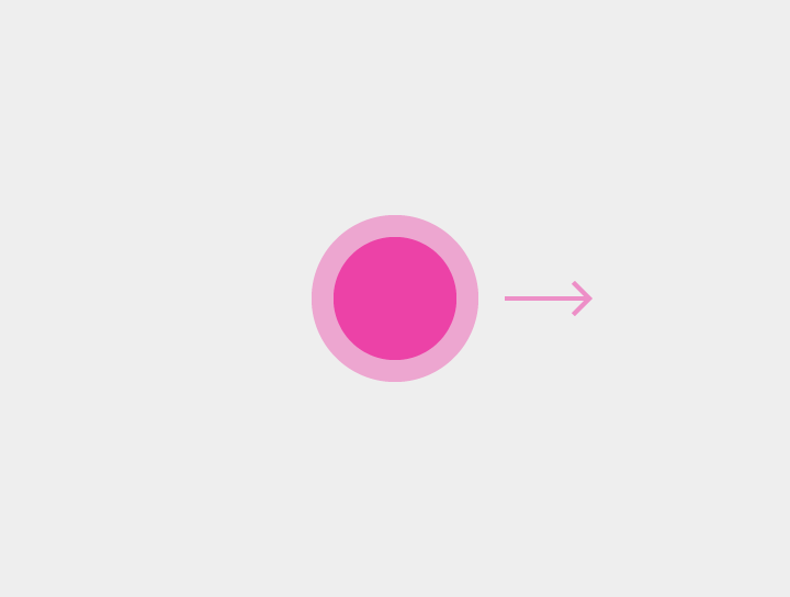
Activate | Activates a screen element, like a button | Touch |
Cancel or Escape | Cancels or escapes out of the current task, as in dialogs or menus | Touch |
Enable/Disable lights out | Hides or shows a view’s chrome | Touch |
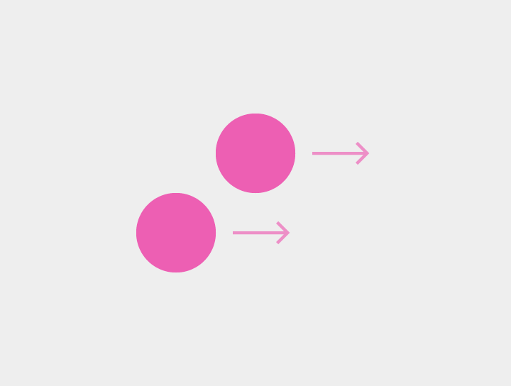
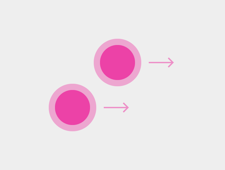
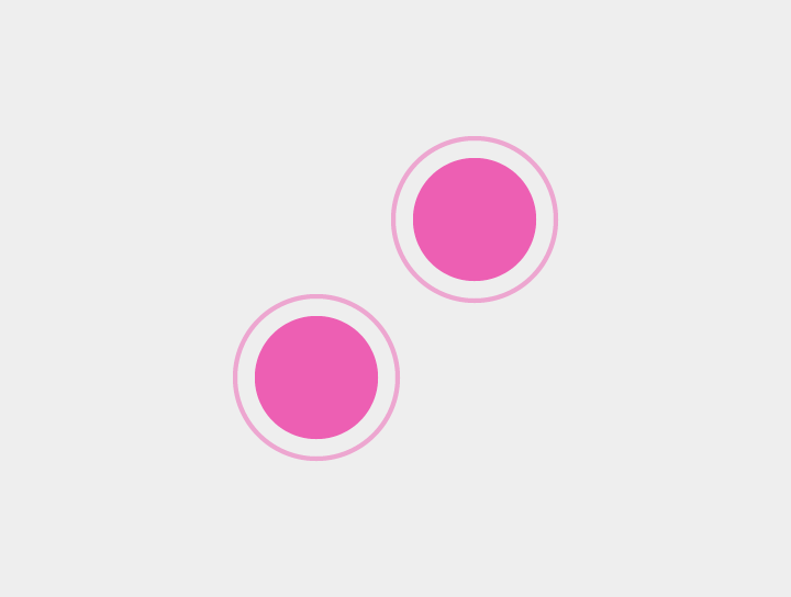
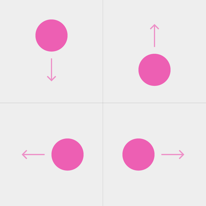
Drag or Swipe or Fling | See the following section Drag, swipe, or fling details for distinctions between Scroll, Reveal upon scroll, Pan, Dismiss, Swipe to refresh, Edge swipe, Paging swipe, Overscroll collapse, Menu open, and Tilt | Drag, Swipe, or Fling |
Data selection (when nothing is selected) | Selects a single element | Long press, two-finger touch |
Data selection (when items are already selected) | Selects additional elements while in selection mode
Can use any combination of subsequent one- or two-finger gestures | Touch, two-finger touch |
Data multi-selection drag | Reveals selection box that originates from point of gesture initiation
The height and width can be adjusted based on finger position.
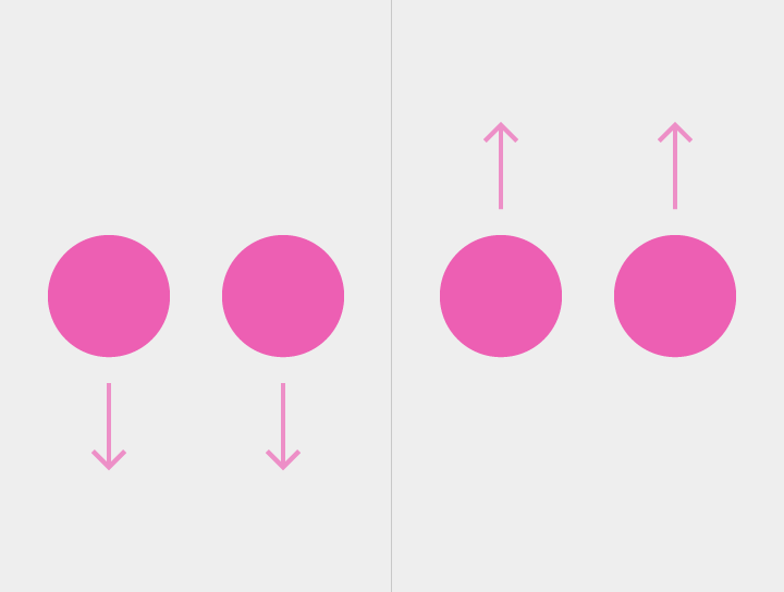
The final selection is based on selection box dimensions upon finger(s) lifting. | Two-finger swipe or drag, long-press drag with no items selected |
Pick up and move | Affects the selected item or items. It can be used to: - Rearrange data within a view
- Move an item into a container or onto a target
- Reorder items in a list or a card collection
| Two-finger long-press drag, long-press drag on selected item |
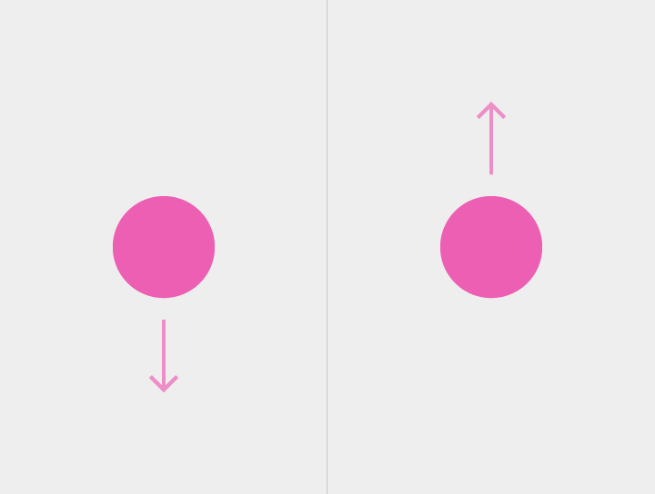
Zoom in | Scales up content | - Double-touch
- Double-touch drag (down)
- Pinch open
|
Zoom in to fit | For nested views, scales up the smallest targetable view | Double-touch |
Zoom out | Scales down content | - Double-touch at maximum zoom
- Double-touch drag (up)
- Pinch closed
- Two-finger touch
- Two-finger double touch
|
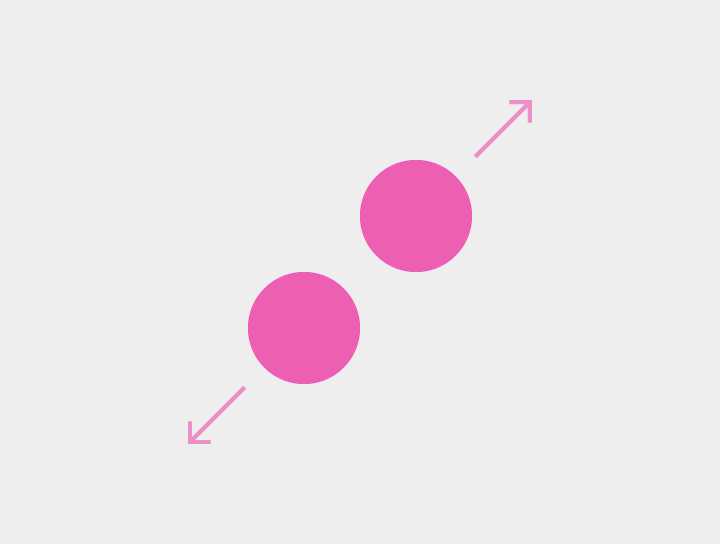
Expand | Expands collapsed content | Pinch open |
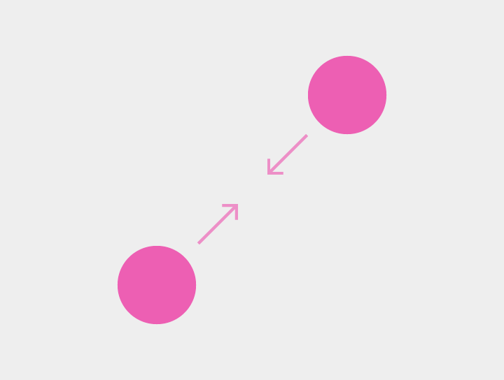
Collapse | Collapses expanded content | Pinch closed |
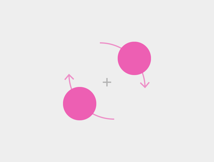
Rotate | Rotates the targeted content | Rotate |
