Patterns Errors

Errors

Errors occur when an app fails to complete an expected action.

Some examples of errors include:

  • When user input is not understood
  • An app failing to load
  • Incompatible operations are run concurrently
Types of errors

User input errors
App errors
Incompatible state errors

Specific error patterns

Forms
General usage errors
Sync errors
Connectivity
Permissions

Material Design errors in app actions

Usage Expand and collapse content An arrow that points down when collapsed and points up when expanded.

Errors occur when an app fails to complete an action, such as:

  • The app does not understand user input
  • The system or app fails
  • A user intends to run incompatible operations concurrently

Minimize errors by designing apps that make it easy for users to input information flexibly. Apps should accept common data formats that use affordances to improve user understanding.

To address errors:

  • Clearly communicate what is happening
  • Describe how a user can resolve it
  • Preserve as much user-entered input as possible

User input errors Expand and collapse content An arrow that points down when collapsed and points up when expanded.

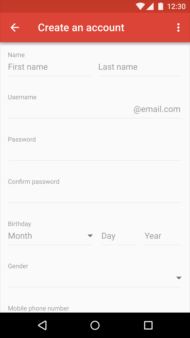
Help users fix input errors as soon as they are detected. Disable the submission of a form if errors are detected, and if detected only after form submission, clearly explain the error and how to fix it.

Text field input

Helper text may be included before, during, or after a user interacts with each field on a form.

Show error text only after user interaction with a field. If the user inputs incorrect data, helper text may transform into error text.

Minimize form text to the essentials. Not every text field needs helper and/or error text.

Specification:

Place 16dp of vertical space between text fields and below the error text.

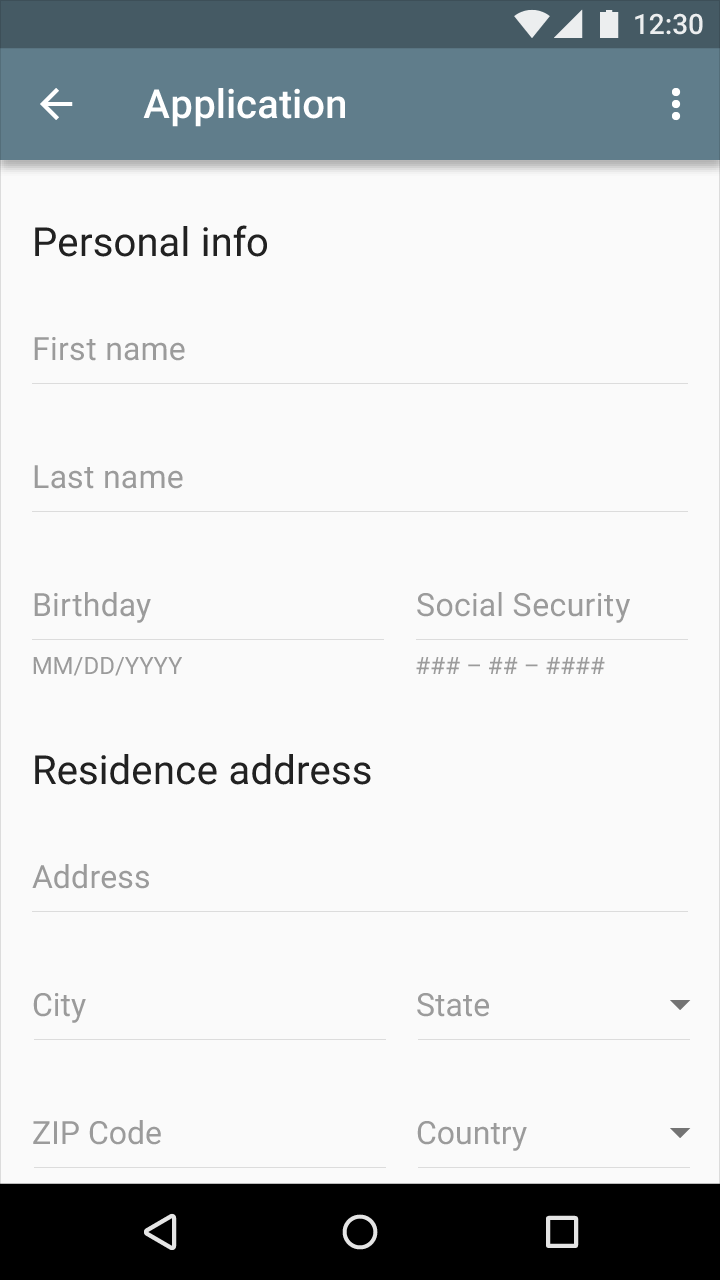
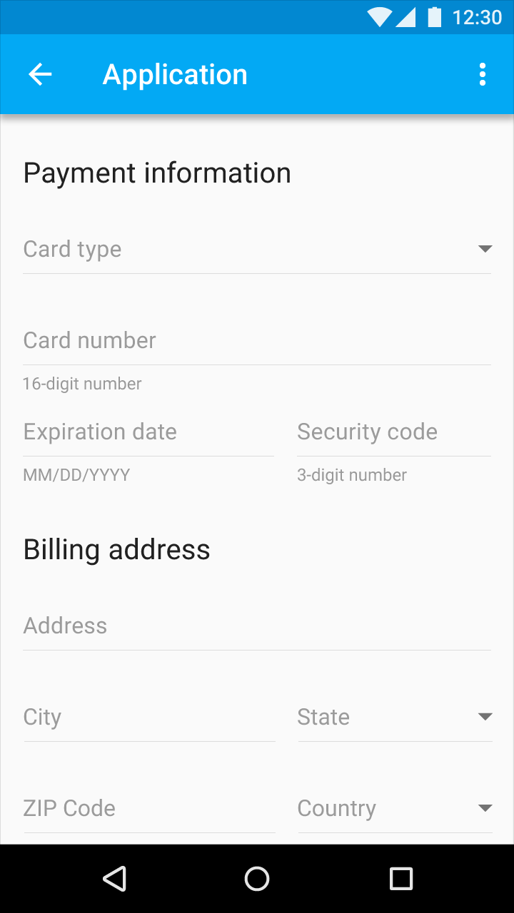
Material Design text field input example

Example of a text field input

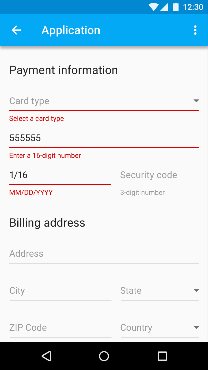
Material Design text field input with error message

Example of a text field input with error text

Form submission

The Submit button should be enabled by default.

If you are performing inline form validation, and the field with the error is clearly marked, the submit button may be disabled until the error is corrected.

Color

Error text should reflect your product’s color palette. It’s recommended that you use a contrasting color for error states, such as a warmer hue like red or orange.

Error text should be legible, with noticeable contrast against its background color.

Sites such as webaim.org offer color contrast checking tools.

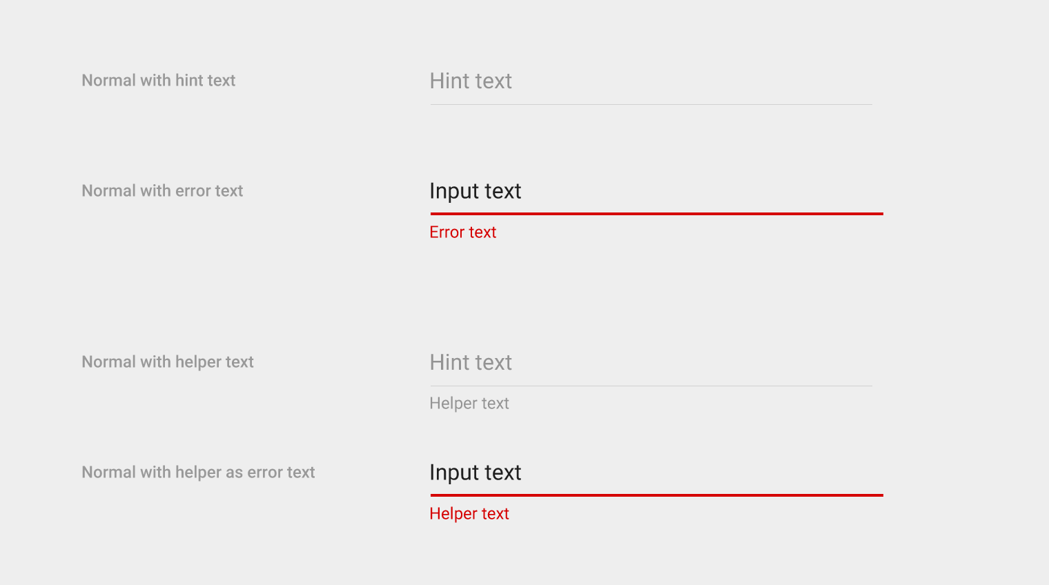
Fonts for light backgrounds

  • Errors: Roboto Regular 12sp
  • Hint and helper text: #000000 with 38% opacity
Material Design light theme for various text states

Light theme for these states: normal with hint text, normal with error text, normal with helper text, and normal with helper as error text

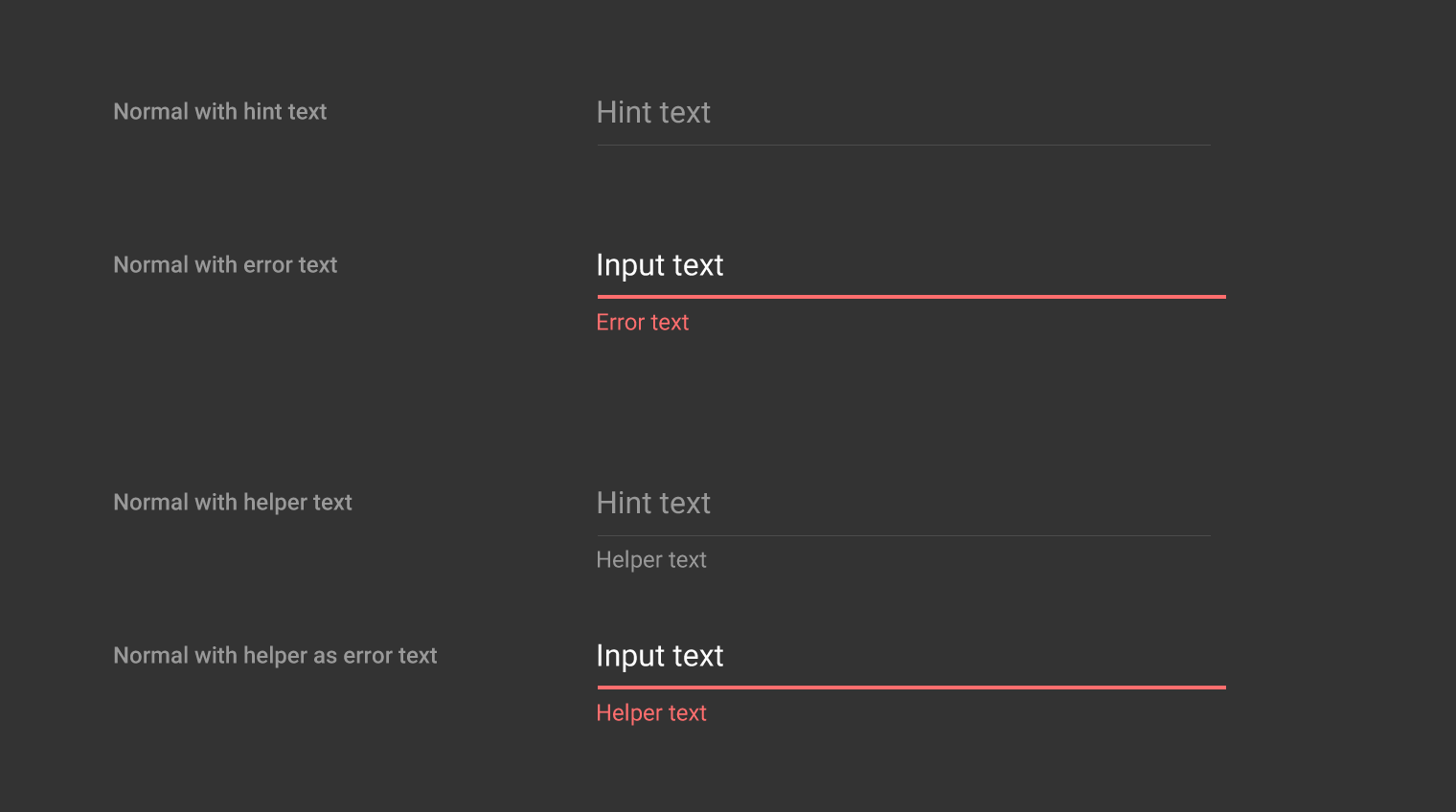
Fonts for dark backgrounds

  • Errors: Roboto Regular 12sp
  • Hint and helper text: #FFFFFF with 50% opacity
Material Design dark theme for normal and error states

Dark theme for these states: normal with hint text, normal with error text, normal with helper text, and normal with helper as error text

Helper and error text

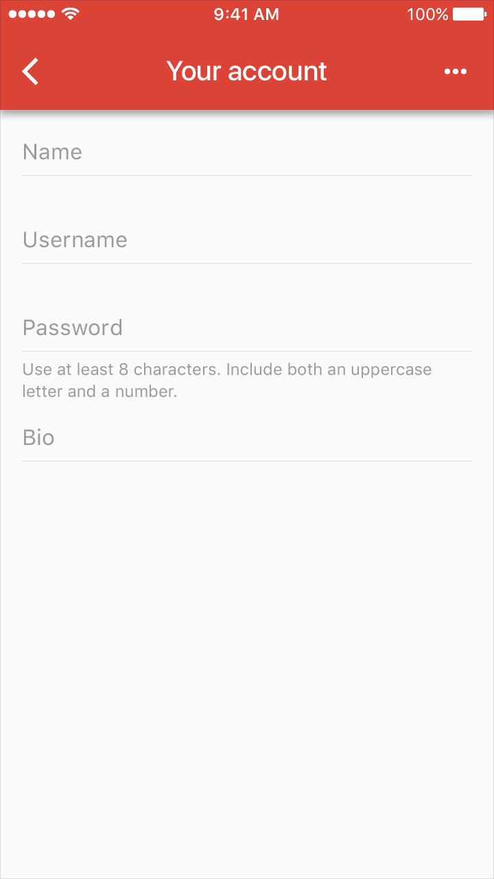
Example with helper text in Material Design

Example with helper text

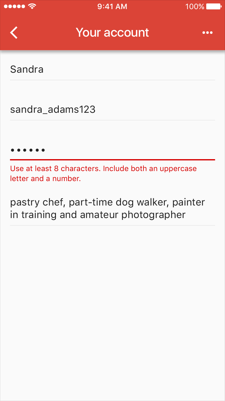
Material Design example with error text

Example with error text

Example with helper text in Material Design

Example with helper text

Material Design example showing error text

Example with error text

Material Design normal state with helper and error text

Examples of normal with helper text and normal with helper and error text

Material Design input and error text example

Input and error text

Tile height: 64dp
Padding above input text: 16dp
Padding below input text: 8dp
Padding above and below error text: 4dp

Error with floating text label

Material Design floating text label with input field

Example of floating text label with input text

Material Design floating text label with error message

Example of floating text label with error text

Material Design: Normal and error input examples

Examples of normal with hint text/label and normal with input text, label and error

Floating text label specifications in Material Design

Specs for floating text label

Tile height: 80dp
Padding above label text: 8dp
Padding above and below input text: 8dp
Padding above and below error text: 4dp

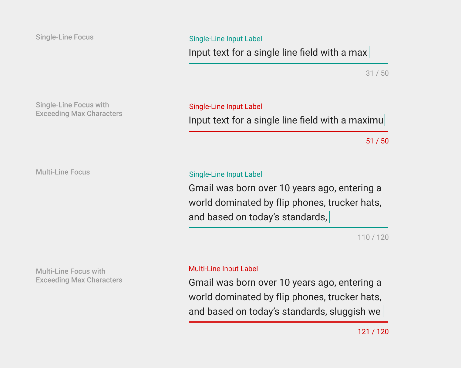
Text field input - Over/under character or word count

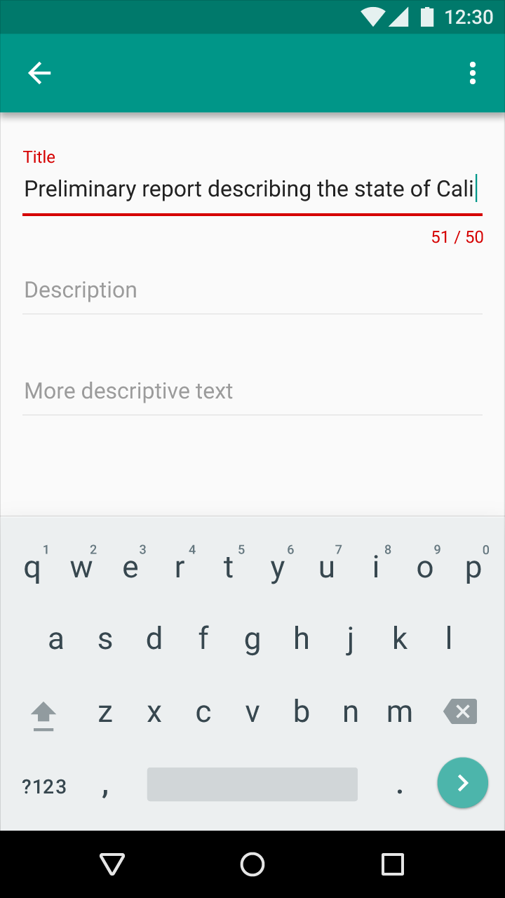
A character counter may be displayed before, during, and after user interaction with a field. Consider not displaying the counter until the user approaches the character limit.

  • Counter font is Roboto Regular 12sp
  • Counter fields have 16dp of additional bottom padding
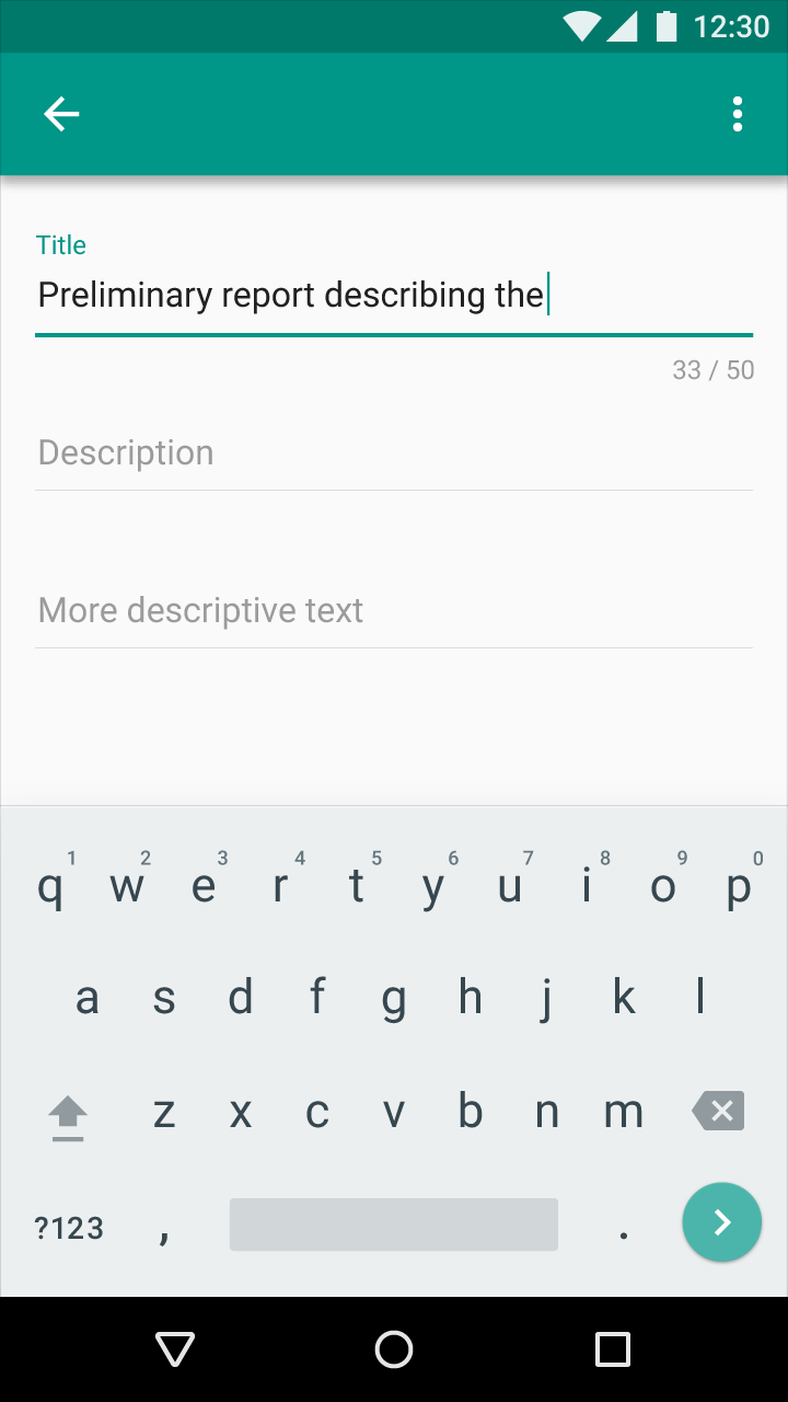
Single-line with character counter

Material Design single-line input with character counter

Example of a single-line input label with character counter and user input text

Material Design single-line input with character counter

Example of a single-line input label with character counter and error text

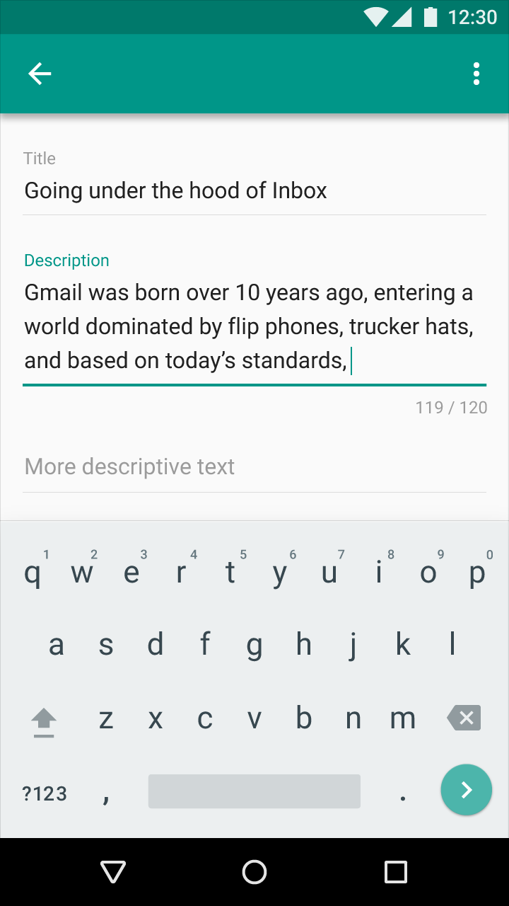
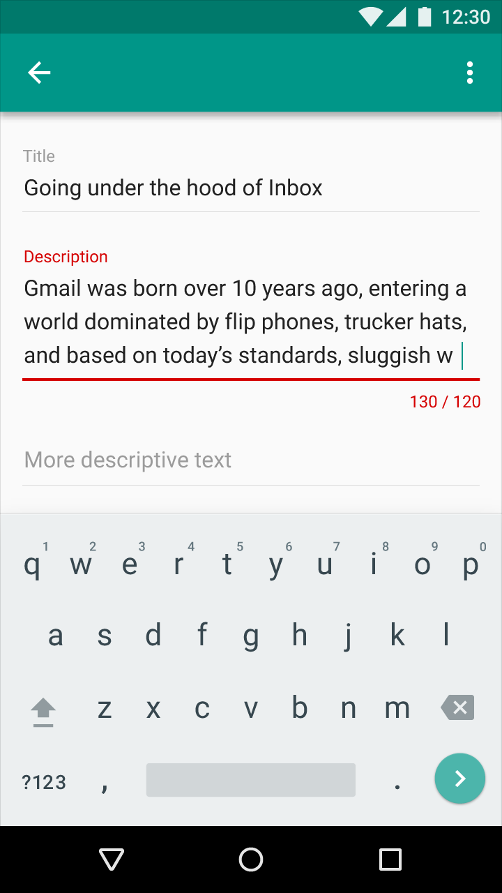
Multi-line with character counter

Material Design multi-line input with character counter

Example of a multi-line input label with character counter and user input text

Material Design multi-line input with counter and error

Example of a multi-line input label with character counter and error text

Material Design input states with user and error text examples

Examples of these states: single-line input label with user input text, single-line input label with error text, single-line input label with user input text, and multi-line input label with error text

Material Design text field input

Text field input

Height of entire input area: 88dp

Single-line input label top padding: 16dp
Top and bottom padding for input text for a single-line field: 8dp
Padding above counter: 8dp
Incompatible values

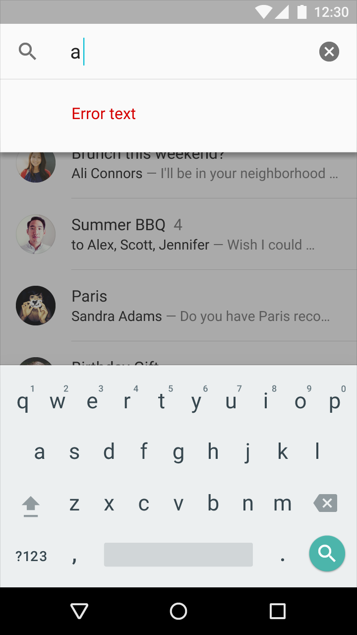
Show errors for incompatible values during or after a user interacts with a text field.

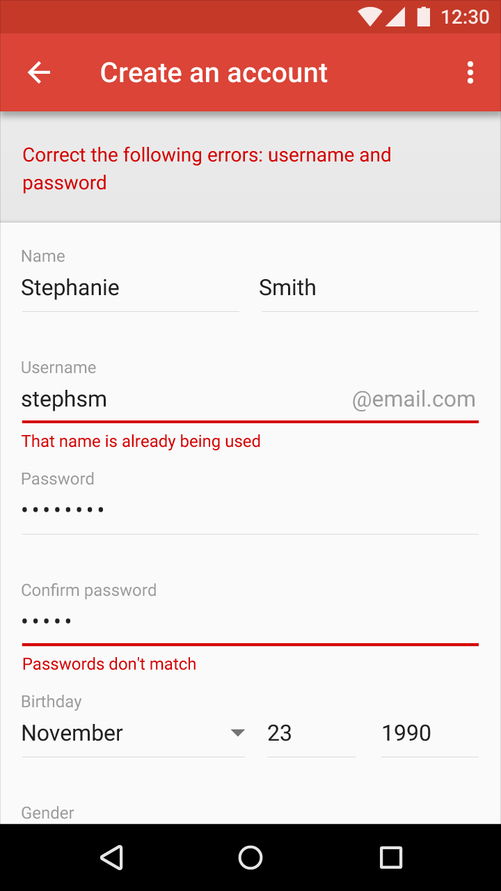
If two or more fields have incompatible inputs:

  • In the text field, indicate a fix is needed. Add an error message below.
  • Display a message at the top of the form, or screen, summarizing the fixes needed and any additional explanation

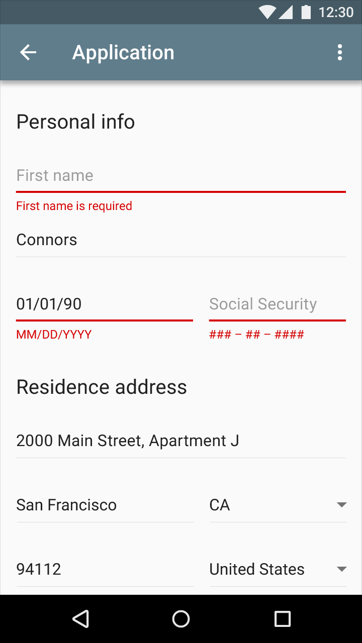
Errors detected upon form submission

Reload the form with consolidated error messages and scroll position at the top. Error messages for individual fields may be resolved as the user works through the form.

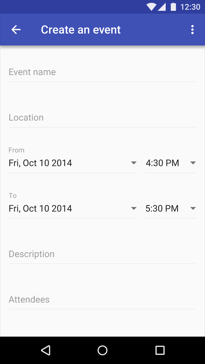
Material Design form example

Example of a form

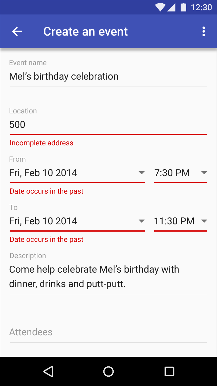
Material Design: Form submission error examples

Example of errors detected after attempted form submission

Incomplete form

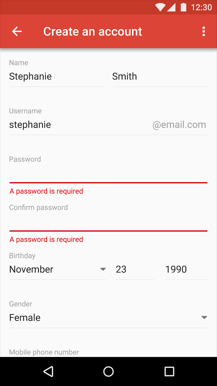
Empty form fields should be indicated by both the text field and error message below.

Display incomplete form errors to indicate a user has skipped a field after they have advanced through a form. If unable to detect user progress through the form, display an error after the user has attempted to submit the form.

Multiple errors before form submission

Individually label error messages as the user works through the form.

Material Design form example

Example of a form

Material Design example of an incomplete form

Example of an incomplete form

Single-line list error

Single-line list error example in Material Design

Example of a single-line list error

App errors Expand and collapse content An arrow that points down when collapsed and points up when expanded.

App errors occur independent of user input.

General app error

When an error occurs, an app should display loading indicators until the error message appears.

Features not available may be indicated as disabled in the UI. For example, a button not may be displayed in a disabled state, paired with text explaining it is not available. Not every error requires a new component to pop up.
If possible, give your user an action that will help them address the error.

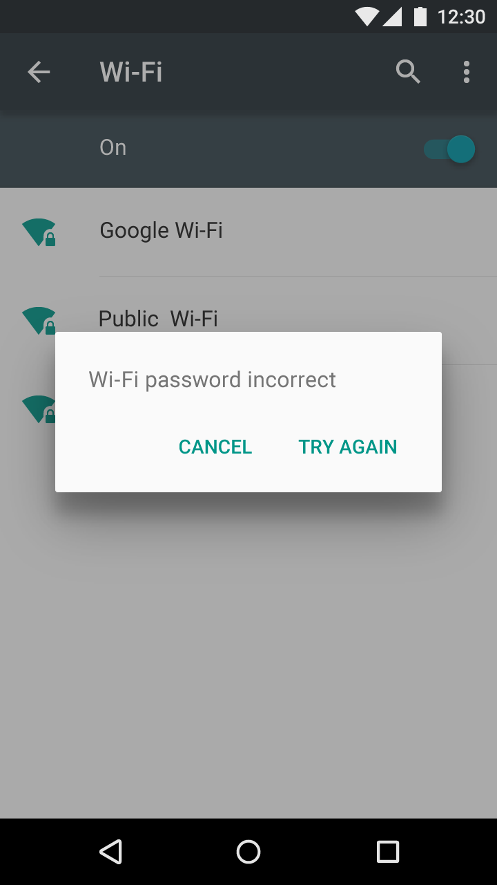
Material Design alert dialog for app error feedback

Alert dialog: app feedback about an error that is blocking normal operation

Material Design snackbar for app feedback on errors

The snackbar contains app feedback about a peripheral error. Snackbars are transient. Don't use them for critical, persistent, or bulk errors.

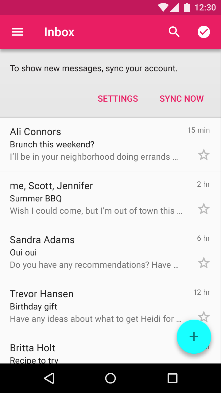
Sync error/failure to load

When sync is down or content has failed to load, the user should be able to interact with as much of the rest of the app as possible.

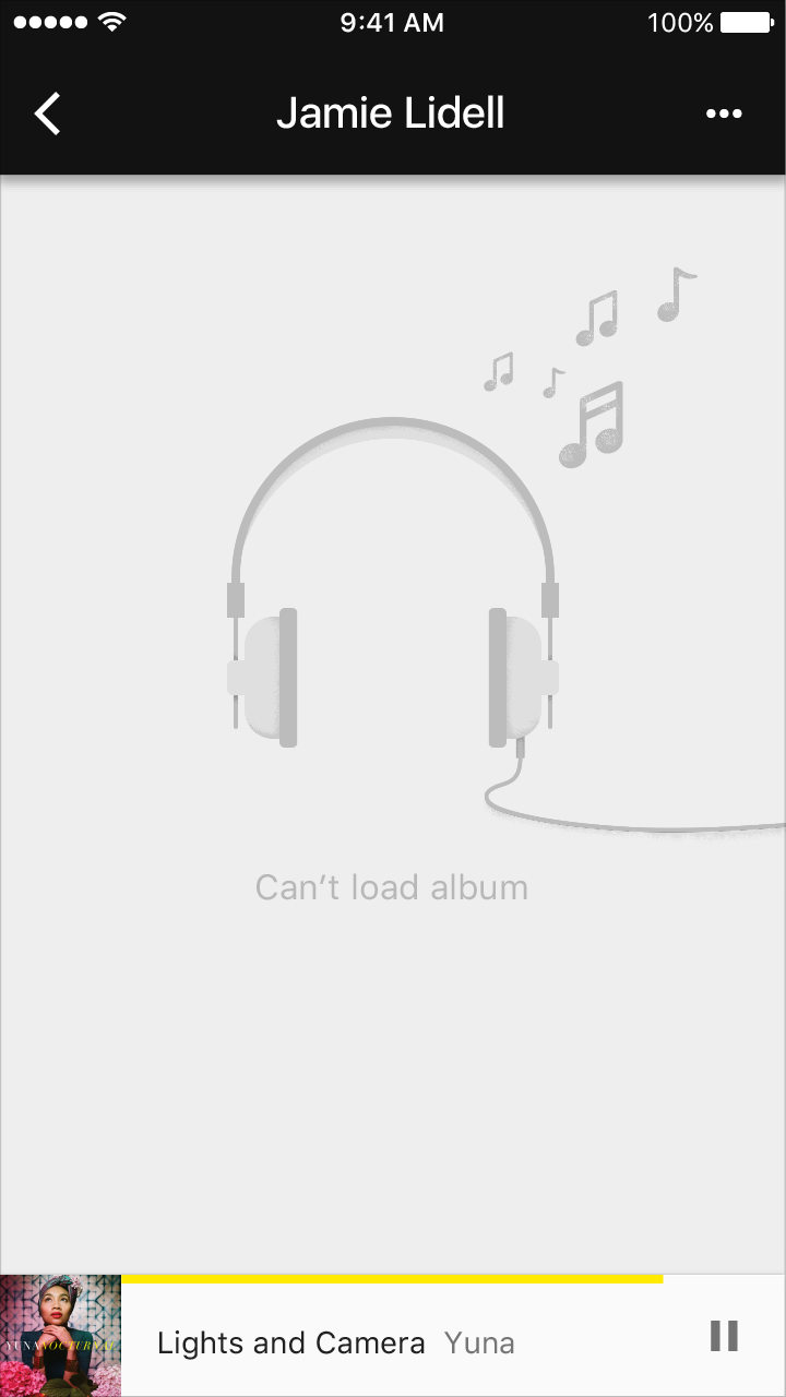
Material Design empty state for loading failure

Empty state for the screen/content failing to load

Material Design component error with action

Container/component specific error with action

Connectivity

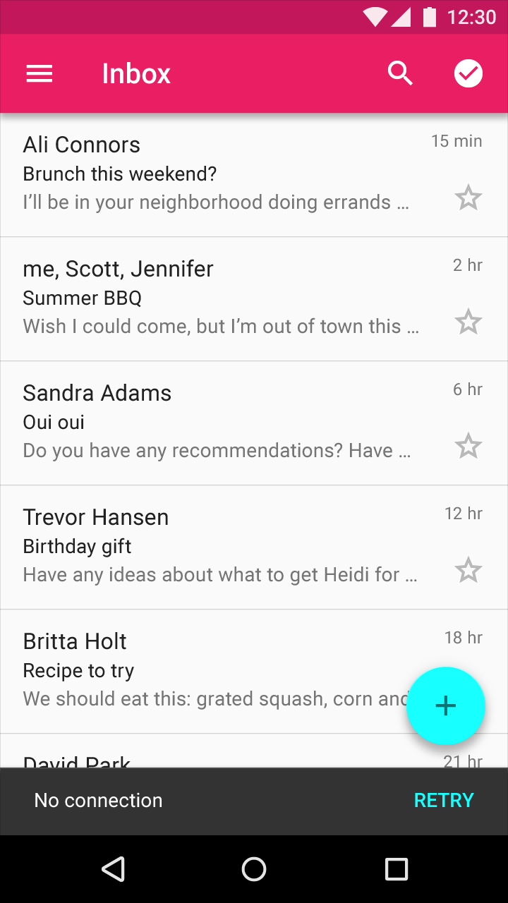
When connectivity is down, the user should be able to interact with as much of the rest of the app as possible.

If appropriate, present a link to help a user accomplish their task. Only offer links that you can actually support. For example, don't offer an option like "Try again" in cases where you can detect that the operation will fail.

Material Design Snackbar with retry action

Snackbar with action to retry

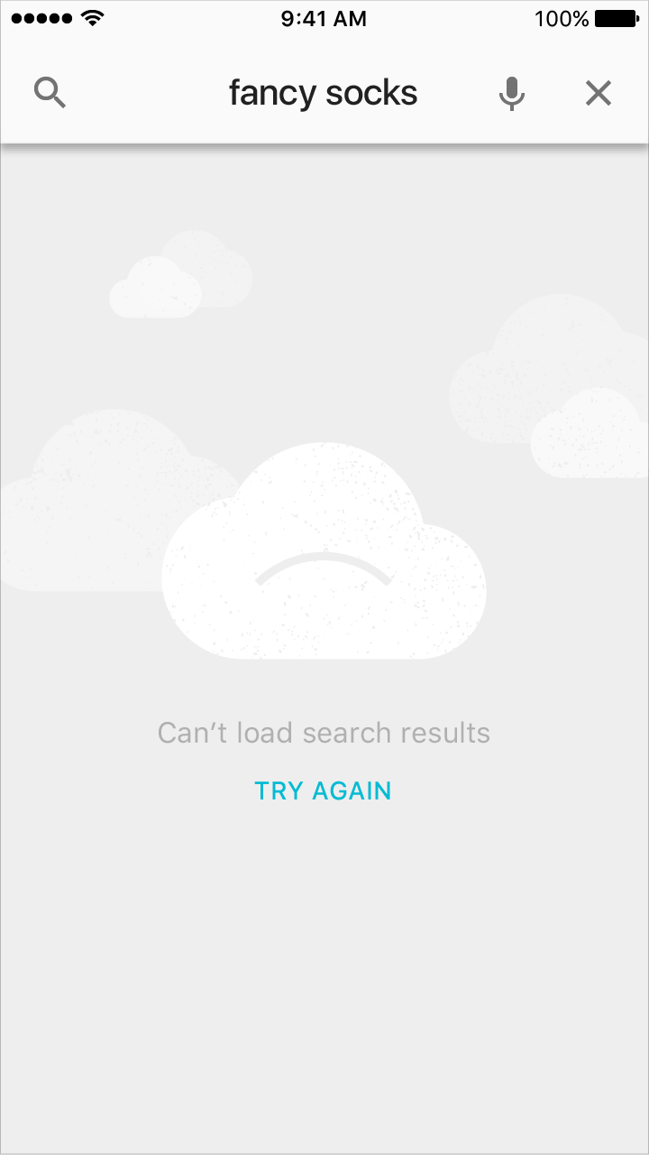
Material Design empty state for online-only screen

Empty state for a screen that is only available online

Incompatible state errors Expand and collapse content An arrow that points down when collapsed and points up when expanded.

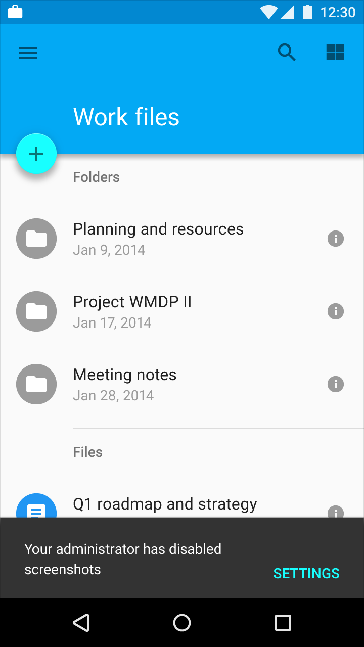
Incompatible state errors occur when users attempt to run operations that conflict, such as making a call while in airplane mode or taking a screenshot from a restricted work account. Help prevent users from putting themselves into these situations by clearly communicating the states they are selecting and the implications for the rest of their experience. When these errors are triggered, do not imply that they are the user’s fault.

General incompatibility

Clarify the reason for and origination of the error.

For example, screenshots and premium features are not allowed while in a restricted mode.

Material Design Snackbar with special mode indicator

Snackbar + special mode indicator

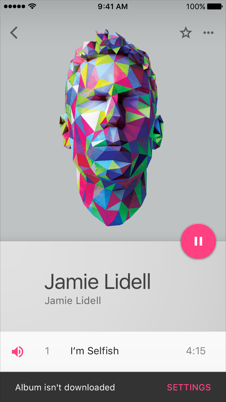
Offline by choice

Display an unobtrusive, persistent indicator when users are offline but try to do tasks that require being online.

Examples:

  • Placing a call while in airplane mode
  • Music availability while offline
Material Design Snackbar

Snackbar

Material Design airplane mode indicator

Indicator that the device has been placed into airplane mode.

Permission requested

If your app requires user permission before proceeding with an action, include the permission request in the app flow instead of treating it as an error.

If permissions are necessary before the first run of an app, consider including them into your app’s first-run experience.

Examples:

  • An app’s permissions have changed
  • In-app purchases have been disabled
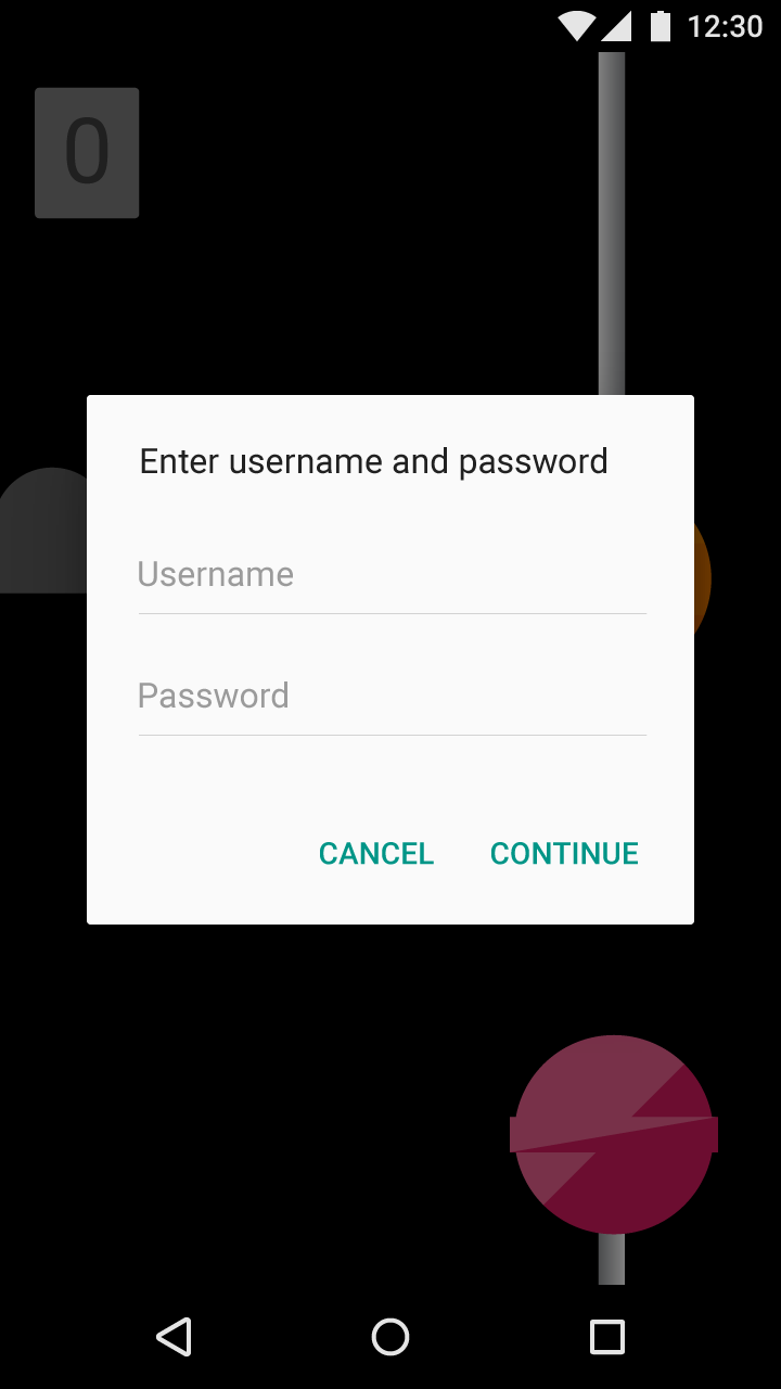
Material Design Dialog

Dialog