Growth & communications Feature discovery

Feature discovery

Provide value and improve engagement by introducing users to new features and functionality at relevant moments.

Design patterns Expand and collapse content An arrow that points down when collapsed and points up when expanded.

Single-step actions

Prompt users to try features or functionality that can be completed in a single tap, such as saving a location in a map app.

Tap target
Material Design feature discovery hint text

Hint text

Multiple-step actions

Prompt users to try features or functionality that require more than one tap to complete, such as turning on automatic backup in a photo app.

Guided flow

Targeting & triggering Expand and collapse content An arrow that points down when collapsed and points up when expanded.

Feature discovery prompts have more impact when they are presented to the right users at contextually relevant moments. When presented to the wrong user at the wrong time, they can be intrusive and annoying.

Targeting

Display features that are relevant to specific users.

Target the right users

Prioritize the right features

Show feature prompts to users who have not tried those features.

Avoid showing advanced features to more casual users.

Present general features to all users, such as undoing sent mail in Gmail.

Feature discovery should continue over time.

Prioritize features that are relevant to user context, not just features that are new.

Triggering

Time the display of feature discovery prompts appropriately.

Don’t present upon opening an app

Contextually relevant moments

Natural pauses

Users may be less likely to find a feature discovery prompt helpful upon opening an app if they’re opening it to take a specific action.

Avoid displaying feature discovery prompts at interruptive moments.

Present feature discovery prompts at moments when they will help the user better complete the action they’re taking.

For example, let a user know they can crop an image only after they’ve added an image.

If you can’t set feature discovery prompts to display when triggered by specific actions, display them during natural pauses in the user experience.

For example, in a mail app, wait until the user has read or sent a message to display a feature discovery prompt.

Volume & frequency Expand and collapse content An arrow that points down when collapsed and points up when expanded.

Volume and frequency

A user’s interaction with a message signals their satisfaction with it and informs when to show the next message.

Volume

Frequency

Limit the number of feature discovery messages you present in your UI. For example, don’t display more than one per session.

If the user dismisses a message, don’t show it or a similar message again for a more substantial period of time.

If the user accepts a message, it’s a good signal that the user found it useful. It’s okay to display a similar message in a shorter period of time.

Design Expand and collapse content An arrow that points down when collapsed and points up when expanded.

Feature discovery scenarios

Feature discovery scenarios and app UIs have specific material design components.

Feature discovery scenario

Design component

Prompts for actions that can be completed in a single tap

Tap target, hint text

Prompts for actions that require more than one interaction

Guided flow

Tap target

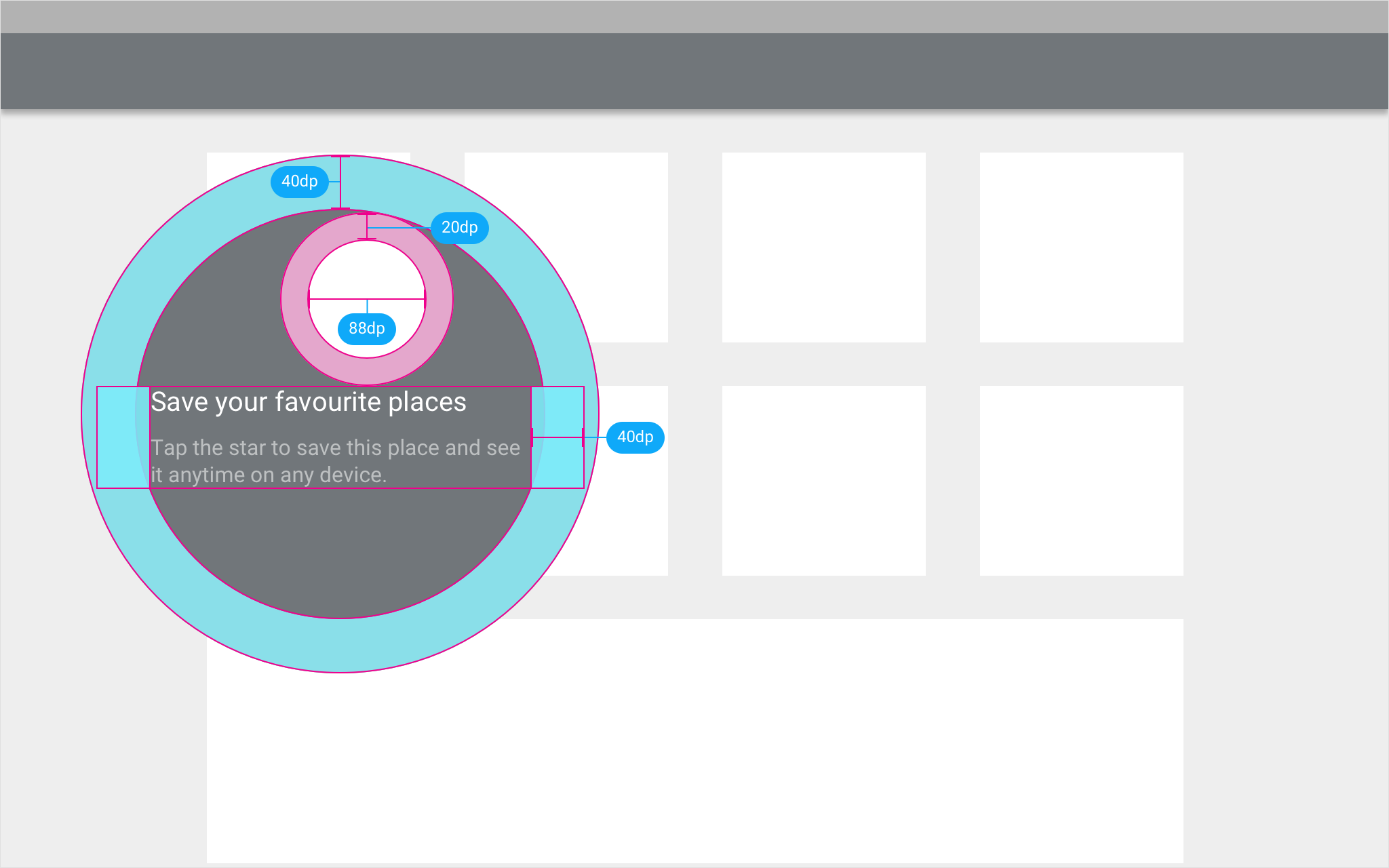
A feature discovery prompt focuses user attention on a specific UI element. It contains a tap target, indicated by a circular shape, which is surrounded by a larger area with a distinct background color.

The prompt contains a single action, without additional actions present.

Users may dismiss the prompt by using a swipe gesture or tapping outside of the prompt’s background area.

Material Design prompt with a tap target and background

The feature discovery prompt contains a tap target, surrounded by a large background area which is colored using the app’s primary color.

Mobile

The prompt may be modified to accommodate different screen locations and display sizes.

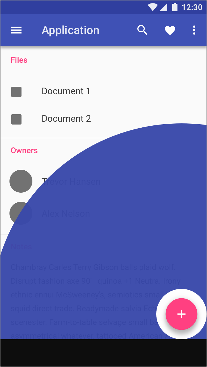
On mobile, tap targets are located at a higher elevation than other UI elements and may span the width of the screen.

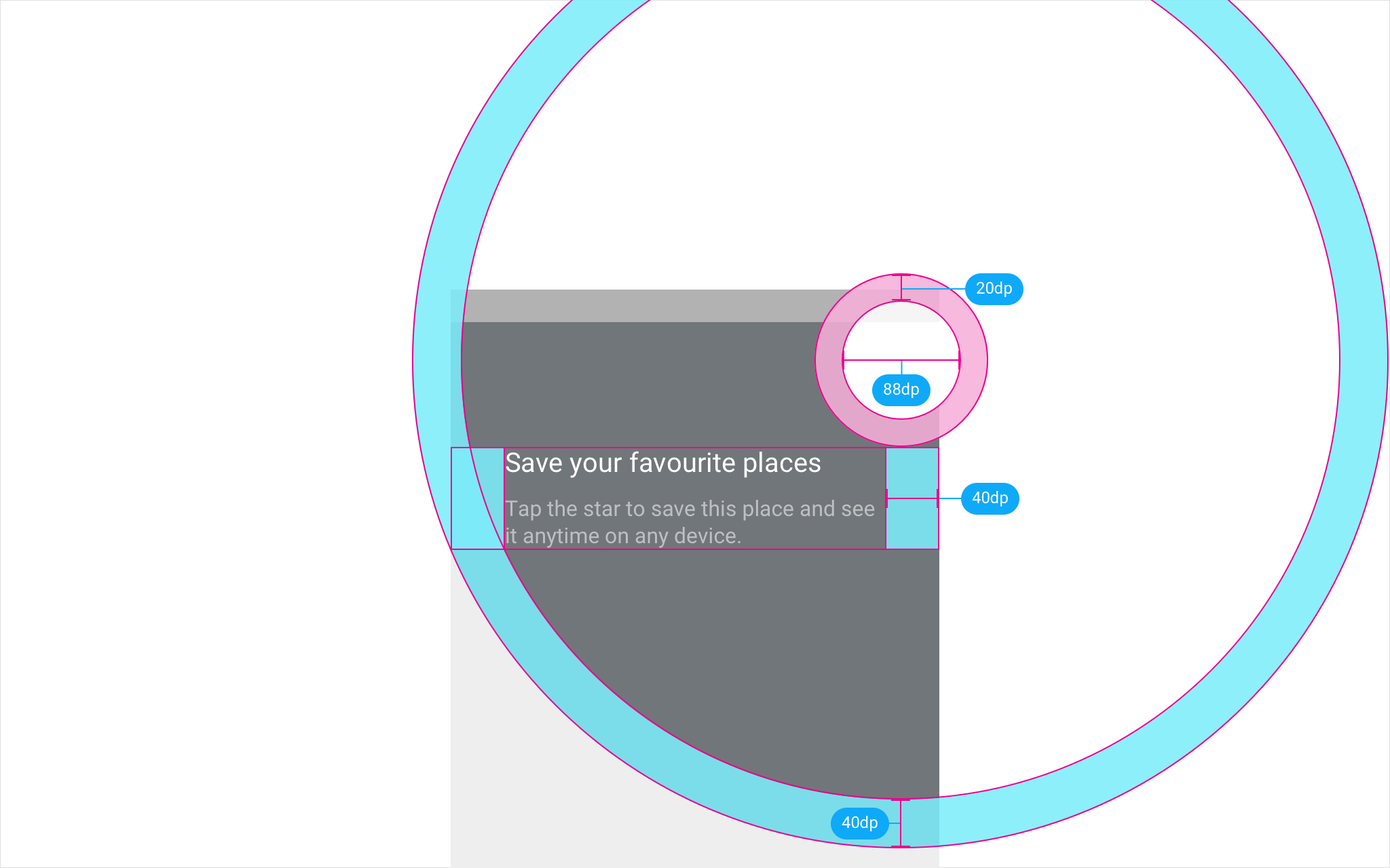
Material Design: Place tap target within 88dp from edges

When the prompted action’s tap target is located within 88dp of the screen top or bottom (not including the status and nav bars), place the tap target directly on top of the promoted action.

Material Design prompt background positioning guidelines

When the prompted action is located toward the center of the screen, the prompt background should be adjusted as follows:

  • Tap targets located right of the screen’s center: The prompt background should be offset 20dp to the left
  • Tap targets located left of the screen’s center: The prompt background should be offset 20dp to the right
  • If the tap target is in the center of screen: The prompt background will be offset automatically to the right or left depending on language

Desktop and tablet

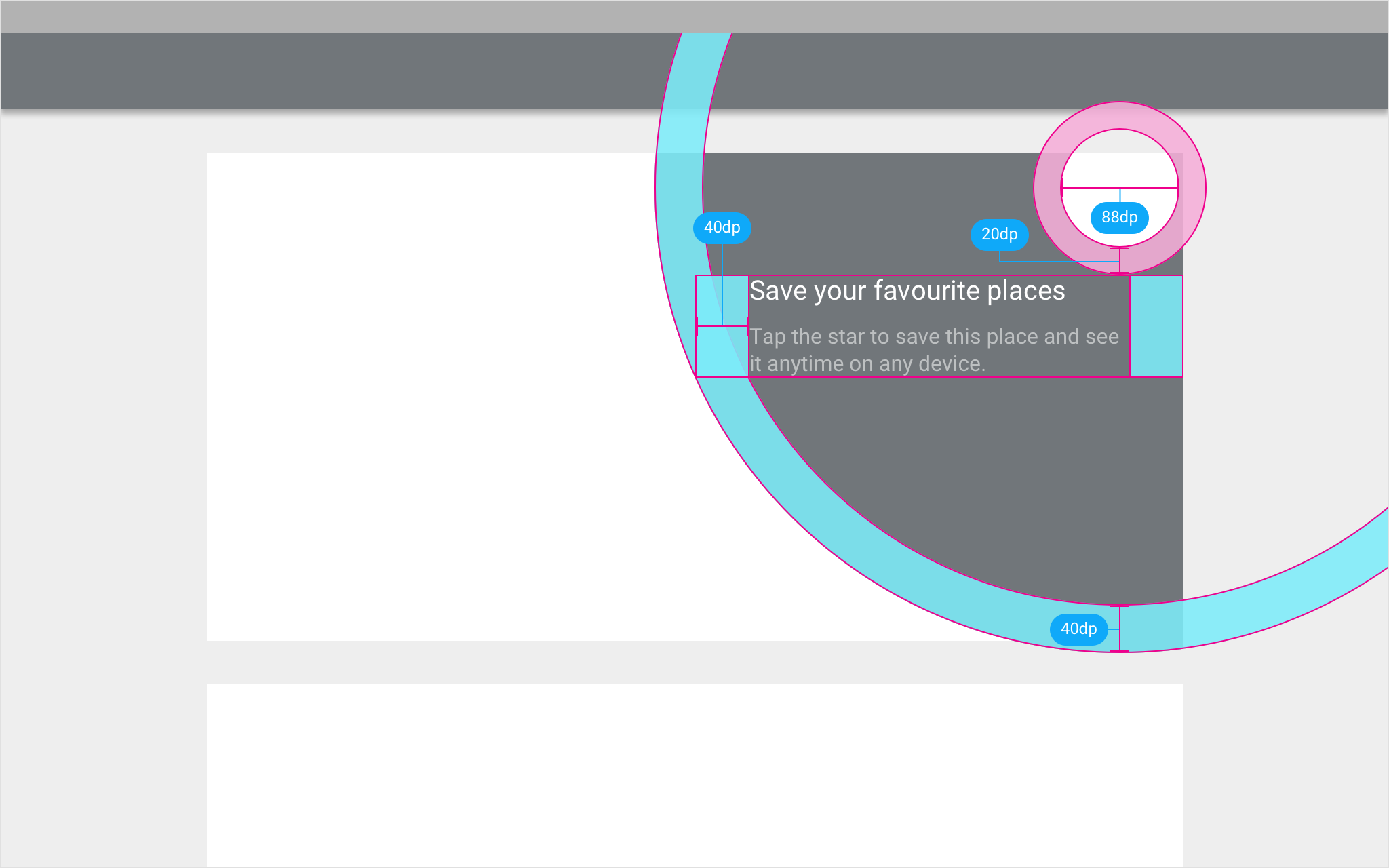
On larger screens, feature discovery prompts are generally limited to the surface on which the tap target rests, such as a card. The tap target should be the size of the tappable surface.

For tap targets not in the center of the screen, offset the prompt background from the center of the surface.

If the tap target appears on a surface smaller than 280dp tall and 360dp wide, allow the tap target and prompt background to extend beyond that surface’s edges (at a higher elevation).

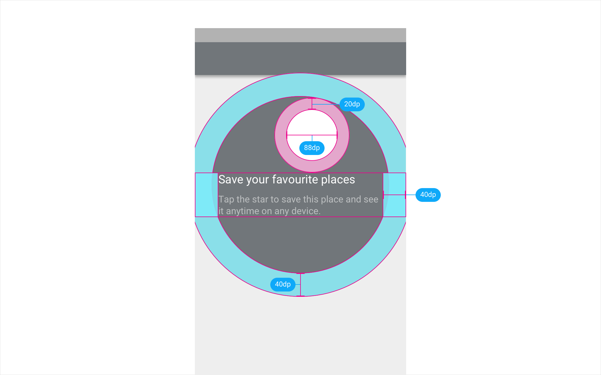
Material Design: Center prompt backgrounds for tap targets

Tap targets located within 88dp of the surface’s edge should center the prompt’s background around the target.

For tap targets located in the center of the screen, offset the prompt background area by 20dp.

For all other tap targets, place the prompt background in a location suitable to other screen elements.

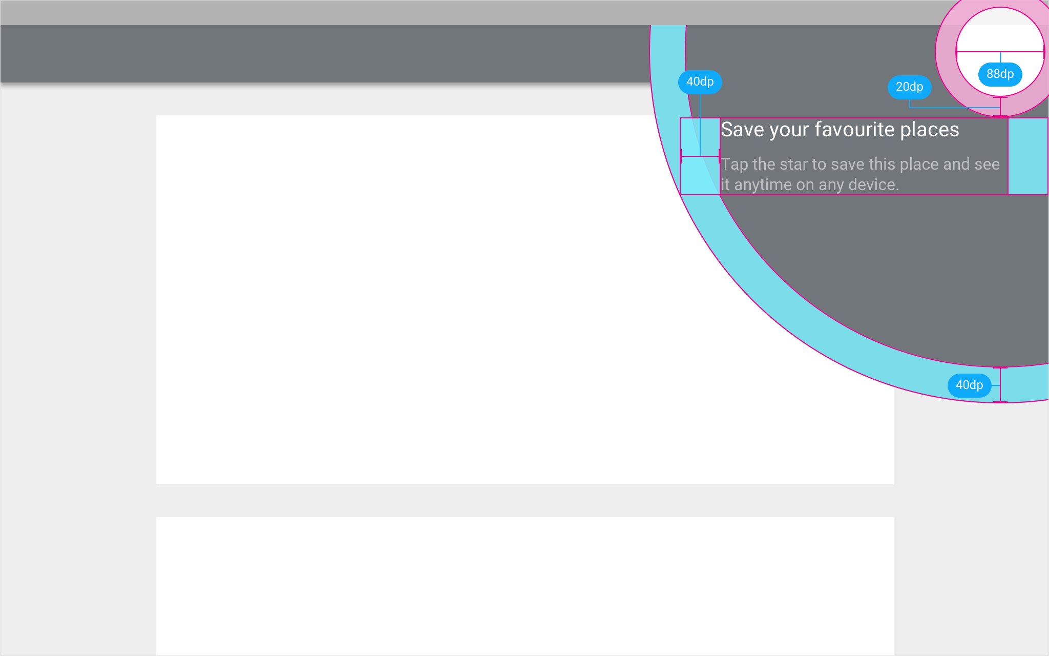
Material Design prompt for tap targets near screen edges

For tap targets located within the top or bottom (144dp) or left or right (200dp) screen edge, center the prompt background around the tap target, above other elements.

Material Design prompt positions for small tap targets

Feature discovery tap targets on small surfaces, outside of the top or bottom (144dp) or left or right (200dp) screen edges, may use prompts be unconfined by any surface.

  • Tap targets located right of the screen’s center: The prompt background should be offset 20dp to the left
  • Tap targets located left of the screen’s center: The prompt background should be offset 20dp to the right
  • If the tap target is in the center of screen: The prompt background will be offset automatically to the right or left depending on language

Color

The tap target may use the primary color of your app or toolbar.

The background of the tap target has an opacity of 96%.

Material Design: Primary color used for tap target background

The primary color is applied to the tap target background.

Material Design accent color in tap target background

The accent color is applied to the tap target background.

Motion

Motion helps inform users where the tap target originates.

Appear

The tap target originates on the screen from the highlighted icon using a standard material motion curve.

Idle

While idle, the highlighted action grows by 10% over one second and then shrinks. A material touch ripple emanates from the action as it reaches its largest size.

Interaction

Tapping the highlighted action causes the tap target to expand and then fade with an ease out.

Dismiss

Tapping outside the tap target causes it to shrink and fade with an ease out.

Motions for appear, idle, and interaction

Motions for appear, idle, and dismiss

Guided flows

Guided flows walk users through tasks that require multiple steps to complete.

Guided flow

Guided flows may contain up to three design components. Use the components that work best for the specific tasks in your UI.

1. Tap target

Tap targets introduce the task ahead by highlighting the user benefit.

2. Ripple

Ripples guide users through subsequent steps.

The color of the ripple should match the color of the tap target.

3. Completion toast

Upon completion of the guided flow, provide a toast confirming that the user has completed the task.

Include an action that brings the user back to where the tap target appeared.

The tap target is used to introduce the guided flow.

The ripples are used for following steps.

The toast is used to reaffirm that the task has been completed.

Hint Text

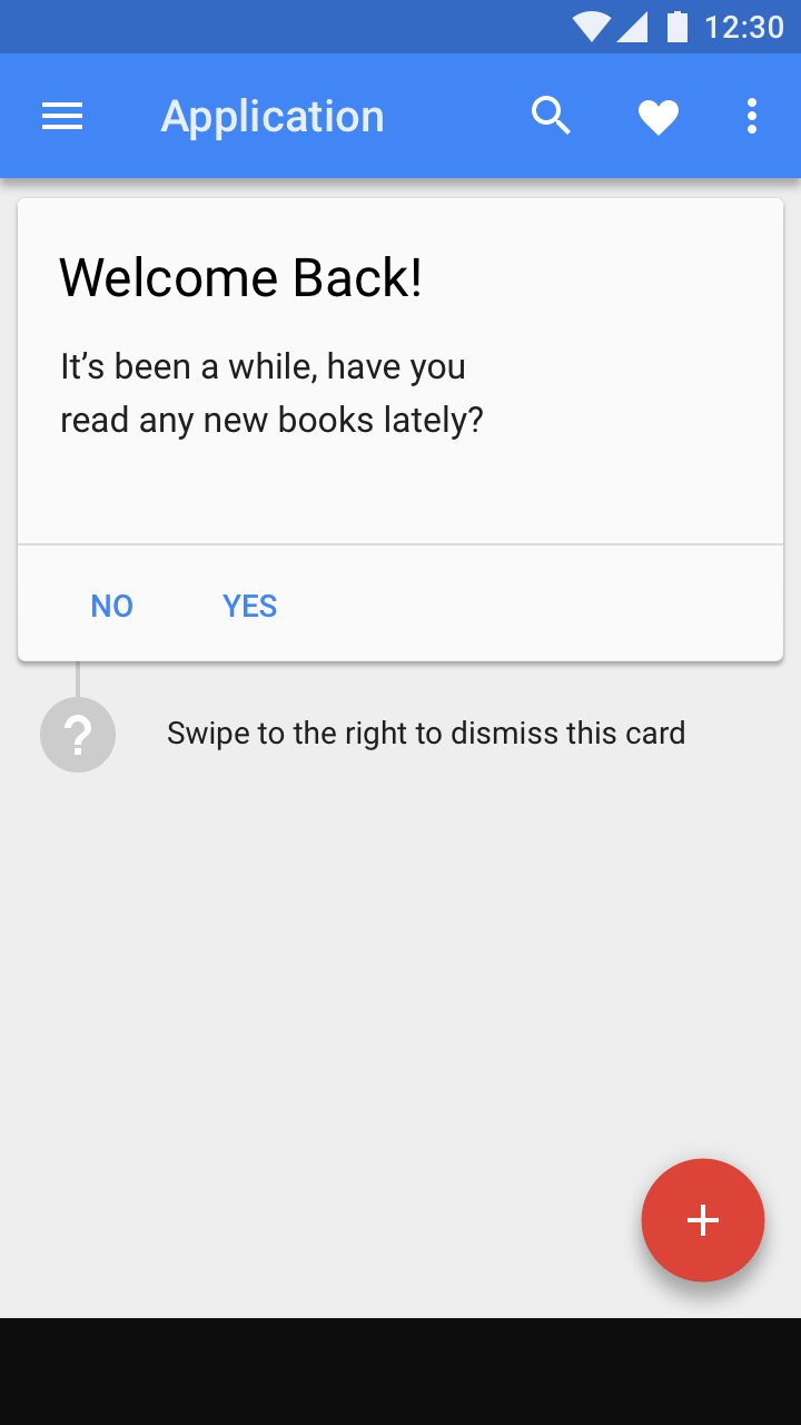
For smaller, simpler prompts that request user input, use hint text instead of tap targets.

Material Design feature discovery hint text example

Example of hint text