Components Sliders

Sliders

Sliders let users select from a range of values by moving the slider thumb.

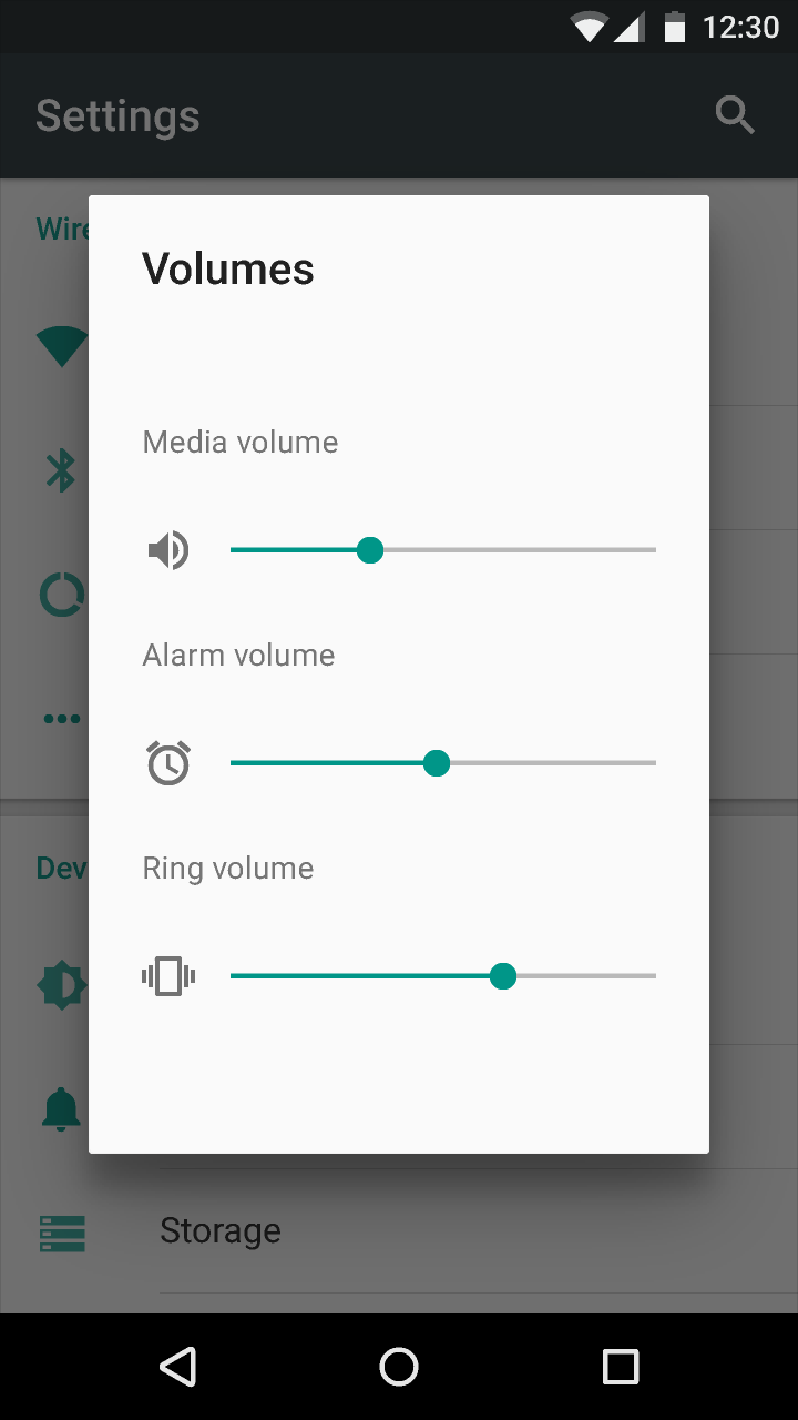
Sliders are ideal components for adjusting settings that reflect intensity levels, such as volume, brightness, or color saturation.

Sliders may have icons on both ends of the bar that reflect the value intensity. Place the smallest value for the slider range on the left and the largest value on the right.

Continuous sliders

Continuous sliders allow users to select a value along a subjective range. They do not require a specific value to make adjustments, although they may, in some instances, offer an editable numeric value.

Discrete sliders

Discrete sliders allow users to select a specific value from a range.

Material Design slider for selecting value ranges

Continuous slider Expand and collapse content An arrow that points down when collapsed and points up when expanded.

Use continuous sliders for subjective settings that do not require a specific value for the user to make meaningful adjustments.

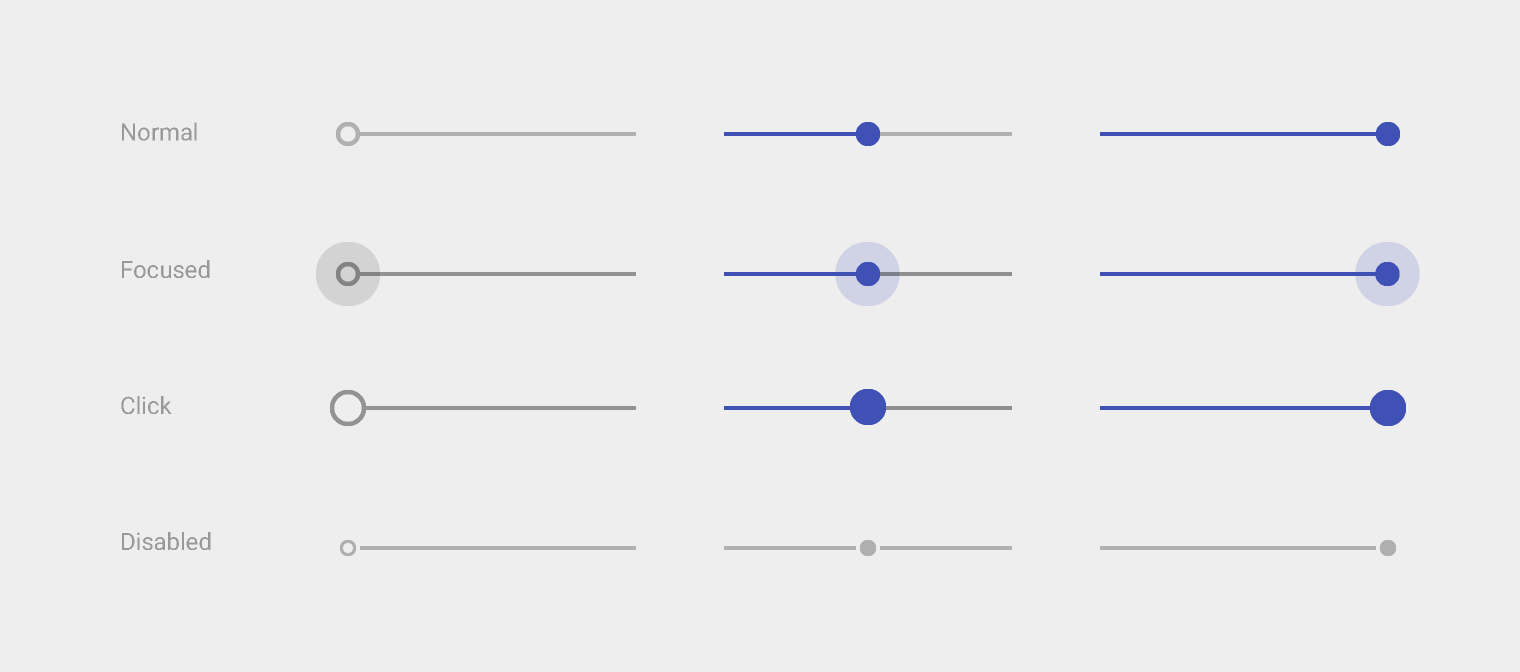
Light

Thumb on: Swatch 500, Opacity 100%
Track on: Swatch 500, Opacity 100%

Thumb off: #000000, Opacity 26%
Track off: #000000, Opacity 26%

Focused and Click Thumb off: #000000, Opacity 38%
Focused and Click Track off: #000000, Opacity 38%

Disabled (disconnected): #000000, Opacity 26%

Material Design light theme continuous slider

Light theme

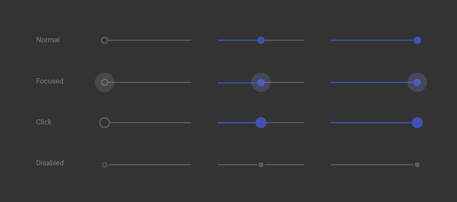
Dark

Thumb on: Swatch 200, Opacity 100%
Track on: Swatch 200, Opacity 100%

Thumb off: #FFFFFF, Opacity 30%
Track off: #FFFFFF, Opacity 30%

Disabled (disconnected): #FFFFFF, Opacity 30%

Material Design dark theme continuous slider

Dark theme

Various slider behaviors

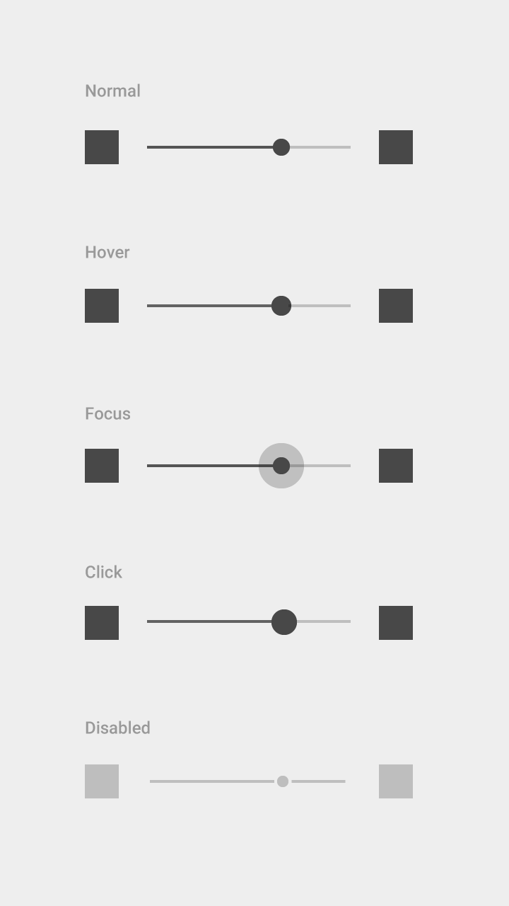
Spacing for icons to the left and/or right of the bar:

Material Design icon spacing in a slider

Example of spacing for icons in a slider.

Material Design slider states: normal, hover, focus, click, disabled

Examples of sliders in normal, hover, focus, click, and disabled states.

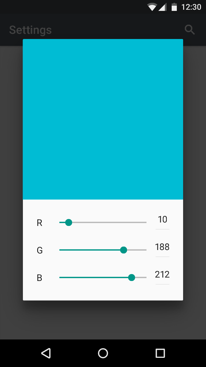
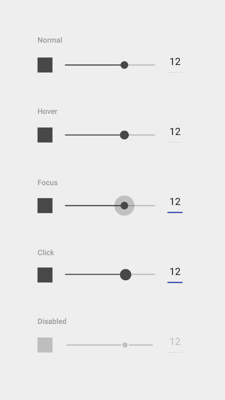
With an editable numeric value

Use for settings for which users need to set the exact value. Upon pressing the thumb, the text box becomes editable for text entry and updates the value automatically with thumb movement.

Slider with editable numeric value in Material Design

Example of a slider with an editable numeric value

Material Design slider with editable numeric value states

Example of a slider with an editable numeric value in normal, hover, focus, click, and disabled states.

Discrete slider Expand and collapse content An arrow that points down when collapsed and points up when expanded.

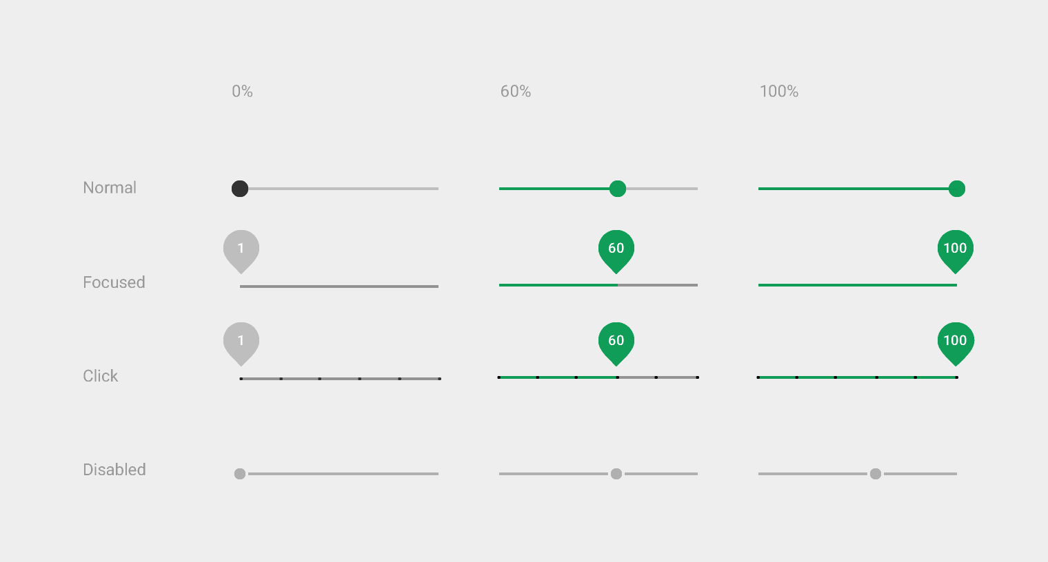
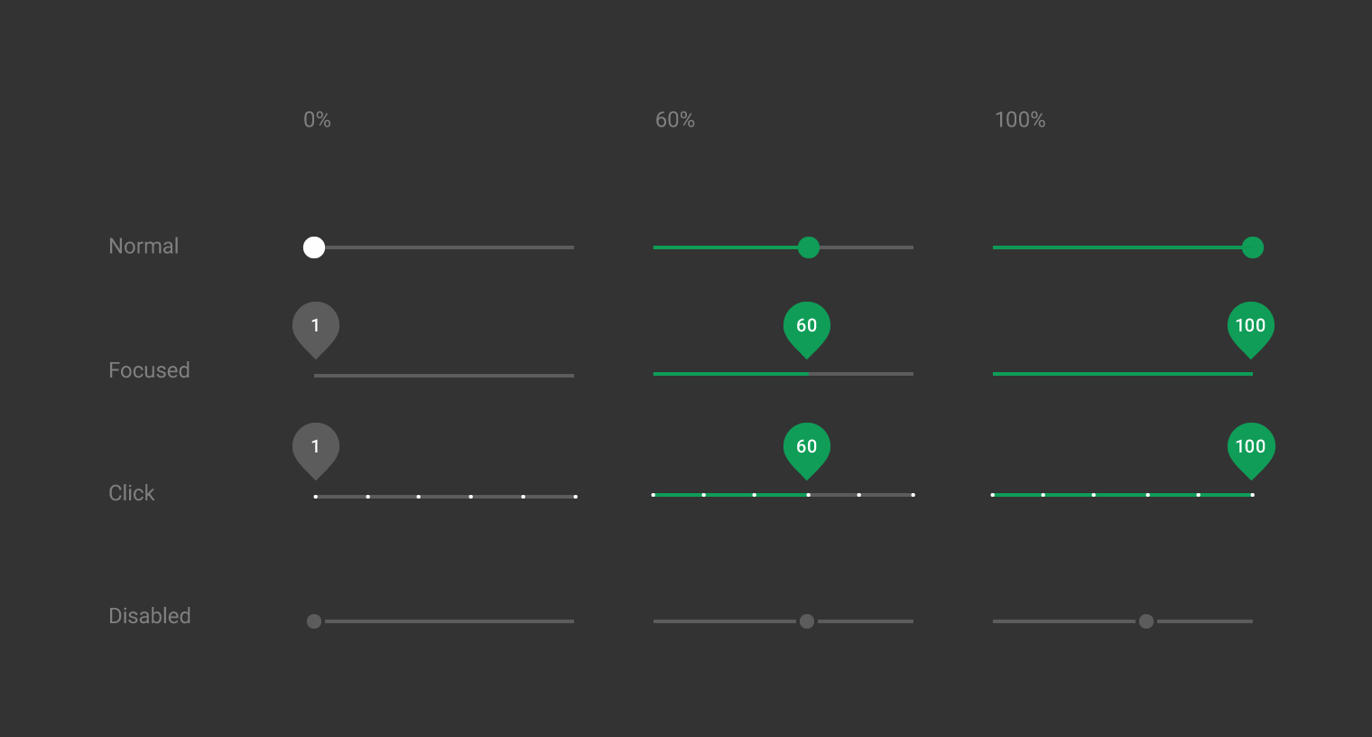
The discrete slider thumb snaps to evenly spaced tick marks along the slider rail. Use for objective settings that require specific values for the user to make meaningful adjustments. Each tick mark should change the setting to a level that’s discernible to the user. The values are predetermined and aren’t user-editable.

With a numeric value label

Use for settings for which users need to know the exact value of the setting.

Material Design light theme discrete slider

Light theme

Material Design dark theme discrete slider

Dark theme

Animation of a discrete slider