Components Expansion panels

Expansion panels

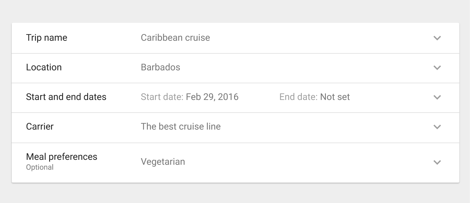
Expansion panels contain creation flows and allow lightweight editing of an element.

An expansion panel is a lightweight container that may either stand alone or be connected to a larger surface, such as a card.

They may be used for a variety of tasks, such as:

  • To edit a setting
  • To create a tool for ad campaigns
Usage

Editing
Creating flows

Behavior

Expand
Collapse
Focus

Material Design expansion panels for creation flows and editing

Usage Expand and collapse content An arrow that points down when collapsed and points up when expanded.

An expansion panel is a lightweight container that may either stand alone or be connected to a larger surface, such as a card.

Editing

Expansion panels are best used for lightweight editing of an element, such as selecting a value for a setting.

For example, an app that contains tables may use expansion panels to adjust settings on table elements.

Creation flows

Expansion panels may be displayed in a sequence to form creation flows.

For example, a tool for creating ad campaigns may display a series of expansion panels to collect campaign details.

Material Design various expansion panels

Various expansion panels

List content

15sp Roboto Regular
87% black

Secondary content

12sp Roboto Regular
54% black

Divider

1dp border
12% black

Expand icon

24dp x 24dp
38% black

Behavior Expand and collapse content An arrow that points down when collapsed and points up when expanded.

Collapsed panel

A collapsed panel displays summary information. Upon selecting the collapsed panel, it expands to display the full expansion panel.

Collapsed panel example in Material Design

Example of a collapsed panel

Expanded panel

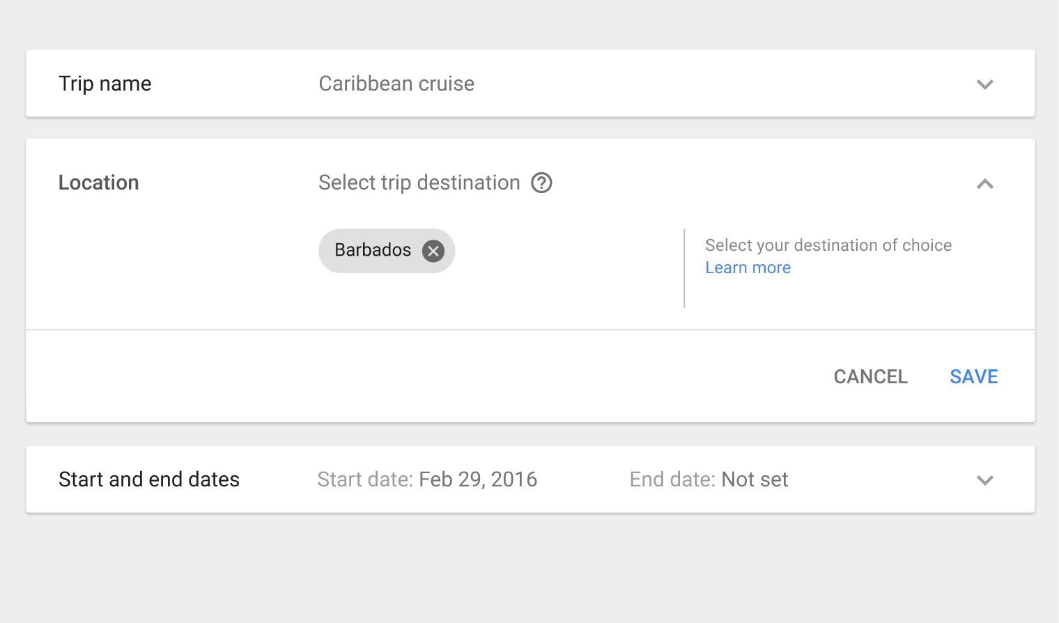
Upon selection, a collapsed panel expands, allowing users to add or edit information.

Helper text may be added to the panel to assist the user.

Extended panel example in Material Design

Example of an extended panel

Focus state

An expansion panel may use a focus state (by using a grey background on the list item) to provide focus to individual list items.

On a keyboard, users may traverse through list items by using the Tab key.

Material Design focus state in expansion panels

Background

Grey 200

Expand icon on hover and pressed

24dp x 24dp
54% black

Specs Expand and collapse content An arrow that points down when collapsed and points up when expanded.

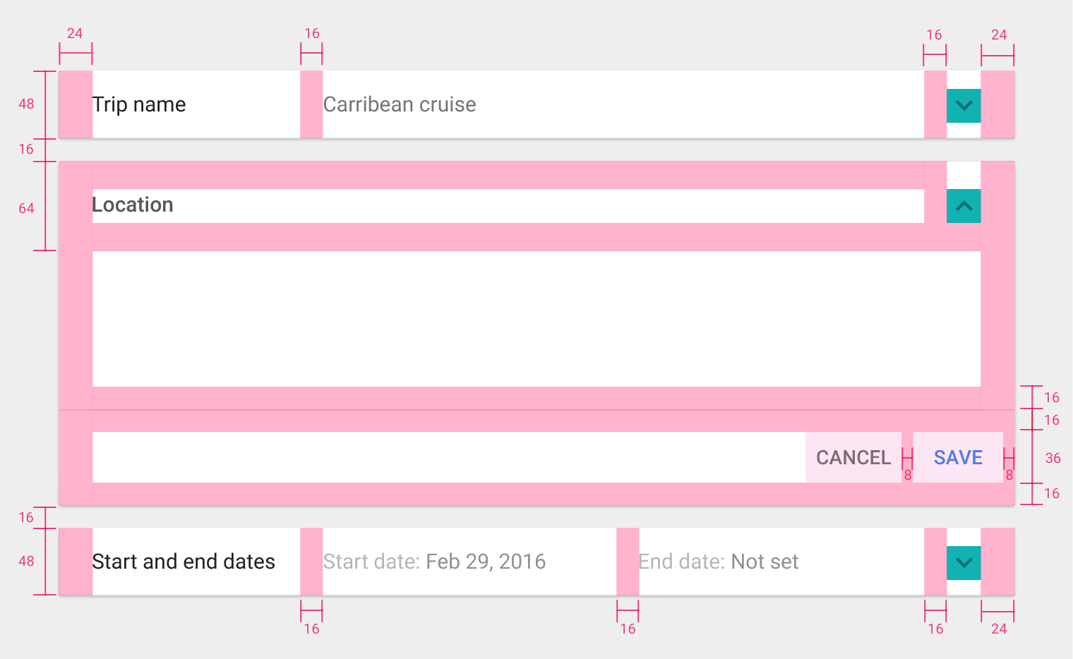
Label

  • Font: Roboto Regular 15sp

Padding

  • Top and bottom padding: 16dp
  • Left and right padding: 24dp
Specifications for Material Design expansion panels