Layout Units & measurements

Units & measurements

Some units have different meanings in different contexts. This chapter discusses the usage of device-independent pixels, scaleable pixels, as well as concepts like pixel density.

Pixel density Expand and collapse content An arrow that points down when collapsed and points up when expanded.

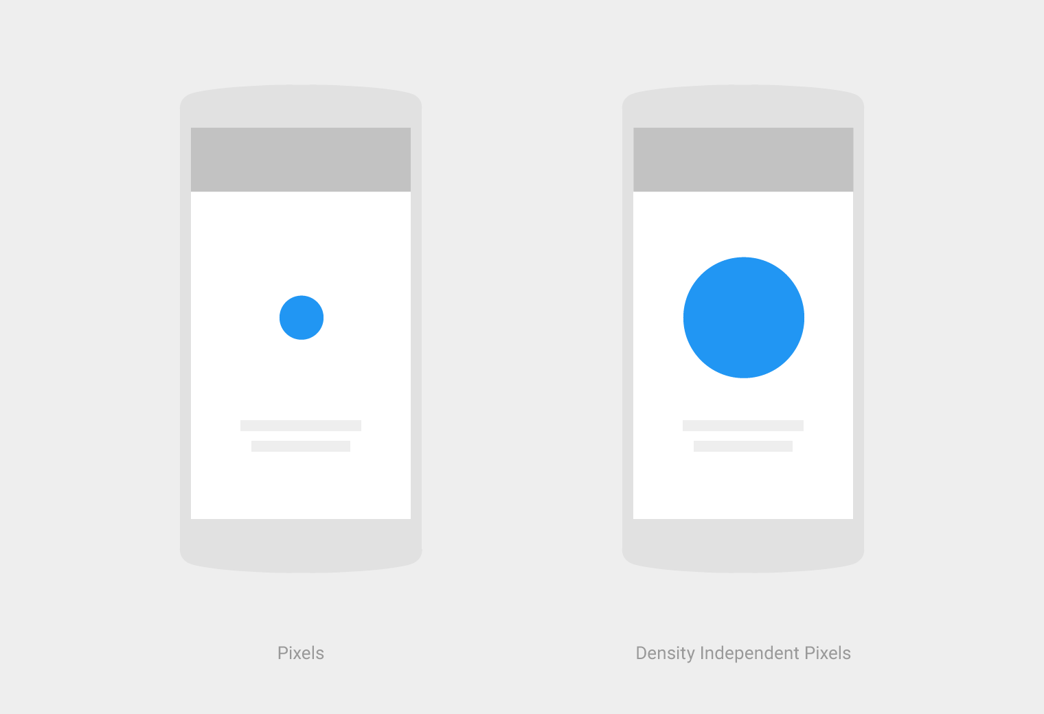
The number of pixels that fit into an inch is referred to as “pixel density.” High-density screens have more pixels per inch than low-density ones. As a result, UI elements (such as a button) appear physically larger on low-density screens and smaller on high-density screens.

Screen resolution refers to the total number pixels in a display.

screen density = screen width (or height) in pixels / screen width (or height) in inches

Optimize your design for different screen densities.

Units of measure supported by Android.
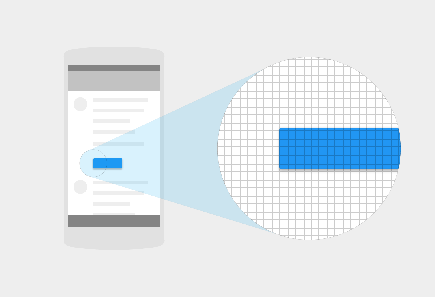
High-density screen with Material Design
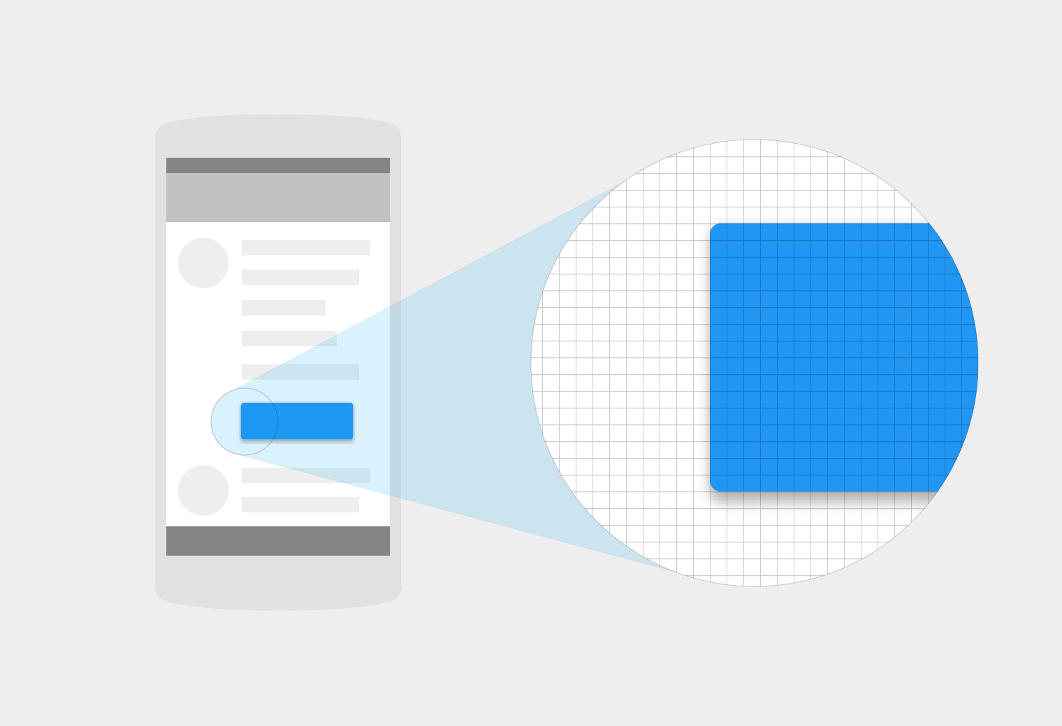

High-density screen

Low-density screen with Material Design


Low-density screen

Density-independent pixels (dp) Expand and collapse content An arrow that points down when collapsed and points up when expanded.

"Density independence" refers to the uniform display of UI elements on screens with different densities.

Density-independent pixels (pronounced “dips”) are flexible units that scale to uniform dimensions on any screen. When developing an Android application, use dp to display elements uniformly on screens with different densities.

Material Design density-independent pixels (dp)

A dp is equal to one physical pixel on a screen with a density of 160. To calculate dp:

dp = (width in pixels * 160) / screen density

When writing CSS, use px wherever dp or sp is stated. Dp only needs to be used in developing for Android.

Screen density

Screen width in pixels

Screen width in density-independent pixels

120

180 px

240 dp

160

240 px

240

360 px

If you have three screens, all 1.5 inches wide, with varying screen densities, the screen width will still be 240dp for all of them.

Scaleable pixels (sp) Expand and collapse content An arrow that points down when collapsed and points up when expanded.

When developing for Android, scaleable pixels (sp) serve the same function as dp, but for fonts. The default value of an sp is the same as the default value for dp.

The primary difference between an sp and a dp is that sp preserves a user's font settings. Users who have larger text settings for accessibility will see the font size matched to their text size preferences.

Designing layouts for dp Expand and collapse content An arrow that points down when collapsed and points up when expanded.

When designing layouts for the screen, calculate an element’s measurements in dp:

dp = (width in pixels * 160) / density

For example, a 32 x 32 px icon with a screen density of 320 equals 16 x 16 dp.

Image scaling Expand and collapse content An arrow that points down when collapsed and points up when expanded.

Images can be scaled to look the same across different screen resolutions by using these ratios:

Screen resolution

dpi

Pixel ratio

Image size (pixels)

xxxhdpi

640

4.0

400 x 400

xxhdpi

480

3.0

300 x 300

xhdpi

320

2.0

200 x 200

hdpi

240

1.5

150 x 150

mdpi

160

1.0

100 x 100