Patterns Notifications

Notifications

Android only

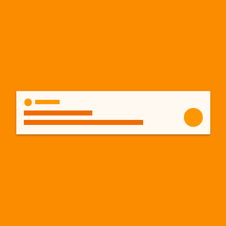
Notifications provide short, timely, and relevant information about your app when it’s not in use.

Notifications are intended to inform users about events in your app. These two types of notifications are the most effective:

  • Communication from other users
  • Well-timed and informative task reminders
Notification components

Header area
Content area
Action area

How notifications may be noticed
  • Showing a status bar icon
  • Appearing on the lock screen
  • Playing a sound or vibrating
  • Peeking onto the current screen
  • Blinking the device's LED
Material Design notifications offer timely app updates

Anatomy of a notification Expand and collapse content An arrow that points down when collapsed and points up when expanded.

Overview

Notifications have been designed to make it easy to scan and use a notification’s most important elements:

Primary content

Content is the most prominent element of a notification. Secondary information, such as a timestamp, is smaller and consolidated above the primary content.

People

If the notification involves a person, an avatar appears on the right where it stands out from the rest of the content.

Actions

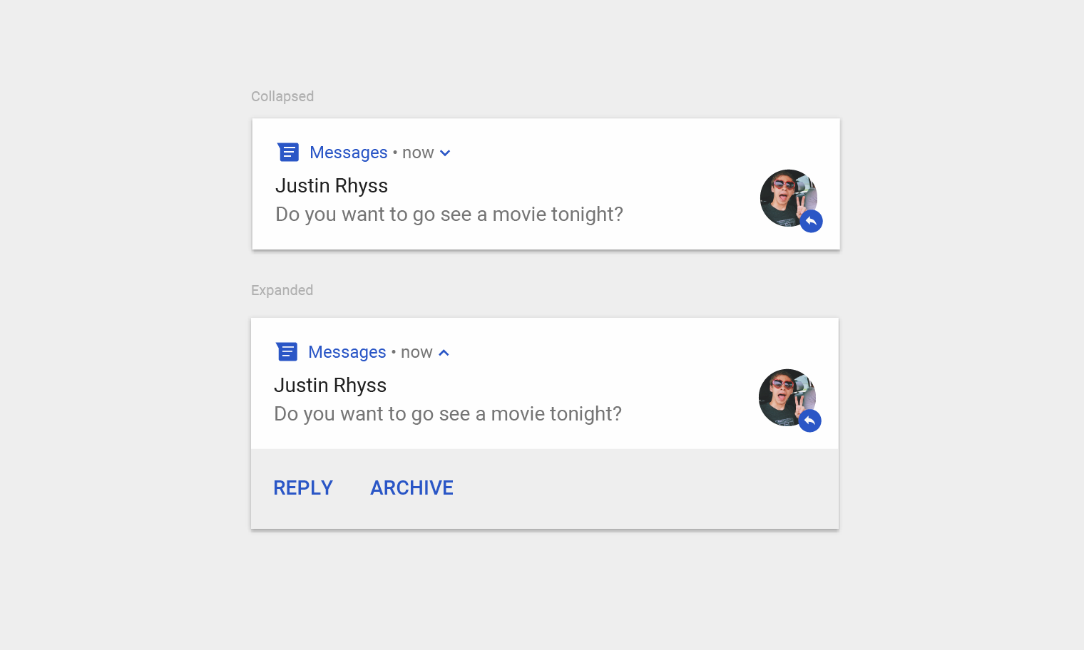
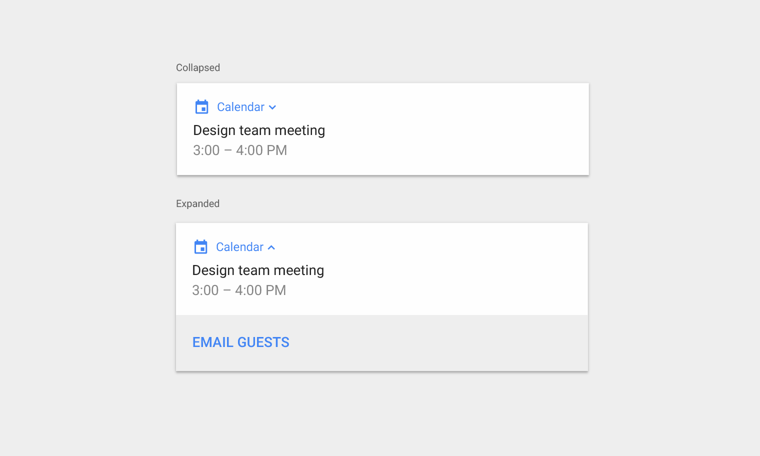
Expandable notifications are revealed by tapping an indicator icon. Actions are displayed with text labels on a separate background color and location.

Material Design notification views: collapsed and expanded

Collapsed and expanded views of a notification

Header area

The header area is comprised of:

1. The app icon: The app icon is a small two-dimensional representation of your app's identity. It appears in monochrome in the status bar. If your app sends a wide variety of notifications, you may replace your app's identity icon with a symbol that reflects the content type. For example, Google Now uses a cloud icon for weather notifications.

2.The app name: The name of the app automatically appears in the notification.

3.Header text (optional): Header text is usually only needed if an app sends notifications from multiple sources, such as the account name for users with multiple accounts.

4. Timestamp (optional): By default, a timestamp does not appear, but it may be added if it's important to display when a notification was sent, such as the time of a missed call.

5. Expand indicator: This appears if the notification can be expanded.

The header area of Material Design notifications

The header area

Content area

The content area is comprised of:

1. A content title: A brief headline for the notification

2. Content text: Supporting information

3. Large icon (optional): An image may be added to reinforce the notification in a meaningful way, such as a message that includes an avatar of the sender

The content area of Material Design notifications

The content area

Action area

When expanded, a notification may display up to three actions on at the bottom.

In Android N and later, actions are shown without icons to accommodate more text. An icon should still be provided because devices with earlier versions of the OS rely on it, as will Android Wear and Android Auto devices.

The action area of Material Design notifications

The action area

Usage Expand and collapse content An arrow that points down when collapsed and points up when expanded.

When not to use a notification

Notifications should not be the primary communication channel with your users, as frequent interruptions may cause irritation. The following cases do not warrant notification:

  • Cross-promotion, or advertising another product within a notification, which is strictly prohibited by the Play Store
  • An app that a user has never opened
  • Messages that encourage the user to return to an app, but provide no direct value, such as "Haven't seen you in a while"
  • Requests to rate an app
  • Operations that don't require user involvement, like syncing information
  • Error states from which the app may recover without user interaction
Material Design: Avoid sending holiday notifications

Don’t.

Don’t send holiday or birthday greetings in the form of notifications.

Material Design: Avoid interrupting users during tasks

Don’t.

Don’t interrupt the user in the middle of a task for the sole purpose of asking if you're doing a good job.

Required notifications

Foreground services are app processes that run in the background while the user is not directly interacting with your app. Because these apps use battery and possibly data, Android requires that users are made aware of these types of services by showing a non-dismissible notification.

Because the user can't dismiss the notification, you should provide an action for the user to stop the service if they don't want it running.

Material Design: Android Download Manager shows progress notification

While downloading apps and files, Android's Download Manager runs a foreground service and shows a notification that lets the user know downloading is in progress, with an option to cancel.

Behavior Expand and collapse content An arrow that points down when collapsed and points up when expanded.

Notification arrival

When a notification arrives, it gets added to the notification drawer. Depending on the parameters you set and the current state of the device, the notification may also:

  • Be indicated in the status bar with an icon
  • Make a sound or vibrate
  • Peek onto the current screen to grab the user's attention

Users may choose to alter the notification behaviors you set.

When a notification arrives, an icon usually appears in the status bar. This signals to the user that there's something to see in the notification drawer.

If it's important to grab a user's attention in the middle of a task, an app can have the notification peek onto the current screen.

Notification drawer

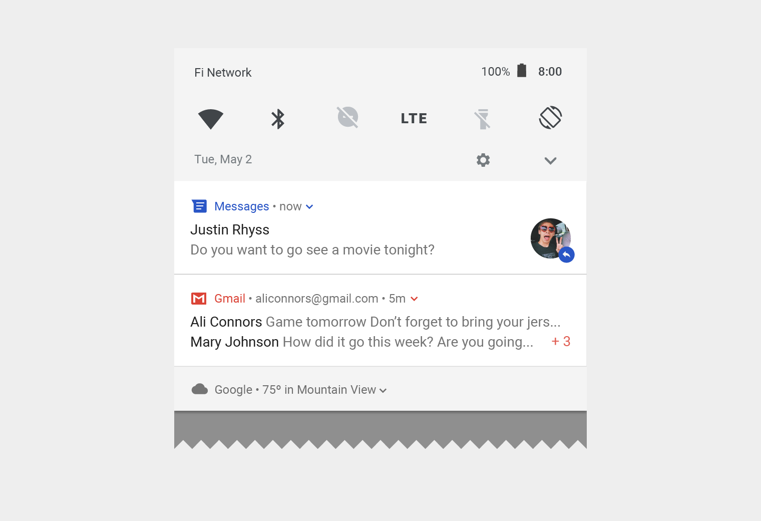
The notification drawer in Android typically shows notifications in reverse-chronological order, with adjustments influenced by:

  • The app's stated notification priority or importance
  • Whether the notification recently alerted the user with a sound or vibration
  • Any people attached to the notification and whether they are starred contacts
  • Whether the notification represents an important ongoing activity, such as a phone call in progress or music playing

Starting in Android O, the Android system may alter the appearance of some notifications at the top and bottom of the list by adding emphasis or deemphasis, to help the user scan content.

Stale notifications

The notification drawer should show users relevant information for the current moment in time. If a notification sent earlier is no longer relevant, you can automatically dismiss it so the user doesn’t see it.

Material Design notification drawer with messages

In this notification drawer, a text that just arrived appears at the top. A lower priority notification about the weather appears at the bottom.

Notification interactions

Users may interact with a notification in the following ways:

1. To navigate to a destination

To navigate, a user may tap a notification. If the notification appears on a locked screen, the user will need to double-tap it and then enter their PIN, pattern, or password.

When the user taps a notification, they should be taken to a screen in your app that relates directly to that notification and lets them take immediate action. For example, if the notification says it's their turn in a two-player game, tapping the notification should take them directly to that game.

2. To see an expanded view

If offered, an expand indicator appears in the header. A user may tap the indicator or swipe down the notification body to expand it.

An expanded notification

3. To dismiss it (if permitted)

A user may dismiss a notification by swiping it left or right.

Ongoing notifications that indicate a continuing process in the background, such as music playing, may not be dismissed with a swipe.

A notification being dismissed

4. To control similar notifications in the future

Notification controls can be accessed by:

  • Touching and holding an individual notification
  • Swiping the notification left or right, and then tapping the settings icon

The controls displayed vary depending on the Android version and whether the app has channels for its notifications (starting in Android O).

Notification settings

Multiple notifications

For apps that generate multiple notifications of the same type, Android offers two different approaches to represent them: summarizing and bundling.

Summarizing

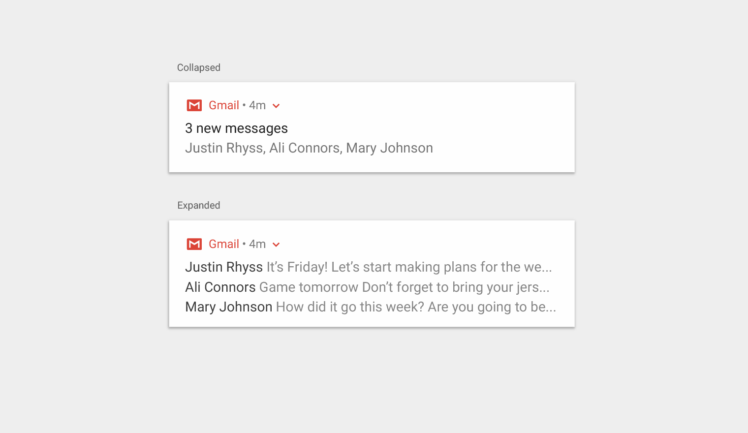
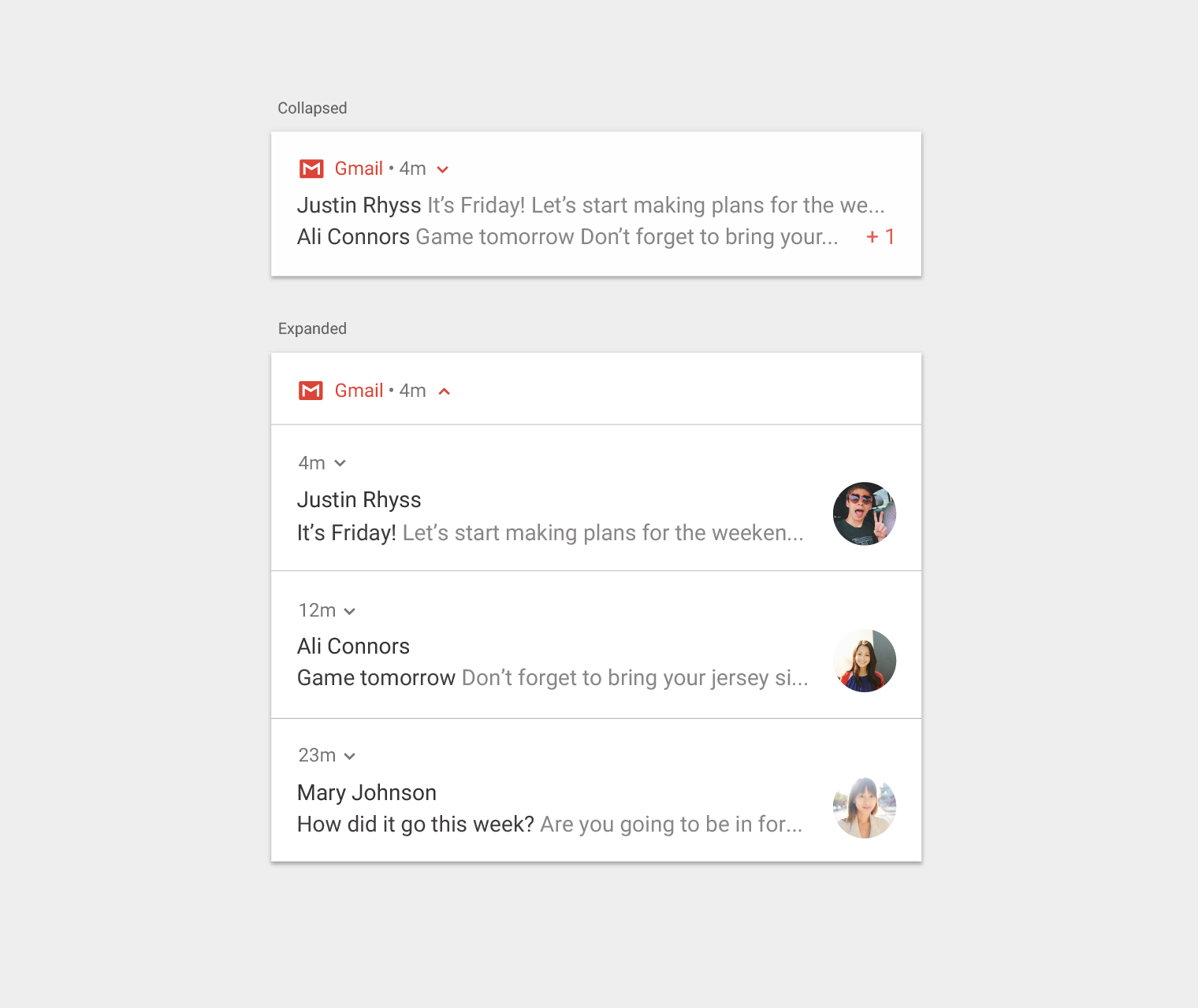
Instead of displaying multiple notifications, you can create one notification that summarizes them all. For example, a messaging app might have a summary notification that says "3 new messages.” Upon expansion, it could show a snippet for each message.

Material Design: Collapsed and expanded notification views

Multiple notifications summarized, shown in both collapsed view and expanded view.

Grouping

Your app can present multiple notifications according to hierarchy:

  • A parent notification displays a summary of its child notifications
  • If the parent notification is expanded by the user, all child notifications are revealed
  • A child notification may be expanded to reveal its entire content

Child notifications are presented without duplicate header information. For example, if a child notification has the same app icon as its parent, then the child’s header doesn’t include an icon.

Child notifications should be understandable if they appear solo, as the system may show them outside of the group when they arrive.

Material Design grouped notifications, collapsed and expanded

Grouped notifications, shown in both collapsed and expanded views

Expanded views

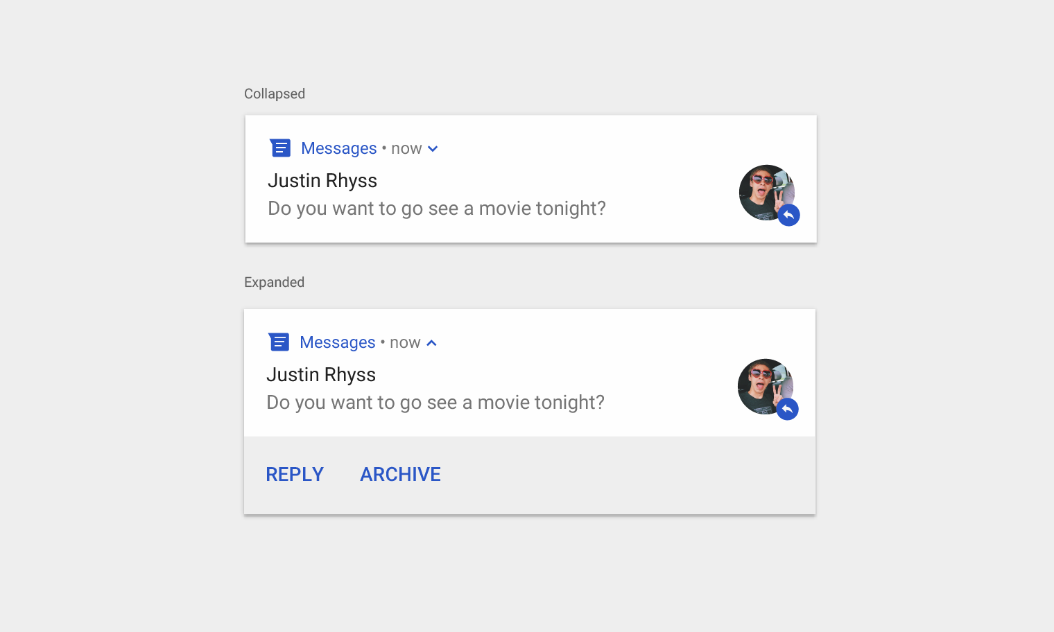
You may display more information in a notification through an expanded view, without navigating away from the notification.

Material Design: Collapsed and expanded notifications

Collapsed and expanded notifications

A notification may offer up to three actions when expanded. It should not duplicate the action taken from tapping on the notification body.

Avoid duplicate actions in Material Design notifications

Don’t.

Don’t include text actions that duplicate the behavior of tapping on the notification body.

Material Design timer notification to pause or add time

Do.

When Android's Clock app has a timer running, this notification lets the user pause or add a minute directly from the notification.

Enable typing into notifications

You may enable the user to type directly into a notification. Users may type small amounts of text, such replying to a text message or jotting a brief note.

For long-form typing, navigate users to your app, where they benefit from more space to view and edit text.

If you're using this functionality for a messaging app, keep the notification around after the user has sent the reply, and wait until the conversation has reached a lull before automatically dismissing it.

Users of Android's Messages app can reply directly to any message without leaving the notification

Types of notifications Expand and collapse content An arrow that points down when collapsed and points up when expanded.

Notifications are considered either transactional or non-transactional.

Transactional

Transactional notifications provide content that a user must receive at a specific time in order to do one of the following:

  • Enable human-to-human interaction
  • Function better in daily life
  • Control or resolve transient device states

Non-transactional

If none of the above situations describe your notification, then it is non-transactional.

Transactional notifications can help users...

Examples

Enable human-to-human interaction

  • Incoming phone calls or text messages
  • Notification of a user's turn in a two-player game

Function better in daily life

  • Calendar event about to take place
  • A reminder or alarm set up by the user
  • Delayed flight
  • Delivered order

Monitor, control, or resolve temporary device states

  • Music playing
  • Turn-by-turn navigation
  • Stopwatch running
  • Screenshot taken
  • App running in the background

Non-transactional opt-out and opt-in

Non-transactional notifications should be optional, as they may not appeal to all users. You can make them optional in one of two ways:

  • Opt-out: Users receive opt-out notifications by default, but they may stop receiving them by turning off a setting.
  • Opt-in: Users only receive opt-in notifications by turning on a setting in your app.

Opt-out

Avoid the opt-out approach unless your notifications meet both of the following criteria:

  • They provide concrete value to the user
  • They clearly relate to the user's context (such as current location, current date or time, past history, or expressed interests)

Example notification

Reason to avoid using opt-out notifications here

A random tip on how to use an app

Provides concrete user value but isn't contextual

A prompt to rate content recently used in the app

Contextual, but doesn't provide concrete user value

YouTube notification showcasing Material Design opt-out options

This notification from YouTube takes the opt-out approach. It offers both context (a YouTube channel the user has subscribed to) and value (a new video from that channel). The "Options" action navigates the user to where they can opt out of future notifications for this channel.

Opt-in

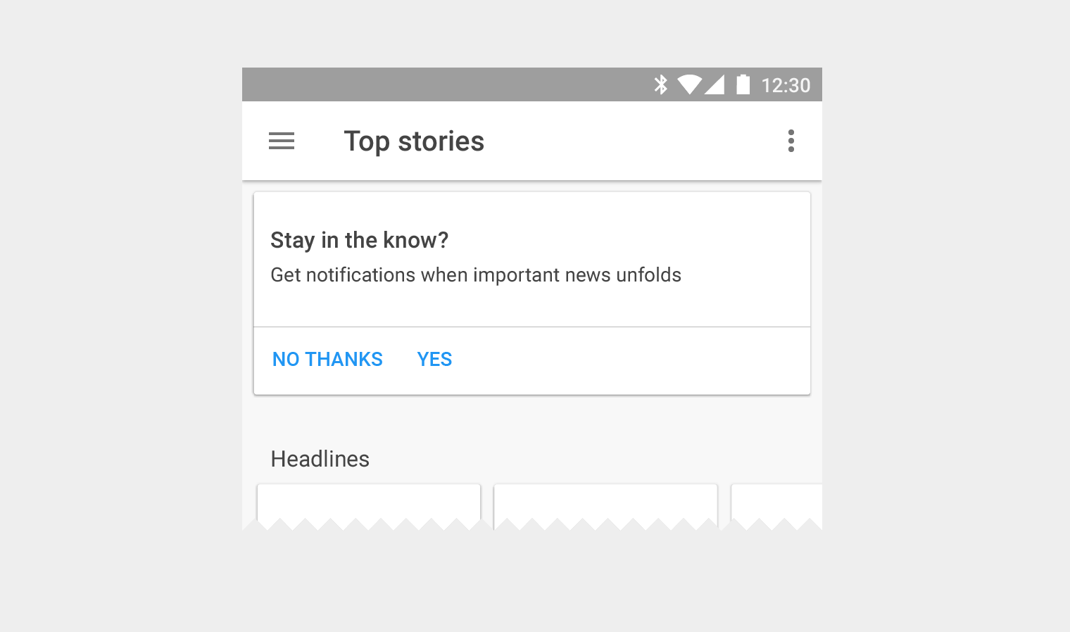
The opt-in approach is more conservative. Because users explicitly choose to receive these notifications, it's more likely they'll be glad to see them. However, they must visit settings to find out how to receive them. You may inform users about these notifications from other places in your app, such as an onboarding flow or a dismissible card.

Opt-in notifications for breaking news in Material Design

This app takes the opt-in approach. A card at the top of the app lets users know that they can receive notifications for breaking news stories. If the user wants to opt in, they choose “Yes.” Otherwise, they choose “No Thanks” and remain opted out. This choice is also available in the app's settings.

Settings Expand and collapse content An arrow that points down when collapsed and points up when expanded.

Channels in Android O

When you upgrade your app to Android O, you'll be required to define channels for your notifications – one for each type of notification you want to send.


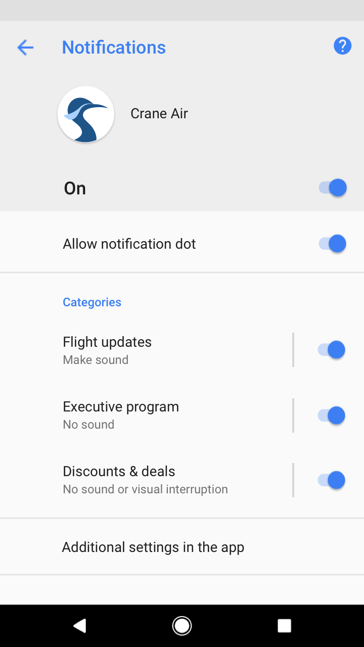
Users control app notifications in Android O with channels. If a user doesn't want a certain notification from your app, they can block that channel rather than all notifications.

Three channels in Material Design categories UI

This app has three channels, which may be referred to as "categories" in the UI.

Channel importance levels

For each channel you define, you'll assign it an importance level. Starting in Android O, importance levels control the behavior of each channel (taking the place of priority levels).

Importance levels have the following restrictions:

  • The importance level you assign will be the channel’s default. Users can change a channel’s importance level in Android Settings.
  • Once you choose an importance level, you're limited in how you can change it: you may only lower the importance, and only if the user hasn't explicitly changed it.


Channel importance should be chosen with consideration for the user's time and attention. When an unimportant notification is disguised as urgent, it can produce unnecessary alarm.

Importance

Behavior

Usage

Examples

HIGH

Makes a sound and appears on screen

Time-critical information that the user must know, or act on, immediately

Text messages, alarms, phone calls

DEFAULT

Makes a sound

Information that should be seen at the user’s earliest convenience, but not interrupt what they're doing

Traffic alerts, task reminders

LOW

No sound

Notification channels that don't meet the requirements of other importance levels

New content the user has subscribed to, social network invitations

MIN

No sound or visual interruption

Non-essential information that can wait or isn’t specifically relevant to the user

Nearby places of interest, weather, promotional content

Defining channels

To define your channels, take inventory of all the notifications you want to send. Group these notifications into sets that have the following things in common:

  • Subject matter. A single topic can succinctly describe all of these notifications, such as "Downloads."
  • Desired importance level. Because notifications in a channel share one importance level, they should carry a similar level of importance to one another from the user’s perspective.

Grouping channels

You can group your channels to make it easier for users to scan your list of channels in Android Settings.

Only create channel groupings if:

  • You have more than 10 channels
  • Your app supports multiple user accounts (such as personal and business accounts) allowing users to have the same channel names and functions across accounts

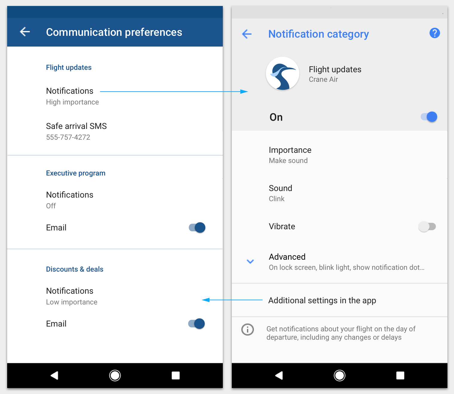
Link your app's settings to Android channel settings

Keep the settings in your app consistent with those in Android channels. If your app offers controls for different types of notifications, direct users to the settings of the appropriate Android channel settings to make changes.

You can also link your channel settings screen to your app's settings.

Material Design: Flight update notifications settings

In this app, a user can specify communication preferences. One of the preferences is notifications for flight updates, which links to a system settings screen for a channel called "Flight updates". That screen includes a link back via "Additional settings in the app".

Channels and foreground services

In Android O, a channel’s default importance level for foreground service notifications must be at least IMPORTANCE_LOW so that it shows an icon in the status bar.

Channels using the less-prominent IMPORTANCE_MIN level will trigger an extra notification from Android at IMPORTANCE_LOW, stating that the app is using battery.

Priority levels without channels

For apps not yet upgraded to Android O, you'll need to assign a priority level for each individual notification. Some priority levels offer the option to play sound.

Priority levels

To affect how each notification is delivered to users, assign it a priority level. The higher the priority, the more interruptive it will be. For example, MAX and HIGH priority notifications will peek onto the user's current screen, regardless of what they are doing. When in doubt, choose a lower priority.

Notification sounds

Notifications assigned a priority of DEFAULT (or higher) have the option to play a sound (using a sound file you provide) when the notification is delivered. However, a notification should only use sound if:

  • It helps the user uphold a time-sensitive social expectation, such as an incoming phone call or imminent work meeting.
  • It helps the user in daily life, such as letting them know that a flight is delayed.
  • The user has explicitly requested that this notification make a sound upon arrival (this option is off by default).

Pre-defined categories

Whether you're using channels or not, assign each individual notification to the most suitable predefined category. Android may use this information to make ranking and filtering decisions.

Category

Description

CATEGORY_CALL

Incoming call (voice or video) or similar synchronous communication request

CATEGORY_MESSAGE

Incoming direct message (SMS, instant message, etc.)

CATEGORY_EMAIL

Asynchronous bulk message (email)

CATEGORY_EVENT

Calendar event

CATEGORY_PROMO

Promotion or advertisement

CATEGORY_ALARM

Alarm or timer

CATEGORY_PROGRESS

Progress of a long-running background operation

CATEGORY_SOCIAL

Social network or sharing update

CATEGORY_ERROR

Error in background operation or authentication status

CATEGORY_TRANSPORT

Media transport control for playback

CATEGORY_SYSTEM

System or device status update. Reserved for system use.

CATEGORY_SERVICE

Indication of running background service

CATEGORY_RECOMMENDATION

A specific, timely recommendation for a single thing. For example, a news app might recommend a news story the user might want to read next.

CATEGORY_STATUS

Ongoing information about device or contextual status

Lock screen Expand and collapse content An arrow that points down when collapsed and points up when expanded.

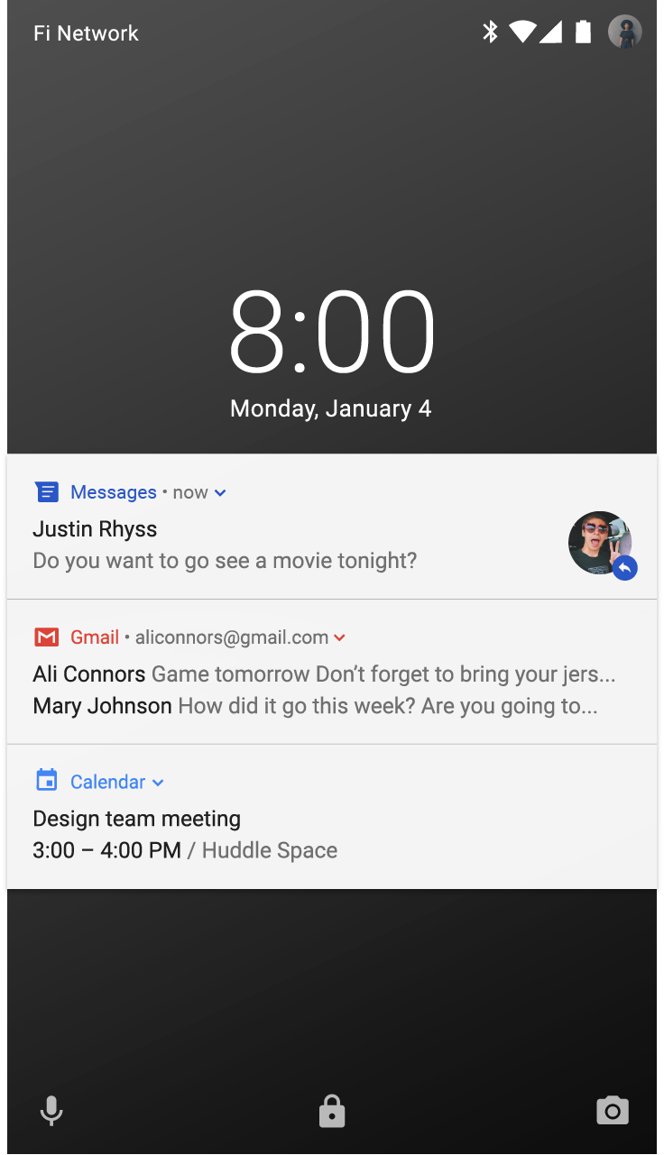
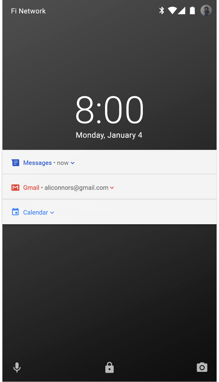
A user may choose to show notifications when their screen is locked. These notifications may conceal any content that an app marks as sensitive. Android evaluates each notification's visibility level to figure out what can safely be shown.

Sensitive content on lock screens

Because notifications are visible on the lock screen, user privacy is an important consideration. For each notification you create, a visibility level is set to either public, private, or secret.

Public notifications are fully visible on secure lock screens, while secret notifications are hidden.

Private notifications fall in the middle: they show only basic information, including the name of the app that posted it and its icon. In place of the regular content – which will be hidden – you have the option to show text that doesn't reveal personal information, such as "2 new messages".

User displays all notification content on lock screen - Material Design

This user has chosen to show all notification content on the lock screen.

User hides sensitive content; Material Design notifications private

This user has chosen to hide sensitive content from the lock screen. Because these apps gave their notifications a visibility level of "private,” no content title or text appears.

Style Expand and collapse content An arrow that points down when collapsed and points up when expanded.

Clear and concise text

Android truncates content titles to a single line (even when expanded).

Content titles should:

  • Be under under 30 characters long
  • Contain the most important information
  • Avoid variables – unless they contain a number or short text string, or are preceded by text
  • Exclude the app's name, which already appears in the header
Material Design app name is redundant in header area

Don’t.

The content title shows the app name, which is redundant with the header area and uses up available characters.

Content text should:

  • Avoid exceeding the 40-character limit
  • Not repeat what's in the content title
Material Design: Key information in content title

Do.

The content title shows the most important information.

The large icon

In Android N, the large icon is only meant for specific situations in which imagery meaningfully reinforces the notification's content, including:

  • Communication from another person, such as the image of someone sending a message
  • The source of content if it's different than the app sending the notification, such as the logo from a YouTube channel to which the user is subscribed
  • Meaningful symbols about the notification, such as an arrow symbol for driving directions

Large icons should be circular when showing a person, but square in all other cases.

Large icon for non-branding in Material Design

Don’t.

The large icon is not intended for branding.

Large icon supports notification content in Material Design

Do.

The large icon is meant to reinforce the content of the notification in a meaningful way, such as a person's photo attached to a message notification.

Templates Expand and collapse content An arrow that points down when collapsed and points up when expanded.

Google uses the following notification templates in its Android apps, which you can adapt for your app.

Standard template

The standard template is suitable for most notifications, allowing succinct text, a large icon (when applicable), and actions.

Material Design standard template for notifications

Standard template for collapsed and expanded notifications

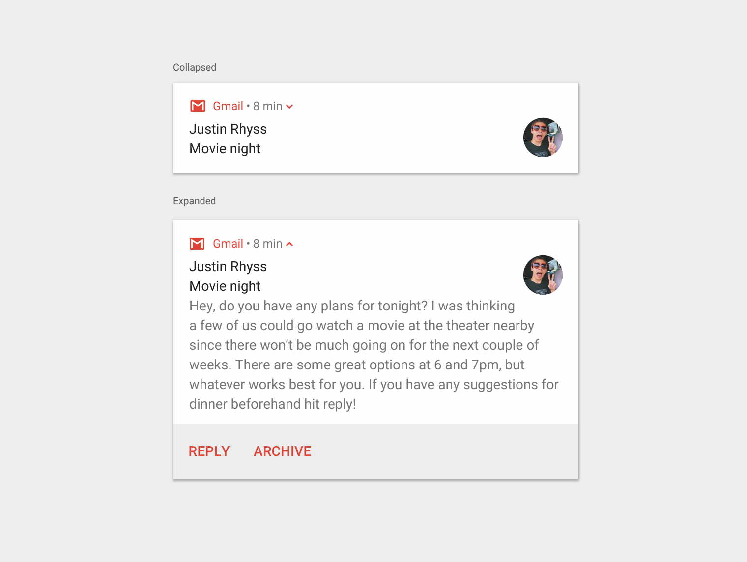
Big text template

This template should be used when long text is displayed. It lets the user preview more text when the notification is expanded.

Material Design big text template for notifications

Big text template for collapsed and expanded notifications

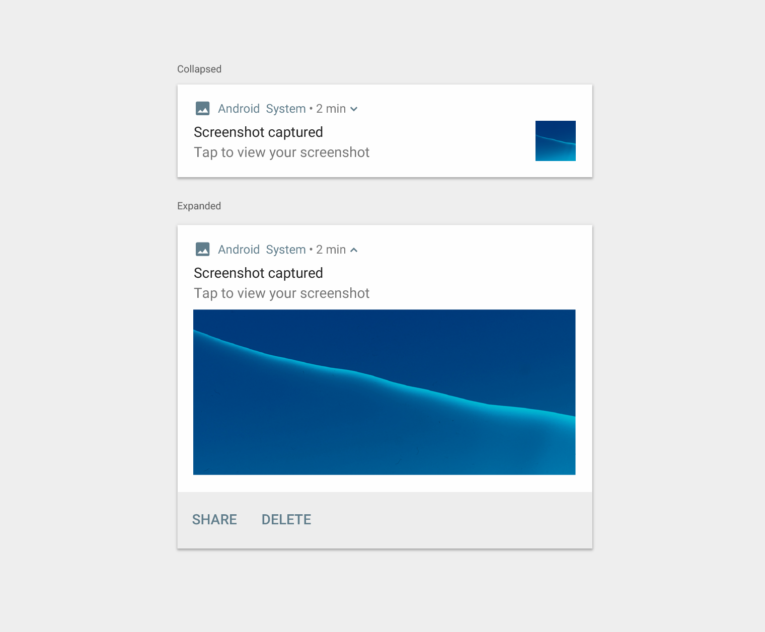
Big picture template

This template should be used when a notification contains a picture. The large icon offers a thumbnail of the picture, and the user can get a bigger preview by expanding the notification.

Material Design big picture template for notifications

Big picture template for collapsed and expanded notifications

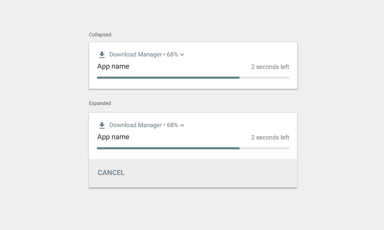
Progress template

This template should be used for user-initiated activities that take time to complete and can be canceled at any time. (Non-cancelable activities don't warrant notifications.)

Material Design progress template for notifications

Progress template for collapsed and expanded notifications

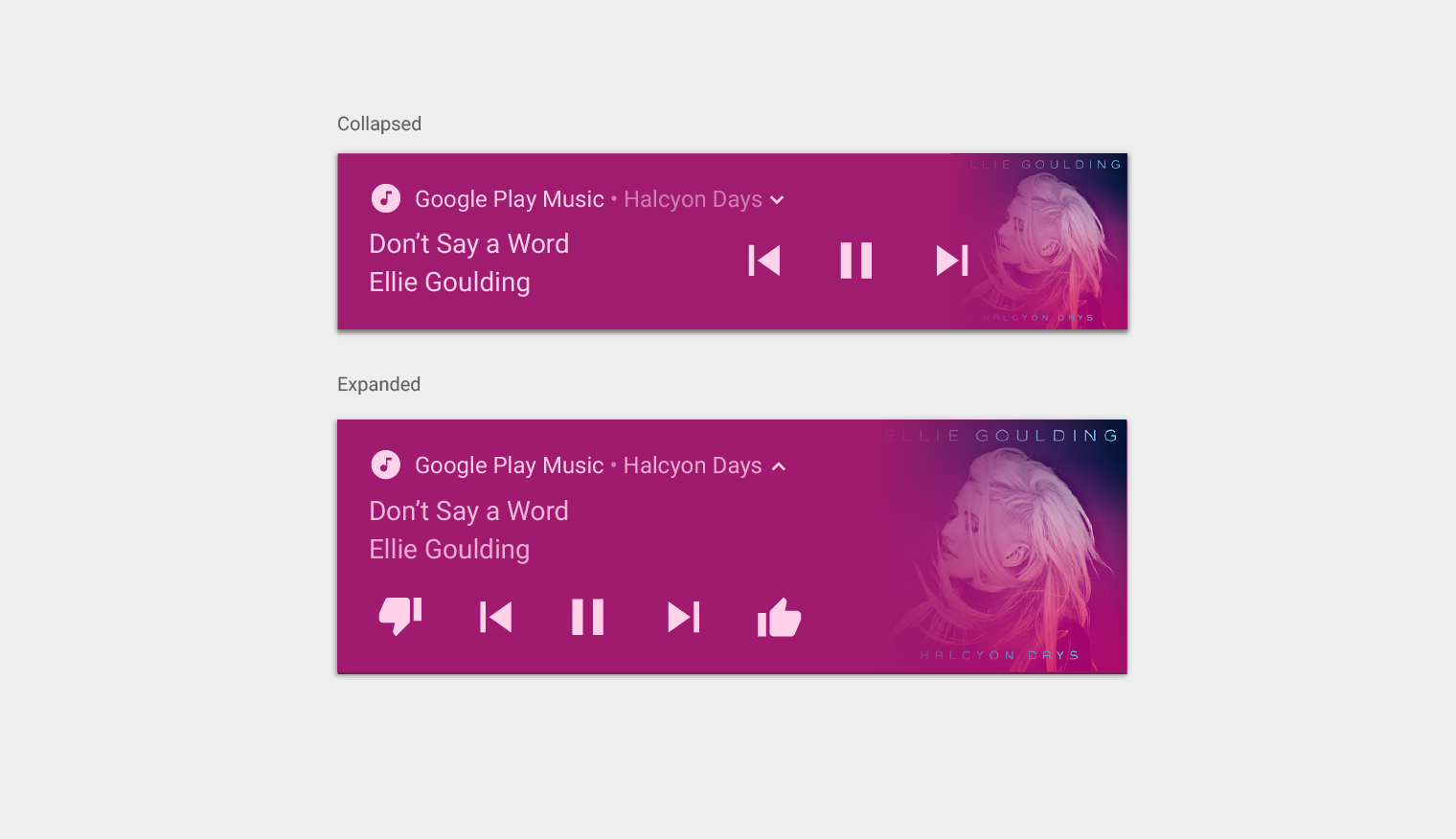
Media template

This template lets the user control media currently playing from an app.

  • The collapsed view displays up to three actions, and the large icon can show a related image, such as an album cover.
  • The expanded view displays up to five actions with a larger image, or six actions if no image is displayed. Colors from provided images automatically color the notification's background and other elements.
Material Design media template for notifications

Media template for collapsed and expanded notifications

Messaging template

This template is for real-time communication. Optionally, you can offer users the ability to type replies directly into the notification.

Material Design messaging template for notifications

Messaging template for collapsed and expanded notifications