Style Writing

Writing

Text should be understandable by anyone, anywhere, regardless of their culture or language.

Clear, accurate, and concise text makes interfaces more usable and builds trust.

In addition to these guidelines, be sure to consult guidelines for specific UI elements, such as Errors, Dialogs, Settings, and Data formats.

Guidelines

Tone
Capitalization
Punctuation
UI button text

Style

Google guidelines generally follow the Associated Press (AP) style guidelines.

Text should be simple, concise, and direct

Do.

Language Expand and collapse content An arrow that points down when collapsed and points up when expanded.

Addressing users

Your UI may address the user using either:

  • Second person, “you” or “your”: Use this conversational style for most situations, as though the app is speaking directly to the user.
  • First person, “I” or “my”: In some cases, you may need to use this form of address to emphasize the user's ownership of content or actions.

Quickly open the camera without unlocking your screen

Your places

Addressing the user with the second person using “you” or “your”

I agree to follow the Google Terms of Service

My Account

Addressing the user with the first person using “I” or “my”

Avoid mixing "me"/"my" with "you"/"your.” It can cause confusion to see both forms of addressing the user in the same context.

Change your preferences in My Account

Don’t.

Avoid the pronoun “we”

Focus on the user and what they can do with your app, rather than what you or your app is doing for the user.

Get started with these popular posts on Google+

Do.

To get you started, we’re showing you popular posts on Google+

Don’t.

One exception is when a person takes an action for a user, such as reviewing an appeal or responding to a suggestion. Here, the use of “we” is appropriate.

We’ll review your appeal and respond within a few days

Do.

Your appeal will be reviewed, and you will receive a response within a few days

Don’t.

Be concise

Write in small, scannable segments to facilitate navigation and discovery.

Send money to anyone in the US who has an email address. It’s fast, easy, and free.

Do.

Send (and receive) money with friends and family in the US with an email address. It’s a two-step process with little-to-no latency and there aren’t any charges for the recipients of the money.

Don’t.

Keep your sentences and phrases short, with as few concepts as possible.

Read the instructions that came with your phone

Do.

Consult the documentation that came with your phone for further instructions

Don’t.

Write in the present

Use the present tense to describe product behavior. Avoid using the future tense to describe the way a product always acts.

When you need to write in the past or future, use simple verb forms.

Write simply and directly

Use simple, direct language that is easy for users to understand.

Common introductory phrases may be omitted.

Save changes?

Do.

Would you like to save your changes?

Don’t.

Message sent

Do.

Message has been sent

Don’t.

Register to vote

Do.

You must register before you can vote

Don’t.

Write for all levels of readers

Pick common words that are clearly and easily understandable to both beginning and advanced English readers.

Turn on Location History

Do.

Enable Location History

Don’t.

Avoid industry-specific terminology or names invented for UI features.

Preparing video…

Do.

Buffering…

Don’t.

“Ok Google” isn’t supported on your phone

Do.

“Ok Google” is only supported on dual-core devices

Don’t.

Refer users to the labels on UI elements, not the type of element (such as menu or button).

Click Continue

Do.

Click the Continue button

Don’t.

Use consistent words in all parts of a feature

Use verbs in a consistent manner across the description of an action.

Remove photo

Do.

Delete photo

Don’t.

Remove photo?

Do.

The dialog title is short.

Remove photo from page?

Don’t.

The dialog title is longer than necessary.

“1, 2, 3” not “one, two, three”

Use numerals in place of words for numbers.

One exception is when mixing uses of numbers, such as "Enter two 3s."

You have 3 messages

Do.

You have three messages

Don’t.

Begin with the objective

If a sentence describes both an objective and the action needed to achieve that objective, start the sentence with the objective.

To remove a photo from this album, drag it to the trash

Do.

Drag a photo to the trash to remove it from this album

Don’t.

Reveal detail as needed

It's not necessary to describe every detail in the first interaction. Reveal increasing detail about features as the user explores them and needs the information.

Remove downloaded book?

Do.

Are you sure you want to remove this downloaded book? You won’t be able to access it unless you’re online.

Don’t.

Never say “never”

Avoid “never” and other absolutes.

Your circle names aren’t shared

Do.

We’ll never share your circle names

Don’t.

Text for buttons and related elements

Buttons appear in dialogs and as blue or underlined text.

Button

Usage

[ Action ]

See above guideline about using consistent verbs.

Back

Allows multi-step processes

Cancel

Cancels an action

Dismiss

Causes a message or dialog to disappear without any consequences

Done

Confirms the completion of a multi-step process

Got it

Causes a message or dialog to disappear without any consequences (similar to OK)

Learn more

Takes the user to additional content

Next

Takes the user to the next step of a multi-step process

No thanks

Allows a user to decline

Not now

Let’s a user postpone an action or decision. Use only when the call to action in the dialog is essential to the functionality of the product, for legal reasons, or for another urgent reason.


Do not use “Not now” as a mechanism to avoid providing a “No thanks” option.

OK

Allows the user to confirm an action that’s relevant to the task at hand

Skip

Gives the user a way to avoid an interruption and proceed with a task

Tone Expand and collapse content An arrow that points down when collapsed and points up when expanded.

Be friendly, respectful, and focus on the user

Your app’s text should complement its design: intuitive, efficient, casual, and trustworthy.

MyApp isn’t responding
Do you want to close it?

Do.

Sorry!
Activity in MyAppActivity (in the MyApp app) is not responding

Don’t.

Be humble

Reveal what a feature does, without bragging or over-promising.

All your savings in one place

Do.

Great deals at places you’ll love

Don’t.

More restaurant reviews

Do.

All restaurant reviews

Don’t.

Be inviting

Focus on the benefits of each feature. Omit implementation details, caveats, and restrictions when features are introduced.

To save power, switch Location mode to Battery saving mode

Do.

Manually control GPS to prevent other apps from using it

Don’t.

Be positive

Present information in a positive light: it’s reassuring.

Use 24 characters or fewer for file names

Do.

Your file name must be less than 25 characters

Don’t.

Try again

Do.

The action failed

Don’t.

Be essential

Communicate essential details, so that users can focus on their own tasks. Sometimes the most effective UI contains no text at all.

Signing in...
Your phone is contacting Google. This can take up to five minutes.

Do.

Signing in...
Your phone needs to communicate with Google servers to sign in to your account. This may take up to five minutes.

Don’t.

Capitalization & punctuation Expand and collapse content An arrow that points down when collapsed and points up when expanded.

Use sentence-style caps

Titles, headings, labels, and menu items should use sentence-style capitalization (capitalizing only the first word of a sentence).

Avoid capitalizing all letters except where the Material spec requires them, such as Button text.

Search settings

Do.

Search Settings

Don’t.

Skip periods and unnecessary punctuation

To help readers scan text at a glance, avoid using periods and other unnecessary punctuation.

Periods

Avoid using periods in solitary sentences in these elements:

  • Labels
  • Hover text
  • Bulleted lists
  • Dialog body text

Periods should be used on:

  • Multiple sentences
  • Any sentence followed by a link

Share your photos with friends. Learn more

Do.

Place periods after sentences followed by a link.

Share your photos with friends. Learn more.

Don’t.

Sentences followed by a link should place the period before the link, not after.

Undo bulk edit?
If you undo this bulk edit, everything you changed will go back to its previous state

Do.

Skip periods after solo sentences of body text.

Undo bulk edit?
If you undo this bulk edit, everything you changed will go back to its previous state.

Don’t.

Don’t place periods after body text if there is only a single sentence present.

Colons

Skip colons after labels.

Share with

Do.

Share with:

Don’t.

Use contractions

Use contractions when they make a sentence easier to understand. However, sometimes not "do not" can give more emphasis than "don't" when needed.

it’s, can’t, wouldn’t, you’re, you’ve, haven’t, don’t

Do.

it is, cannot, would not, it’ll, should’ve

Don’t.

Avoid exclamation points

Avoid exclamation points as they tend to come across as shouting. Some exceptions include greetings or congratulatory messages.

Welcome!

Do.

Learn about the new features of Calendar!

Don’t.

Punctuation

Use punctuation to add clarity or be grammatically correct.

Glyph/character

HTML entity

Unicode

Usage

Example

Colons

:

\u003A

Omit colons on labels.
Use them above lists.

Two things:

  • First
  • Second

Commas

,

Place commas inside of quotation marks.

Use the serial comma in a list of three or more items, except when using an ampersand (&).

Double angle brackets

>>

<<

&laquo;

&raquo;

\u00AB

\u00BB

Omit double angle brackets from links or buttons that open another page or step.

Em dash

&mdash;

\u2014

Use en dashes, not em dashes

En dash

&ndash;

\u2013

Use an en dash instead of a hyphen to indicate a range, without spaces.

Avoid using dashes to separate text. If you must use dashes for this purpose – like this – use an en dash surrounded by spaces.

3–5 kg

Ellipses

&hellip;

Use ellipses to indicate an action in progress or incomplete or truncated text, without a space before the ellipses.
Omit ellipses from menu items or buttons that open a dialog or start a process.

Downloading…

Exclamation points

!

Avoid exclamation points, as they may come across as shouting

Hyphen

-

Use hyphens to represent negative numbers, or to create compound words

-5

5-mile walk

Midline ellipses

• • •

Midline ellipses are used to represent numeric truncation and the redaction of sensitive data..

SSN • • • 5678

Parentheses

( )

Use parentheses to define acronyms or jargon

SSL (secure socket layer)

Periods

.

Omit periods on fragments and single sentences, but use them when in a group of two or more sentences.
Place periods inside quotation marks.

Primes

&prime;

&Prime;

\u2032

\u2033

Use prime (′) only in abbreviations for feet, arcminutes, and minutes.
Use double-prime (″) only in abbreviations for inches, arcminutes, and minutes.
Don’t use generic quotes ", ' or free-standing accents `, ´ for primes.

3° 15′

3° 15′ 35″

Quotation marks

&ldquo;

&rdquo;

&lsquo;

&rsquo;

\u201C

\u201D

\u2018

\u2019

Use quotation marks, not the inch or foot symbols.
Use the right single quotation mark for apostrophes.
Never use generic quotes ", ' or free-standing accents `, ´ (", ', `, ´) for quotation marks, apostrophes, or primes.

Global writing Expand and collapse content An arrow that points down when collapsed and points up when expanded.

People of all ages, cultures, and education levels rely on the English versions of products. Simple, clear English makes it easy for anyone to understand your product.

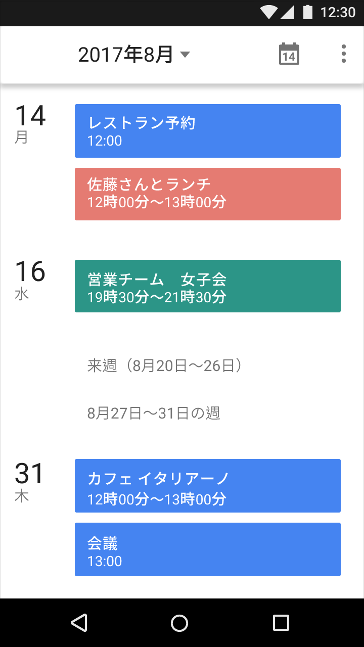
Japanese writing example in Material Design style

Example of Japanese writing

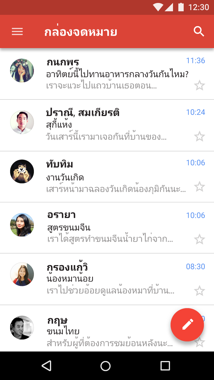
Thai writing example in Material Design style

Example of Thai writing

Be aware of using terms like “left” and “right” in RTL languages

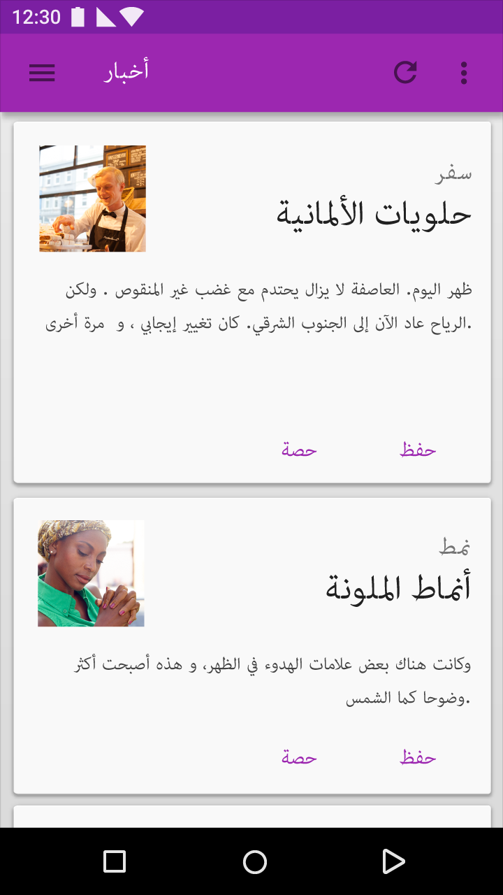
Interfaces for languages with right-to-left scripts may be mirrored when a product is localized.

RTL Arabic interface example with Material Design

In this example of a right-to-left (RTL) interface in Arabic, the interface is mirrored relative to English.

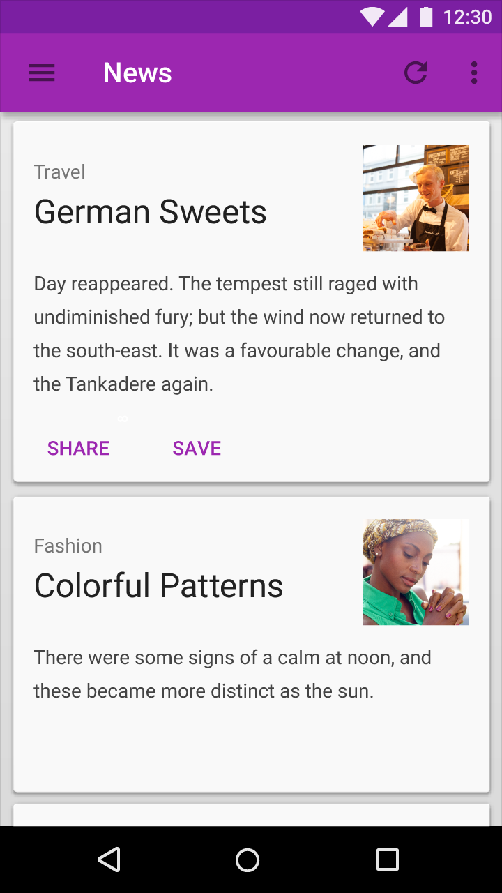
Material Design LTR interface example in English

Example of a left-to-right (LTR) interface in English

Specifying gender

Sometimes the gender of the user isn’t known. In English, the gender-neutral word "they" may be used in this case. But many languages refer to gender in different ways.

When referring to gender in your app:

  • Don't combine gender options, such as "his/her" or "she/he.”
  • If a specific gender is required, such as text referring to a person’s name, provide clear translation instructions and use the International Components for Unicode (ICU) APIs or equivalent libraries.