Components Lists: Controls

Lists: Controls

List controls display information and actions for list items.

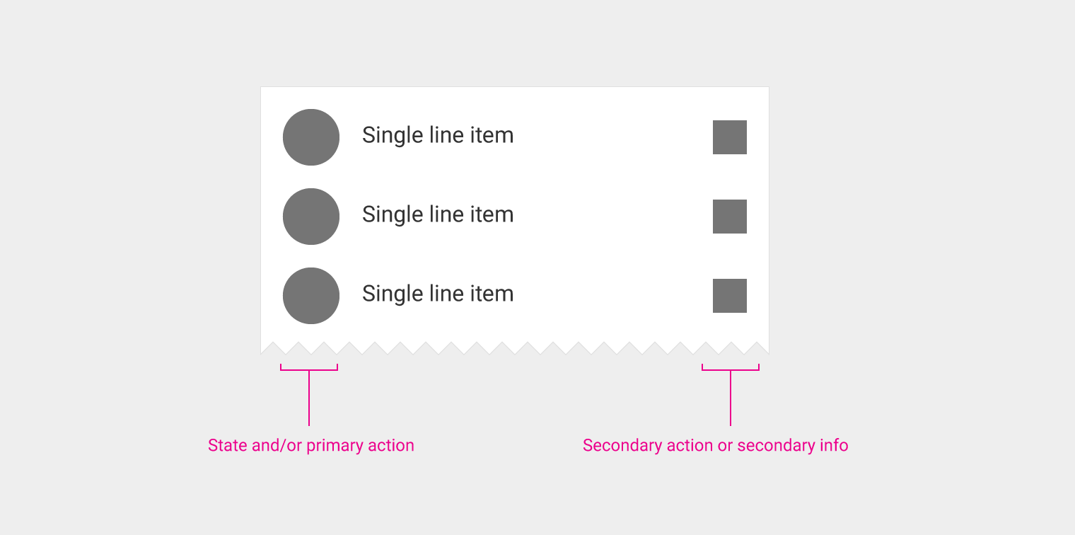
List controls provide information, indicate a state, or present actions for list items. List controls appear as icons to the left or right of list text.

List control placement:

  • States and primary actions are placed on the left side of a list tile.
  • Secondary actions and info are placed on the right side of the tile.
Types

Checkbox
Switch
Reorder
Expand/collapse
Leave-behinds

Menu controls

Check
Inline information
Nested menu indicator

Material Design: List controls for item information and actions

Usage Expand and collapse content An arrow that points down when collapsed and points up when expanded.

List controls fall under four categories:

  • State
  • Primary action (including text strings)
  • Secondary action
  • Secondary info

Distinguishing elements of list tiles need to be on the left for left-to-right interfaces, and vice versa. States and primary actions are placed on the left side of a list tile. Text within a list item should be considered part of the primary action target.

Don’t place two icons or actions next to one another, such as a checkbox next to an avatar.

If the primary action of the list item is navigational, don’t use an icon. The list item itself and its context should be sufficient to communicate the destination.

Secondary actions and info should be placed on the right side of the title. Secondary actions are always a separate target from the primary action, as users increasingly expect every icon to trigger an action.

Material Design list controls: state, actions, and info

States and primary actions are placed on the left side of a list tile. The secondary action and secondary info should be placed on the right side of the title.

Types of list controls Expand and collapse content An arrow that points down when collapsed and points up when expanded.

Checkbox

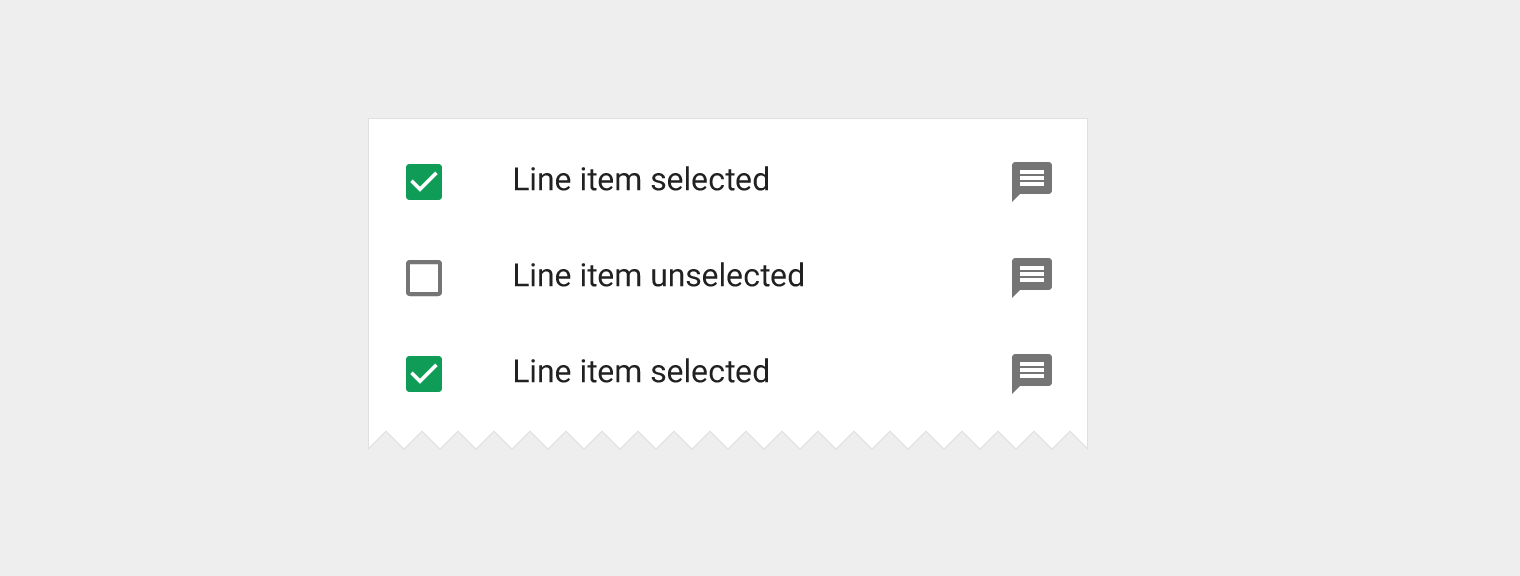
A checkbox can either be a primary action or a secondary action.

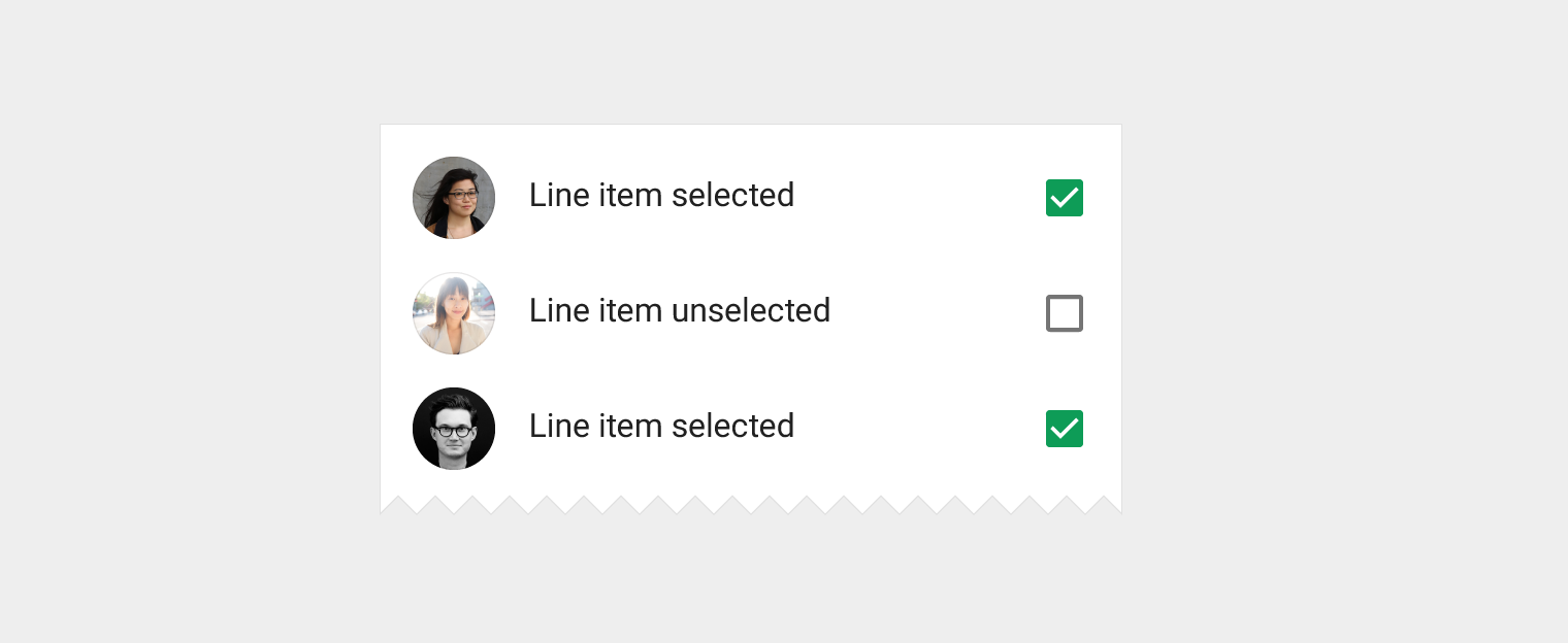
Type: primary action/state

Desktop checkboxes should appear only on hover and focus.

Material Design checkbox as primary action and state indicator

The checkbox is the primary action and the state indicator for the list item.

Type: secondary action

Separate target

When controlling a family of variables, consider using switches instead.

Checkbox as secondary action in Material Design

The checkbox is the secondary action for the list item.

Switch

Type: secondary action

Separate target

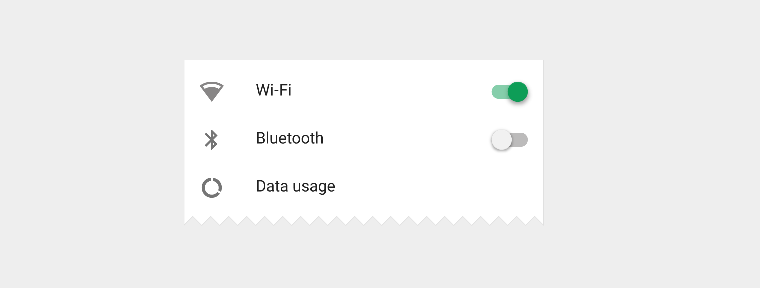
Switch as secondary action in Material Design

The switch is the secondary action and a separate target.

Reorder

Type: secondary action

Usually a separate target, depending on which mode list it is in.

Allows dragging of the list item to other locations within the list. It usually appears in list editing mode.

Reorder icon for list item in Material Design

The reorder icon is the secondary action for the list item.

Expand/collapse

Type: secondary action

Separate target

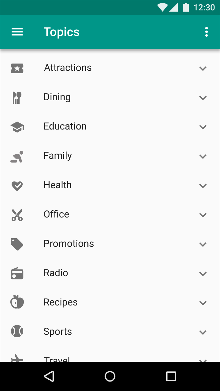
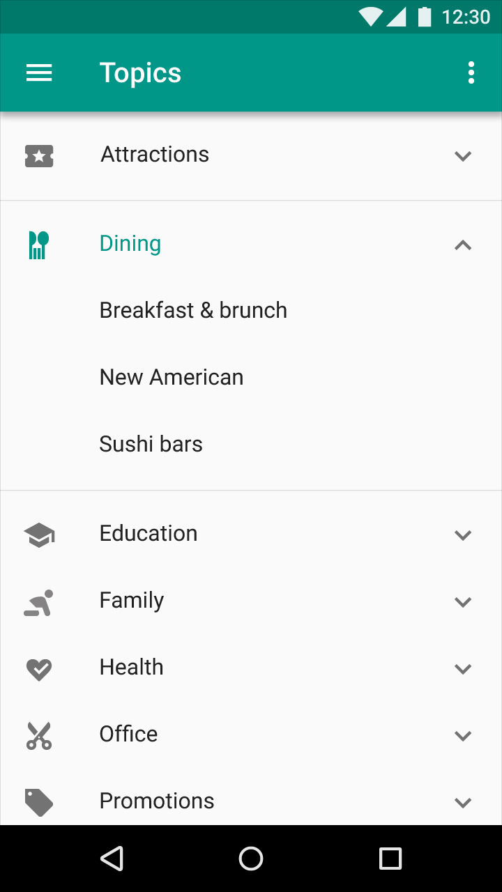
Expands and collapses a list view vertically to show and hide details of existing list items.

Expand list control in Material Design by touch

By touching the list control, the user expands the list.

Expanded list in Material Design

The list is expanded.

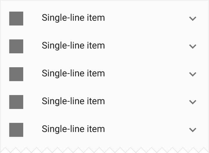
Collapsed single-line item in Material Design

Collapsed single-line item

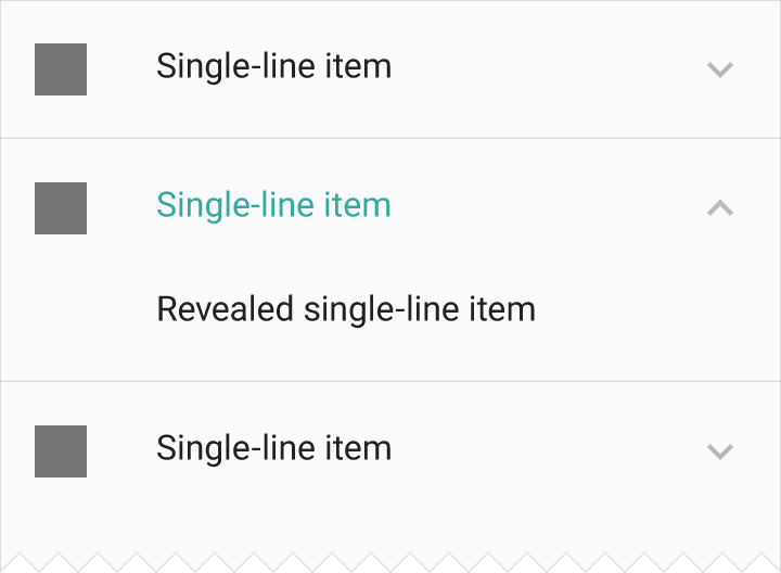
Expanded single-line item in Material Design

Expanded single-line item

Leave-behinds

Type: Other

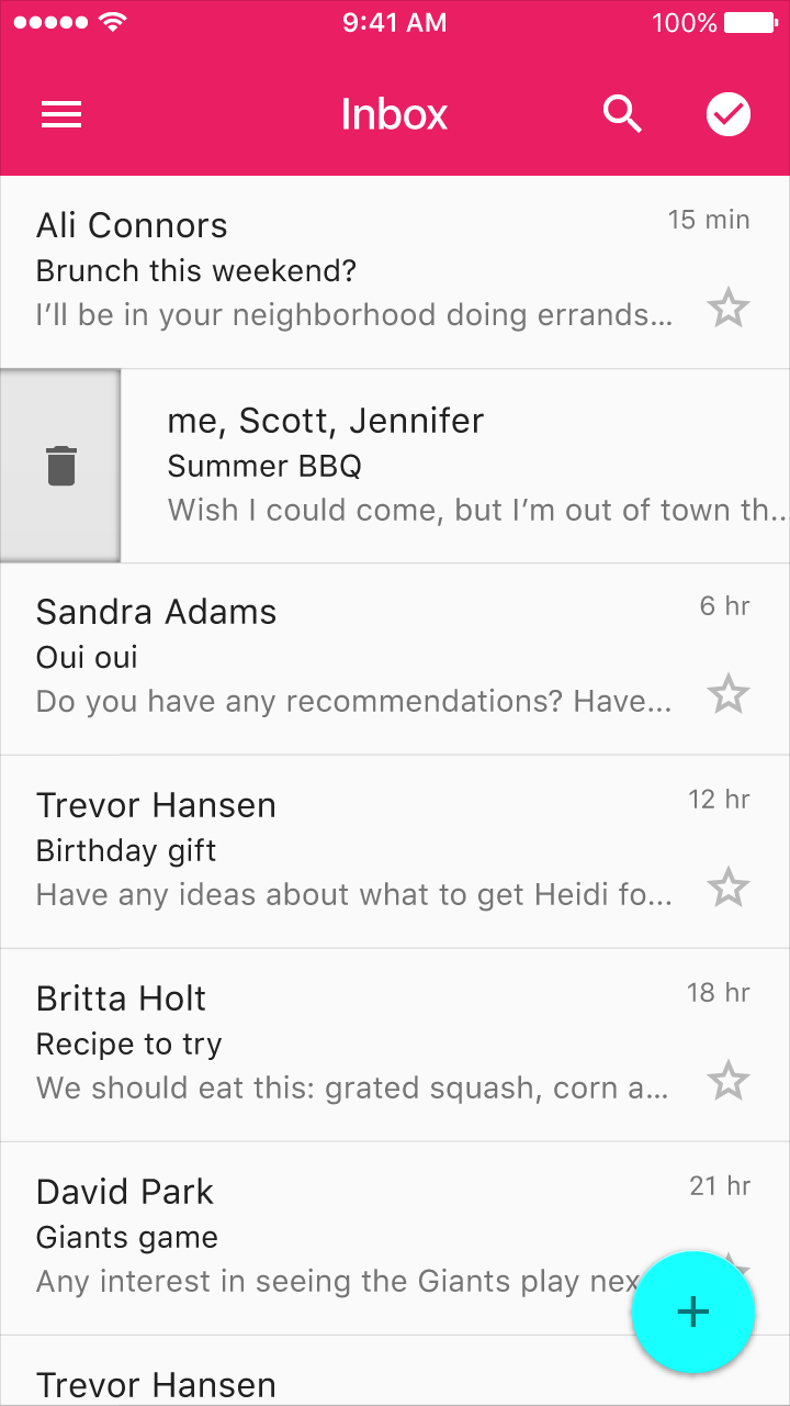
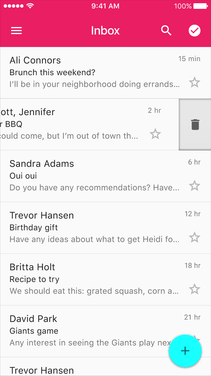
A leave-behind is an informative hint as to what swiping a list item away will do to that item. The leave-behind can transform into an action.

Swiping on a list item from either direction will reveal an icon indicating the action. After swiping, a follow-up action can appear as a text button within the space of the list item.

Material Design: Swipe left to reveal action icon

Swiping on a list item from right to left will reveal an icon indicating the action.

Material Design: Swipe to reveal action icon

Swiping on a list item from left to right will reveal an icon indicating the action.

Types of menu controls Expand and collapse content An arrow that points down when collapsed and points up when expanded.

A menu is a special type of list. In menus, use controls that are appropriate for dropdown menus, overflow menus, and so on. Don’t use these controls in regular lists. Use the regular list controls instead.

Check

Type: state

Not a separate target.

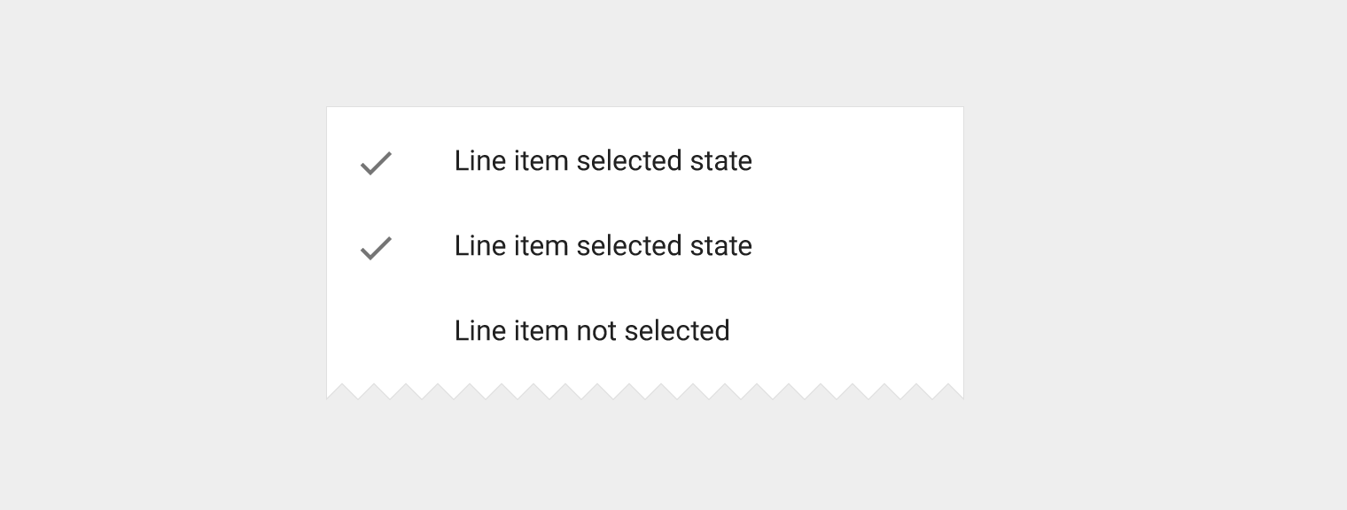
Menus only. Indicates that the list item has been selected. The selection is done through a different control.

Material Design check indicates selected list item

The check indicates that the list item has been selected.

Inline information

Type: secondary info

Not a separate target.

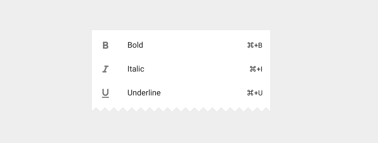
Menus only. Inline information is a small snippet of text related to the line title that can provide information or a tip, like a keyboard shortcut. It cannot be truncated.

Material Design keyboard shortcuts for Bold, Italic, Underline

The inline information for Bold, Italic and Underline provide keyboard shortcuts.

Nested menu indicator

Type: primary action

Not a separate target.

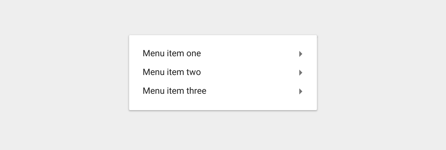
Menus only. The glyph indicates that a secondary menu will fly out upon hover, focus, and/or selection.

Material Design menu items indicate flyout on interaction

The glyphs for the menu items indicate that a secondary menu will fly out upon hover, focus, and/or selection.