Usage
Your onboarding should have specific goals suited to the user’s level of familiarity with the app.
User context | Goals of the warm welcome |
|
|
Your onboarding should have specific goals suited to the user’s level of familiarity with the app.
User context | Goals of the warm welcome |
|
|
Onboarding is one point in a longer journey that begins in the app store and ends with either:
When designing your onboarding, consider the screens that came before it and those that will come after it.
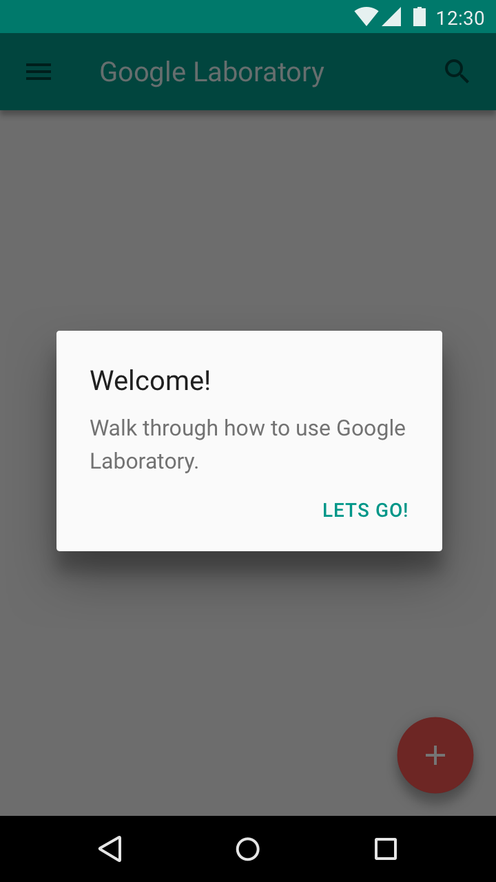
Show onboarding to first-time users. Don’t show it to returning users.
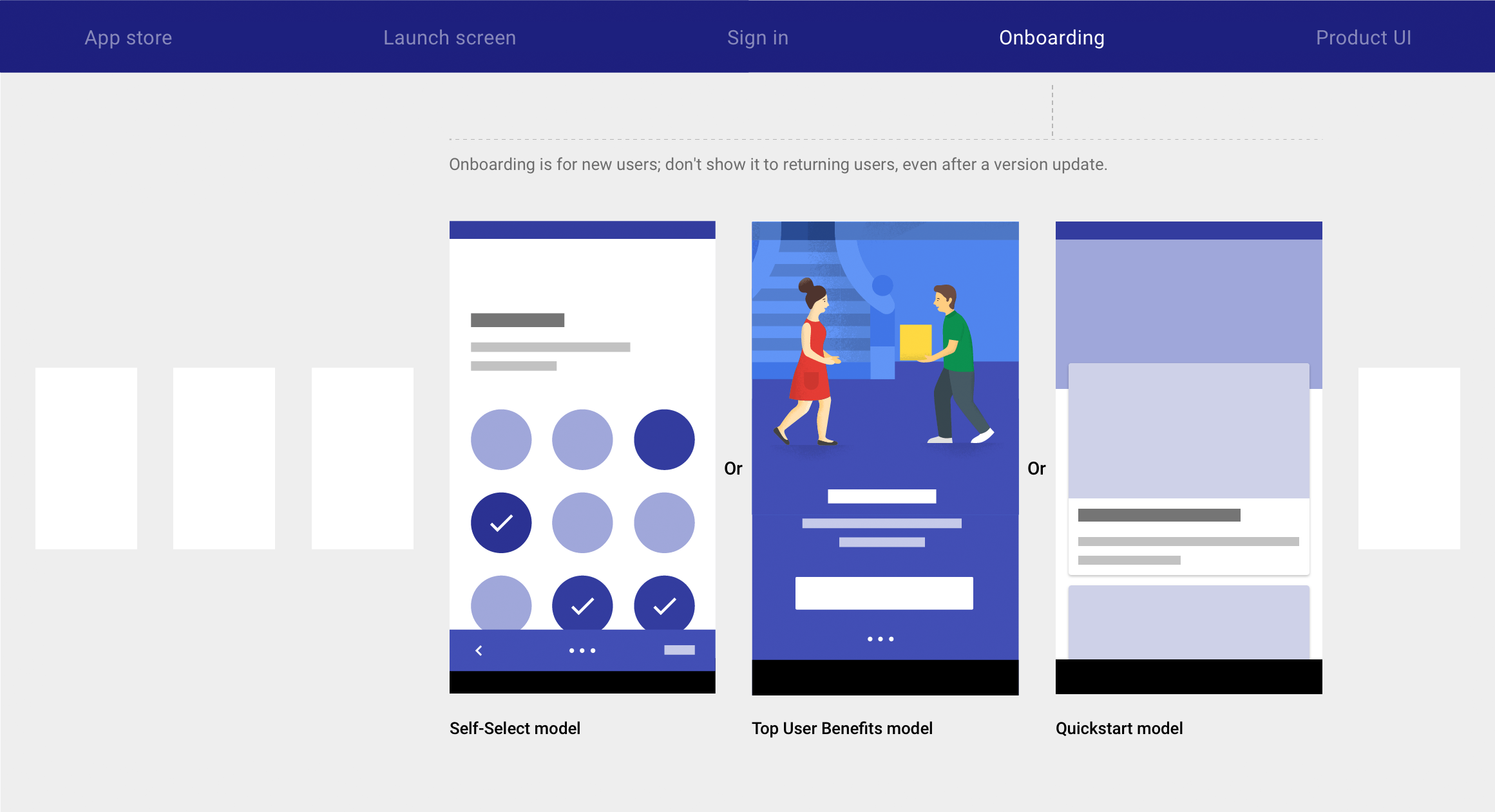
Material design includes three onboarding models:
1. Self-Select
Allow users to customize their experiences.
2. Quickstart
Start the user directly in the app.
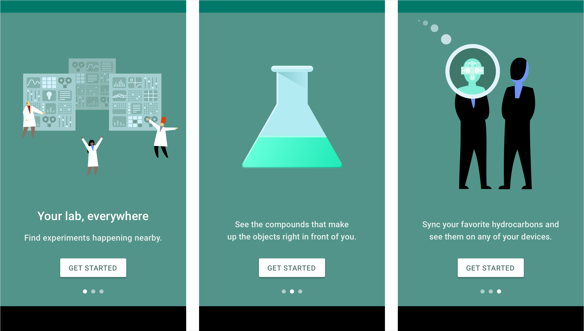
Display a brief autoplay carousel (or animatic) highlighting up to three benefits of using the app.
The onboarding best suited to your app depends on if your app uses a common, recognizable UI style and and how easy it is to set up.
When to use |
| You’ve already identified the behaviors that correspond to increased engagement (in the first session) or increased retention (in the first seven days) |
|
When not to use |
| Your app is tackling a new challenge or providing a new kind of benefit |
|
Combinations | Don’t combine Self Select with Top User Benefits | Ok to include setup before first-run experience |
|
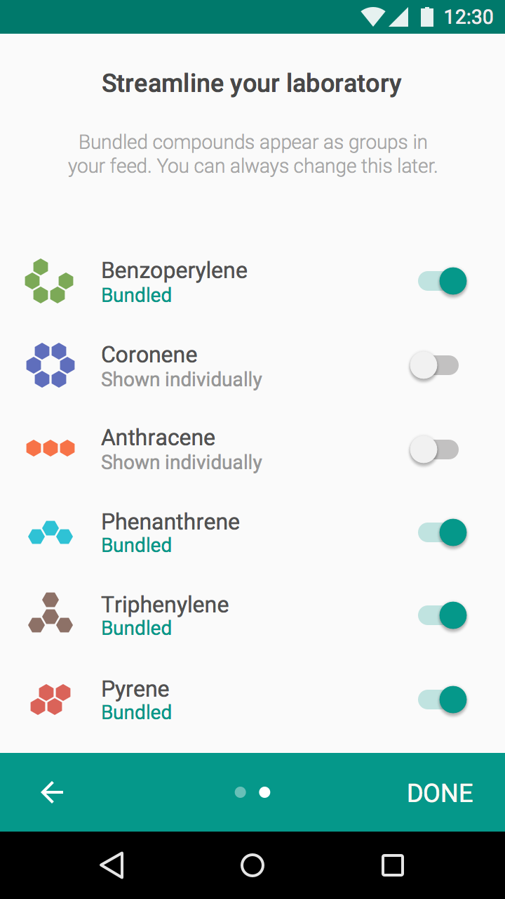
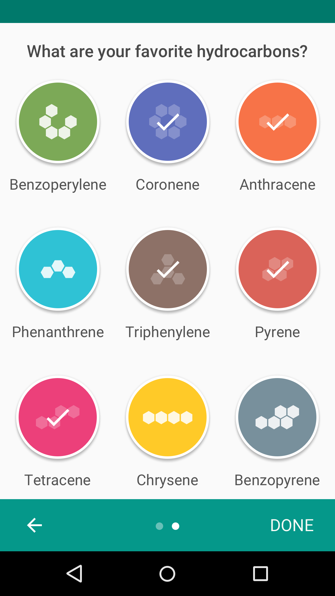
The Self-Select model allows users to customize their first-run experience by making a short series of choices.
This experience provides implicit education, giving the user a sense of control and vested interest in the screens to come.
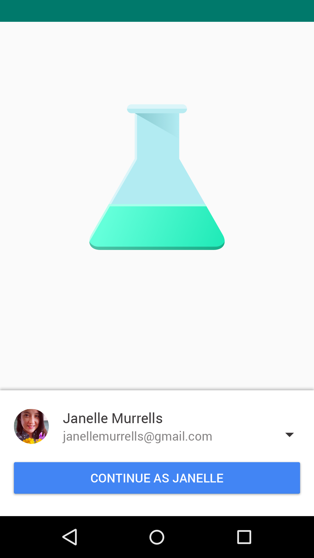
Sign-in screen
Self-Select model
The choices you give users affect the success of your onboarding.
Choices should:
Offer choices that have a meaningful and noticeable impact on the user experience. These implicitly teach users how to interact with your UI.
Do.
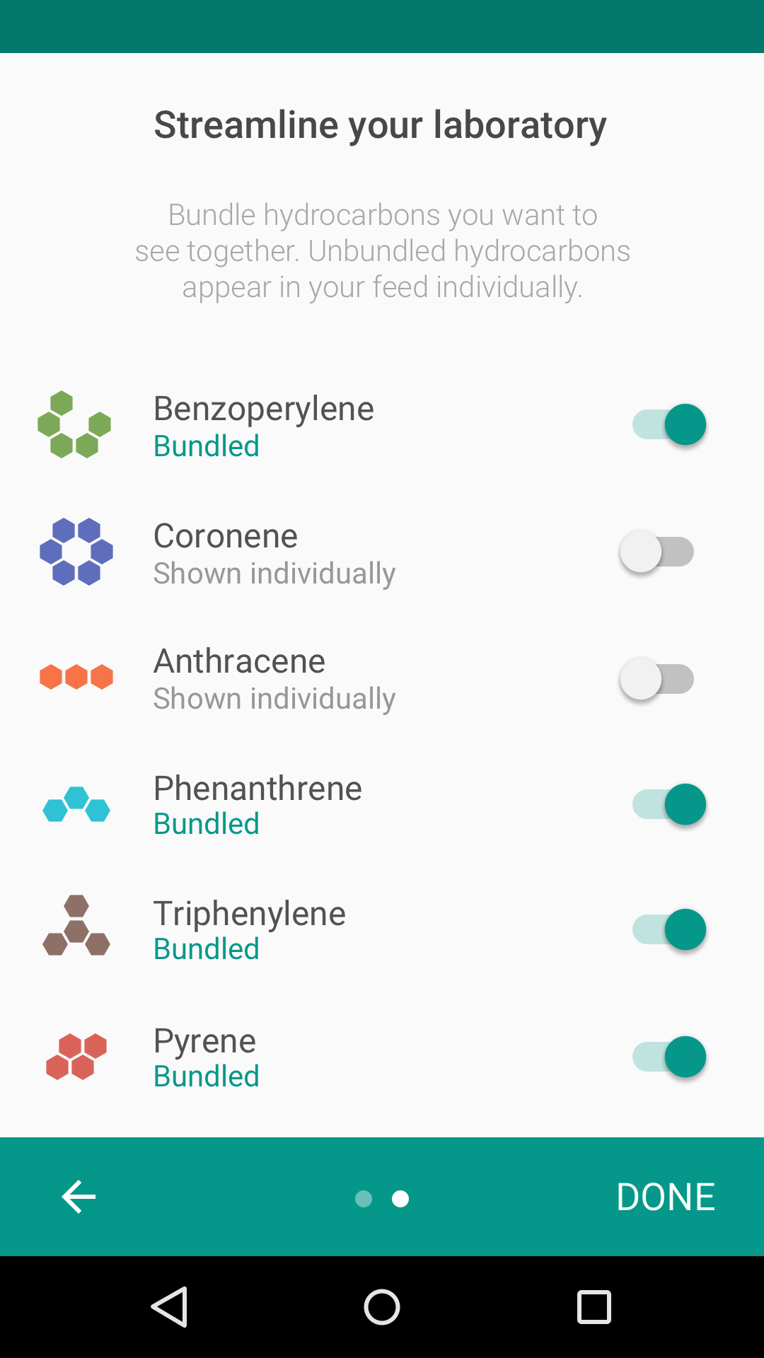
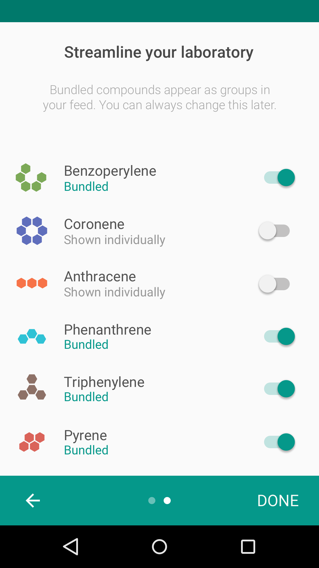
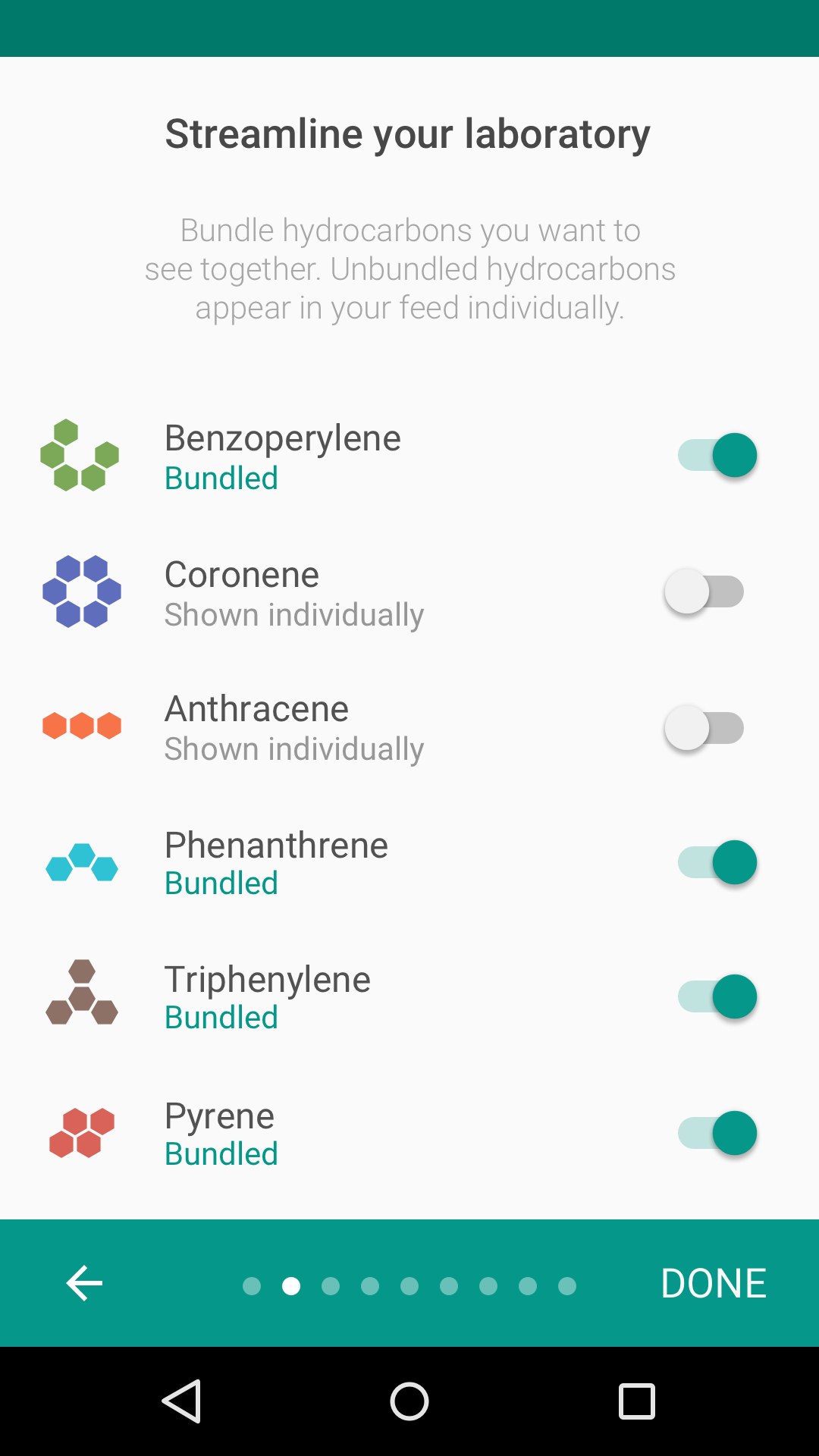
Selecting what to bundle will have a meaningful impact on the user experience.
Don’t.
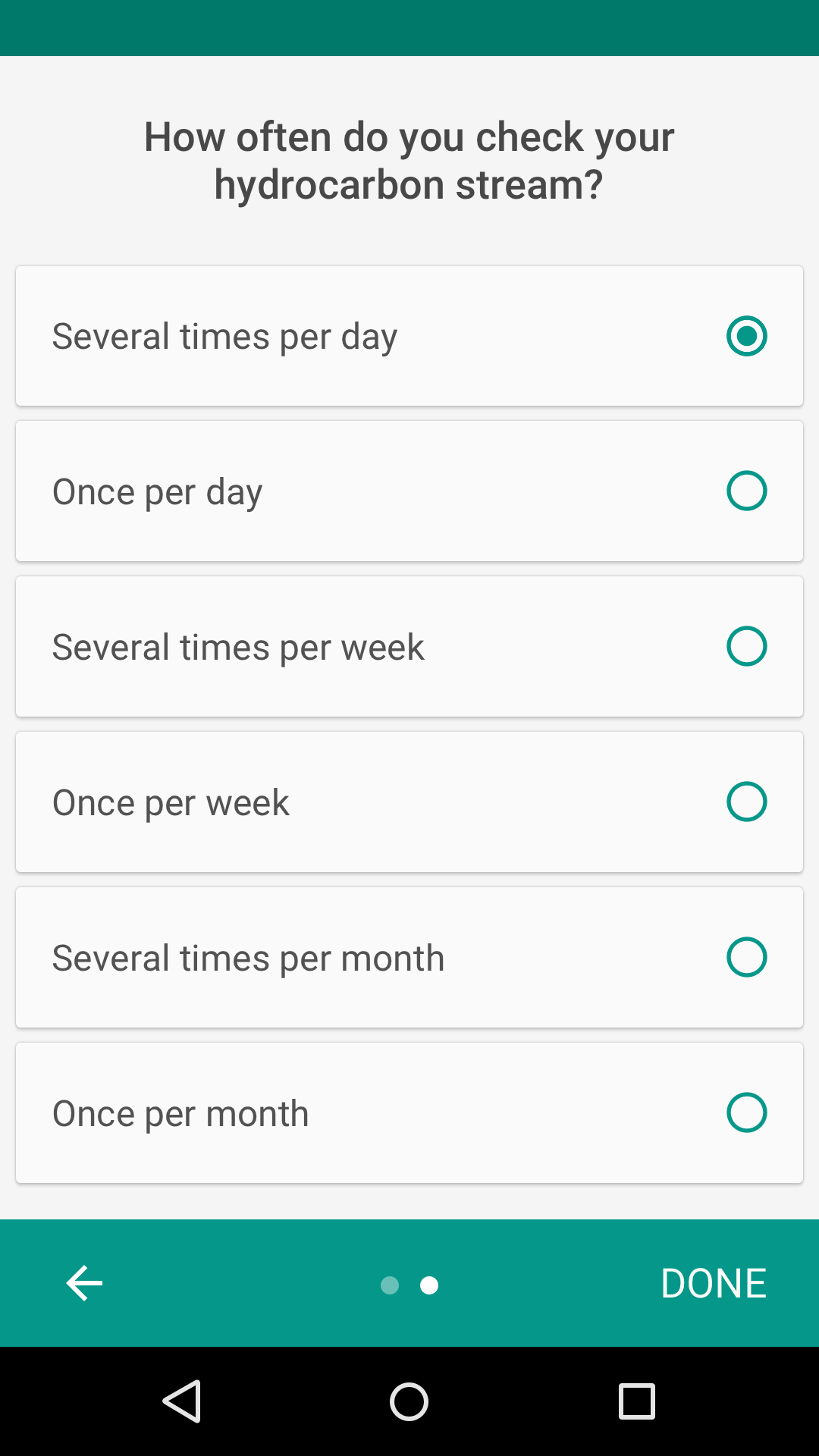
Knowing how often users check their stream doesn’t impact their experience.
Don’t ask for preferences that can be garnered from normal usage.
Do.
Normal usage won’t easily clarify what a user wants to bundle. It is valuable to ask the user their preferences.
Don’t.
Don't ask users to make selections that will become evident with normal use of the app and that won't meaningfully change the first-run experience.
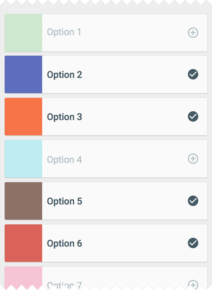
Limit choices to one screen, or make multiple screens feel connected to each other.
Each screen should have fewer than ten choices.
Do.
A single Self-Select screen
Don’t.
Many Self-Select screens
When designing onboarding, think about how the onboarding process connects to a user’s first-run experience. After onboarding, the users should land on a screen that makes it easy to act on what they just learned.
Design your Self-Select screens to relate to what your app does. Apps focused on content consumption may ask for topics of interest, whereas apps with feeds may ask which topics to bundle.
Some common Self-Select design patterns include:
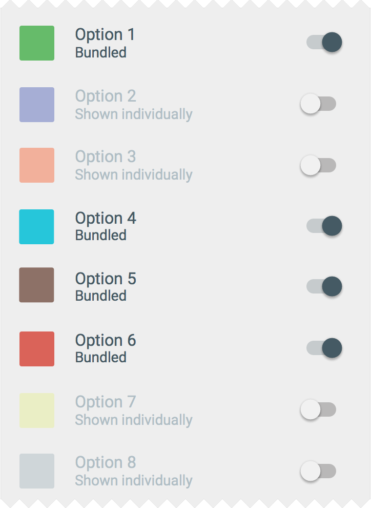
Bundled List
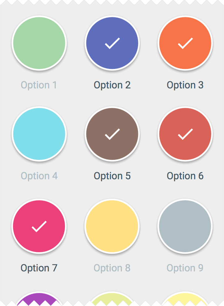
Grid View
List
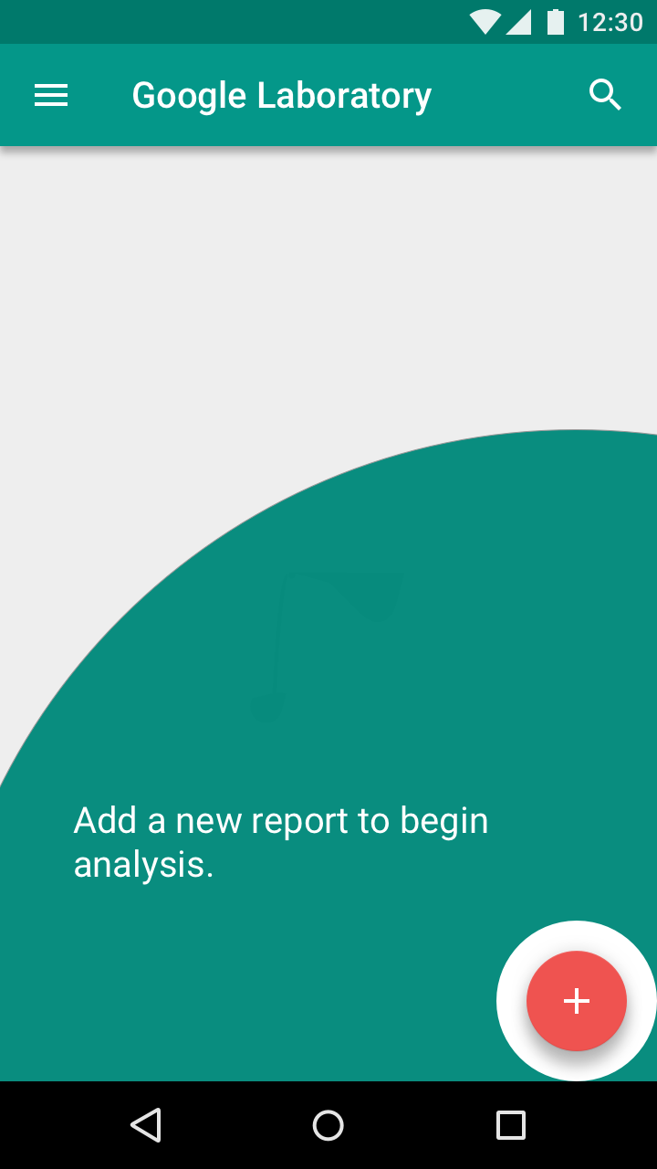
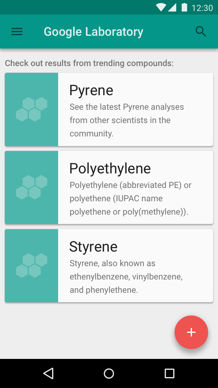
In the Quickstart model, users land directly in the UI without any onboarding model shown (other than sign in and setup).
The Quickstart model:
Give users something to do
Rather than leaving users on a blank screen, your UI should encourage interaction.
Do.
Provide options to get the user started.
Don’t.
Don’t leave users with nothing to do.
Offer education
If it appears as though the user is unclear how to use the app towards the end of the average first-run experience (90% of the way through the first session), display a UI prompt offering the opportunity to learn how to use the app.
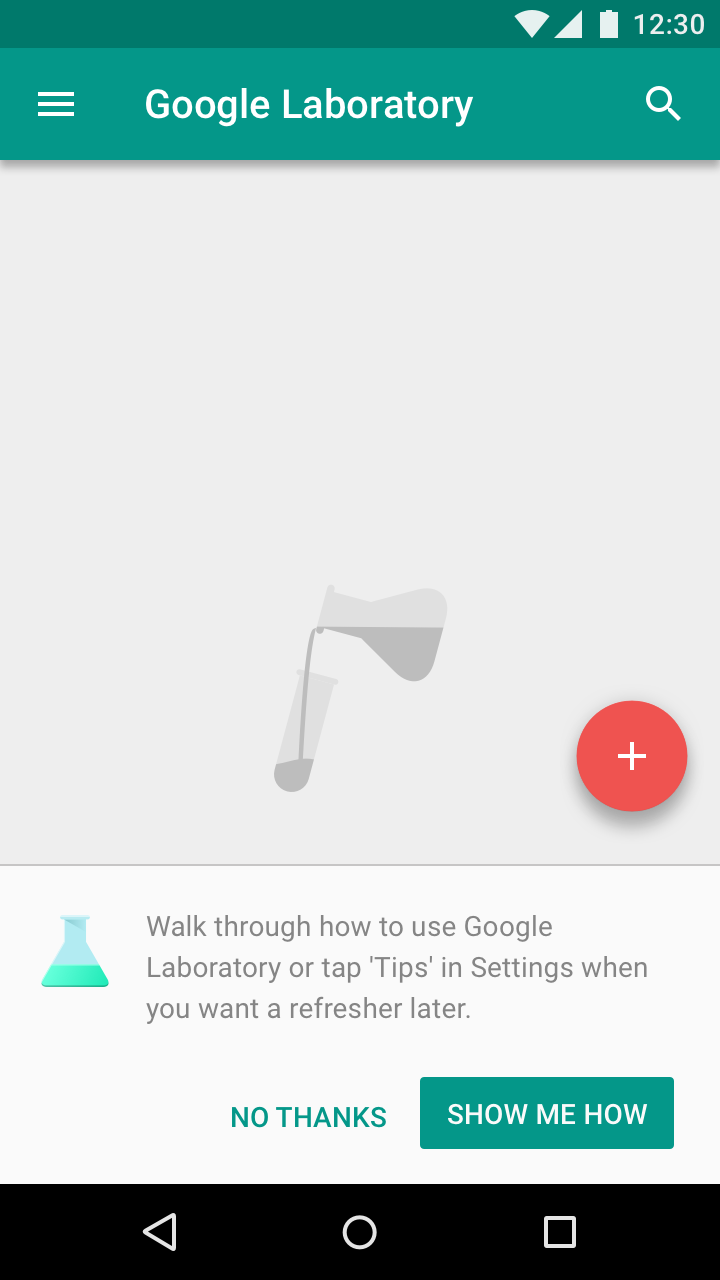
Do.
Offer the user the opportunity to learn more about the app.
Don’t.
Don’t force education upfront.
Prioritize the first key action
Choose the action most closely linked to engagement in the first seven days. Alternatively, introduce core functionality as tips for actions that a user hasn’t tried.

Do.
Nudge users to take the first key action.
Don’t.
Don’t leave users with nothing to do.
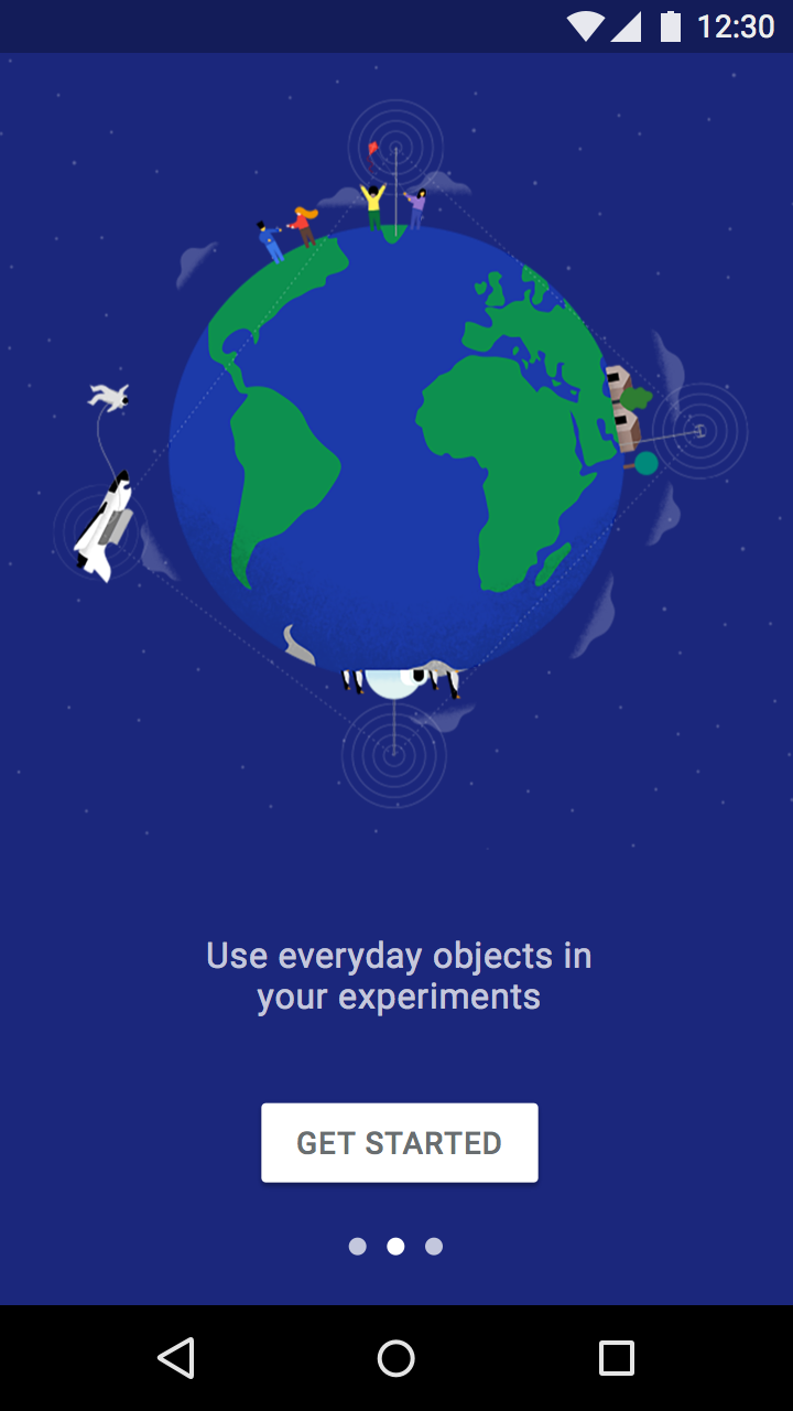
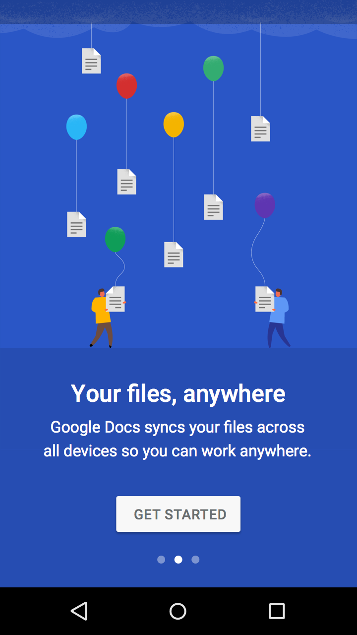
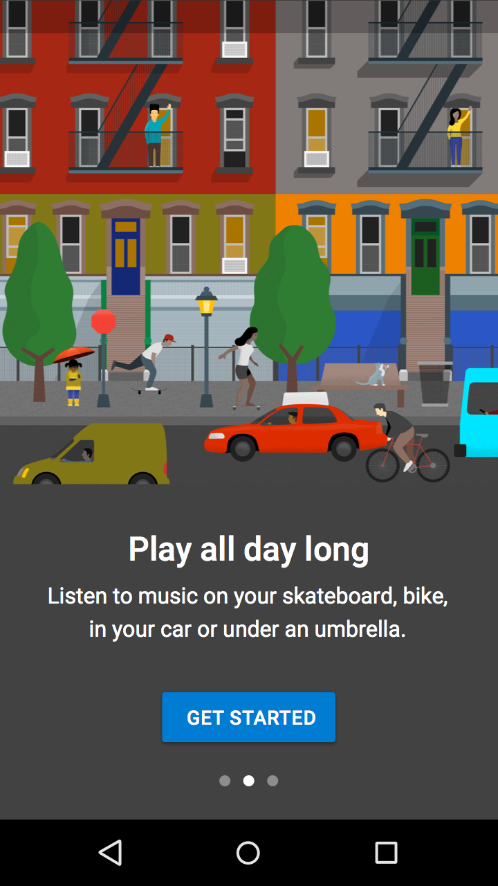
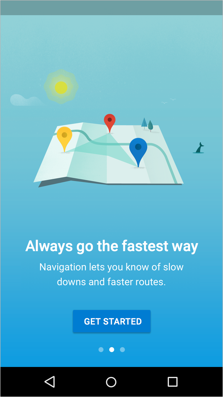
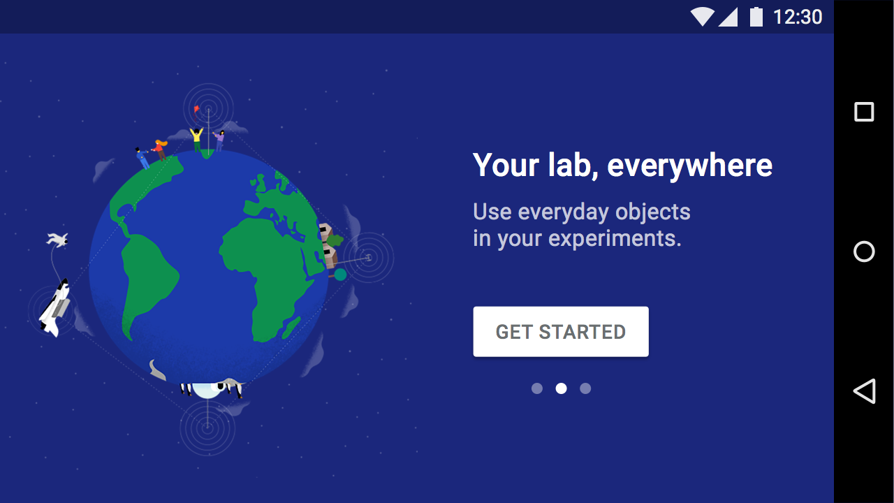
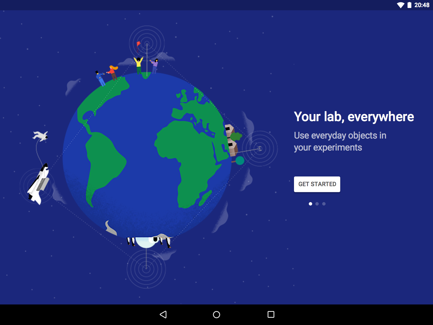
The Top User Benefits onboarding model contains a brief autoplay carousel, or animated storyboard, that highlights up to three of the primary benefits from using an app.
The Top User Benefits model should demonstrate up to three primary benefits from using the app. These benefits should position the app as relevant and personal during a moment that matters, rather than give instructions or describe features.
When identifying which benefits to present, consider:
Auto-rotating carousel
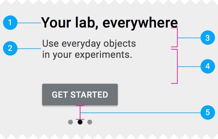
A maximum of three illustrations should auto-rotate every two to three seconds and display pagination navigation. Auto-advance the first screen more quickly so that it’s clear this isn’t a single screen. The auto-advance feature should be disabled if the user touches the carousel.
Display a “Get Started” button throughout the animation, and loop through the animation continuously until the “Get Started” action is tapped.
The screen should be swipe-enabled, either in a forward or backward direction.
The button and pagination navigation are fixed. The typography is dynamic and on a separate field than the illustration, but at the same elevation.
Video
The most complex version of a Top User Benefits experience includes a highly produced video.
This should include a “Get Started” button, without pagination circles.
Video implementation
Maintain visual continuity
Maintain visual continuity throughout characters, environments, style, typography, and button colors.
Do.
Using consistent visuals and colors throughout the experience unify the story by creating a uniform canvas for the button and circles.
Simplify
Simplify the visuals to the essentials needed to convey a concept.
Do.
The metaphor of saving files to the cloud is visually illustrated.
Don’t.
There is no point of focus in this image.
Don’t be UI literal
Don’t show app UI if users haven't experienced it yet. Show the user benefit first.
You may display education about the specific UI in a later context.
Do.
This illustration helps convey the benefits of directions.
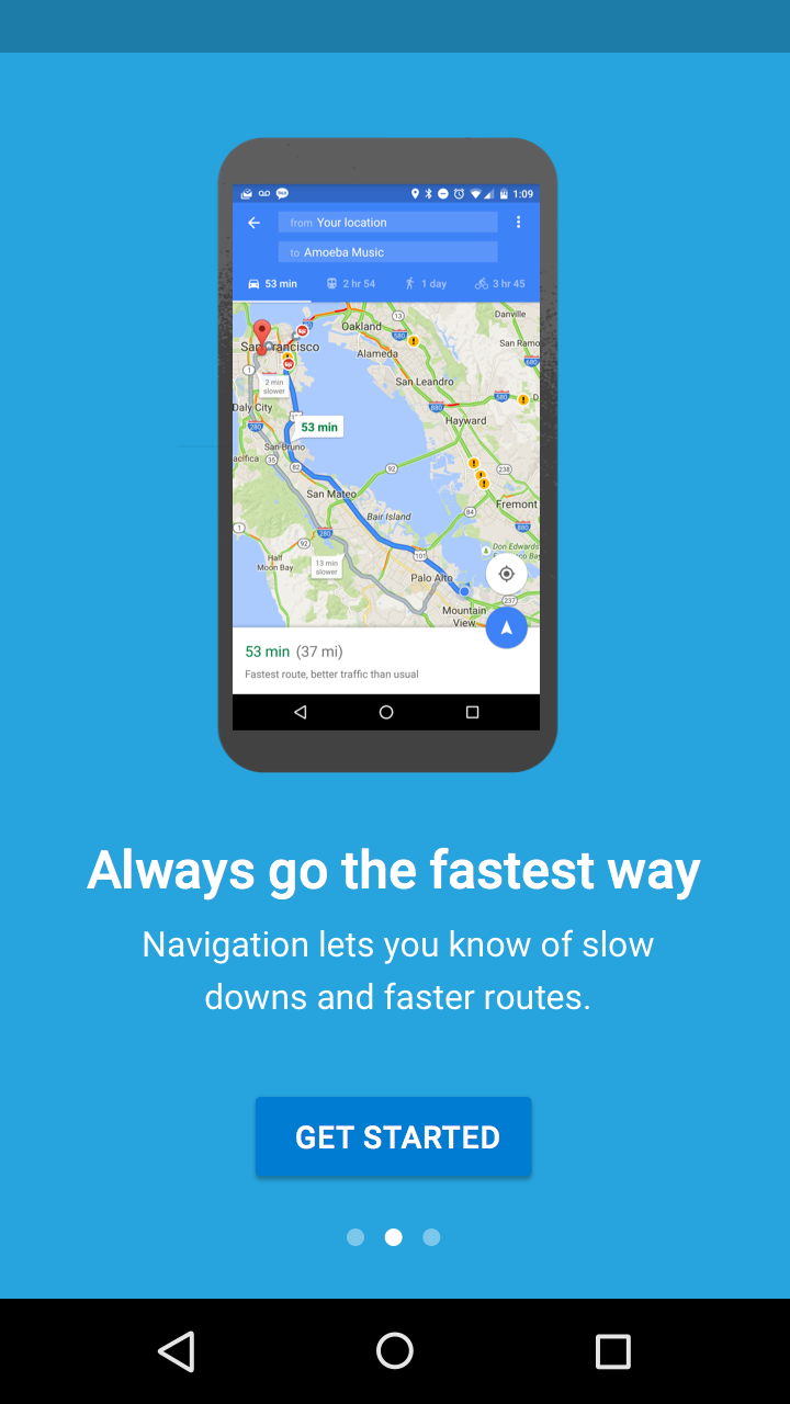
Don’t.
Showing the actual app’s UI makes it unclear if the images are an illustration or an interactive element.
Design onboarding that connects to a first-run experience. The UI seen after onboarding should make it easy for users to act on what they just learned.
The design of Top User Benefits should compliment the writing. If there’s an idea that can be better expressed through words, use text rather than imagery.
These layouts are designed to allow an illustration with a 1:1 aspect ratio to consistently fit on screens across all platforms. Ensure that the background and text color meet minimum contrast ratios for accessibility.
Mobile and tablet portrait
Place center-aligned copy and interactions beneath the illustration.
Mobile portrait
Tablet portrait
Mobile and tablet landscape
Place left-aligned copy and interactions against the right edge of the illustration, vertically centered.
Mobile landscape
Tablet landscape
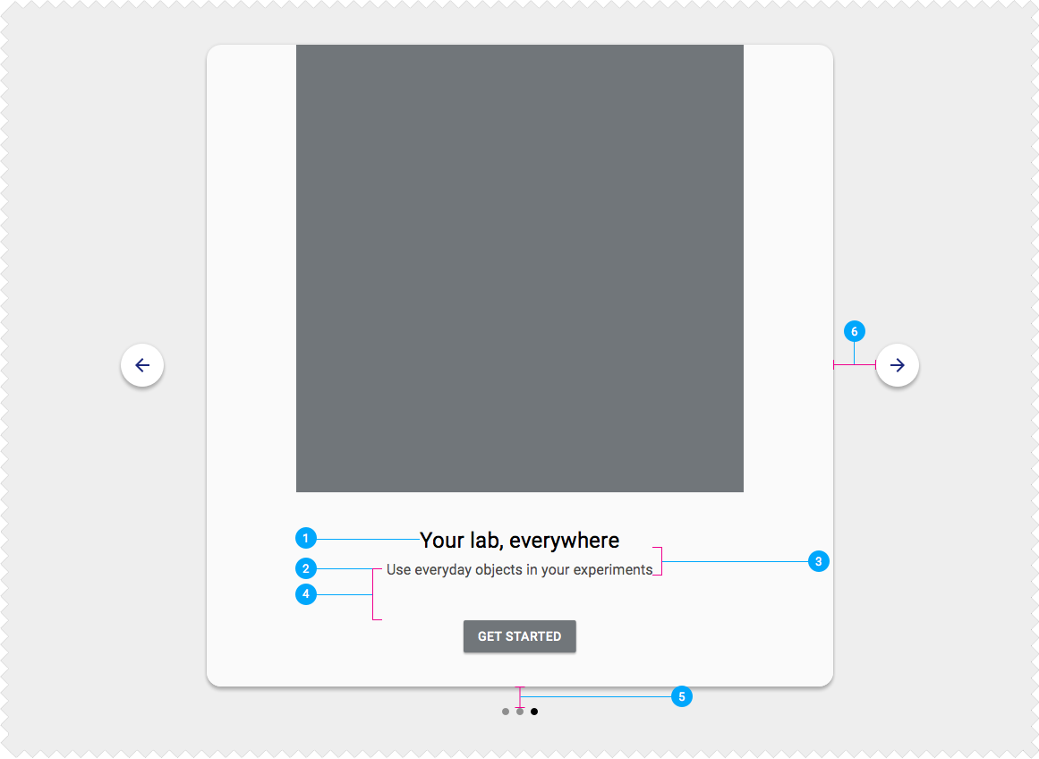
Desktop
Place illustration, copy, and interactions in a centered card. Display “Next” and “Previous” buttons beside this card and pagination indicators beneath it.
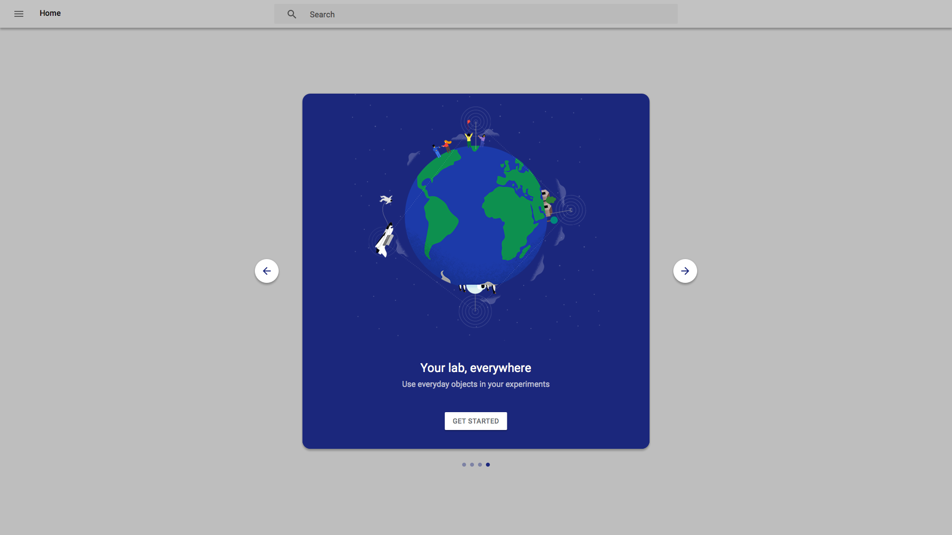
Desktop
Warm welcome experiences for wearables and TV use different methods of interaction, and should be treated differently.
Mobile and tablet portrait
Copy and UI are center-aligned on the screen and built from the bottom of the screen upward with 24dp padding.

Mobile and tablet landscape
Align copy and UI to the left edge of the illustration, vertically centered.
Desktop