Components Widgets

Widgets

Widgets display glanceable views of an app's most important data and functionality.

Usage Expand and collapse content An arrow that points down when collapsed and points up when expanded.

Home screen widgets display your app’s new and interesting content in a consolidated form. They link to richer detail within the app.

Users can move and, if supported, resize widgets across their home screen panels.

How to publish an app widget

Types of widgets Expand and collapse content An arrow that points down when collapsed and points up when expanded.

Information widgets

Information widgets display a few elements of importance to a user and track how that information changes over time, such as weather or sports scores. Tapping the widget launches the associated app into a detail view.

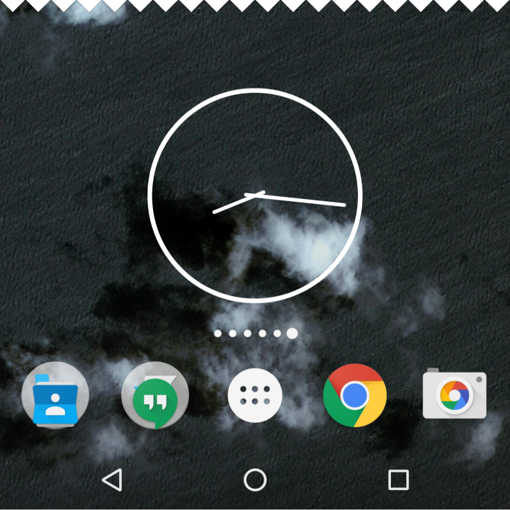
Material Design information widget

An information widget

Collection widgets

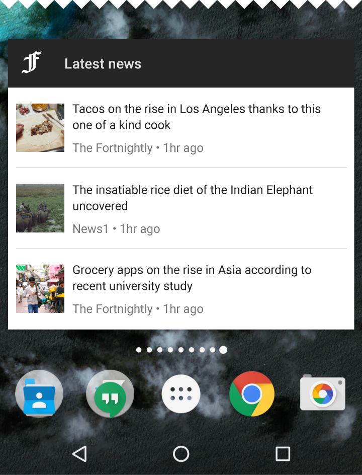
Collection widgets display multiple elements of the same type, such as a collection of articles from a news app. They focus on two interactions:

  • Browsing a collection
  • Opening an element’s detail view

Collection widgets can scroll vertically.

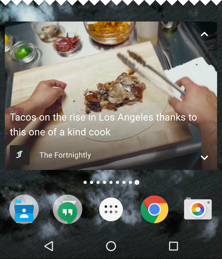
Material Design collection widgets

Collection widgets

Material Design collection widgets

Control widgets

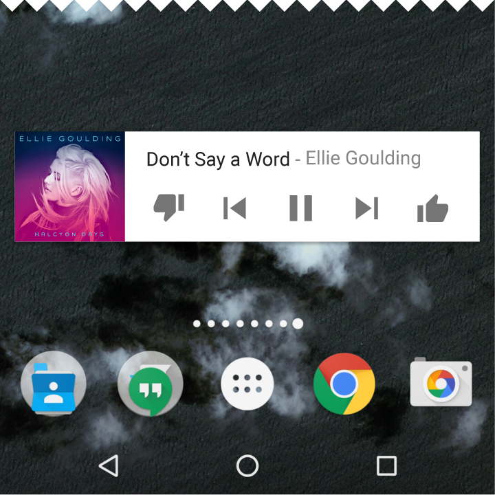
Control widgets display frequently used functions. These functions may be triggered from the home screen without opening the app. For example, music app widgets allow the user to play, pause, or skip music tracks from outside the music app.

Control widgets may or may not progress to a detail view.

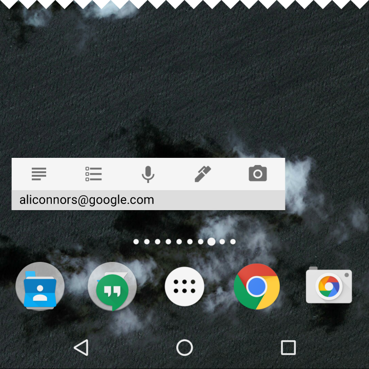
Material Design control widget

A control widget

Hybrid widgets

Many widgets are hybrids that combine elements of the different types above. Center your widget around one of these types and add elements of others as needed.

For example, a music player widget combines a control widget with elements of an information widget. The result keeps the user informed about which track is currently playing.

Hybrid widget in Material Design

A hybrid widget

Behavior Expand and collapse content An arrow that points down when collapsed and points up when expanded.

Navigation

Your widgets should provide navigation links to frequently used areas of your app, including:

  • Functions that allow the user to create new content, such as a new document or message
  • Access to the top level of your app

Widget resizing

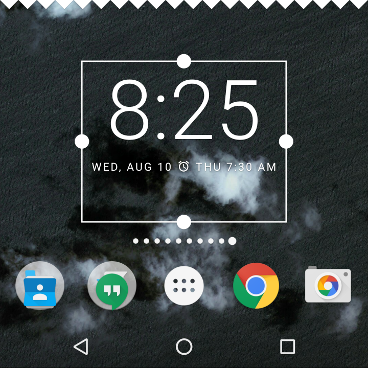
Resizing allows users to adjust the height or width of a widget. This allows users to influence the layout of widgets on home panels.

Your app may be completely resizable or constrained to horizontal or vertical size changes.

Material Design widget resizing for customizable layouts

A long press and subsequent release sets resizable widgets into resize mode. Users can use the drag handles or the widget corners to set the desired size.

Scrollable widgets

List or grid-based collection widgets usually expand or contract the vertical scrolling area. Regardless of the widget's size, the user can still scroll all elements into view.

Determine how much of your app's information should surface. For smaller sizes concentrate on the essential and then add more contextual information as the widget grows.

Non-scrollable widgets

Information widgets are not scrollable. All content and layout must dynamically fit as sized by the user.

Responsive resizing

Widgets should accommodate different spacing requirements across devices, including cell number, size, and spacing variations.

Configuring widgets

Android widgets display their configuration choices once placed on a home panel.

Configuration best practices:

  • Keep configuration light and don't present more than 2-3 configuration elements
  • Present configuration choices using dialogs, rather than full-screen, to retain the user's context

Once setup, widgets do not typically show a "Setup" or "Configuration" button.