Components Dividers

Dividers

A divider is a thin, lightweight rule that groups content in lists and page layouts.

Dividers help organize page content and hierarchy into individual tiles.

Full-bleed dividers emphasize separate content areas and sections that require more distinct visual separation. Alternatives to full-bleed dividers include white space, subheaders, or inset dividers.

Image-based content in grid lists does not need dividers. Grid lists adequately separate content using white space and subheaders.

Usage

For lists and to separate content

Type of dividers
  • Full-bleed dividers are used to separate distinct content sections.
  • Inset dividers are used to separate related content.
Specs
  • Thickness: 1dp
  • Opacity: 12% black or 12% white
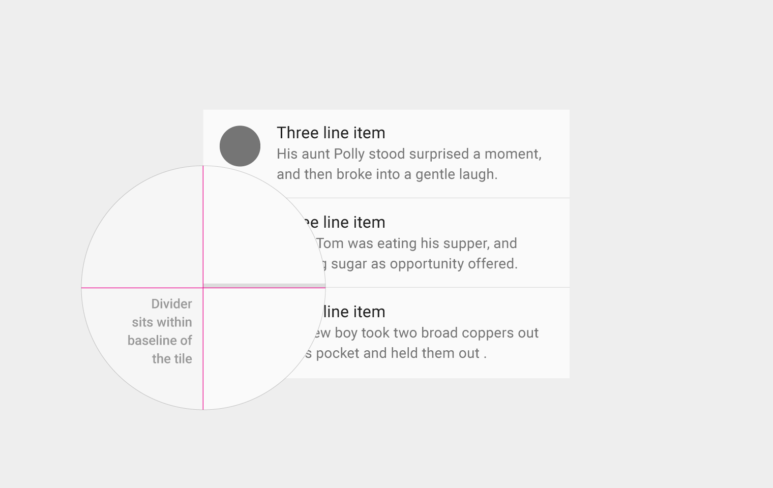
  • Placement: Along the bottom edge of content tiles

Material Design divider for grouping content in layouts

Usage Expand and collapse content An arrow that points down when collapsed and points up when expanded.

Dividers help users understand how content is organized by establishing a rhythm and hierarchy on a page. But a heavy use of dividers can lead to visual noise and dilute their impact.

Full-bleed dividers emphasize separate content areas and sections, but if such strong divisions are not required, consider using white space, subheaders, or inset dividers.

Items without anchors

When lists don’t have an anchoring element such as an avatar or icon, spacing alone isn’t always enough to separate tiles. In this case, full-bleed dividers can help create rhythm and separate individual tiles.

Material Design full-bleed dividers for email summaries

Full-bleed dividers separate email summaries.

Material Design full-bleed dividers for email sections

Full-bleed dividers separate the From, To, Subject, and Message sections of the email screen.

Image-based content

Because the grid itself creates visual distinction, grid lists do not need dividers to separate subheaders from content. In this case, the white space and the subheaders separate the sections adequately.

White space and subheaders in Material Design

The white space and the subheaders separate the photos and albums.

Material Design inset dividers for section separation

Do.

Judicious use of inset dividers demarcates major sections of content.

Material Design: Use inset dividers with avatars

Do.

Use inset dividers in conjunction with anchoring elements such as avatars.

Material Design: Avoid full-bleed dividers to reduce noise

Don’t.

Overuse of full-bleed dividers creates visual noise and ultimately diminishes the meaning of the dividers.

Material Design inset dividers reduce visual noise

Don’t.

Inset dividers help cut down on visual noise and should be used with anchor elements, but overuse reduces their meaning.

Types of dividers Expand and collapse content An arrow that points down when collapsed and points up when expanded.

Full-bleed dividers

Full-bleed dividers separate distinct content sections (e.g., biographic details from contact information) or distinct content elements (e.g., list items) in both lists and page layouts.

Full-bleed dividers can also indicate seams in material where the material will expand when content is expanded.

Full-bleed divider example in Material Design

Example of full-bleed divider

Material Design full-bleed divider example

Example of full-bleed divider

Inset dividers

Inset dividers separate related content, such as sections in a list of contacts or emails in a conversation.

Inset dividers should be used in conjunction with anchoring elements such as icons or avatars aligned with the Title Key Line.

Inset divider example in Material Design

Example of inset divider

Material Design inset divider example

Example of inset divider

Subheaders and dividers

When using a divider with a subheader, place the divider above the subheader to reinforce the relationship between the subheader and the content.

Material Design divider above subheader example

Example of divider above subheader

Material Design example of divider above subheader

Example of divider above subheader

Specs Expand and collapse content An arrow that points down when collapsed and points up when expanded.

Dividers are 1dp thick, with an opacity of either 12% black in light themes or 12% white in dark themes.

Dividers are placed along the bottom edge of the content tiles, independent of the grid.

Divider within the tile baseline in Material Design

The divider sits within the baseline of the tile.