
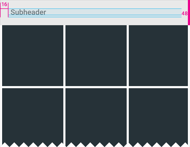
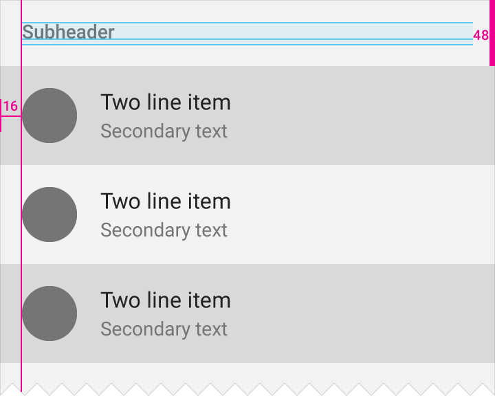
List subheaders
Specs
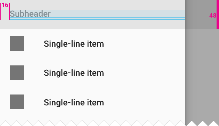
Tile height: 48dp
Subheader font: Roboto Medium 14sp
Color
Subheader color can either be the secondary grey text value (54% black) or the primary color of the app.
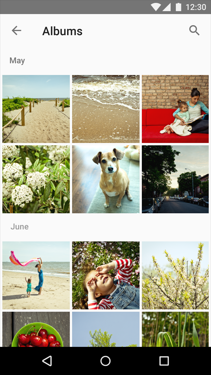
In long lists of complex information, consider using colored subheaders to delineate content. Android settings contain an example of how color can be used on subheaders.
Grey subheader
Padding: 16dp
Subheader tile height: 48dp
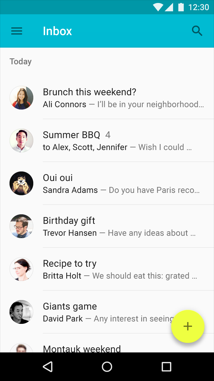
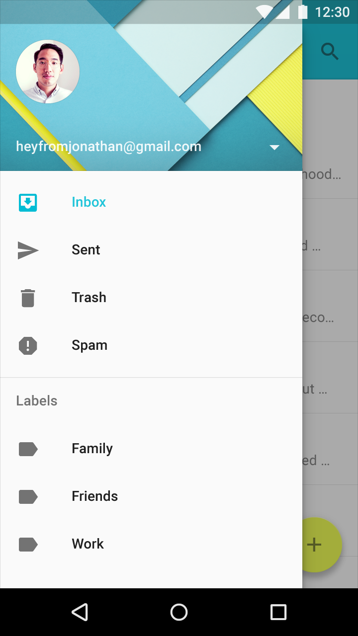
Grey subheader in email inbox
Alignment
A subheader should be left-aligned with an avatar/icon in a list, unless there is a promoted action in that space.
If there is a floating action button left-aligned with the avatar/icon in a list, align the subheader with the text content.
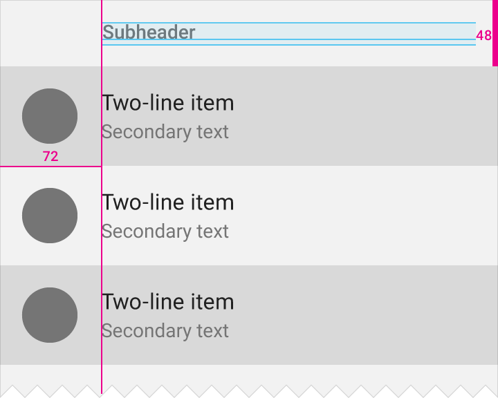
With a left-aligned floating action button, the subheader is aligned with the text content.
Subheader tile height: 48dp
Floating action button tile width: 72dp
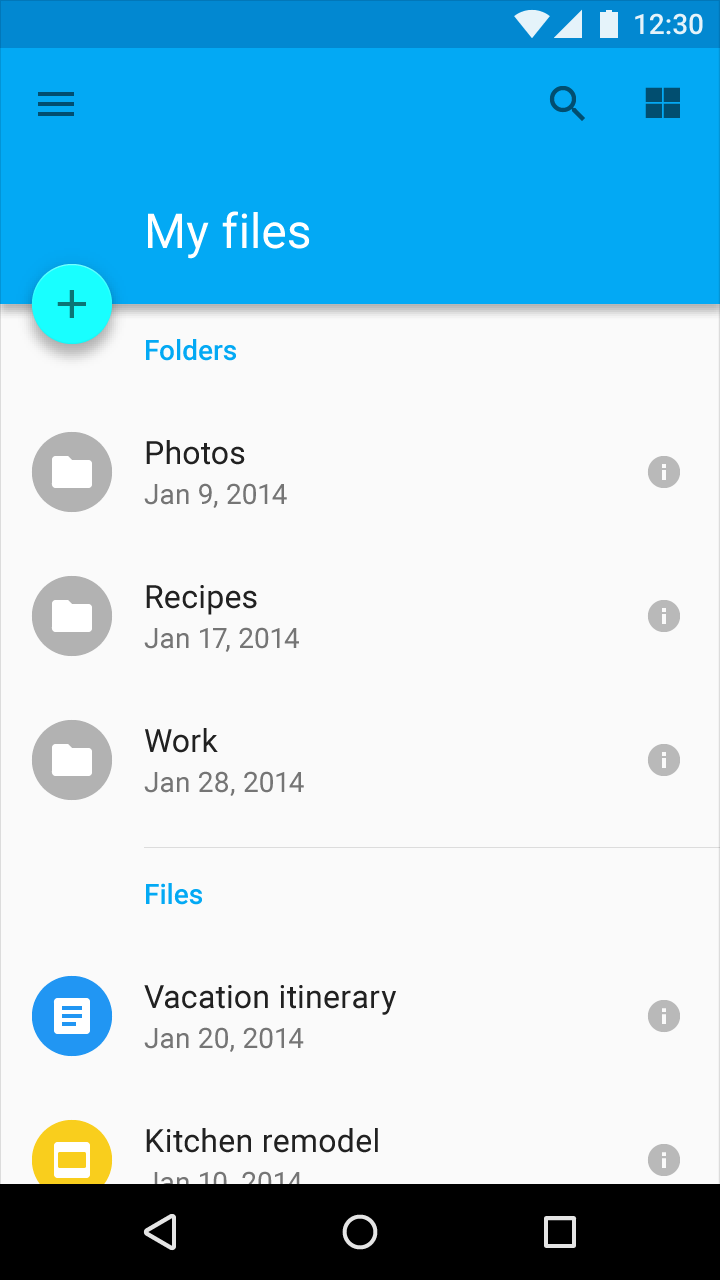
The subheader is in the primary color of the app and aligned with the text because of the left-aligned floating action button.